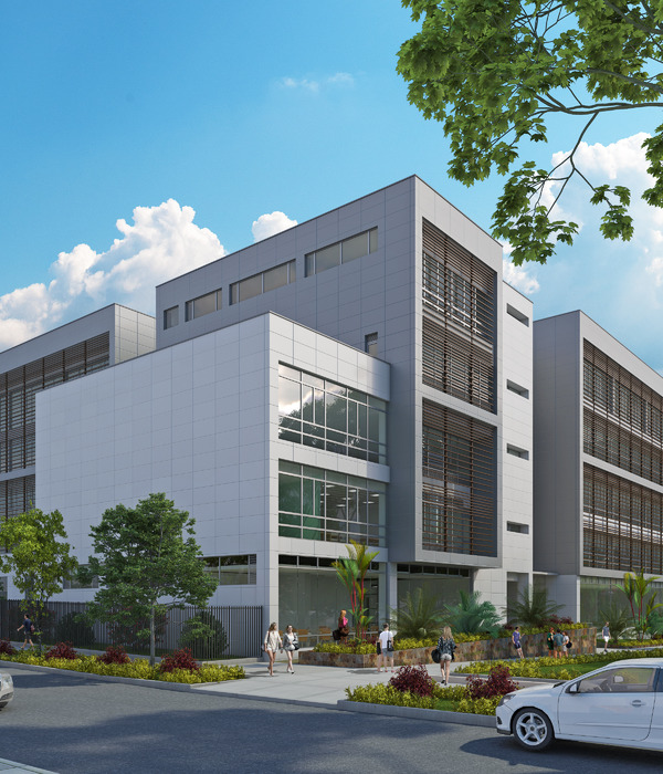
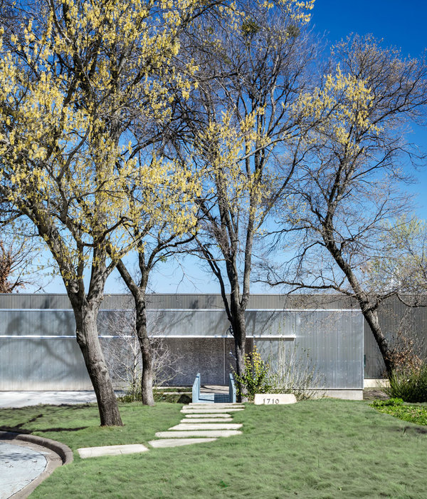
凯州新城规划展览馆位于凯州新城启动区范围内,毗邻新城两轴交汇之地,横轴是人民渠公园——启动区核心景观带,纵轴是中金快速路——联系新城市群的纽带。地处新城建设及发展的龙头地带,意味着规划展览馆既是新城的重要公共空间,也是新城对外最直接的展示窗口。
The Kaizhou New Town Planning Exhibition Hall (Window of Kaizhou) is located within the start-up zone of the Kaizhou new town, adjacent to the intersection of the two axes of the new town. The horizontal axis is the People’s Canal Park, which is the core landscape belt of the start-up zone. The vertical axis is the Zhongjiang – Jintang expressway, which is the belt connecting the new urban agglomerations. Being located in the leading development zone of the new town means that the exhibition hall is not only an important public space of the new town, but also the most direct display window of the new town to the outside world.
▼项目概览,overall of the project © 傅兴
展览馆基地位于金中快速路东侧,总占地面积约1.4万平方米。场地西临荷塘,东靠山丘,人民渠经山顶流过。背山面水、极具当地自然景观特色。一条沿东侧山丘延伸进入村庄谷地的小路,被扩展为进出展览馆的主要道路。
▼潘公凯先生题字,Mr. Pan Gongkai inscriptions ©潘公凯:中国美术协会主席、中国美学院原院长、中央美术学院原院长
This exhibition hall is located on the east of the Zhongjiang – Jintang expressway, with a total land area of about 14,000m2. It is adjacent to a lotus pond on its west, and the hill on its east. The People’s Canal runs through the top of the hill. This site is thereby characterized by local natural landscape features. There was a path extending from the hill on the east into the valley of the village, which had been expanded as the main road to the exhibition hall.
▼项目鸟瞰,aerial view of the project © 傅兴
▼顶视图,top view © 傅兴
场地具有较好的景观优势,既有自然景观——荷塘;也有人文景观——人民渠。优美的荷塘景观是传统农业社会的乡村景观的延续;而人民渠则是特定的历史时期人们生产活动的见证。建筑师认为新城建设需要重新审视人与自然、人与历史的关系,回应场地周围的特定环境,激活业已存在的时空要素,最终明确创作方向。
▼场地区位,location © BIAD|朱小地工作室
▼场地分析,analysis of the site © BIAD|朱小地工作室
The site takes advantages of the landscape features both of the natural landscape (lotus pond) and the human landscape (the People’s Canal). The beautiful lotus pond is a continuation to the rural landscape of traditional agricultural society, while the People’s Canal is the witness to human’s production activities in a specific historical period. The architect believes it is necessary to reconsider the relationship between human and nature when developing the new town, which shall response to the specific environment of the site and activate the existing space-time elements to achieve an accurate design intention.
▼穿越洞口的廊桥让人在荷塘与山丘间建立起联系,the bridge through the window allows people to establish a connection between the lotus pond and the hill © 傅兴
▼凯州之窗建筑外景,exterior view of the building © 傅兴
方案结合功能需要,形成一个20米高、100米长的形体作为基本体量。同时,设计一座穿过建筑,连接荷塘与山顶的廊桥,与建筑体量形成交叉关系。由此,建筑体量的中部被打开了一个大尺度的洞口,既形成室外公共空间,又进一步强化这种对话关系。穿越洞口的廊桥让人在荷塘与山丘间建立起联系,将建筑作为欣赏自然的窗口。原本并非宏大和独特的山水场域,借助观察洞口的视觉约束和释放,提示着山水情景的存在,并使观者获得新的心理体验。
▼设计概念,design concept © BIAD|朱小地工作室
▼形态生成,formation © BIAD|朱小地工作室
According to the functional requirements, a 20m-high and 100m-long building is placed in the site as the basic volume. A bridge is designed that goes through the building, connects the lotus pond and the hill, which forms a cross dialogue with the building volume. A large-scale window opens in the middle of the building volume forms an outdoor public space, strengthens such dialogue and highlights the concept of the window. The bridge through the window allows visitor to establish a connection between the lotus pond and the hills, which using the building as a window to view nature. The landscape field, which is not originally grand and unique, is visually constrained and released through the observation of the window, it hints at the existence of the landscape scene and enables the visitor to gain a new psychological experience.
▼穿越洞口的廊桥,he bridge through the window © 傅兴
▼室外楼梯,outdoor staircase © 傅兴
▼城市“窗口”,”window” of the city © 傅兴
▼景观的画框,frame view of the landscape © 傅兴
▼室外路径,outdoor circulation © 傅兴
▼镜面不锈钢反射了周围的景观, mirrored stainless steel reflects the surrounding landscape © 傅兴
建筑由四层的规划展览馆主体与北侧一层的员工食堂构成。规划展览馆主体分为南北两个体量,均设置有独立的出入口及竖向交通系统。首层门厅是联系展览馆南北体量的核心空间,也是展览馆主要出入口和礼仪空间。首层门厅南北两侧分别是展览库房和会议区。建筑自二层分开为两个体量,又在屋顶处连接为一体,中间的“窗”是开放的室外平台。北侧体量2-4层均为办公区。南侧体量2-3层为规划展览区,4层为办公区。
The whole project is comprised of the four-story exhibition hall as the main body and a staff canteen on the north side. The exhibition hall consists of the south volume and the north volume, both of the volumes are equipped with independent entrances and exits as well as vertical transport system. The entrance hall on the first floor is the key space that connects the south and north volumes, and also serves for main entrance and reception. On this floor, the conference area and exhibition storage area are located in each volume. This building is divided into two volumes from the second floor which are joined together again at the roof level. The “window” in the middle is an open outdoor platform. On the north volume, the second to the fourth floors are the office areas. On the south volume, the second to the third floors are the planning exhibition areas, and the fourth floor is the office area.
▼接待大厅,entrance hall © 韩金波
▼大厅细部,details of the hall © 韩金波
▼室内空间,interior views © 韩金波
▼二层走廊,hallway ©朱小地
建筑开窗主要集中在东立面,为不同功能的空间提供充足的采光通风。西立面作为主要展示面,同时避免西晒,采用了封闭的石墙面。中部的洞口通过两侧建筑不同楼层的错叠,形成复杂的轮廓。西立面石材包裹的体量以层层退台的方式形成室外平台,折返的台阶联系各层平台,在西立面上勾勒出简洁有力、连续向上的路径,由低到高直至屋顶平台,贯穿整个立面。一方面满足安全疏散要求,减少建筑内部交通空间冗余;另一方面弱化建筑体量的压迫感,带来更多的形体变化。更为重要的是方案在此进一步调动观众的动线,在不同高度及屋顶获得领略建筑与周围环境的不同视角,这里是以现实场景的方式展示新城建设过程的平台。
The window openings are mainly on the east elevation to provide sufficient light and ventilation for the different functional spaces. The west elevation serves as the main display surface while avoiding western exposure with a “solid” surface. The volume of the stone forms the outdoor terraces which set back layer by layer. The interlaced steps connect with the terrace of each floor and become a concise and continuous path that goes through the facade towards the roof platform. Therefore, it can relieve the vertical transport for the evacuation purpose and reduce the redundancy of the interior transport space, and in the meantime, weakens the oppressing sensation of the building volume and brings more changes. More importantly, the design further mobilizes the movement path of the visitors, and allows them to experience the building and the surrounding environment from different perspectives in the vertical direction and at the height of the roof. Therefore, it can be considered as a platform through which visitors may witness the urban development process in a realistic scenario.
▼建筑外立面,exterior view of the building © 傅兴
▼体块的堆叠,stacking of blocks © 傅兴
▼建筑细部,details of the building © 傅兴
人们在其中漫步、穿行、登高、远眺,人、建筑、自然,历史相互交融,成为最生动的城市舞台,更是展示凯州新城的“未来之窗”。
Visitors are walking, passing through and climbing in this building. By integrating human, architecture and nature into a picturesque scene, it becomes the liveliest urban stage and “a window of the future” that shows the landscape and culture of the Kaizhou new town.
▼立面夜景,exterior view at night © 傅兴
▼夜景鸟瞰,aerial view at night © 傅兴
▼总平面图,site plan © BIAD|朱小地工作室
▼底层平面图,ground floor plan © BIAD|朱小地工作室
▼二层平面图,second floor plan © BIAD|朱小地工作室
▼西立面图,west elevation © BIAD|朱小地工作室
▼剖面图,sections © BIAD|朱小地工作室
项目名称:凯州之窗 项目地点:四川省德阳市凯州新城 设计时间:2020年 建成时间:2023年 用地面积:14100.74㎡ 建筑面积:7819.93㎡ 业主:德阳市凯州投资开发有限责任公司 设计单位:BIAD|朱小地工作室 主持建筑师:朱小地 设计团队:贾琦、罗盘、孙晓倩、孙栓柱、王烨、马宜勃、李燚、王晓东 结构:陈晗、尹飞 设备:崔玥 电气:毕雅冲 灯光设计:北京光湖普瑞照明设计有限公司 胡芳、李亚辉 室内设计:北京建院装饰工程设计有限公司 石珊珊、杨子霖 摄影:傅兴、韩金波、朱小地
Project Name: Window of Kaizhou Location: Kaizhou New City, Deyang, Sichuan Province, China Design time: 2020 Completion time: 2023 Land area: 14100.74m2 GFA: 7819.93 m2 Client: Deyang Kaizhou Investment and Development Co. Design Unit: BIAD|ZXD Architects Lead Architect: Zhu Xiaodi Design Team: Jia Qi, Luo Pan, Sun Xiaoqian, Sun Biaozhu, Wang Ye, Ma Yibo, Li Xiaoying, Wang Xiaodong Structure: Chen Han, Yin Fei Equipment: Cui Yue Electrical: Bi Ya Chong Lighting Design: Purilighting Design (PURI), Hu Fang, Li Yahui Interior Design: BIAD Decoration Engineering & Design Co., LTD, Shi Shanshan, Yang Zilin Photography: Fu Xing, Han Jinbo, Zhu Xiaodi
{{item.text_origin}}

