旅行是人们获得灵感、四处游历、体验不同生活方式和处事方式的首选途径。尤其在当今时代,人们需要引起对远方的回忆的事物,这些回忆有时也会在几年之后演变成设计。当设计师开始曼谷%咖啡店的设计时,曾经在泰国旅行的记忆浮现在脑海,他参观了陶器和令人惊叹的手工工厂,还有大量寺庙及其壁画和装饰。
Traveling is our preferred way of inspiration, wandering around, experiencing different ways of life, different ways of doing things. Especially in times like these, the reminders of distant places become essential and the collection of memories might evolve into designs. Sometimes years later. When we started the design process for % Arabica in Bangkok, memories from previous travels in Thailand came to mind. The visit of potteries and amazing handcrafting factories. And the abundant temples with their murals and ornaments.
▼室外入口,outdoor entrance © WWorkspace
▼室内入口,indoor entrance © WWorkspace
设计师一直对泰国文化重视“交谈”印象深刻,这种交谈常见于泰国壁画。在奥地利咖啡馆文化中,人们倚靠桌椅谈话。而在这些泰国壁画中,人们以有趣的方式利用景观或传统建筑地形。这些回忆激发设计团队在%咖啡店内创建座位地形,人们可以在其中漫步然后找到位置坐下或休息,自然地再现了设计师记忆里壁画上的闲聊场景。
▼轴测分解,axon exploded © Studio Precht
I was always impressed that Thai culture values the “chat”, the engaged conversation as its often depicted in these murals. In Austrian coffee house culture, we are reliant on chairs and tables for a conversation. But in these Thai murals, the landscape or the traditional architectural topography was used in a joyful way. These memories inspired us to create a seating topography inside the % Arabica store, to allow people to roam and find their spot to sit or lounge. Naturally recreating the arrangements “for a chat” as we remembered from the murals.
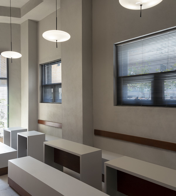
▼内部外观,indoor appearance © WWorkspace
▼从外部望向内部,view from the outside to the inside © WWorkspace
▼窗洞细节,details of the holes © WWorkspace
▼室内概览,overall view of the interior © WWorkspace
▼从阶梯座位望向吧台,view from the terrace to the counter © WWorkspace
▼制作区,the making area © WWorkspace
▼取餐口,the pick-up space © Sherman Chong
传统泰国设计还包括模块重复和矩形阶梯,这也是设计团队经常使用的两种设计策略。模块理念以及对陶器和瓷砖工厂的参观使设计团队产生了用手工瓷砖和砌块构建整个空间的想法。模块大小为15 x 15 cm,一块瓷砖是一级台阶,三块瓷砖连成45cm的座位,五块瓷砖组成75cm的柜台。一个简单的模块就构成了整个项目。
▼设计理念,concept drawings © Studio Precht
Other aspects of traditional Thai design are modular repetitions and rectangular terracing, two design strategies that we often use in our designs. The modular principle, and our visits to potteries and tile factories, led to the idea of simple handcrafted tiles and blocks, to assemble the entire space. The modules are 15 x 15 cm. One tile is a step, three tiles are connected to a 45cm seating, five tiles constitute a 75cm counter. One simple module for the entire program.
▼模块重复和矩形阶梯,modular repetitions and rectangular terracing © WWorkspace
▼普通座位区,general seating area © WWorkspace © WWorkspace
▼阶梯座位区,terrace seating area © WWorkspace
▼座位区使用场景,usage scenarios © Chris Schalk
设计团队与当地工匠合作,制作了中间是白色釉面砖的灰色方形混凝土块。手工工艺为简约的设计注入了侘寂感。这些模块质地丰富、瑕疵细腻,使空间鲜亮又不失触感。
We collaborated with local craftsmen for the creation of the square, grey, concrete like tiles with a white glazed centre. The handcrafting infused the clean, nearly minimalist design with a little hint of Wabi Sabi. Rich in texture, with delicate imperfections, keeping the space bright and fresh, yet haptical and sensual.
▼砖块细部,details of blocks © WWorkspace
▼产品细部,details of products © WWorkspace, Chris Schalk
▼平面图,floor plan © Studio Precht
{{item.text_origin}}

