Architect:ARCANIKA
Location:Almetyevsk, Russia; | ;View Map
Project Year:2021
Category:Exhibition Centres;Workshops;Cultural Centres
The main aesthetic challenge is creating the city center. The quarter in front of the Community Center was the first space that could be called an attraction point, and the Community Center is its cultural dominant. The Community Center expands its boundaries outside the building, attracting new visitors via temporary outdoor displays.
The semantic challenge is a change in the paradigm of a place that attracts people, where citizens come to spend their leisure time. The social demand for a space that corresponds to the values of the information age - leisure + education format.
The architectural challenge is the absence of recognizable architecture of the region, existing buildings. Followingly, there were no restrictions in the design of the future building. Reconstruction is always a challenge, it determines a strict framework for design - in addition to the "surprises" that appear during opening / demolition, there are design parameters that cannot be changed - for example, a 6x6m column grid.
An interior challenge is to unite a set of zones with different functions and styles with a single space. To create a recognizable look of interiors that will unite and continue the ideas set by the architecture of the façade.
The Community center in Almetyevsk is a reconstructed building of a former department store of the 70s. The idea of the project is to create a new attraction point - a modern multifunctional building with educational and cultural facilities for citizens.
The look of the building, created by the pattern of the hinged perforated facade, goes back to the geology of the region. The original drawing is a metaphor of the sequence of oil-bearing layers of the Almetyevsky ledge, which echoes the corporate identity of the Tatneft company. Behind the decorative facade, a second facade is visible, which is illuminated in the evening. The play of light and shadow, seen through the stencil of the drawing, creates the illusion of theatrical scenery. The image of oil-bearing layers, expressed on the façade, can be traced in the layout as well. Each function occupies an entire floor of the building, so they are stacked on top of each other, repeating the idea of the facade.
The idea of interiors is to unite external and internal, creating a multifunctional space that will be filled with the life of citizens and will adapt to their needs and events happening there. Consequently, the interiors came out minimalistic, according to the principle of "necessary and sufficient" with the introduction of bright accents. Light became the main tool in the interior - it brings dynamics and emphasizes the "life cycle" of the building during the day - penetrating through the perforated panels of the facade, light creates peculiar shadows that move through the building over the day, and unites the interior with the exterior.
- with the determination of the restaurant operator, a wood-burning stove appeared, this lead to STR and a secondary State expertise
- design of a summer terrace of the restaurant
- the restaurant owner wanted to extend the elevator to the 5th floor. As the pits of elevators had already been constructed, and the equipment had been purchased, we offered to make an additional elevator from the 4th to the 5th floor, providing access to the roof.
- the local ethnography museum was replaced by a space for temporary exhibitions. Now it holds an exhibition of Turkic musical instruments and the Digital Academy of Almetyevsk.
Public center in Almetyevsk replaced the former department store of the 1970s. The goal of the project was to create a multi-functional object with cultural and educational programs for citizens of all ages.
After the reconstruction the building’s volume doubled – 3 stories were added, so the public center’s volume became to look like a cube. Pattern on the hinged perforated façade relates to the geology of the region. An original drawing is a stylized sequence of the oil-containing layers of the Almetyevsk ledge, which also refers to a corporate identity of “Tatneft”. There is a volume of panoramic glazing behind the hinged façade, which is illuminated during evening and night-time. The game of light and shadow seen through the pattern of the façade’s panels gives an illusion of the theatre's decorations.
Interiors of public zones are open spaces filled with light. These spaces are easily adopted for different usage scenarios – halls, exhibition spaces, concert hall, auditoriums are easily transformed and zoned. There are used shades of white and grey mostly, tones of natural wood as well as color accents. The main architectural tool is natural light. It connects interiors and exteriors, coming through perforated façade panels and creating shadows - "negative" of the facade pattern. Light brings in dynamics and transforms interiors depending on time of a day and year.
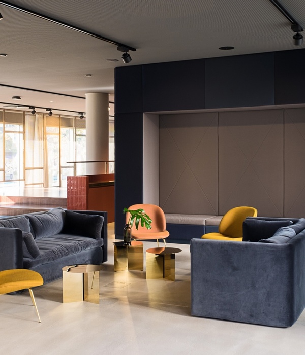
When you enter the building from Lenina street, you get into the lobby with a reception desk and a lightbox with navigation across all the facilities of the building. Ice-white reception of geometric shape is crafted of corian from architect’s drawings, behind it there is a media wall describing the schedule of events held in the Community center. In the double-light area of the hall, which faces the quarter, there is a lounge zone with Arper sofa composition and a café overlooking the square. Under the ceiling, there is a custom-made lighting installation of complex shape, consisting of "light tubes". It is a programmable downlight with controlled color, color speed and brightness. Light gray self-leveling floor, white or wooden wall panels is a key element of all the interiors, and a false ceiling made of metal mesh cassettes is a feature of the 1st floor lobby. The downlights are installed behind these panels, so the light is scattered along the plane of the cassette, creating a flickering visual effect.
From the main hall one can get to other floors using the main staircase, or to other facilities on the ground floor: the temporary exhibition area or to Digital Academy, where children and teens are taught graphic and motion design. An exhibition of Turkic musical instruments is now being held in the temporary exhibition zone. Instruments from several private collections can be studied or even play music.
The main staircase connects all floors with a vertical volume without natural light, designed in light monochrome colors. The guardrail is a single geometric line created of perforated metal sheets. Pattern of perforation is a quote from the decorative facade of the building. The handrail on the other side of the stairs is built-in with integrated LED lighting. Outer walls of the staircase are finished with panels and inserted navigation elements.
Navigation is a crucial part of interior design, providing intuitive movement around the building. From the main lobby with an accent lightbox to the signs and tactile navigation elements, everything is designed to complement interior space. A peculiar detail is used in halls in front of the elevator - the numbers of the floor seem to be “scrolling” as you go upstairs.
The second floor is occupied by the interactive center "Almetrika". There, laws of physics are explained through interaction with exhibits, and master classes in a laboratory are held.
The third floor is taken by a linguistic center, which is a school of additional education for different age groups. This school includes 14 educational classes, a spacious hall with a library and computer class available for all the citizens, as well as a multifunctional conference hall. Interiors of the school are designed in brand colors – bright and open they perfectly match with each other. There is a design-ceiling of acoustic wavy panels creating comfortable sound surroundings and a composition of Tacchini’s sofas in the main hall. From the hall one can get to the conference space, equipped with a video projector, stackable ISKU chairs and a big mirror with a barre.
Some of the classrooms are designed with transformable NAYADA partitions, which allows to hold classes for bigger groups. All the classes are provided with multimedia blackboards and are divided into several groups depending on the student's age. Furniture is chosen according to age groups; all desks are individual and allow different organizational schemes. Besides classrooms there’s a playroom and a coffee point for tea-parties. Teacher’s rooms also include relaxation rooms and coffee points. There’s an individual navigation design corresponding to the school's branding and classrooms are named after Russian and world cities.
A multifunctional concert hall is located on the 4th and 5th floor. Its capacity is 283 seats, and there are special areas for disabled visitors using wheelchairs. The hall with a telescopic tribune follows demands of modern scenography, allows to hold all the different types of occasions – music concerts, festivals, philharmonic concerts, theater performances, presentations, symposia and film shows. Its walls are covered with wooden acoustic panels with integrated LED-lightning, equipment corresponding to the acoustic project, designed by Merlin-pro.
In addition to the concert space, there is a restaurant on the fourth floor with a summer terrace on the rooftop, and a spacious hall. There is an exhibition of photography and sculpture at the moment. The hall is furnished with modular Arper sofas with USB-chargers, walls are faced with panels with an integrated monitor which shows a program of the events being held.
On the 5th floor there is a transit hall to get to the balcony of the concert hall or to the rooftop. A composition of individually designed lighting makes this space look festive.
There is a cloakroom and lavatories in the basement. Despite the fact that this area is utilitarian and lacks natural lighting, the space matches the level of other public spaces. Color composition on the accent wall designed by architects, columns faced with mirrors, navigation modules and cloakroom desk with metal mesh panels, black downlights on tracks adding graphic elements, they all continue interior methods used in other spaces of the building.
▼项目更多图片
{{item.text_origin}}

