Architect:Spaces Architects @ ka
Location:New Delhi, India
Project Year:2016
Category:Offices;Showrooms
The brief was to design a tiles showroom and office. Of the two existing identical buildings at the site that had been used as warehouses for the past 15 years, one had to be converted to a showroom cum office. The scope was identified as facade design, landscape and interiors.
With the requirements of the client, came along the passion for their work over three generations in the tile industry. They wanted the showroom to be a museum in which they would showcase the tiles as their beloved possessions. So the objective became rather to create a museum cum experience centre where people would spend hours to look, select and know about the kinds of tiles available in today’s market.
Also the goal was to showcase the application of tiles to its extent. The tiles were tested to its limits by using it for every possible application, in the floor, walls, ceiling, hanging elements, artefacts, sculptures, furniture and even lighting.This would educate the visitors about the much greener and less expensive and easily maintainable product than stones.
Since the building was used earlier as a warehouse with excessive structural loading than its designed limit, various measures were taken such as micro-concreting, epoxy grouting, FRP wraps and at some places increase columns to make the structure fit.
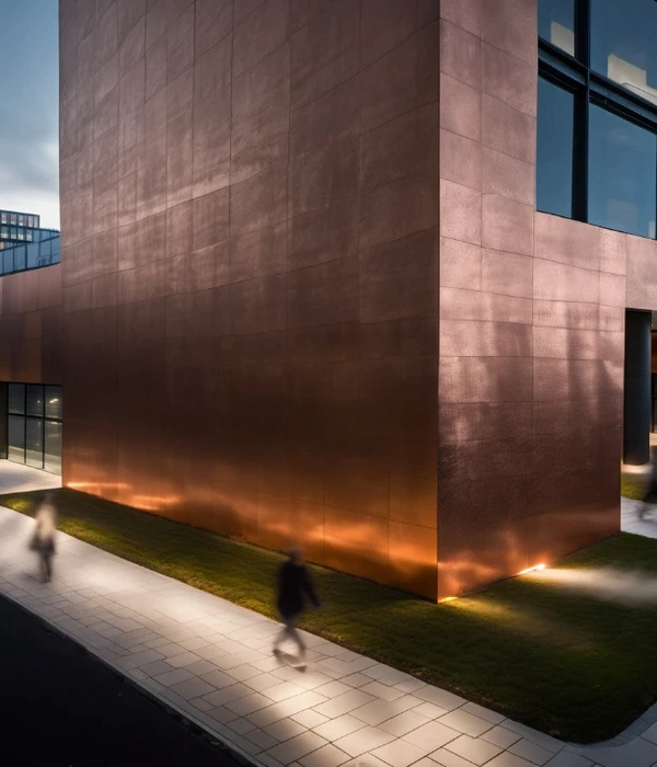
For the facade, the concept was to depict natural weathering of stones creating multiple lines and layers. Juxtaposed blocks are created using MS framework with self-foundation and tied to the existing building. These were cladded with large sized (8 feet x 4 feet) slim tiles. A much abstract form was created in the corner of the building near the entry where the tiles are put to extreme testing with multiple sharp angles and joints.A 6 feet x 8 feet glass box emerges over the entry of the showroom supported by MS columns and framework. This glass box forms a sculpture over the façade which connects the exteriors with the interiors and it is also a very essential part of the aesthetics.The landscape also plays a major role in the architecture of the building. The boundary wall also reflects the concept of the elevation with multiple abstract blocks emerging out it. These blocks are also clad with slim tiles on MS framework using chemical adhesive. The motorised gates open up toabstract patterns in the landscape made out of water-jet cut tiles. A very interesting depiction of shadow of the abstract corner is created in the floor using black coloured tile and grass patches. The area also includes human sculptures, a water body as the front attraction and a bench forming a part of raised landscape with tensile roof over it.
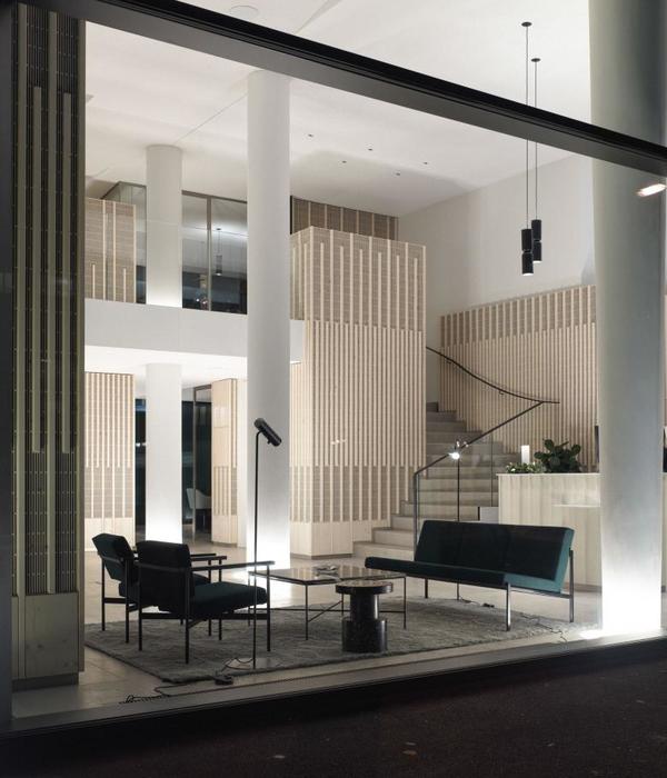
The showroom was intended to be placed in the ground and first floors. When a person enters the showroom, to create a sense of volume and to connect the two floors, existing RCC slab is cut to create a double height space with large hanging ceiling lights over it. A reception table clad with 8 feet x 4 feet slim tiles is kept in the middle with the famous Barcelona chairs adorning the visitor area. The double height wall also has a backlit panel with the initial concept sketch of the building. In the ground floor, a central aisle is planned with separate zones on both sides. These zones are created for different brands and kinds of tiles whereeach zone has display cassettes and tiles are displayed in different patterns and combinations making it much easier to select. To create the desired dark interiors, the partition walls are clad with dark coloured tiles and multiple niches are created to display contrasting décor tiles. The ceiling and the exposed services are painted dark grey andpanels of tiles are hanged using MS framework to show creative application. At some places to bring relief, cement grey texture paint has also been used. The ground floor also has an architect’s display area, where he/she can move in, select tiles, put them on a slanter and make concepts for their space. Also in this area the temperature of lights can be varied from 2700k to 5000k according to the space it has to be fixed in.
Light plays a major role throughout the showroom for various reasons. The only focus of light is on the tiles to enhance the depth and texture in the various patches of tiles. A visitor is driven through a dark spaces towards various colours of tiles with spots of light over it. This creates a sense of being in a museum with just the priced artefacts, in this case tiles, highlighted.
In the first floor of the showroom, the client wanted to introduce a sanitary ware and wallpaper brand. So, various mock-ups are created of washrooms, living areas, bar etc.from whichan architect, interior designer can just select a complete concept for his house. For example, each washroom mock-up has its own concept with matching tiles, wallpaper, vanity, sanitary ware, faucets, furniture, ceiling elements and lighting. In the central aisle, few free standing partitions are erected at angles to create a feeling of mystery. Every step ahead takes the person through a new journey unveiling the different mock-ups ahead. An architect’s display area is also created in this floor. Since white colour tiles are most commonly used in all facilities, we decided to dedicate an area for the white tiles with various patches. Here the tiles can be showcased for various applications using temperature changing lights from yellow to bright white.
▼项目更多图片
{{item.text_origin}}


