这是一个精品服装店的项目,店内服饰从经典、现代、到新兴的品牌一应俱全。店铺空间宽敞,层高4.8米,沿着商场的一侧展开。设计师们为了凸显店铺给定的特征打造了一个全新的方案。白色灰泥墙被选作设计的基础,同时也作为背景来展示精选商品,一排排V形衣架则沿着天花板整齐分布。
A select shop project for a store that carries items from classical to contemporary and emerging clothing brands. The site was a large scale space with a ceiling height of 4.8m located along side a shopping arcade. We decided to create a plan that emphasized the given characteristics. A white stucco wall which was chosen as the base of the design and to also function as a backdrop to show the selected items, while a simple composition was kept throughout the overall atmosphere with V shaped hanger racks aligned from the ceiling.
▼商店入口, entrance
▼店铺由内到外都以白色为基调,the store is white from the inside out
▼商品主展示区,main display area
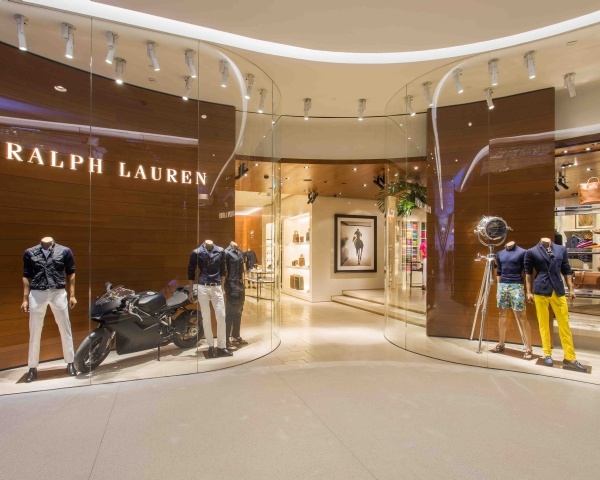
天花板上的其他如电线、聚光灯、和空调等元素都是根据衣架的布局来排布的。柔和的弧形立面从拱廊通向入口,墙面的白色以与室内相呼应。同时,通过与拱廊保持一定的距离,让客人一进入商店就能留下深刻的印象。
▼柔和的弧形立面从拱廊通向入口,the soft curved facade which leads from the arcade to the entrance
Other elements located in the ceiling, such as line and spot lights, air conditioning, were carefully organized along with the layout of the hangers. The soft curved facade which leads from the arcade to the entrance, was kept white to coincide with the interior. Simultaneously, by maintaining a certain distance from the arcade, we succeeded in creating a strong impression for the visitors upon stepping into the store.
▼冷色调的服装与灰泥墙互相呼应,cool – toned garments echo the white stucco walls
▼V型衣架整齐排布,V-shaped hangers are neatly arranged
▼衣架排布细部,details of hanger arrangement
▼弧形立面内部细节,details inside the curved facade
▼设计平面图,plan
Client: MAKES co.,ltd. Type of Project: Interior Use: Boutique Period: Oct 2018 – Feb 2019 Floor Area: 159m2 Location: Toyama, Japan Design: Koichi Futatusmata, Riki Harada(CASE-REAL) Construction: HORAISHA CO.,LTD. Lighting Plan: ModuleX Inc. Photo: Daisuke Shima
{{item.text_origin}}

