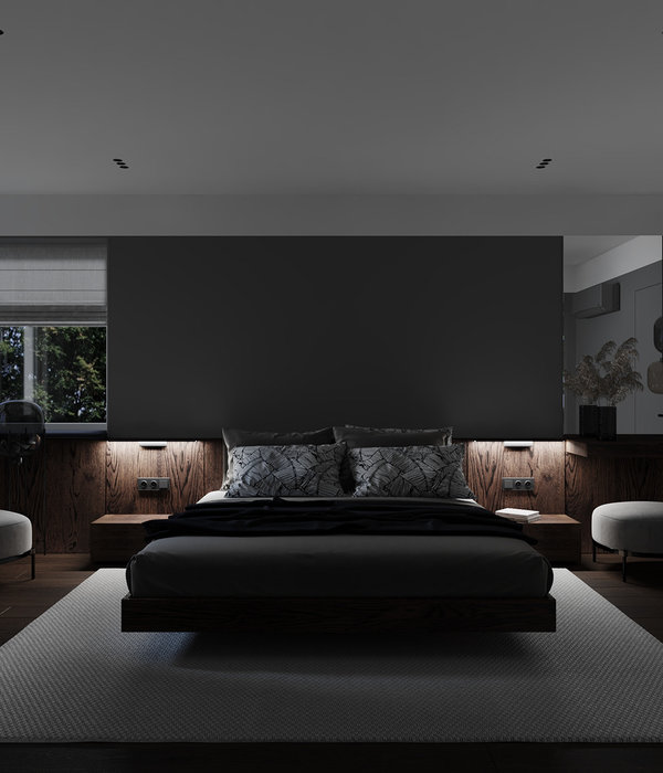
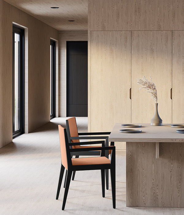
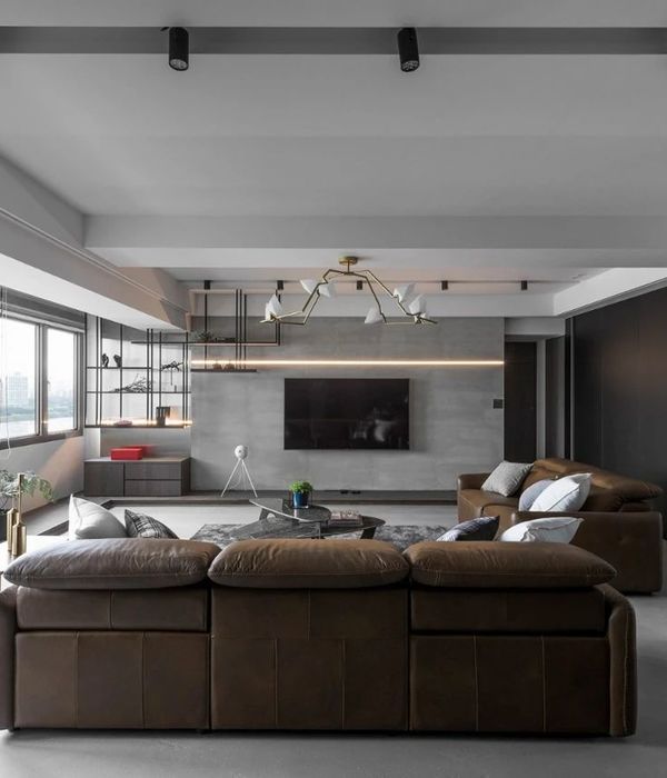
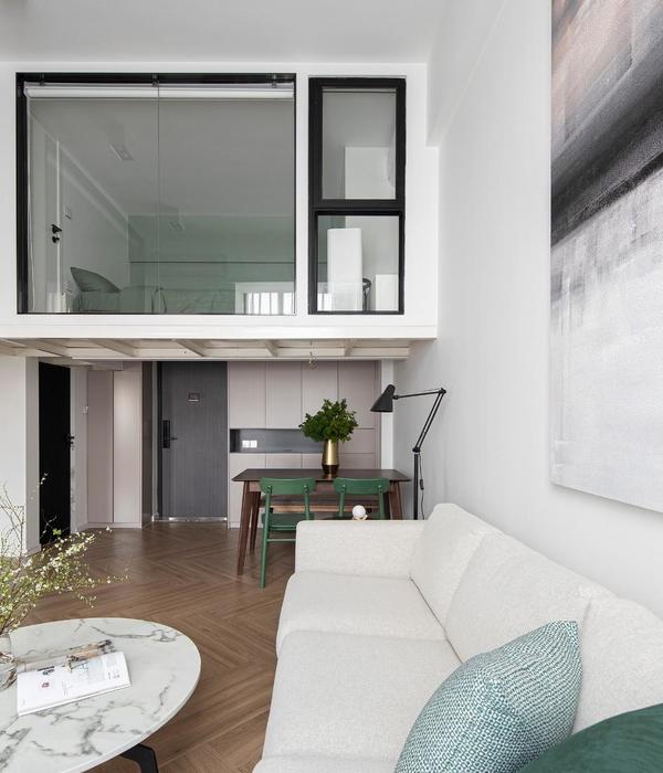
The client’s Scandinavian heritage greatly influenced the design of the Magnolia residence remodel. The existing 1,940 square foot midcentury modern home with 4 bedrooms, 3 bathrooms sits perched on a 5,800 square foot site on Magnolia Hill with a coveted view of Elliott Bay. “With the client’s desire to bring a little memory of their homeland of Sweden to Seattle, we felt it important to look at the existing building through a Nordic lens.”
“Interestingly, the Scandinavian style flourished in the 1950’s so it was exciting to see how it would pair with the existing Midcentury modern style of their original home built here in Seattle in 1954” says Kristen Becker from Mutuus Studio who collaborated on the design of the project with the contractors Emilee and August Birrell at Crescent Builds.
Characterized by simplicity, minimalism and functionality, the new floor plan worked with the mid-century layout which had good bones and lines to work with to infuse the home with Hygge. The Danish word Hygge translates as “an attitude towards life that emphasizes finding joy in everyday moments and emphasizes coziness, warmth and family.”
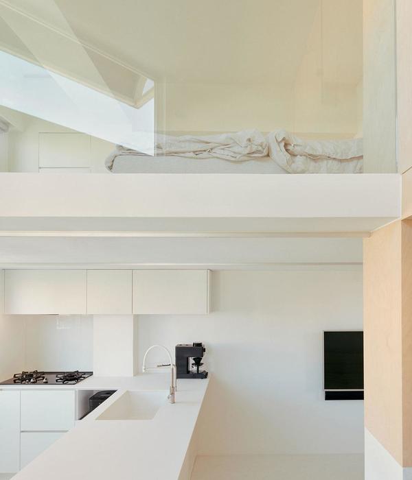
The hallmarks of the Scandinavian influence are apparent with the white walls, neutral warm wood floors with the pops of color which provide a brightness to the home. Project Manager Emilee Birrell from Crescent Builds played a lead role in helping the client select materials that were in the spirit of the Scandinavian style. Seattle’s often grey and overcast days necessitate the need for the white walls to bounce as much light as possible into the space. “The first major move was to open the floor plan to bring in the light.” The original tight entryway and closed off stair and kitchen were dark and unwelcoming. The simple move of opening these closed off areas completely transformed the experience of the home. “By opening up the rooms to bring in light and connect the living, dining and kitchen areas to flow together it ironically made the space feel more cozy.”
Now, light flows down the originally closed off stairs, making the home also feel larger. “When we first walked into the home, you were unaware that there is even a lower level, by opening up the stairwell to the main level felt like the home was given an addition.” The ceiling of the kitchen was vaulted and countertop heights were raised to accommodate a more comfortable head space for the remarkably tall clients Aaron and Stina Brown. The bold colors of the textiles, objects and glassware throughout the home add the finishing touches to balance the architecture with the interiors.
Year 2017
Contractor Crescent Builds
Status Completed works
Type Single-family residence
{{item.text_origin}}

