- 设计机构:辰夏空间规划
- 设计团队:夏兆民,孙曼丽
- 项目地点:江苏淮安
- 主要材料:进口乳胶漆,柔抛砖,木饰面,水磨石岩板
- 空间摄影:王浩建筑空间摄影
- 完工时间:2022年12月
CHENXIA STUDIO2023NewCase
不可否认空间价值的前提应该是建立在实用为目的的基础之上。所以本案应甲方的要求,尽可能的让大空间在块面的表现上显得够简洁够利索,同时用严谨的现代底层逻辑去处理不同空间之间的关系,又要把握好尺度不失夸张,在表现空间的美感同时又不失实用,这也是我们在接触大平层类的私宅时一直去探索的。
The premise of undeniable spatial value should be based on practicality as the purpose. Therefore, at the request of Party A, this case strives to make the large space appear concise and agile in terms of block surface representation, while using rigorous modern underlying logic to handle the relationships between different spaces, while also grasping the scale without exaggeration, expressing the beauty of the space without losing practicality. This is also what we have been exploring when encountering private residences with large floors.
家具元素/
Furniture elements
VAST柔石
棱角分明,由块状构成的靠背、坐垫、扶手,软硬适度,体贴舒适。
The backrest, seat cushion, and armrests are made up of blocks with distinct edges and corners, providing moderate softness and comfort.
——CAMERICH
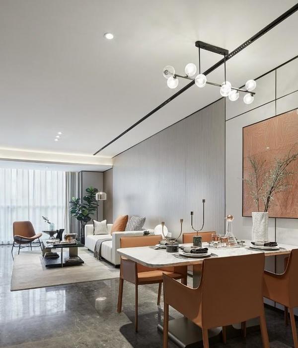
大面积的白色和木色是空间的基础,结合有序的结构,梳理了客餐厅关系,引导着独属客厅跳色休闲椅的视觉焦点。大块面的深色墙板连接了两个区域,看似分割却又有关联,这是我们对于独立区域的一惯设计手法。我们想要极简的目的是在于生活中也能活出类似图片的场景,于是乎必要的储藏空间也成了客厅空间中不可或缺的部分,同时这也是“强迫性患者”(设计师本人)必须去执行的严谨的区域块逻辑思维。
The large area of white and wood is the foundation of the space, combined with an orderly structure, sorting out the relationship between guests and restaurants, and guiding the visual focus of the unique living room color jumping leisure chairs. The large wooden wall panels connect two areas, seemingly separated but interconnected, which is our usual design technique for independent areas. The purpose of our desire for minimalism is to create scenes similar to images in daily life, so the necessary storage space has become an indispensable part of the living room space. At the same time, this is also the rigorous block logic thinking that "strong breaking patients" (designers themselves) must execute.
厨房是这个户型比较难处理的空间,它不像别的区域四方四正,于是在不规则的结构下,一向遵循线性逻辑的设计手法就派上了用场,用极致的黑跟白将空间墙顶地区域块划分,看似随意实则严谨。
独立餐桌在我们的私宅案例中已不常见,设计成了餐岛一体,更符合现代人对于社交与就餐的需求,不容易破坏空间的整体性,也达到了实用的目的。
The kitchen is a difficult space to handle in this layout, unlike other areas that are square and square. Therefore, in the harsh structure, the design technique of always following a sexy line is put into use, using extreme black and white to divide the space wall top area into blocks, seemingly casual but actually rigorous.
Independent dining tables are no longer common in our private residence cases. They are designed as an integrated dining island, which better meets the needs of modern people for socializing and dining. It is not easy to damage the overall space and also achieves practical purposes.
半开放式书房是男主人的需求,可以独立办公的时候需要私密,不用办公的时候也可以跟客厅形成一定的互动,大部分时候我们需要书房的门是敞开的,增加空间的开阔感。
北儿童房空间比较小,所以我们将床与柜和书桌做整体设计,用颜色划分层次感,简约而不失单调,空间利用率最大话。
A semi open study is a requirement for male owners. When working independently, it needs to be private, and when not in use, it can also interact with the living room. Most of the time, we need the door of the study to be open to increase the sense of openness in the space.
The space in the North Children’s Room is relatively small, so we have designed the bed, cabinet, and desk as a whole, using colors to create a sense of hierarchy, which is simple yet monotonous, and maximizes space utilization.
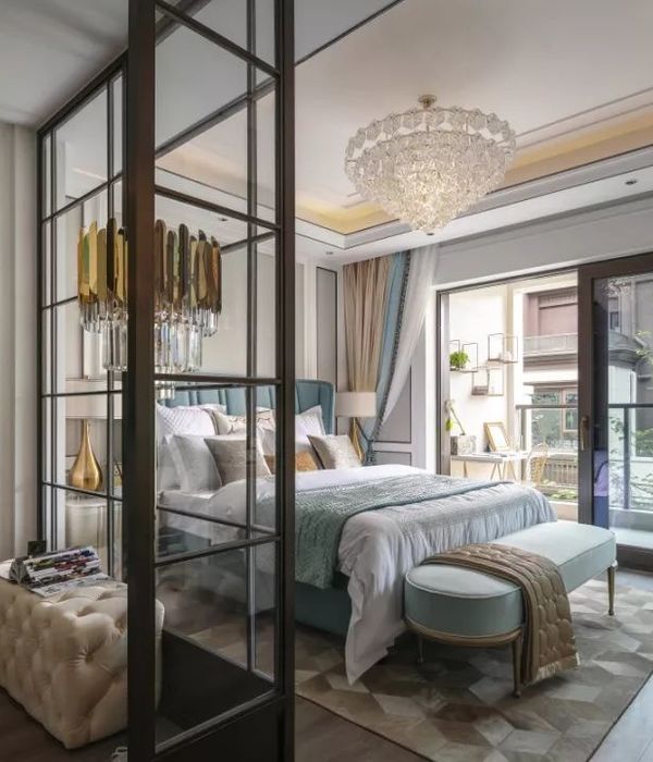
南次卧空间是父母房空间,由于父母不经常来住,于是也可以当作客房来使用。通过点线面的关系处理,优化顶面的吊顶部分与硬包墙面,配合横向的逻辑线,释放简而不凡的空间层次。用黑白灰配色分界,再放任暖色台灯修饰空间,为空间注入那不可多得的一抹温度。
The southern bedroom space is a parental room space, which can also be used as a guest room as parents do not often come to stay. By processing the relationship between points, lines, and surfaces, optimize the suspended ceiling and hard clad walls on the top surface, combined with horizontal logical lines, to release a simple and extraordinary spatial hierarchy. Divide the space with black, white, and gray colors, and then let the warm colored desk lamp decorate the space, injecting a rare touch of warmth into the space.
主卧室则依旧延续其它空间的黑白色搭配的深木色,简约的同时也不失去质感。严谨似乎成为我们现代简约手法的核心要素,不论是墙面的墙板与吊顶的分割,还是对于干区岩板的收口,看似都是简单的细节却是我们关注的核心点。
而步入式衣帽间和独立的干区跟私密性的卫生间也是大平层品质住宅不可或缺的部分,干区是也整个主卧空间内最具亮点的,在色彩上我们没有过多的去追求个性,而是用独特的水磨石岩板将空间调性拔高,既显得特立独行,也是代表着本案甲方内敛魅力的人格。
The master bedroom, on the other hand, continues the dark wood color scheme of black and white in other spaces, while maintaining simplicity and texture. Righteousness seems to have become the core element of our modern minimalist approach, whether it is the segmentation of wall panels and ceilings, or the closing of tiles in dry areas, seemingly simple details are the core focus of our attention.
The walk-in closet, independent dry area, and private bathroom are also indispensable parts of the large flat quality residential area. The dry area is the most highlight of the entire master bedroom space. In terms of color, we do not pursue individuality too much. Instead, we use unique terrazzo slabs to elevate the space tone, which not only appears unique and independent, but also represents the introverted charm of the first party in this case.
▼平面图,Plan
项目信息
Projectinformation
设计机构:辰夏空间规划
设计团队:夏兆民孙曼丽
项目地点:江苏淮安
建筑面积:180 m²
主要材料:进口乳胶漆、柔抛砖、木饰面、水磨石岩板
空间摄影:王浩建筑空间摄影
完工时间:2022年12月
Design agency: CHENXIASTUDIO
Design team: Xia Zhaomin, Sun Manli
Project location: Huai’an, Jiangsu
Building area: 180m²
Main materials: Imported latex paint, soft polished bricks, wood veneer, terrazzo rock board
Completion time: December 2022
致力于严谨的现代城市空间生活美学
追求建筑与空间的尺度平衡
2018/
艾特奖公寓设计优秀奖
2018/
芒果奖中国人文设计大赛住宅公寓类创意奖
{{item.text_origin}}

