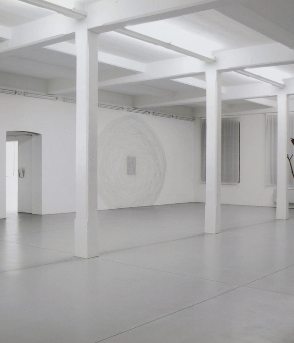
Z VERANDA | 城村共生的魔幻白拱廊
- 项目名称:天健 Z VERANDA 展览空间
- 设计方:BEING 时建筑
- 设计团队:戴家明 郭源 冯熠 陈杰 杨翔 张嘉毅 朱韵彤 李玉青 江建伦
- 摄影版权:曾喆
- 客户:Z STUDIO
- 施工方:BEING时建筑
天健广场是广州北部一个大型的以物联商务为主的园区,西北侧一路之隔毗邻电商聚集的城中村,外围不远处是开发商割据的高密度住宅小区。
2000 年后,互联网经济的发展让整个市场的业态结构发生了巨大的改变,天健园区的主导商户也由原来单一的五金汽配和装饰材料逐渐转变为以物联仓储、O2O 商务和信息贸易为主的文化产业创意园区。此时,园区和城中村的关系已不再是高筑围墙,相互封闭,新型的业态和经济形式拉进了两者的距离,打开边界,相互融合将是新的合作形式。Z 就是在这样的背景下应运而生的。
Tianjian Square is a large commercial park in Northern Guangzhou, adjacent to an urban village which is concentrated by a large number of e-commerce merchants, while its periphery is close to a high-density residential area occupied by real estate developers.
Since 2000, the development of the Internet economy has greatly changed the structure of the entire market. The dominant merchants of Tianjian Square have gradually varied from the original merchants of hardware and decoration materials to the cultural industry park that focus on IOT storage, O2O business and information commerce. By this time, the relation between Tianjian Square and the urban village is no longer isolated like there are high walls built between. New forms of business and economy have assisted to shorten the distance and to break the boundary between the park and the village simultaneously, hence letting mutual integration to become the new type of cooperation. Under such condition, Z is created.
以城村为背景的 Z 展览空间,an exhibition space in the urban village context ©曾喆
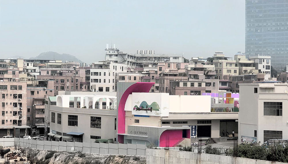
为了创造一个线上线下可同步展示和体验性的场地,不仅是为园区内部,也希望可以给电商村提供一处公共的平台,业主选择在园区和电商村的边界,可俯瞰城中村的仓储屋顶,尝试打造成一个开放的园区客厅,一个复合型的电商平台,一个集展览、SHOW 场、摄影、交际、洽谈于一体的公共空间。
通过 Z 将周围电商的人流引入到园区,同时作为园区内的休闲配套场地提升园区内的租赁价值,也使得附近住宅区的“城里人”愿意来此处休闲消费。这不仅是一个新的业态融合的突破,同时也是园区对城村共生的一次主动尝试。
In order to create an online synchronous display and experiential venue – not only for the internal part of the park, but also to provide a public platform for the e-commercial village, the customer has decided to build an open public space by the boundary of the commercial park and the village. The space is specifically located on the rooftop of a warehouse, which could overlook the entire urban village. It could be used as an open living room for the park, or a compound e-commercial platform – it is a collective space which integrates exhibition area, SHOW field, photography site and communication space into one.
The existence of Z draws merchants from the surrounding e-commercial village to the park. It leads to an enhancement on its rental value as a recreational facility of the park, while also attracts residents from the nearby areas to the park for leisure consumption. This is not only a breakthrough in the new integration of different Form Structure, but could also be seen as an active attempt of the park to achieve a sense of symbiosis between cities and villages.
▼Z 空间位于城市边界,Z VERANDA is located on the edge of the city ©时建筑
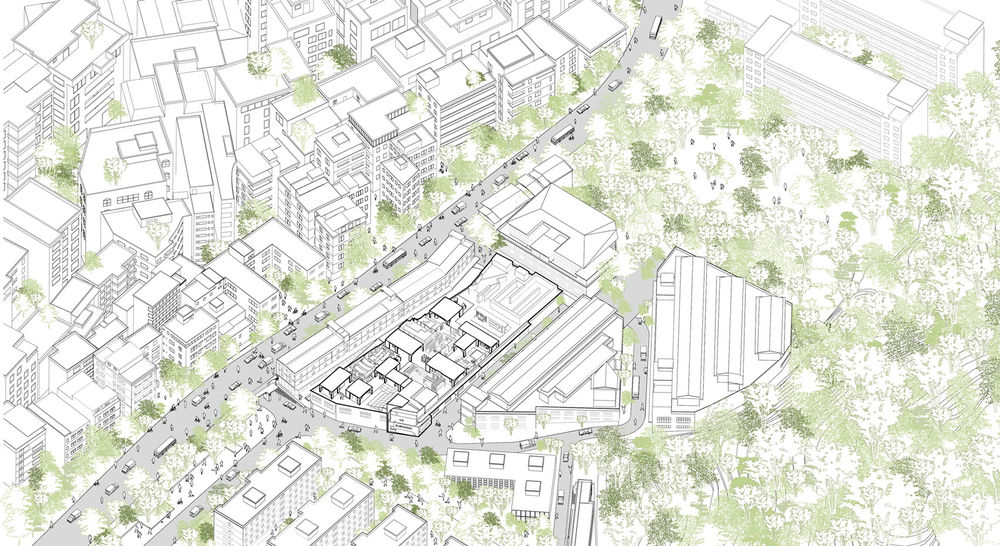
在近十年的工业化和城市化进程中,园区和外围村落的边界被不断的清晰化,一路之隔的左侧是自发型野蛮生长的“村”,右侧是以经济主体为导向规划的“城”。
随时间的推移,分离出两种不同的尺度,一边是不断翻建,最大限度撑满宅基地的高密度握手楼,一边是园区不断扩张,新建的大型综合展贸楼; 之呈现了两种不同的图像,一边是包裹各种廉价马赛克和彩色涂料开着密集小窗的村屋,一边是大体量工业化大开窗的灰白色为主的工业厂房。
基于 Z 场地位于城村交接边界的特殊性,设计希望借由城村的巨大反差为背景,置入一次装置艺术展览,将历史的片段叠加,产生一个魔幻超现实的图像之城,探索不同场所空间秩序下城村共生的可能性。
In the process of industrialization and urbanization in the recent ten years, the boundary between the park and the peripheral villages has been continuously clarified. On the left side of the road is the “village” with spontaneous and barbaric growth and on the right side is the “city” which has been planned under the guidance of economic agents.
As time goes by, ‘village’ and ‘city’ develop into two different scales. On one hand, high-density of ‘handshaking buildings’ are constantly rebuilt and occupied the area of the homestead to the hilt; on the other hand, large scales of complex buildings are arising along with the continuously expanding commercial park. It ends up with the display of two distinctive images – one is village houses with high dense windows being wrapped in various cheap mosaics or color paints, and the other one is industrial factory with large scale of grey and white windows that has strong style of industrialization.
Based on the particularity that Z site is located at the boundary between cities and villages, the design intends to place an exhibition of installation art against the background of the huge contrast between cities and villages. It aims to superimpose all the historical pieces so that a magical and surreal city of image could be created, and the possibility of the symbiosis between cities and villages in various sites could be explored within different spatial order.
▼拼贴图像,Collage©时建筑
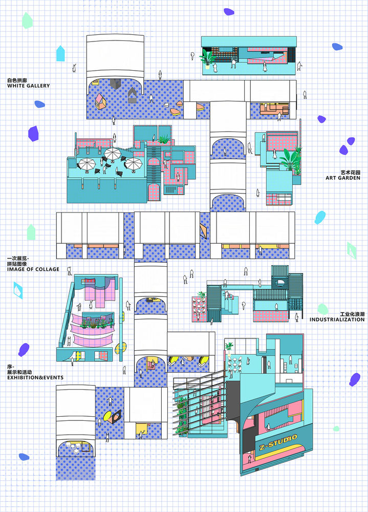
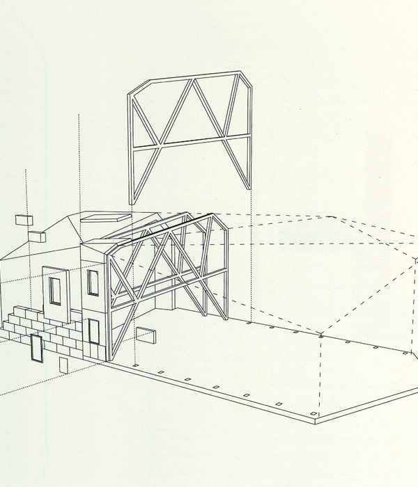
基于 Z 展览持续时间的不确定性,整个展览场地分为前后两期建设实施。呈条状的天台靠南侧为半室外的一期,北侧二期为室内空间。为了更灵活且让不同功能的空间相互独立且关联,在室外的平台上以现状底部原厂房结构的模数创造了一个连续的白色拱廊,它和前区的入口空间相连,是整个花园的核心 T 台展示空间。可移动的各种装置体被设置在有屋顶的白色展廊内部,根据展示的内容做移动和调整,并连接外侧户外不同主题的小型展示拍摄和活动空间。Z 不仅是园区的配套休闲空间,也对外提供展览场地,其中一部分作为城中村电商的摄影场地。
Due to the uncertainty of the duration of the Z-Exhibition, the construction of it is divided into two phases. The first phase will be semi-exterior and implemented on the southern side of the banked roof; while the second phase will be an interior space constructed on the northern side. In order to let the entire space become more flexible and allow individual space of different functions to be relatively independent but still connected, a continuous white arcade has been created based on the modulus of the existing bottom structure of the original factory. The arcade is connected to the entrance of the front area of the veranda, and serves as the core runway space. Various types of movable installations are arranging inside the part of white arcade which has a roof on top. These installation parts will be moved around or adjusted depends on the contents of the exhibition, and they are even connected to small exhibition, photographing and activity space of different themes in the exterior. Z is not only the recreational facility of the park, but it also offer exhibition venues for the public, with some of it may even become photography site for the e-commercial village.
▼展览活动空间,exhibition & activity spaces ©时建筑
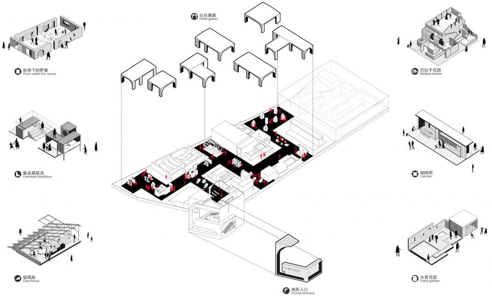
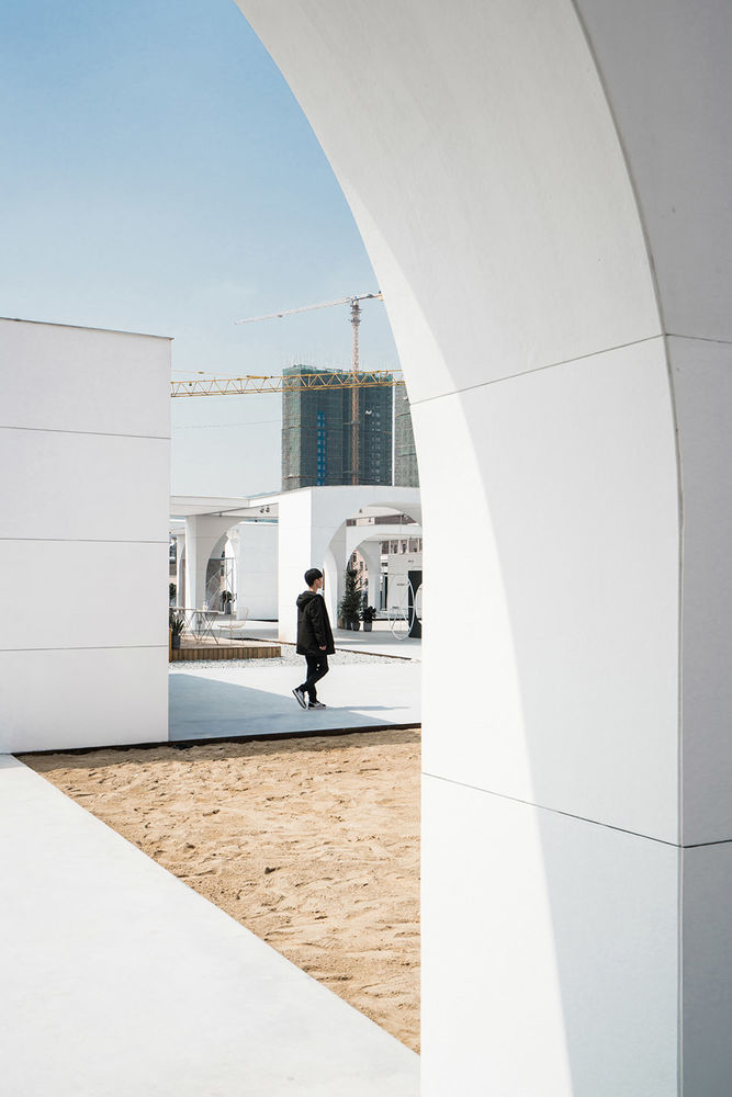
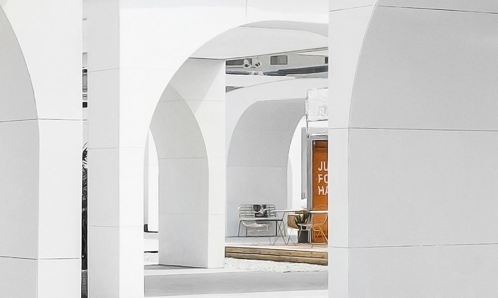
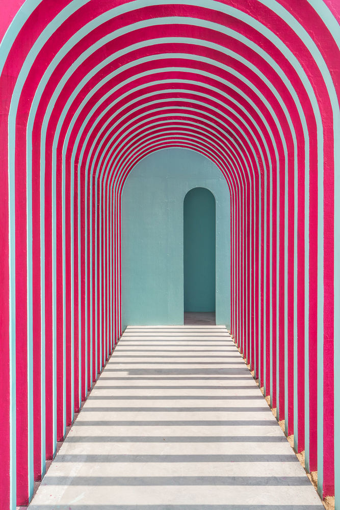
白色拱廊是整个空间的功能主体和构建内在秩序的结构骨架,由一个个拱形单元拼接串联起所有的区域。不同的活动、展览和产品摄影有不同的需求,故拱廊的高宽比以常规观展的距离和空间为基本尺度,半围合的拱廊可根据特殊需求拉上帷幕变成封闭/半封闭的室内空间。
The white arcade is the main functional component of the whole space, as well as the structural skeleton to construct the internal spatial order. Every single arched unit helps to connect all areas together. Due to the different demands of different activities, exhibition and product photographing, the ratio of height to width of the arcade is hence, constructed based on the regular exhibition viewing distance and space. However, if there are any special requirements, the semi-enclosed arcade could transform to an enclosed/semi-enclosed interior space by closing the curtains up.
▼半围合的拱廊,the semi-enclosed arcade ©曾喆

作为日景的展示空间,光膜可吸收并使部分光线均匀地照到内部,产生令人舒适的光源效果,廊下空间也被匀质的光感包围,营造出高级的半户外摄影空间。
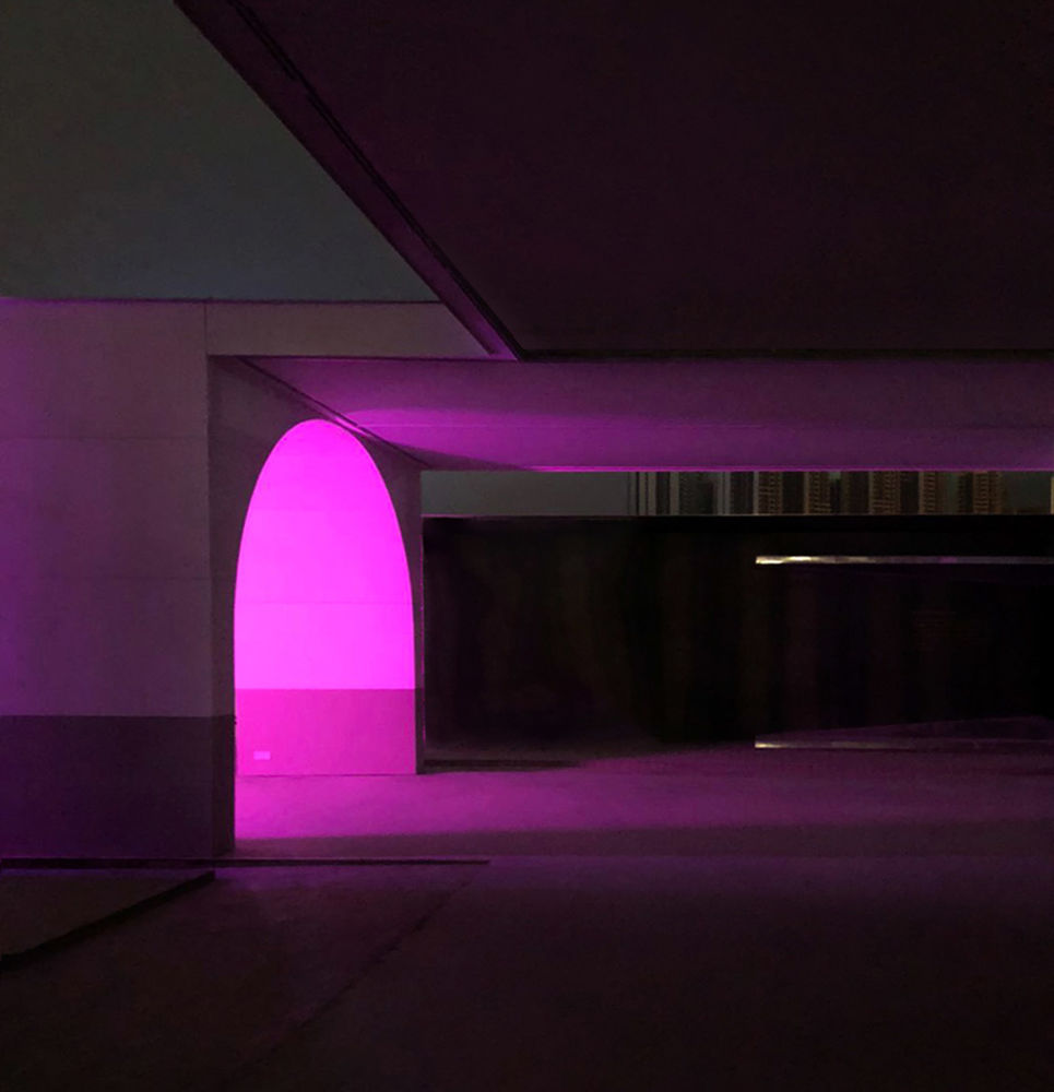
夜晚,展廊变身为 T 台秀场时,光膜内侧的灯光均匀将下部打亮,展廊的边界即是舞台空间,内部各种色彩的灯光反射到光膜上呈现五彩梦幻的场景效果,模特在宛若充气泡泡的空间中漫步。
Being as an exhibition space of day view, the light film can well absorb and allow partial light to shine evenly into the interior. A comfortable lighting atmosphere could be created while the arcade could also be shined by uniform light source. Thus, an expert semi-enclosed space for photography is created. By the night time, when the exhibition arcade transforms into a fashion runway, the light source by the interior part of the light film will evenly illuminates its lower part. The exhibition arcade now becomes the stage. Various colors of lights from the interior would create a luminous and dreamlike scene after it is reflected by the light films, making the models seem like walking within colorful bubbles.
▼拱廊日景&夜景,arcade daytime view & night view ©曾喆
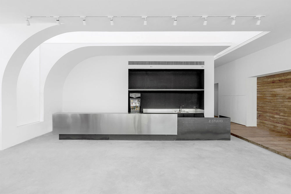
入口前厅是白色拱廊的起点,也是展览空间的序幕。一个巨大的拱形装置将人们从嘈杂的外部街道引导进入电梯,经过入口休息区到达前厅,前厅通过大块面的白色墙体,灰色的水泥地面和黑色的钢板回应简洁的工业性,原木走廊的置入将休息区前厅和花房连接起来,与照射进来的阳光一起传递着朴素的自然性。
The lobby of the entrance is the starting point of the white arcade as well as the prelude of the exhibition. A giant installation in an arched shape would guide people move from the crowded street to the elevator, passing through the entrance lounge area to the lobby. The lobby makes a beautiful response to the simplicity of the industrial nature through its white walls, grey cement floor and the black steel plates. Meanwhile, the insert of timber corridor well connects the lounge and the greenhouse, conveying a pure sense of nature with the incoming sunlight.
▼前厅,lobby ©曾喆
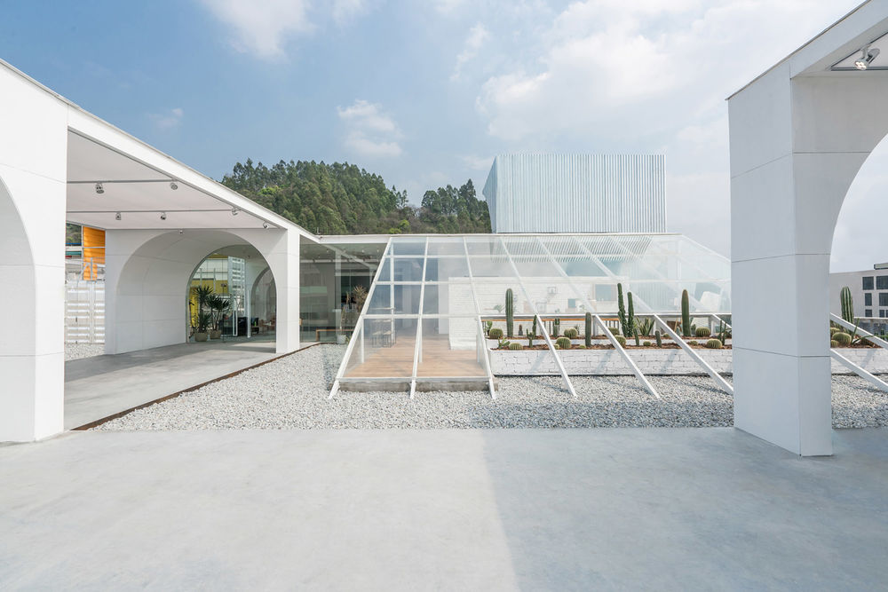
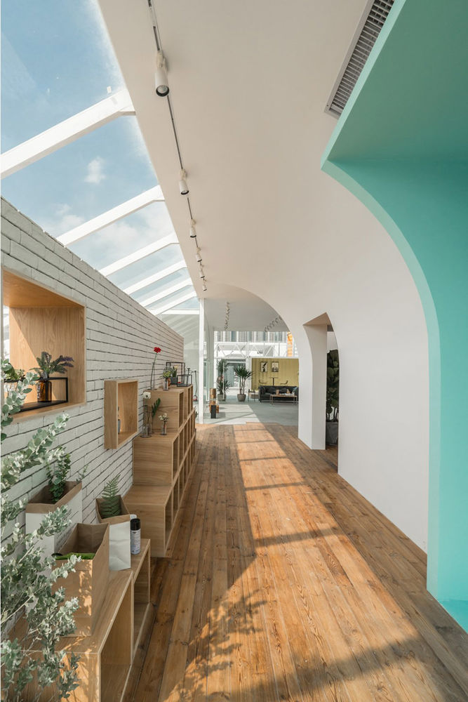
入口区连带一个玻璃房的花园休闲空间,通过斜屋面天窗和拱廊的交接,形成一个短暂的充满阳光与自然气息的过渡空间,希望到达后的人们很快进入一种轻松自然的氛围。
Together with a lounge in a glasshouse garden, the entrance area forms a temporary transitional space which filled with sunlight and sense of nature through the intersection of the arcade and the skylights in the sloping roof, intending to provide a relaxed atmosphere to the arriving people shortly.
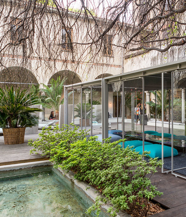
花园休闲空间,the garden lounge ©曾喆
巴西景观建筑师巴拉甘曾说“色彩、光线和简洁的几何都是为了表达内心的情感”。为了回应高密度城中村的超现实感,设计创造了一处用色块墙体构成的纯粹景观花园与白色的拱廊形成强烈的对比。门、窗、洞口、墙体相互交错,各种元素和色彩相互冲撞又莫名平衡,强烈的视觉冲击构筑了一个艺术的空间。
According to the Brazilian landscape architect Barragan, color, light, and simple geometry is all about expressing inner emotions. In order to respond to the sense of hyper-reality embedded within the high-density urban village, there is a strong contrast created between the white arcade and a purely landscaped garden constructed by color-blocked walls. The doors, windows, holes and walls interlaced with each other. Even though there seems to be a collision between all types of elements and colors, they somehow still achieve a sense of harmony. The strong visual impact helps to construct an extreme artistic space.
▼艺术花园,Art garden ©曾喆
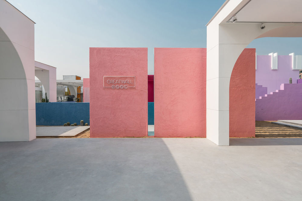
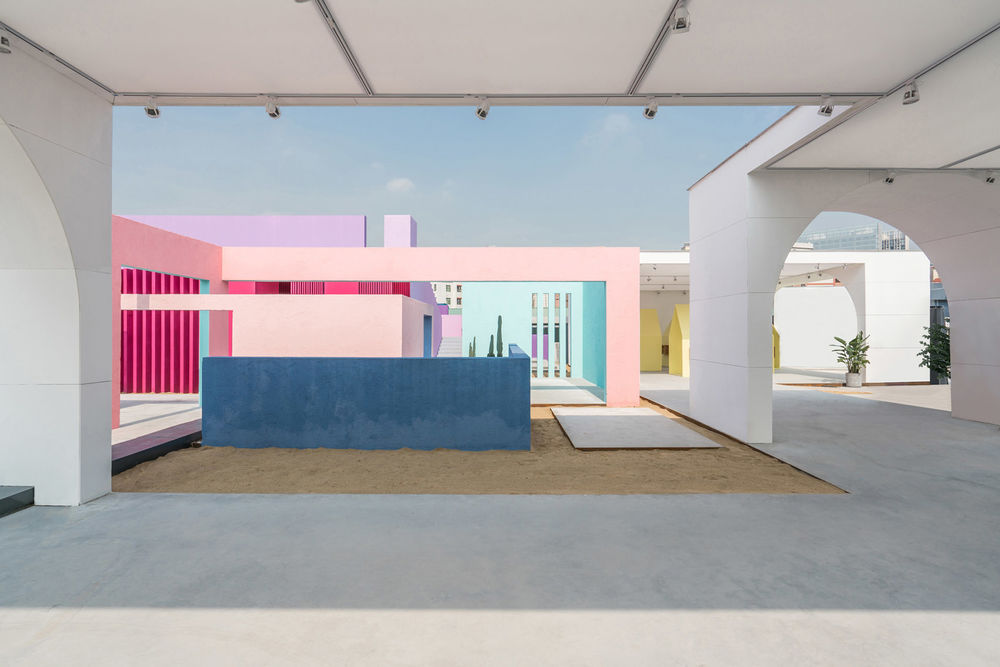
简洁几何形态的墙体和构筑物加上极简的色彩搭配使得空间产生魔幻的诗意,地面和墙面的光影在一天中随光线的变化缓缓移动旋转,像迷离的舞蹈。光影交错间仿佛走进异域之城。
在阳光下,艺术化的色彩和墙体构成与城中村彩色斑驳的马赛克外立面形成了有趣的对比,宁静和喧闹彷佛可以和谐共存。
The simple geometry of the walls and structures, together with the minimalist color collocation, has introduced the space with a magical sense of poetry. The light and shadow projected on the ground and walls move slowly with the change of light throughout the day, just like a psychedelic dance. A walk into an imaginary exotic city seems like to be introduced through the interplay of shadow and light. Under the illumination of the sun, the artistic colors and the composition of walls have presented an interesting contrast to the colorful Mosaic facades of the urban village. In this moment, there is a harmony risen up between the sense of silence and the noise.
▼艺术化的色彩和墙体构成,the artistic colors and the composition of walls ©曾喆
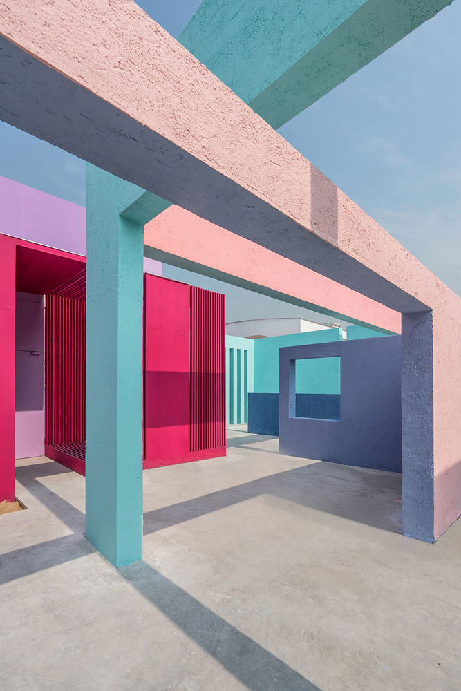
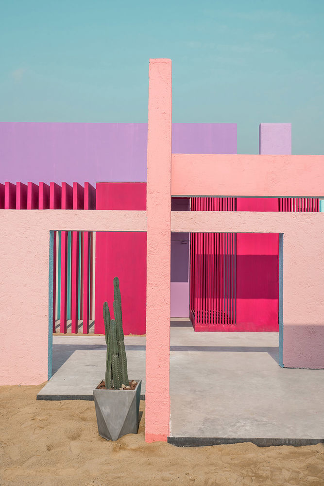
这个艺术花园里面包含了一个私人接待室,整个外部景观围绕着私人接待室展开,花园的创作始于对巴拉甘作品的致敬。通过对墙体这一基本元素的分解和重构,希望创造出诗意的景观建筑空间。这种诗意可以在不同层次上更加接近真实。首先,作为一种外来的、充满色彩的环境希望能给人们带来更多的愉悦感;其次,通过光线、色彩、景观等元素的展现,让建筑成为了对日常展览场所的补偿。
The creation of the garden started off as a tribute to Barragan’s work. It contains a private reception room which surrounded by the entire exterior landscape. The design intended to produce a poetic landscape architectural space through decomposing and the reconstructing the basic element of the wall. Such a sense of poetry could approach much closer to the reality in different levels. Firstly, being as a colorful environment that derived from the foreign, the space intends to bring much more fun to the visitors; Secondly, through the display of light, color, landscape and other elements, the building becomes a compensation for the daily exhibition place.
▼对墙体的分解和重构创造出诗意的景观建筑空间 ©曾喆 a poetic landscape architectural space was created through decomposing and the reconstructing the basic element of the wall
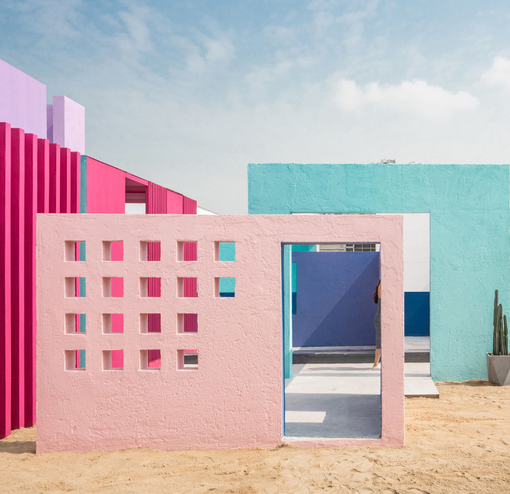
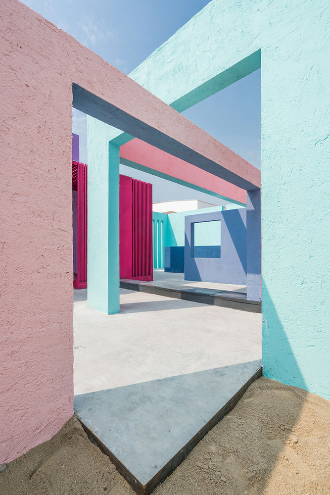
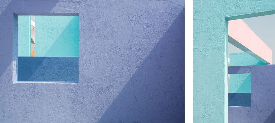
有时墙会形成一个走廊;有时会把自然融入庭院中,有时会把屋顶平台变成整栋房子中最重要的一个房间,那里,天空就变成了顶棚,有时墙体会变矮以实现与自然的对话。所有这些都在彩色的墙中得到了淋漓尽致的体现——既赋予了景观人性化的一面,又没有忽视自然的存在。
Sometimes the walls would form a corridor; sometimes the nature would be incorporated into the courtyard; sometimes the roof terrace would becomes the most important space of the building, where the sky becomes the ceiling; and sometimes the walls would lowered their body to communicate with nature. All of these are reflected in the colorful walls – which humanized the landscape without neglecting the existence of nature.
▼墙体细节,wall details ©曾喆
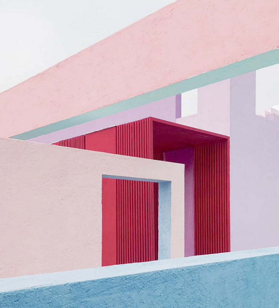
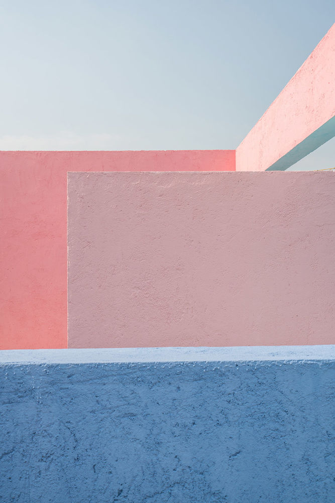
▼拱廊,thearcade ©曾喆
每一处空间都被隐藏在不同色彩的墙体后面,每一处墙体都成了另一处空间的舞台背景。鲜亮的泥灰墙和斑驳的光影自成一个独立的色彩世界,由此建立了理性与感性,景观建筑与自然与人之间的联系,作为对周边冰冷无序工业化城市环境的一种回应。
泥灰墙和斑驳光影,the plaster walls and dappled light and shadow ©曾喆
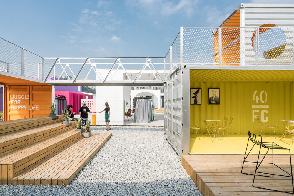
集装箱是工业化和物流运输的历史见证,利用场地内原有的废弃集装箱体,通过拆分、重组、层叠、交错、拉伸、等动作,搭建了一个有半室外观演露台、室内酒吧和二楼平台围合的空间。
Container could be seen as the historical witness of industrialization and logistics. Through actions of splitting, regrouping, stacking, interlacing, stretching, etc., the original abandoned container on the site are used to construct a space with a semi-exterior terrace for performance, an indoor bar and a second floor platform.
集装箱搭建的空间,the container structure ©曾喆
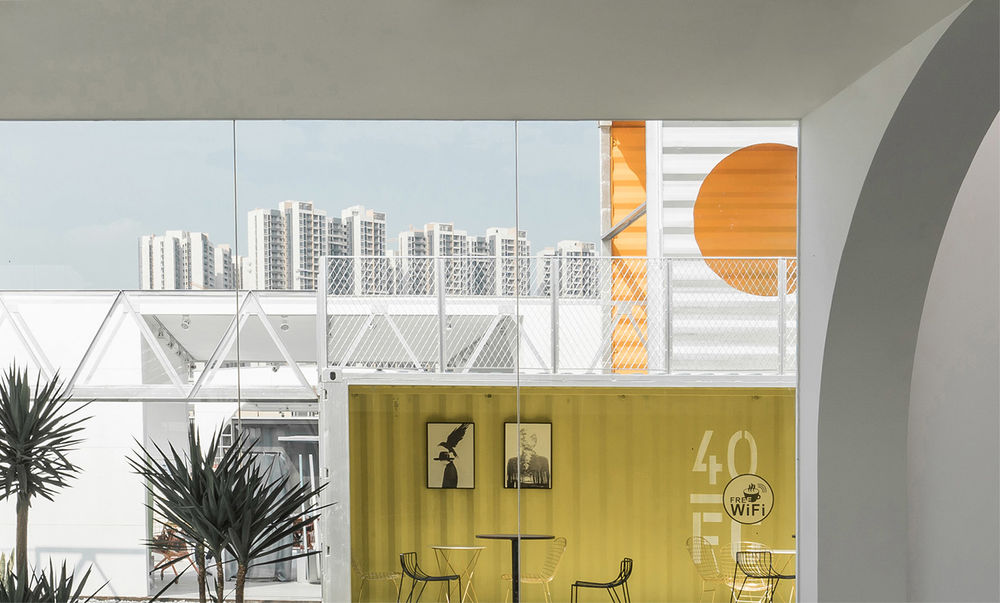
内部箱体被饰以明亮的色彩,成为人们乐于聚集交流的场地。箱体叠合朝向不同方向,张望城市的同时,也展示着内部空间的一切。夜晚,人们在这里享受时光,对饮畅谈。
The inner space of the container is decorated with bright color and becomes a place for people to gather and communicate. The containers are overlapped with each other in different directions, so while it offers space for viewing the surrounding cities, it is also presenting everything from its inner space. When night comes, people could certainly enjoy spending their time here chatting and drinking.
▼酒吧和观演露台,the bar and theterrace for performance ©曾喆
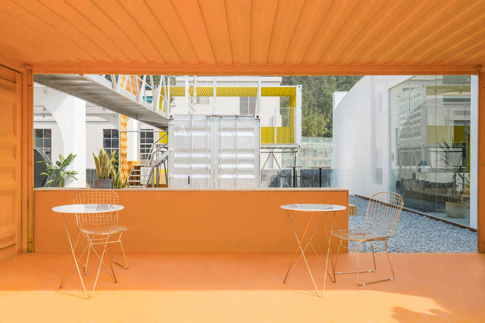
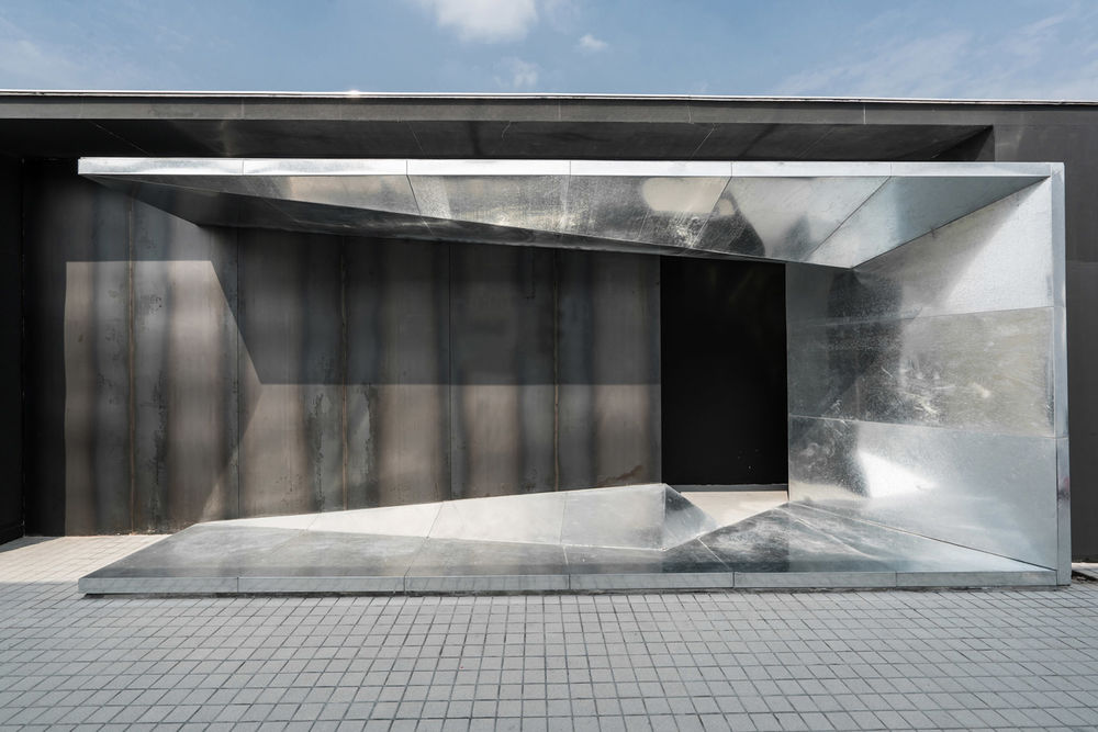
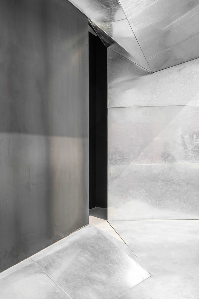
咖啡吧位于展区的末端,由原色热压钢板和浅色镀锌钢板构成,作为展览的尾声,以简洁的形象和原始生产材料的力量感回应着外部环境,重塑工业化材料的印象。
The coffee bar is located by the end of the exhibition, composed of primary-colored hot pressed steel plates and light colored galvanized steel sheets. As the coda to the exhibition, the bar responds to the external environment with its simple image and the sense of power of raw production materials, reshaping the impression of industrialized materials perfectly.
咖啡吧,coffee bar ©曾喆
▼钢板墙面,the steel wall detail ©曾喆
瓦尔特·本雅明曾说“没有一张面孔的超现实感能够达到与城市的真实面孔相同的程度。” 今互联网改变了人们的生活方式,爆炸式的数字化信息和迅速更迭的城市空间彷佛后现代图像的叠加。设计希望用空间展览记录并传递这一当代的景象,创造一个舞台剧般的场所,将历史中的空间片段重组,让不同时间的场景片断叠加并使之戏剧化,打造一个图像之域。
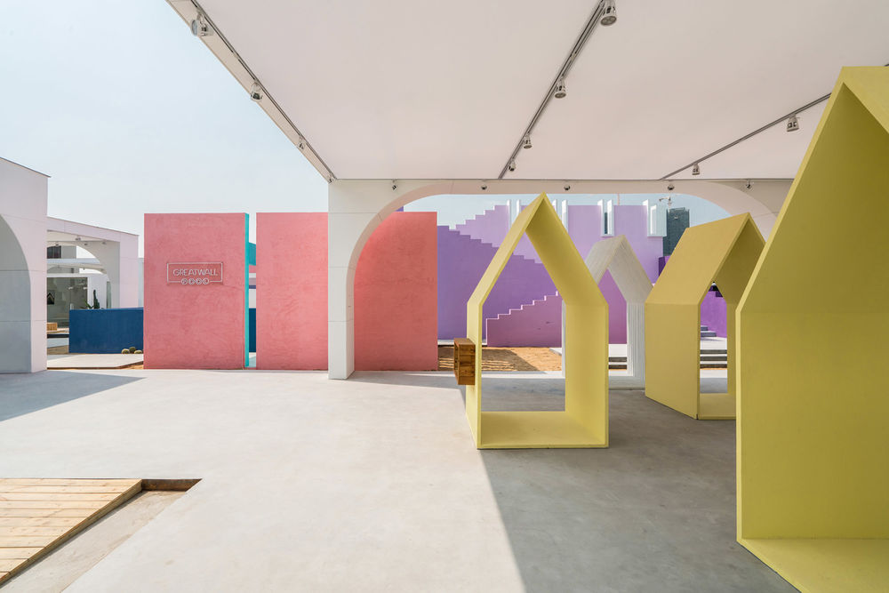
几组可移动的装置被设计成舞台剧的背景,为不同场景的替换和组合提供可能性,作为独立的个体他们也是展览空间的主角,象征着城市的片段,同时也是引导到来的人们从前厅深入到场地的内部的路标。
Walter Benjamin once said that “there is not a face that can reach the same degree of surreal sense as the real face of the city.” Nowadays, the Internet has changed the way people live, the explosion of digital information and rapidly altering urban space seem like a superposition of postmodern images. The design intends to record and transmit such a contemporary scene through the exhibition. By creating a theatre-like place, recombine the spatial fragments from the history, superimpose and even dramatize the scene from different times, the design finally creates a domain of image.
Several sets of movable installations are designed as the background for the stage play, providing the possibility for different scenes to be replaced and combined. However, as independent individuals, they are the protagonists of the exhibition which symbolize fragments of the city, as well as the signpost that guide arrivals from the front lobby to the interior of the site.
▼可移动装置,movable installations ©曾喆
Z 是一个集摄影、社交和展览空间于一体的复合场所,是天健园区用业态共生的方式打开城村边界的一次尝试,未来还将进行更多城村相互融合、共生可能性的探索。
Z is a compound site that integrates photography, social interaction and exhibition as a whole, and it is the first attempt of Tianjian Square to break the boundary between city and village with the mode of commercial symbiosis. Perhaps in the future, more possibility for mutual integration and coexistence between cities and villages will be explored.
▼展览细节,exhibition details ©曾喆
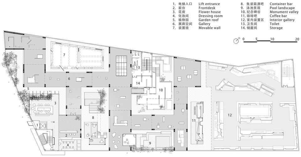
▼平面图,plan©时建筑
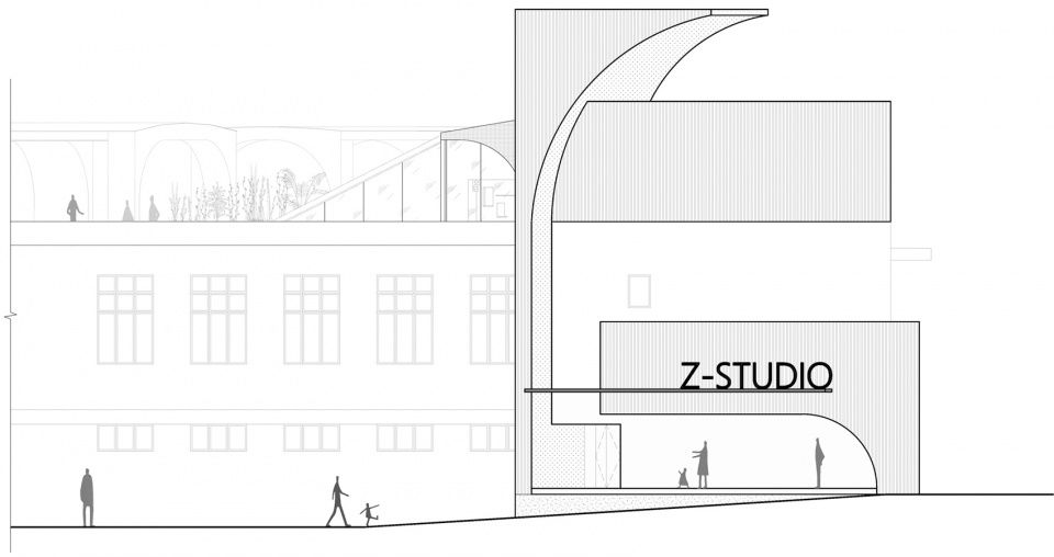
立面图,elevation ©时建筑
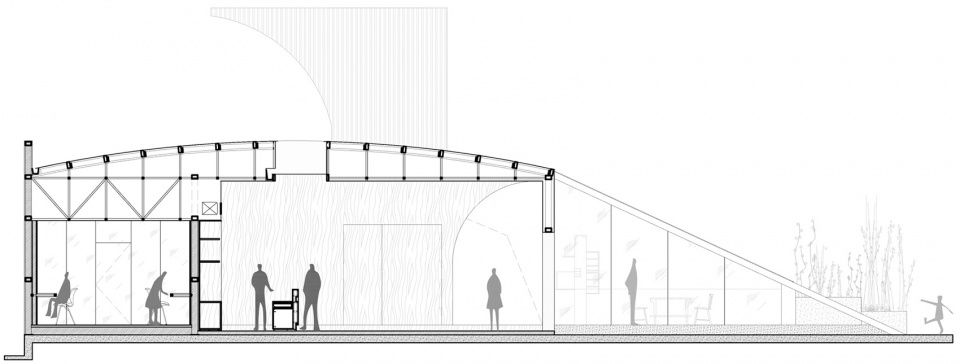
▼剖面图,section ©时建筑
项目名称:天健 Z VERANDA 设计方:BEING 时建筑 项目设计 & 完成年份: 018.03-2019.03 主创及设计团队: 筑师:戴家明 郭源 冯熠 设计团队成员:陈杰 杨翔 张嘉毅 朱韵彤 李玉青 江建伦 项目地址:广东天健广场 建筑改造面积:3800 平米 摄影版权:曾喆 客户:Z STUDIO 材料:卡布隆 户外埃特板 废弃集装箱 金刚砂地坪 水泥砖 户外灯膜 碳化木 热轧钢板 花岗岩碎石 户外涂料 施工方:BEING 时建筑
Project name : Tianjian Z VERANDA
Design : BEING ARCHITECTS
Design year & Completion year : 2018.03-2019.03
Leader designer & Team : Architect: Jiaming Dai , Yuan Guo , Yi Feng
Design Team: Jie Chen, Xiang Yang, Jiayi Zhang, Yuntong Zhu, Yuqing Li, Jianlun Jiang
Project location: Guangzhou
GFA : 3800 m²
Photo credits : Zeng Zhe
Clients : Z STUDIO
Material:Polycarbonate,, Outdoor Eterpan, Abandoned containers, Emergy flooring, Concrete bricks, Outdoor light membrane, Carbonized wood, Hot-Rolled steel plate, Granite gravel, Outdoor paint

