Interior Designers:BANDe Architects
Area :4957 m²
Year :2019
Photographs :Weiqi Jin
Contractor :Changsha Guangda Building Decoration Co. LTD
Partners : Beijing HYP-ARCH architectural design co.LTD
Clients : Zhejiang Zhichu Wuxian Culture Media co. LTD
Construction Team : Gaungjin Wu, Xiang Li, Mumu Chen, Xiaoliang Xie, Ming Zhou, Weixiang Tang, Yuhou Wu, Leyu Zhang
Leader Designer : Kun Zhou, Lin Xu
Design Team : Chenggang Yang, Wei Feng, Hesuo Li
Construction Team : Gaungjin Wu, Xiang Li, Mumu Chen, Xiaoliang Xie, Ming Zhou, Weixiang Tang, Yuhou Wu, Leyu Zhang
Country : China
The GreenMonster Lab is located on the B1 floor of Kuntai Jiarui Cultural Center in Wangjing area, Chaoyang District, Beijing, with a building area of 4957.3m2. The design is positioned as a multi-functional cultural space integrating exhibition, entertainment and leisure. The complex includes culture exhibition center, traditional culture hall, bookstore, brand exhibition room, and other functional spaces.
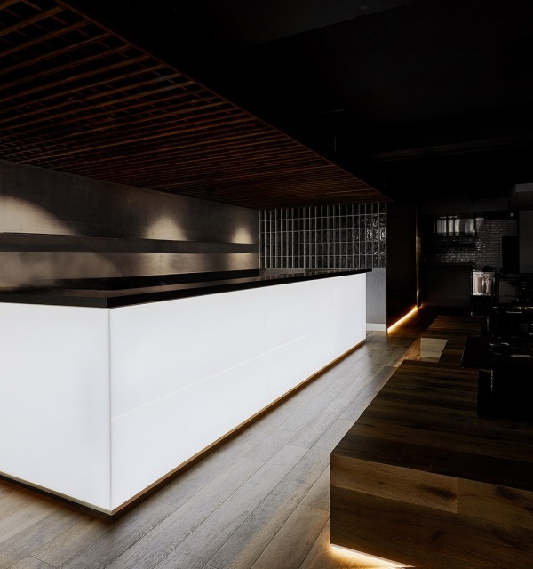
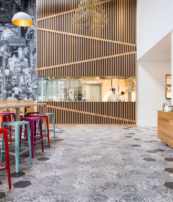
The first part: The feastThis area is the beginning of the overall space, the first scene the customer will encounter when coming down with the escalator. It consists of a set of wooden structures, defined as a traditional cultural pavilion, used to display traditional cultural relics from around the world. We use "wood structure" that best represents Chinese architecture to showcase the world's traditional culture.
The classiness brought by the wooden structure makes the area an astounding starting chapter for the spatial sequence that follows, presenting a gorgeous feast for the expansion of the overall space. The form of the exhibition includes the exhibition wall, the exhibition stand, and the ground. It features both the grandeur of an “exhibition hall” and the liveliness of a “market”.
The second part: Craftsmen shopThis area is the second sequence of the overall space, which consists of five sets of stencil-covered units, each of which has an on-site structural column and can be dedicated to two dealers. We put the functional display of merchant and the tricky columns in each stencil-covered unit. The visuals are neat building spaces and looming merchant staff inside the unit.
Each stencil installation is a ground for the "artisan" spirit. The placement of the five stencil unit in the relative to each other in the area creates an effect of street and ally, which enables visitors and dealers to have a better place for communicating, exchanging, and learnings. In addition to the function of culinary display and communication, this space is also a gallery. The wall of the five stencils unit is used to display art. Different sizes paintings and the stencils echo each other, forming a spectacular view.
The third part: Le flottantThis area is the last part of the overall space. It consists of eight sets of manual workshops and two sets of leisure units. In this space, we hope that visitors will feel the food, culture, and coziness brought by the workshop. We hope this space will be a rest stop for urban life and a terminal of emotions.
The eight sets of manual workshops and two sets of leisure units contain every structural column on site. The architectural space presented is a row of imposing manual workshops and a neat casual Le flottant. This is also a place to chat and relax, centered by Le flottant, where people can earn a bit of tranquility in the chaotic city.
The fourth part: Space organizingThis part is the idea in our design process. The overall design is a process of spatial integration and organization.
These pipelines occupy one-third of the space height, making the actual feeling of the space does not match the original height. The overall feeling can be summarized into one word, "messy". So the first thing we had to do before designing is "inductive sorting." We were trying to find a pattern that governs the space. This process took us a while. Slowly, we find that the "messy" of this space is also one of its characteristics. We were able to harness this feature on the basis of space organizing to create a spatial order suitable for the local conditions, including spatial relationships, geometry relationships, material combinations, etc.
Then we re-examined this space: the first is the messy pillar. We merged some of the columns into decorations and thereby hide them. For the rest of the pillars, we choose to face them, make them even thicker, forming a functional column. We use steel mesh to enclose several thick columns and put the dealers inside. The steel mesh is a semi-transparent material, give both style and some extent of blurring of the thick column, while shrouding the staff inside the unit.
In this way of processing the space, we found an interesting experience of space. The void between the thick pillars, forming a sense of blocks. The original messy columns became a number of functional large bodies and give a feeling of neighborhood, which is an ideal way for us to handle them.
The second is the division of several fire zones. In this part, we have to meet the fire codes and make the divisions have a positive sense of space. So we tried to increase the height of all the fire shutters and thicken al the firewall. Originally we wish to weaken this part, but we ended up emphasizing it more. The heightened fire shutters and the thickened firewall form a door opening that presents an unexpected effect. The division between spaces becomes looming and has a solemn sensation, which changes the characteristic from "blocking" into "communicating".
The third is the pipeline network in the upper area. Due to its complexity, we were going to deal with it initially. But after a period of "back and forth", we found that its complexity is actually a rich layered sense from another perspective, so we decided to expose them.We use the pipeline to set a uniform height of the shape, which is 5.4 meters. All the pipelines above this height are painted black so that it presents its own unique layering and does not conflict with the shape. This renders the top and the shape do not have a fixed dividing line, but are both blended and separated at the same time.
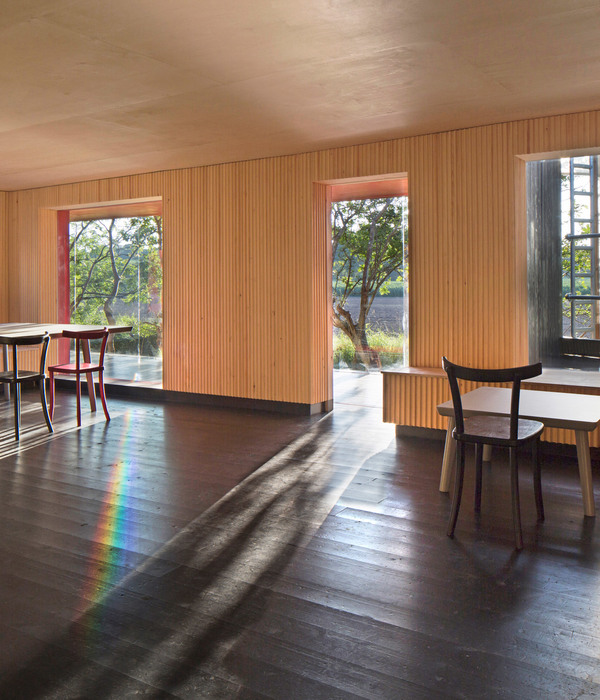
The fourth is the role of the wood structure. In addition to its functionality, the design of this area is a starting point and a central point in the overall space. We chose the wood structure, a symbol of Chinese design, which expresses a strong sense of admiration and inheritance. At the same time, we added a warmth to the overall color to make the whole space mixed with warm and cold.
▼项目更多图片
{{item.text_origin}}

