沃伦系统门窗城市展示中心 | 现代极简设计下的空间美学
点击上方“
周笙笙全案设计工作室
”可以
订阅哦!
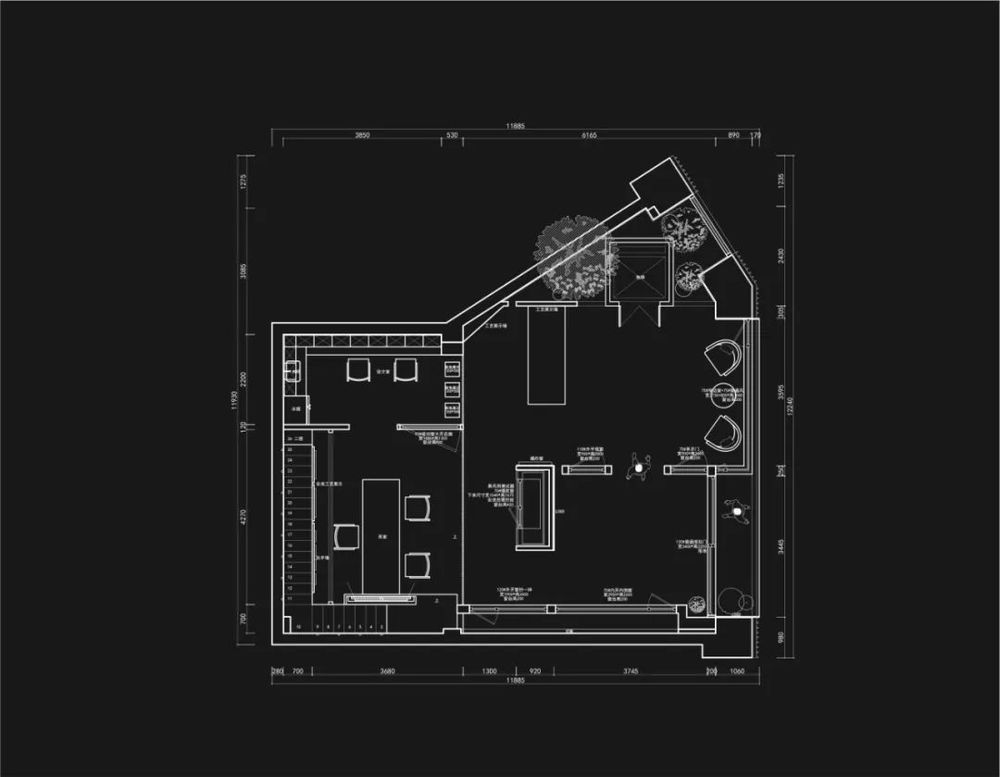
▲[1F 平面方案 ]
1F plan
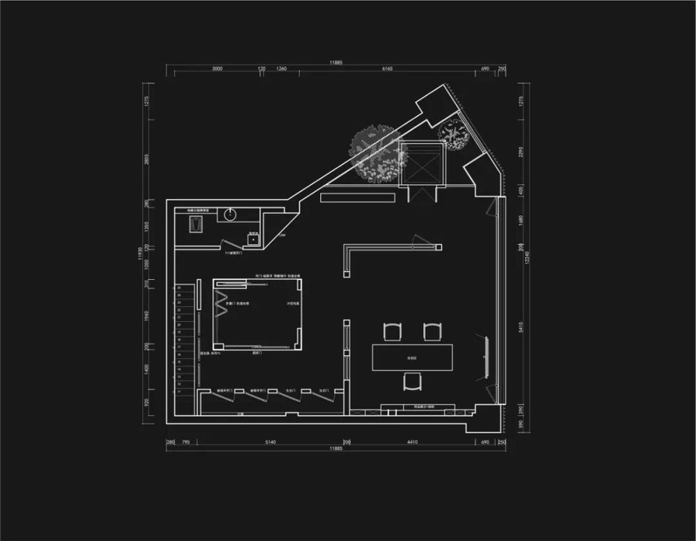
▲[2F 平面方案 ]
2F plan
展厅是人们了解品牌的重要途径,是展现产品的方式,因此吸引人的、上档次的展厅可以树立更高端的品牌形象。门窗作为一种常见的建材产品,在现代生活中已不再局限于采光通风的基本功能,而更多
地
体现了居住者的精神诉求。
透过窗户,他们表达自己对时间与空间、人与自然、自我与外界的理解和认知。
The exhibition hall i
s an important way for people to understand the brand and a way to show the product. Therefore, an attractive and high-grade exhibition hall can establish a more high-end brand image. As a common building material product, doors and Windows are no longer limited to the basic functions of lighting and ventilation in modern life, but more reflect the spiritual demands of residents. Through the window, they express their understanding and cognition of time and space, man and nature, self and the outside world.
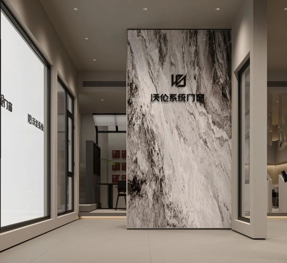
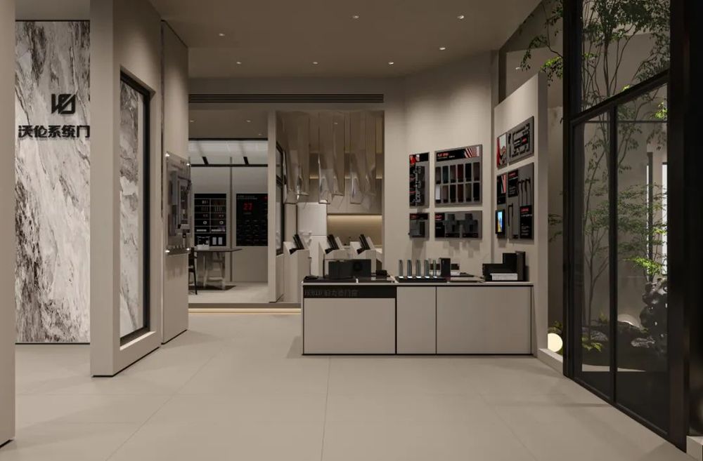
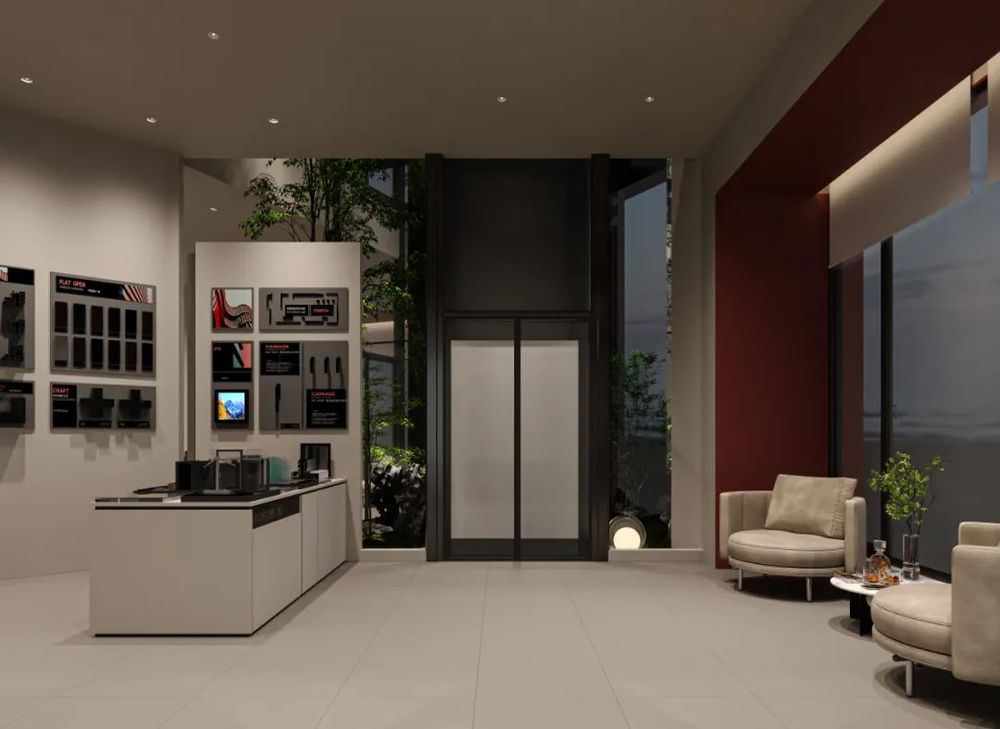
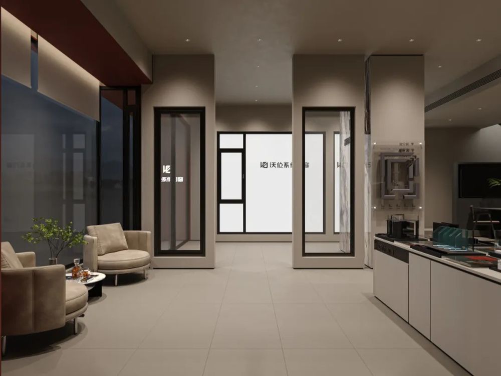
本案设计重在反映展厅产品所代表的品味和气质,设计师把空间的设计感降低,将主角的位置归还给门窗本身,门窗展厅的氛围,由门
窗产品来营
造,也因此创造出了独具设计感的第一印象。
The design of this case focuses on reflecting the taste and temperament of the products represented by the exhibition hall. The designer reduces the design sense of the space and returns the position of the protagonist to the doors and Windows themselves. The atmosphere of the doors and Windows exhibition
hall is creat
ed by the doors and Windows products, so as to create a unique first impression of the design.
▲[前厅 ]
The front office
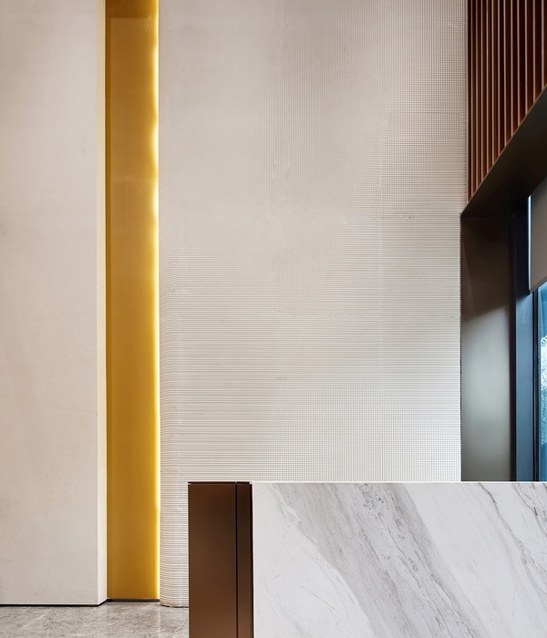
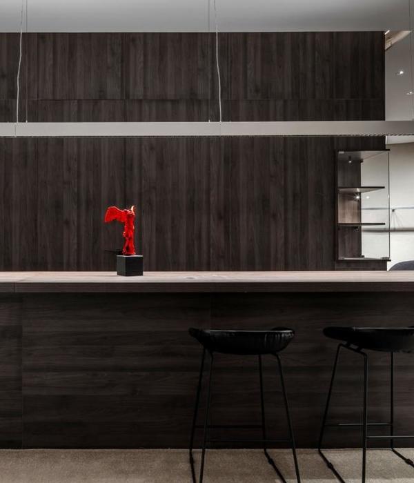
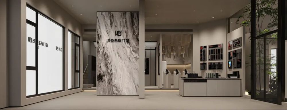
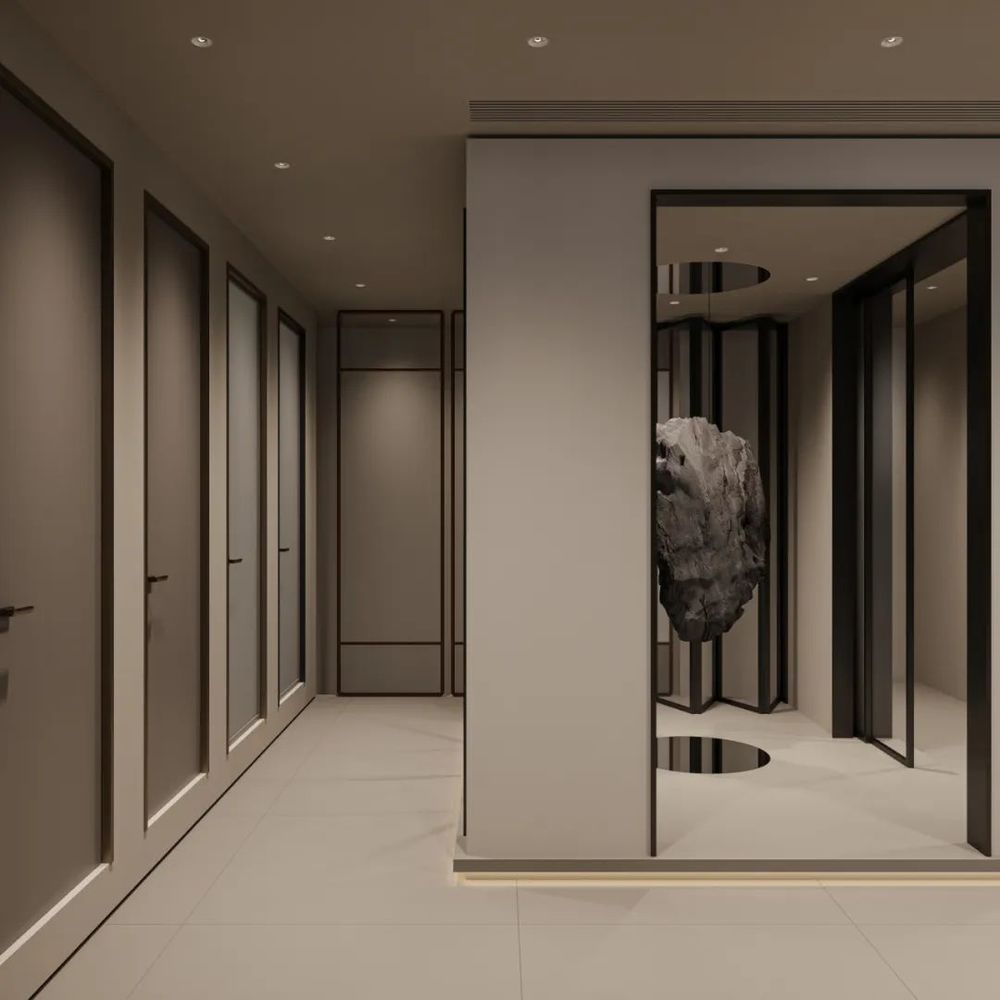
进门映入眼前设计师放置了一块化繁为简
却不失大气高级的大理石,在灰色墙体与黑色木质感柜体之间打破了空间的单调却不失极简的平衡与清冷感。
加上大理石本身具有釉面光泽感与沉闷质朴的木质板材交相呼应将极简轻奢中的精致感呈现尽致。
The designer placed a piece of complex into a simple but do not lose the atmosphere of advanced marble, in the gray wall and black wood cabinet to break the space between the monotonous but do not lose the balance of the minimalist and cool sense. In addition, the marble itself has a glossy glaze and the dull plain wood board echo each other to show the exquisite sense of minimalist light luxury.
▲[茶室 ]
Tea house
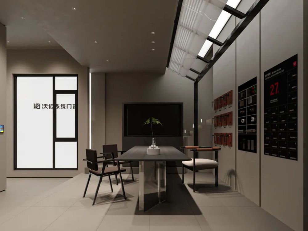
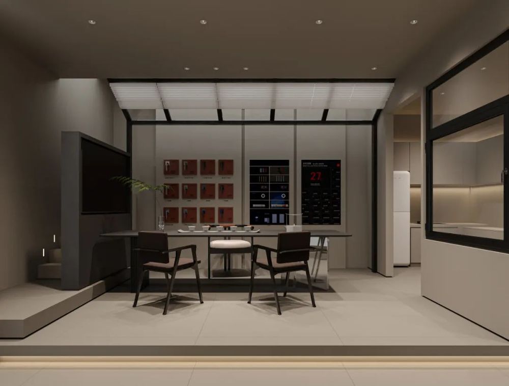
空间强调了产品本身,也注重“体验感”。通过对茶室的塑造以及细节的处理,融入了设计师对艺术和人文的思考。希望给大家留下的印象,不是商业气息浓厚的空间,而是能与品牌产生互动的空间,能享受到门窗带来的安全感与幸福感。
The space emphasizes the product itself and the "sense of experience". Through the shaping of the teahouse and the processing of details, it integrates the designer's thinking of art and humanity. I hope to leave you with the impression that it is not a space with a strong commercial atmosphere, but a space that can interact with the brand and enjoy the sense of security and happiness brought by doors and Windows.

▲[展示区 ]
Display area
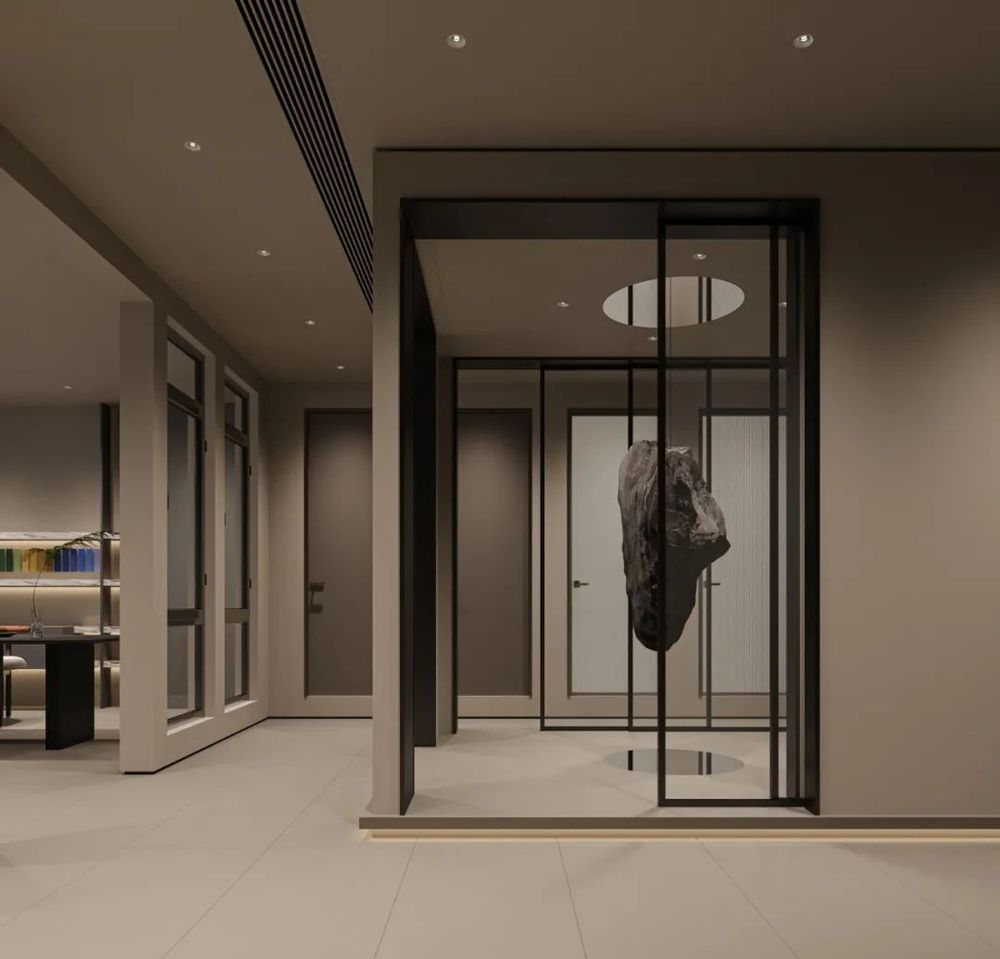
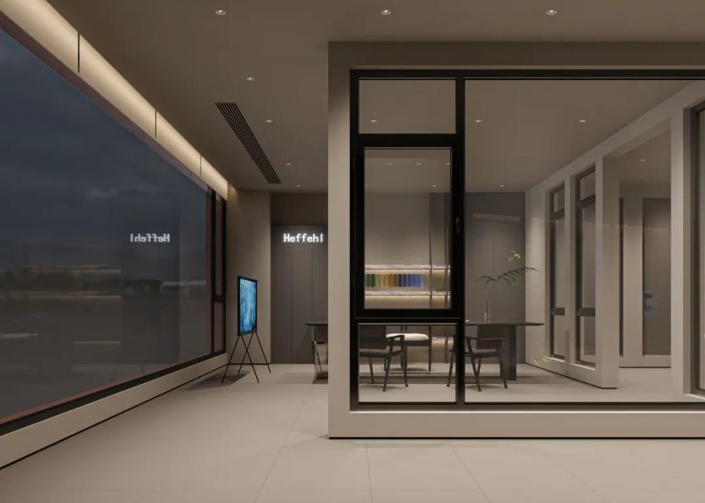
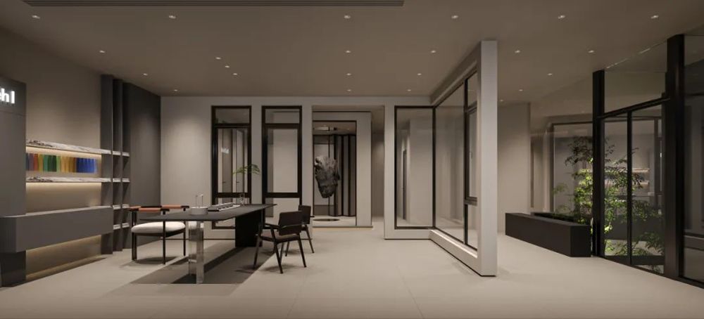
方形的洞口不断
地
穿梭在展厅之间,悬空石块装置艺术为之点缀。
Square holes constantly shuttle between the exhibition hall, suspended stone installation art for ornament.
▲[洽谈区 ]
Negotiation area
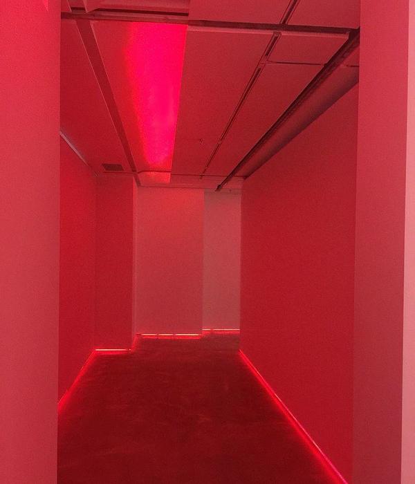
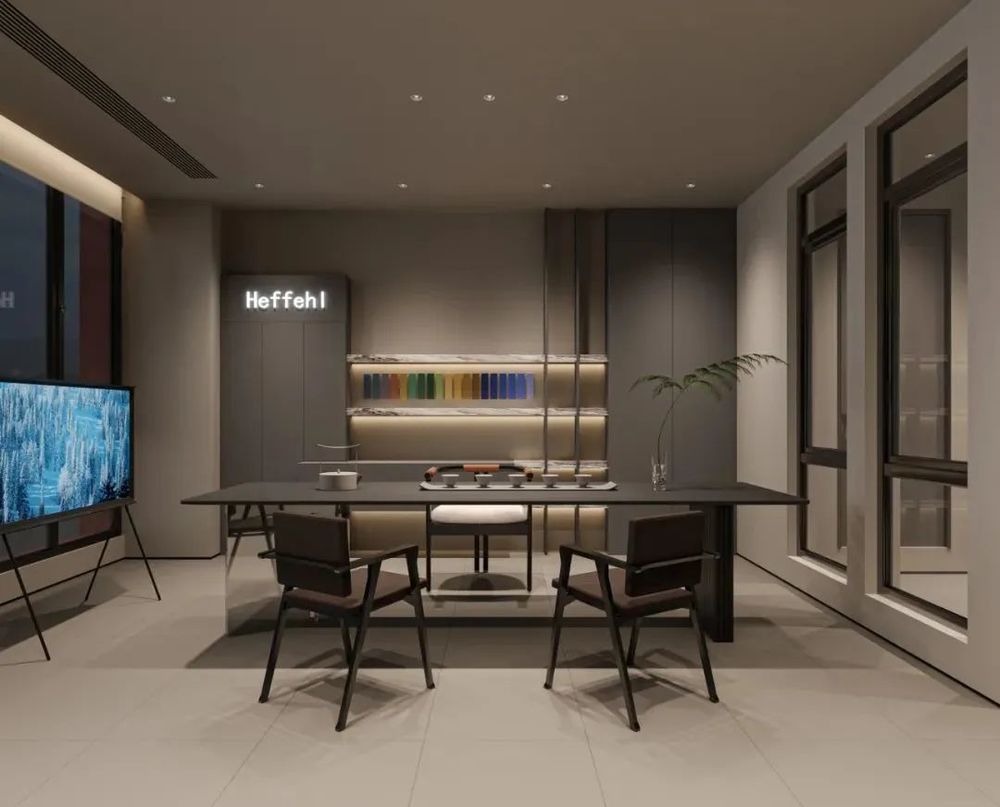
设计从传统的洞口中寻求突破,通过顶部灯光塑造,光影的不断变换,展现门窗的全新外观,时间与空间的变换,使内部环境充满活力。
The design seeks a breakthrough from the traditional entrance, through the top light shaping, the constant change of light and shadow, to show the new appearance of the doors and Windows, the change of time and space, make the internal environment full of vitality.
▲[门头展示]
Door head display
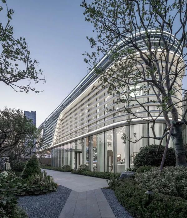
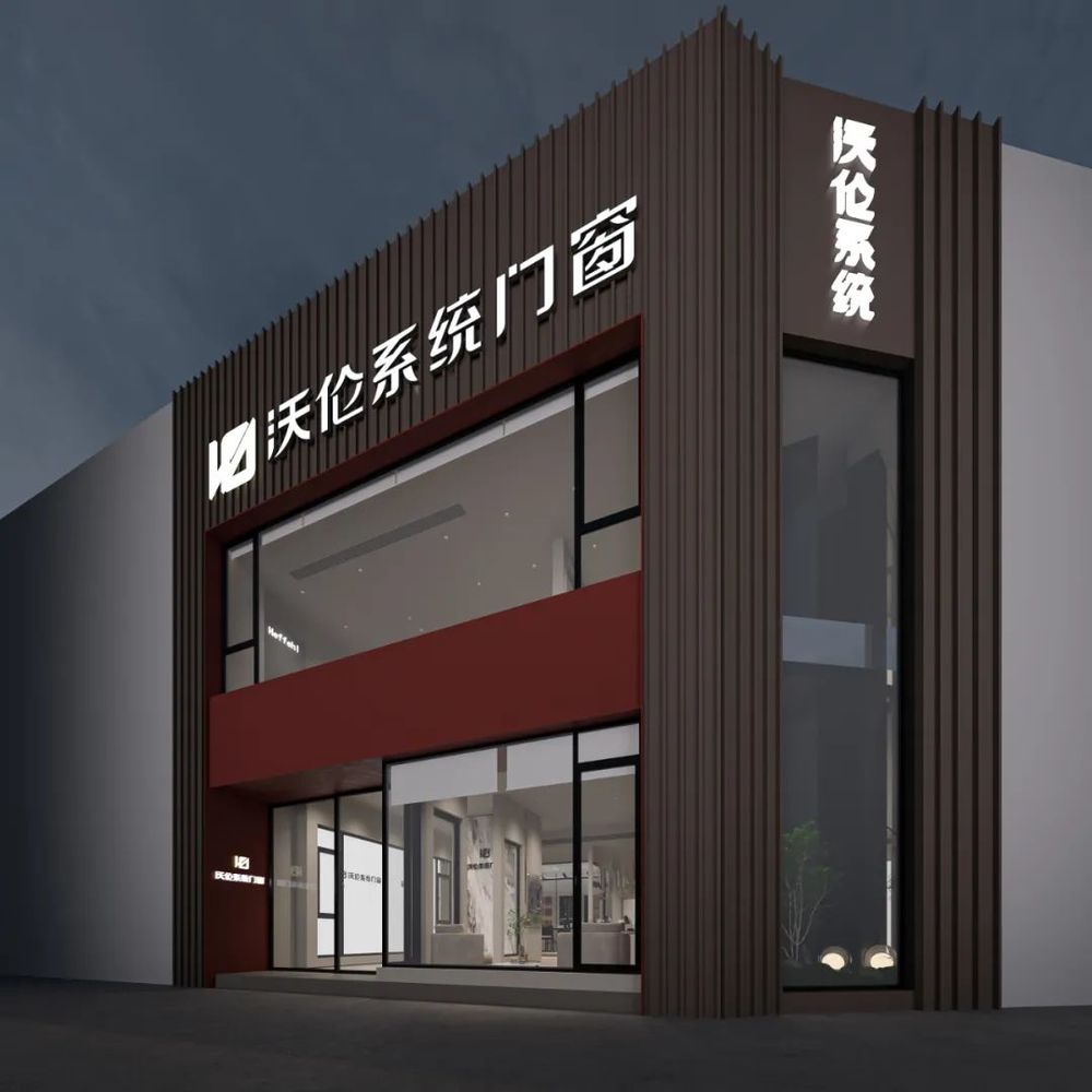
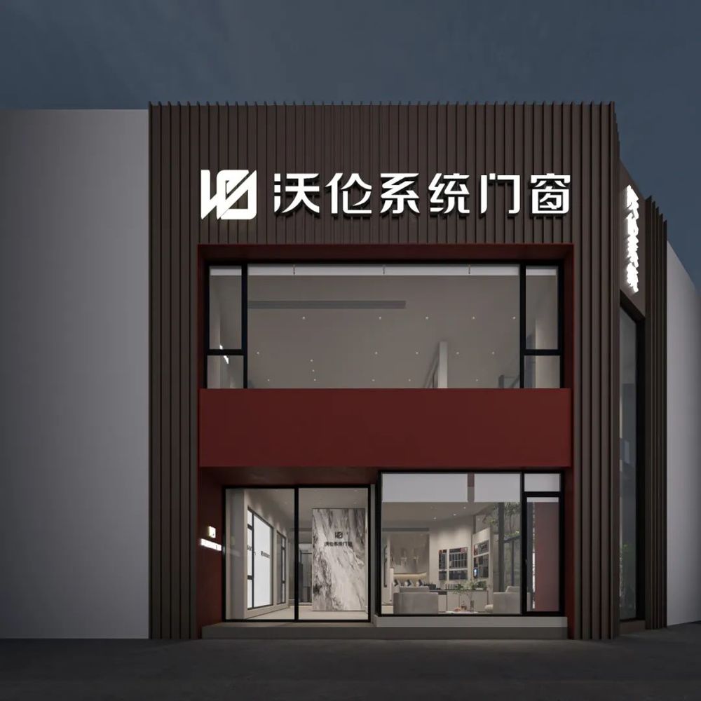
线条的重复排列使用在
钢筋水泥的堡垒中寻求自由肆意,少即是多的极简思想尽显低调的张扬。
The repeated arrangement of lines is used in the fortress of steel and cement to seek freedom and wanton, the minimalist thought of less is more is low-key publicity.
项目地址:湖南-长沙
建筑面积:260
设计风格:现代极简
硬装设计
:
周笙笙全案设计工作室
软装设计
:
周笙笙全案设计工作室
主要材料:铝板、石材、造景、涂料、亚克力、线性灯等
THANKS
手机 /tel:15388051772
:长沙设计师
周笙笙
周笙笙全案设计 | 南玻集团玻璃展厅-穿越光影的旅程
周笙笙全案设计 | BOX-东芝中央空调展厅
周笙笙全案设计 | 150m² 黑暗武士风-松下+多伦斯暖通展厅


