Architects:Eduardo Borges Barcellos, Garoa
Area :1005 m²
Year :2017
Photographs :Pedro Napolitano Prata
Authors : Eduardo Borges Barcellos, Lucas Thomé, Erico Botteselli, Alexandre Gervásio, Pedro de Bona
Collaborators : Nathália Lorena, Liene Baptista, Thaís Coelho
Structural Project : Carolina Milani de Oliveira
Management And Execution Work : MP Engenharia (Maurício Pelegrini)
Woodwork : Ockfer (Salvador Ockner)
Installations : Engeprev Projetos de Instalações (Dionísio Veras de Souza)
Air Conditioner : Brascon Refrigeração & Ar Condicionado (Higgor Lazarini)
Lighting Project : Vertz (Vanessa Masson)
Country : Brazil
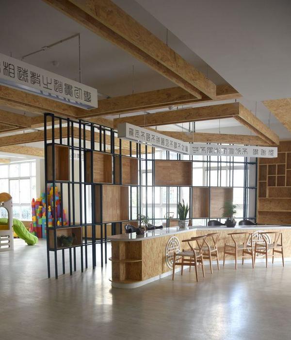
The design commissioned by Royal FIC (gas distributor), based in Campinas, State of Sao Paulo, was a part of a major structural revamp initiative by the company through administrative and marketing actions to create a new workspace. The requirements for the office headquarters design aimed to address new space necessities and to establish a different interface between collaborators and clients. The new space was created inside a pre-existing warehouse with approx. 1,000m²: Open double-height space with basic infrastructure and mezzanine at the entrance to serve the reception, a few conference/private rooms, restroom and garage.
The design aspired to accentuate the spaciousness offered by the un-obstructed double-height space, placing less flexible parts of the program on the pre-existing mezzanines, and maintaining the hydraulic core to serve the restrooms (remodeled), reception area, service / resources rooms (such as IT, storage), garage transformation into a living space with a counter, and shift of the vertical circulation, which altered the stair and added an elevator; In the top-level new conference / private rooms and an additional living space with a counter to service events. The full extension of the warehouse outboard of the mezzanines was designed to provide open office work stations for approximately 100 employees, offices for the partner and new conference rooms.
The design process of the project and premisses were defined through a research of the company’s workflow, the interface between different work departments of different sizes, the client use and interaction with the different activities from the firm’s collaborators, access control between departments and coexistence of people. The company’s department division induced the design to layout the space in a non-orthogonal arrangement, going against the classic organization concept of repeated and parallel work stations. Furthermore, Integrated and dedicated space were assigned to each department, to benefit the team’s interaction at its own activities.
In this respect, the project integrated the workstation cabinets perpendicularly, creating long linear pieces which defined the circulations and the arrangement of the plan. The combination of workstations and cabinets reinforces, even more, the idea of the seating booths, making it easier to identify each department, which for instance, have a specific drawing in the plan. The non-orthogonal arrangement of the layout increased the need for clear walking passages to order the office’s main circulation, and the linear cabinets define a diagonal line which starts at the reception towards the stair/grandstand which leads up to the new conference rooms.
In addition to sorting out the layout of the workstations, there was a need to create new conference rooms and training, summarizing 4 new rooms: 3 rooms to accommodate 8 to 10 people and 1 to accommodate 20. These new spaces had to be increased, the existing mezzanine did not hold the required sizing for the program. The expansion was designed in an intermittent and discontinuous, at an intermediate level between the lower and upper level in the opposite side of the mezzanine, clearing the open double-height office. The new construction occupies the perimeter of the warehouse, which creates a ceiling for departments that needed some sort of access control. The overhead of the new mezzanines above provided a lower ceiling height to have partitions and glass doors.
Differently, to the existing mezzanine, the designed expansion free from perimeter walls avoids big single-height enclosed spaces in such a wide space. The proposed Mezzanine are regular pentagons inclosed by woodwork and glass panels with no top enclosure, and with open circulation. The new structure is the intermediate space between the two existing levels, proposing a new level and alternate circulation. This element in space serves multiple uses. The double riser step can be used as an alternative working space and place for an informal meeting, or space for projections/presentations.
The intermediate level has two spaces and follows another stair thread to access the existing mezzanine, which has also been expanded with a pentagonal conference room for 20 people. It’s fair to say that the design offers a clear path through the space for users, creates a sort of promenade which allows the experience of space provided by the scale of the warehouse and new spaces that were created. The project allows a space dynamic which strives for a bigger interaction between people. The proposal aimed to create contemplation spaces in coexistence with the necessary conditions for developing the required work. The proposed circulation allows different fluxes of people in contrast with the rigidity of workstations, which grants the space with fluidity and movement.
▼项目更多图片
{{item.text_origin}}

