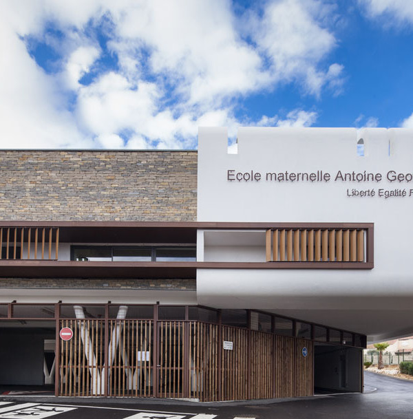
Qingdao Max Products Center
设计方:PRAXiSd'ARCHITECTURE
位置:山东 青岛
分类:商业建筑
内容:实景照片
设计团队:Di Shaohua, HuoJunlong, Liu Xing, Feng Shuxian
合作方:CSCEC
委托方:Gold Concord Investment
图片:18张
摄影师:Jin Fengzhe
这是由PRAXiSd'ARCHITECTURE设计的Max产品展示中心。为了达到最好的可视性,该展示中心将布置在规划用地十字路口的一角。客户要求经济、高效地建造,将售楼处设计为一个可以被复制的单体,以相同的形式出现在不同基地环境中。因此建筑师在没有具体基地和周边文化环境的前提下进行设计,建筑师从企业文化、建筑内部功能、结构分析出发,最终以“礼物盒”为设计理念,传达企业策划思想。
参观者需要通过一个空间序列后再看到“盒子”里的内容,在这个空间序列中企业的LOGO“MAX”被应用到建筑材质、形体和空间中:立面的外挂构件为“M”, 门厅的前台为“A”, 沙盘四周的地面延伸到墙面成为“X”。外立面设计试图表达意外性:一种对严谨的方盒子的消解,对理性的层板梁结构的消解。“M”组成的格栅以及带有“M”图案的打孔金属板为外立面增添了精致和细腻,使建筑对人产生的亲和力。每一块“M”都是由GRC板浇筑而成。四个“M”成一组在立面上进行重复,形成富有立体感的镂空层,使建筑内部通风透气,外部则呈现出光影的变化。
译者:筑龙网艾比
From the architect. Our client for this project is under process of developing the company into enterprise groups. The MAX Show Center, along with the grouping process, will be located in multiple cities. In order to receive a maximum visual presence, the show center will always be placed at a corner of a road crossing. For purpose of building efficiently as well as economically, the show center was to be designed as a prototype and multiplied in different cities.
With no reference to a specific physical or cultural context, the design started from understanding culture of the company, and rationalizing the show center’s inner structure and space use. The architecture then is conceived as a “gift box” to present a proposal represented through a physical model showing the company’s vision of development for that area .
For visitors the “gift” is revealed through a spatial sequence constructed by an architectural adaptation of the company’s logo “MAX”: M as module of the facade, A as a front desk, and X as wrapping of the gift – floor material extending to the wall. The “M” screen and “M” patterned perforated metal panel add refinement and delicacy to be inviting to visitors. The screen is made from GRC blocks in the shape of “M”. Four M blocks comprises a unit that repeats on the facade, creating a three dimensional screen that facilitates natural ventilation from inside and registers change of day light from outside.
The interior design has left some room to bring in a local feel. The show center’s first location is Qingdao, a previous German colonial city. In this case, part of interior wall was applied with red brick that is typical impression of old part of the city. Some segments of curves from the “X” in the show room is carried onto walls of other individual spaces to emphasize the theme symbolized by “X”, reiterate color of the logo, and to provide visual pleasure as well.
青岛Max产品展示中心外部实景图
青岛Max产品展示中心外部局部实景图
青岛Max产品展示中心内部实景图
青岛Max产品展示中心平面图
青岛Max产品展示中心剖面图
{{item.text_origin}}

