“用水、风、人的脚步声收集地球的能量两年,用六年的时间照料人参。六岁的红参在韩国人参公司的奉献下营养了八年。“在KT的一楼开业
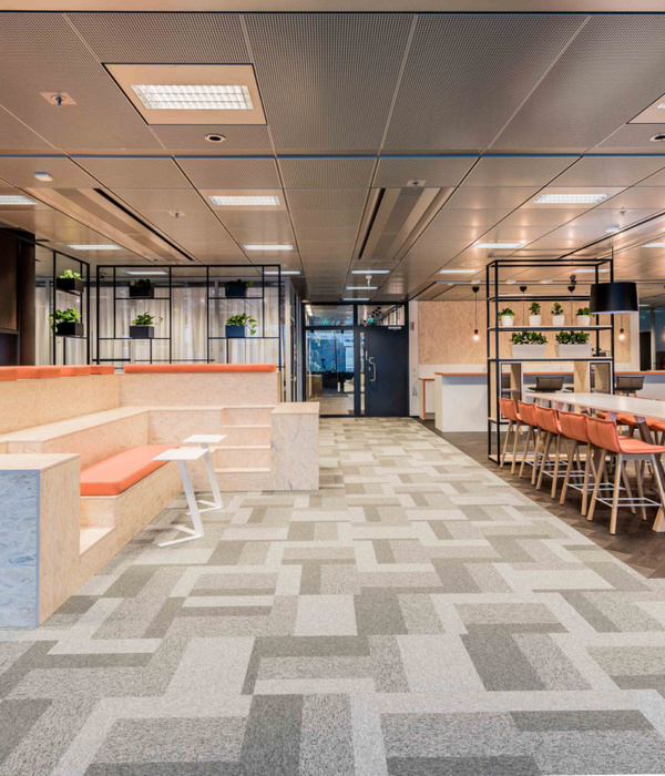
“Two years for gathering energy of the earth with the sounds of water, wind and human footstep, and six years for looking after ginseng. Six-year-old Red Ginseng nourished by the devotion of KGC (Korea Ginseng Corporation) for eight years. ”Opened on the first floor of KT&G (Korea Tobacco & Ginseng Corporation) Tower last August, Café Sapoon Sapoon expresses the advertising copy of Cheong-Kwan-Jang implicatively. Sapoon Sapoon is a compound word of Saponin, main ingredient of red ginseng, and Spoon, a tool to deliver taste and nutriment of food. As Sapoon also means ‘a figure of light and careful step’ and ‘light and refreshing state of body and mind’ in pure Korean word, people can feel refreshing scenery with light beverage.
© Yong-joon Choi
蔡永俊
萨丰是KGC为了摆脱“红参不过是保健功能食品”的观念而创造的休闲空间,同时保持公司的信誉和质量第一的精神。Be孪生空间设计在这间咖啡厅上移植了传统的张群昌思想。他们将“自然”和“实验室”两种元素应用于向年轻客户提供长期顽固生产的产品的空间。他们从人参田的风景中获得了主题。构成场地的所有自然要素,如遮阳木结构、遮阳幕、风、丘陵等,都成为萨丰的设计元素。天花板上的雕塑,遮住了空间,暗暗地象征着木结构,以控制阳光的数量。围绕着重复雕塑的织物是遮阳窗帘的隐喻,它在风中自然地飘动,穿透光线。他们创造了各种形状的座椅,反映了客户对座椅的广泛需求。
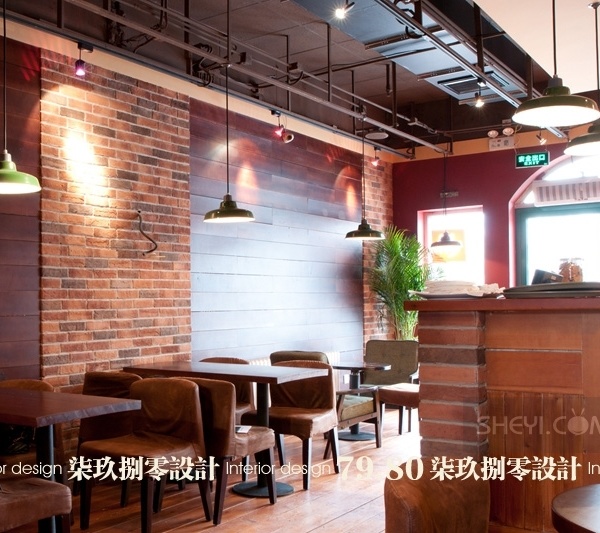
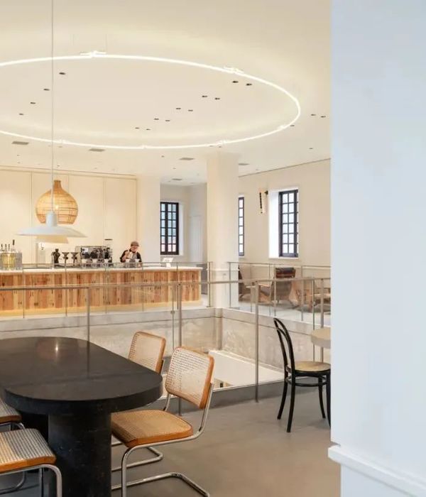
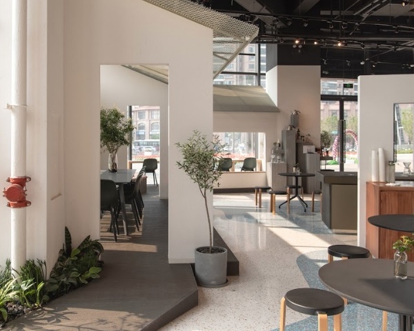
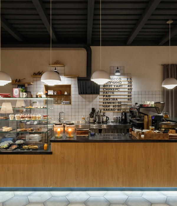
Sapoon Sapoon is a casual space created by KGC in order to be free from the perception, ‘Red ginseng is nothing but health functional food’, while keeping credibility of company and its quality-first spirit. Betwin Space Design grafted traditional ideology of Cheong-Kwan-Jang on this café modernly. They applied two elements, ‘Nature’ and ‘Lab’ to the space for delivering the products produced obstinately for a long time to young customers intimately. They obtained the motif from the scenery of ginseng field. All the natural elements composing the field such as wooden structure for screening sunlight, shading curtain, wind, and hilly spot become design elements of Sapoon Sapoon. Sculpture on the ceiling which overwhelms the space secretly symbolizes the wooden structure to control the quantity of sunlight. Fabric which surrounds the repetitive sculptures is a metaphor of shading curtain, which penetrates the light while fluttering naturally in the wind. And they created various shapes of seats, reflecting customers’ extensive needs for seat.
© Yong-joon Choi
蔡永俊
Floor Plan
© Yong-joon Choi
蔡永俊
它还运用了土的元素,通过设计方法,把木材放在混凝土或组成不同的层次。户外露台有椅子和背形成的水平差,这是有机地延伸到内部。中间的桌子只用混凝土的物质属性来表达泥土的感觉,到处都有植物。前面杆的下部是人参根三维展开的图形,酒吧后面的雕塑用冷饮管道设备和实验室材料展示了专业精神和可信度。
It also applied the element of ‘earth’ through the design method to put wood on concrete or to compose diverse levels. Outdoor terrace has chairs and backs formed only by level difference, which is extended to inside organically. Along table in the middle expresses the feeling of earth only with the matter property of concrete, and plants are placed on it here and there. Lower part of front bar patternizes the figure of spreading ginseng roots in three dimensions, a sculpture behind the bar displays professionalism and credibility with piping equipment for Cold Brew and materials reminding of laboratory.
© Yong-joon Choi
蔡永俊
{{item.text_origin}}

