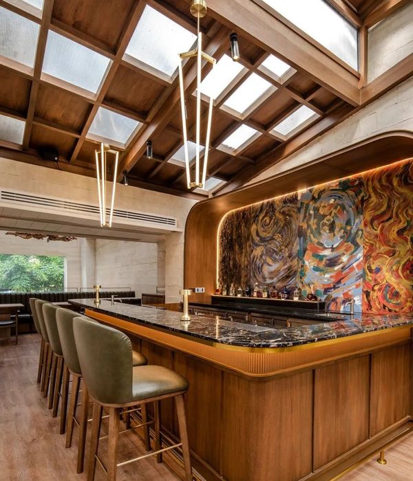
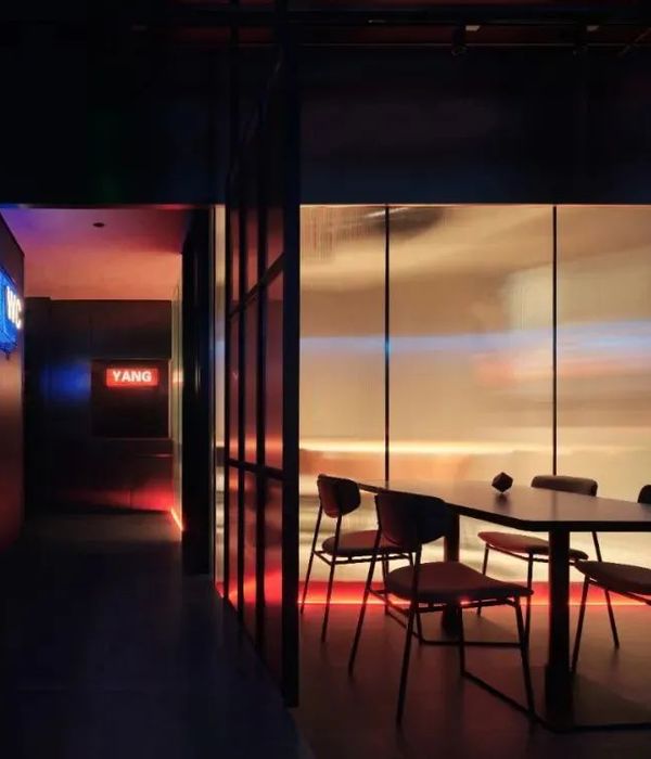
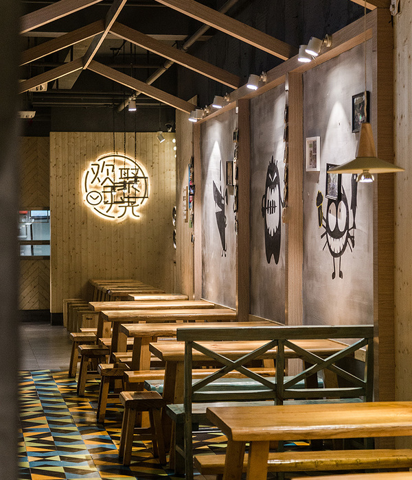
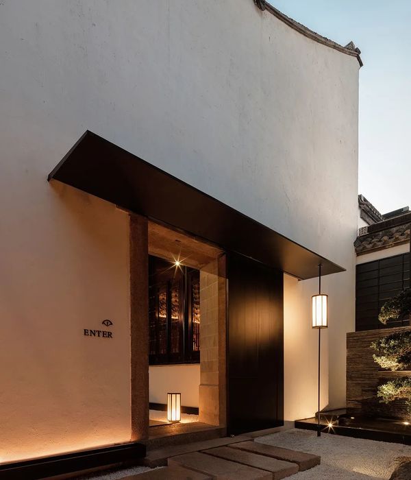
This project took us on a nostalgic walk through the Ciudad Satélite area —where the original concept emerged in 1957— in one of the commercial centers of the subdivision. Our research aimed to preserve the concepts that keep the brand current today, for which we paid particular attention taking care of all the details of the space and its adaptation in a pocket version located in another legendary place in the area, the fast food area. in the renovated Plaza Satélite.
We define the space as a service station in which, in addition to efficient operation, it is very important to attract the attention of visitors to this area of the shopping center. Taking full advantage of the rebranding work, we applied the renewed color palette and highlighted the presence of blue and green, fresh and vibrant colors that were combined with the game of lines characteristic of the time in which this successful place originated.
The result is a luminous look that stands out for being very attractive and timeless, giving it the presence that a commercial space requires within one of the most experienced shopping centers in the country.
{{item.text_origin}}

