Slash Architects designed the unique and thoughtful layout for Clinic Estetik Diş Hekimi in Istanbul, Turkey.
Having the brief of “A Space that is Contemporary, Striking, Iconic and Extraordinary” is probably one of the most charming project briefs. The Clinic that is located in Zorlu Office Blocks, has enabled us the designers to have an experimental field regarding this motivation.
With this approach we have focussed on the sensation of flow and located the spaces in a composition that provides the best circulation. The tectonics of the interior architecture is also shaped by the organic nature of the idea of flow. The plasticity of the clinic is derived from the inner facade, which folds and flows according to the composition of functionality. The human scale is the primary reference whilst creating an interior attitude that is shaped by natural codes and references. Contemporary design technologies being used, the integration of art and technology to the space shows itself almost in every aspect of the clinic. The spatial design and the production of the interior is shaped by parametric tools and methods.
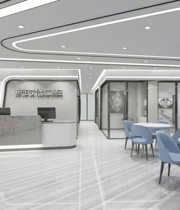
Having to office spaces united, us designers were bound to generate a 5 box (examination rooms) dental clinic in 250 sqm. Within the planning we choose to maintain the existing service units such as kitchen and toilets as they are. Regarding these constrains, we focused on creating spaces that provide the best dental ergonomy for both the staff and the patients. The circulation and the waiting area that define the public spaces of the clinic, is the most crucial part in terms of design. The “ring corridor” that is planned considering the differentiation of the visitor and staff access, also provides separation of public and private. The waiting area and entrance that hosts the reception is located in the public part where one can experience different waiting experiences such as digital activities, easy access to kitchenette and terrace usages. The waiting area is separated from the rest of the clinic where the examinations are made by a sliding glass door. Starting from this separation on the inner part of the clinic transforms itself to white choice of color which has an emphasis of clean and sterile nature of the clinic. This attitude is designed for the privacy of the patients that are being healed.
The inner “shell” that is around this circulation changes its color and openings regarding the functional usages and change in the public and private. This skin has folded openings that expose the reception desk, facades like kitchenette or waiting sofa and also the entrances to public clinic rooms. Some private rooms within the shell are also hidden as the client wanted to keep these rooms out of reach of the patients. This shell, being the most memorable inner facade of the project, provides a lot of different perspectives within the clinic.
Considering the characteristic of this shell, us designers have mostly examined the organic folds, stretches and openings of some animal skins. The nature’s mathematical response to this fold systems has been a great reference. Thinking of an “armadillo” or “isopod bugs” mechanical folding, we have designed a folding skin via bio-mimicry. The metallic color and texture of this skin also has an emphasis on the man-made nature of this element.
Architect: Slash Architects Design Team: İpek Baycan Magriso, Şule Ertürk Gaucher, İpek Baycan Magriso, Şule Ertürk Gaucher, Nergis Kahraman Contractor: Aks Architecture & Construction Photography: Altkat Architectural Photography
16 Images | expand images for additional detail
{{item.text_origin}}

