巴西圣保罗·妈咪地球总部 | 拥抱自然,创新共享
Architects:Memola Estúdio, Vitor Penha
Area :630 m²
Year :2021
Photographs :Fran Parente
Manufacturers : Otis, Aerovent, Ajalumi, Alessandra Delgado, Allarmi, Brasil Antigo, Cia. de Produtos, Espaço Luz, Galpão Teo, Gresca, Lepri Cerâmicas, Marcenaria Conceito, Masterinox, Navarro, Nilko, Suvinil, São Domingos, Tintas Solum, Tuboar Coifas Especiais, UniflexOtis
Architecture : Veronica Molina, Vitor Penha, Debora Brasil, Bianca Sinisgalli e Luisa Oliveira
Interior Design : Memola Estúdio + Vitor Penha
Landscape Design : Um Design Studio
Lighting Design : Estúdio Penha
Structure : Stec
Electrical And Hydraulic Installations : W Projetos
Kitchen : Topema
Air Conditioning : Tempo Ar
Construction : Abduch
Production : Aldi Flosi
City : São Paulo
Country : Brazil
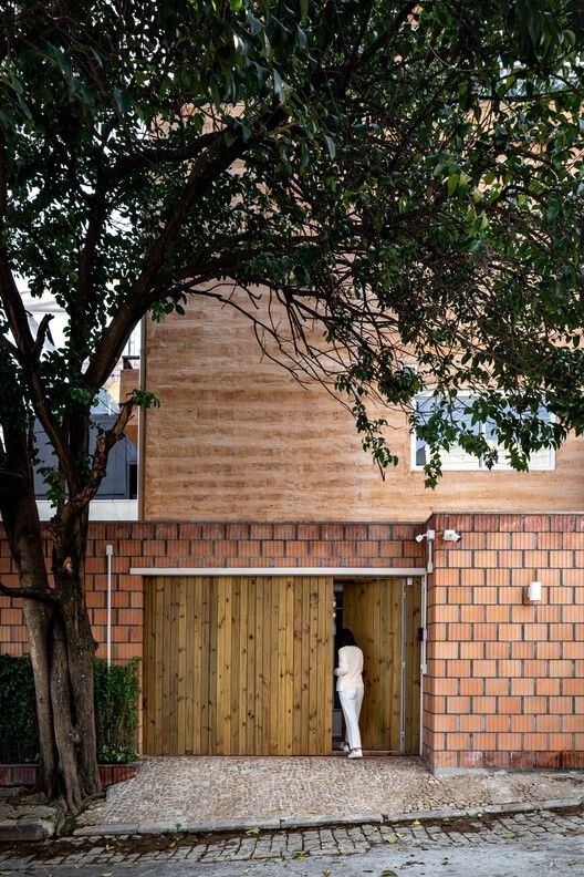
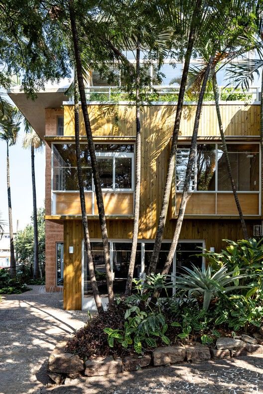
This project transforms an old bar at Vila Madalena, in Sao Paulo, into Mãe Terra headquarters, a company in the food business. The goal was to bring together different areas – administration, innovation, and product development – but also spaces to sample the food and to experience the company’s work philosophy.
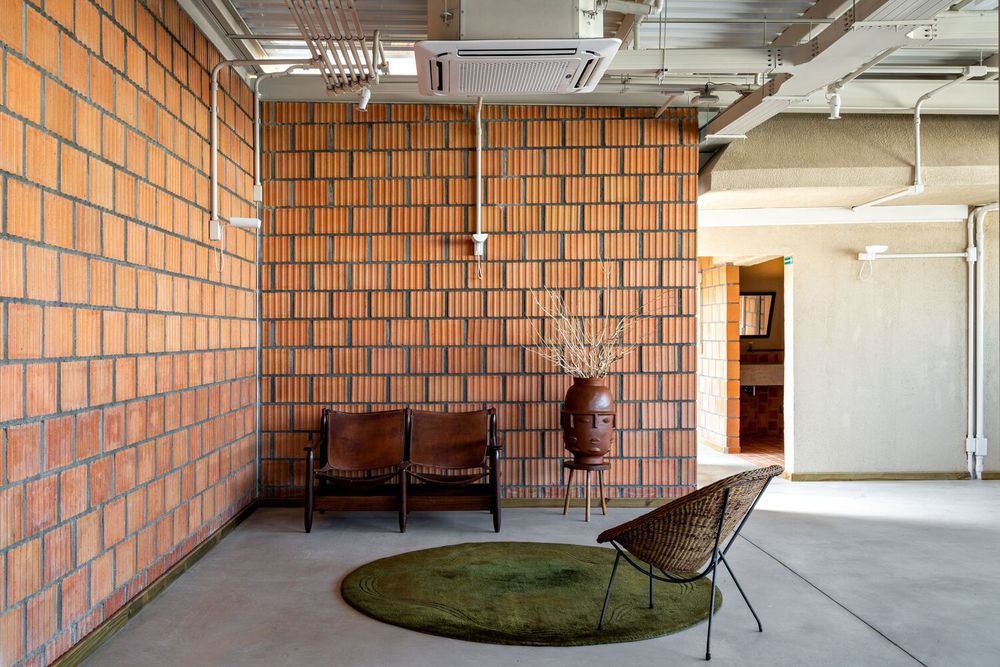
From the beginning, earth (“terra”, in Portuguese) was thought of as the project’s emblematic material, capable of expressing the values of receptivity and being connected to nature, both present in the brand’s name, Mãe Terra (“mother earth”). Conceived as an open house to all employees, consumers and even neighborhood visitors, the architecture’s materiality is composed of earth’s variants: rammed earth and fired bricks.


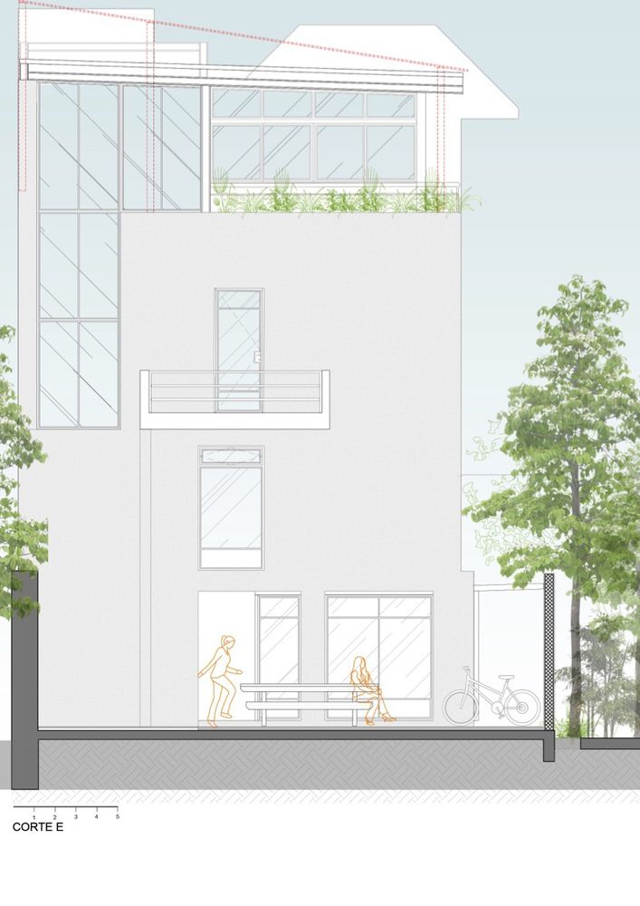
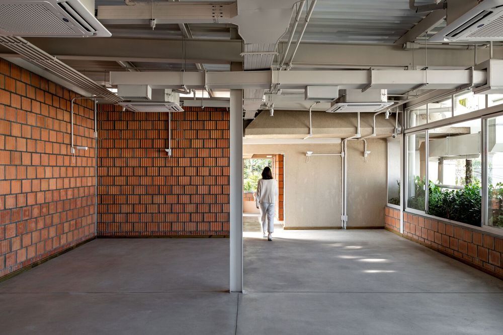
Even though the property’s building area didn’t change, this is a renovation and expansion. There was complete interior redesign: elimination of dividing walls, removal of coatings, rebuilding of vertical accesses, structural reinforcement, new infrastructure installations, and the rebuilding of the roof, which is now also occupied.


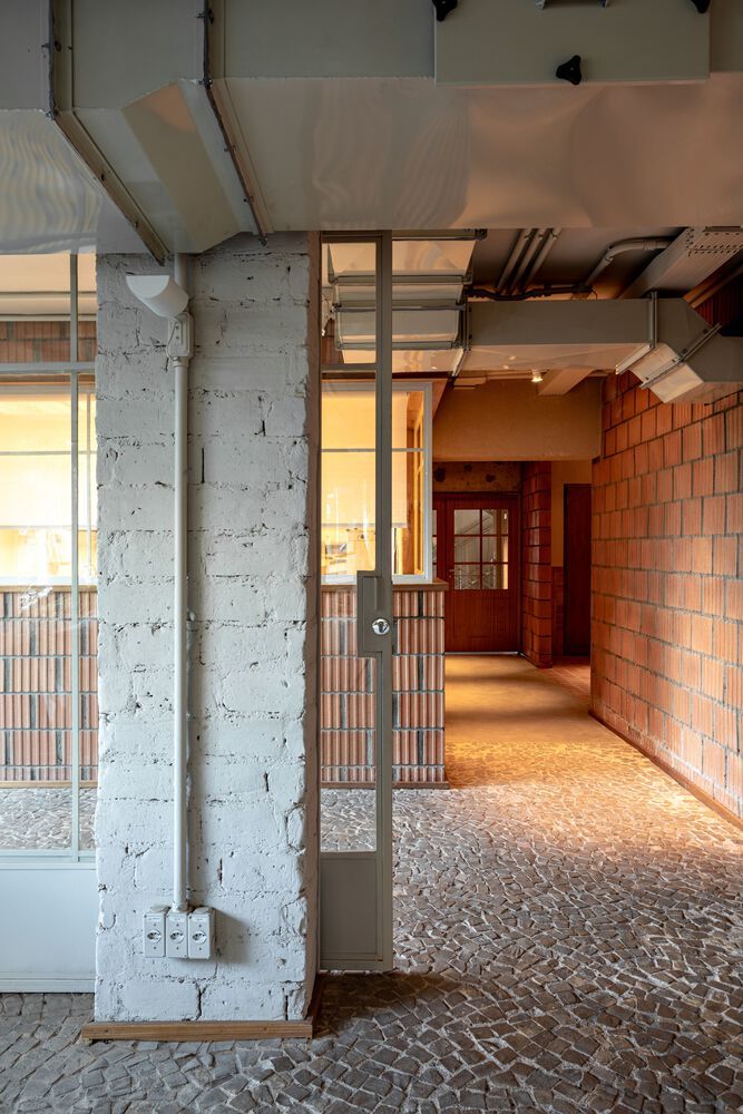
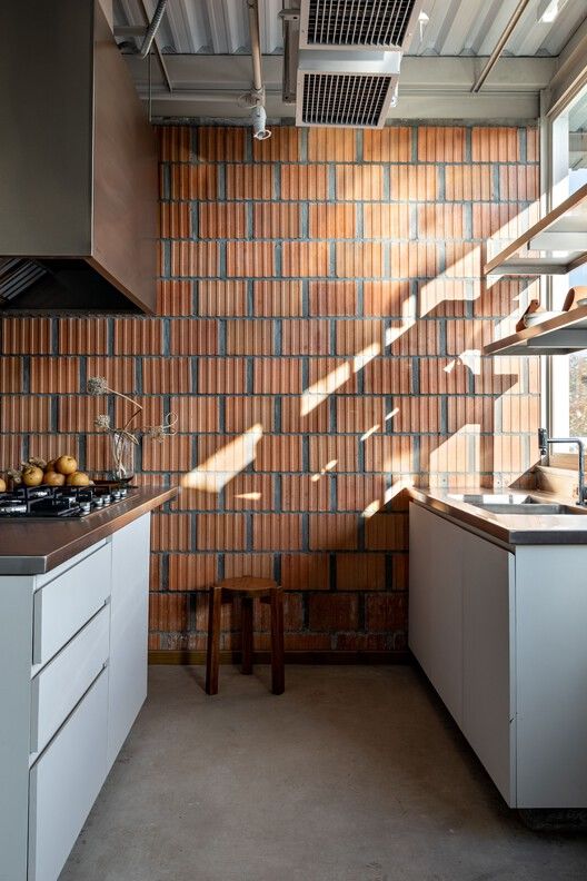
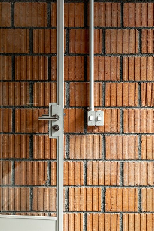
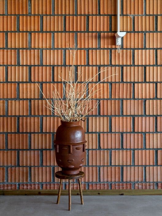
The goal was to use, in the new walls, a different type of brick from the conventional blocks, with broader ribs, as selected in the design phase. Once found in the market, the manufacturer agreed to work together to strengthen the block’s load bearing capacity and to allow it to be used without further coatings, natural and exposed. From this partnership one of the project’s main materials was born. Its layout it’s alternate, running bond type, and the expansion joints are larger than usual, the same width as the brick’s ribs.
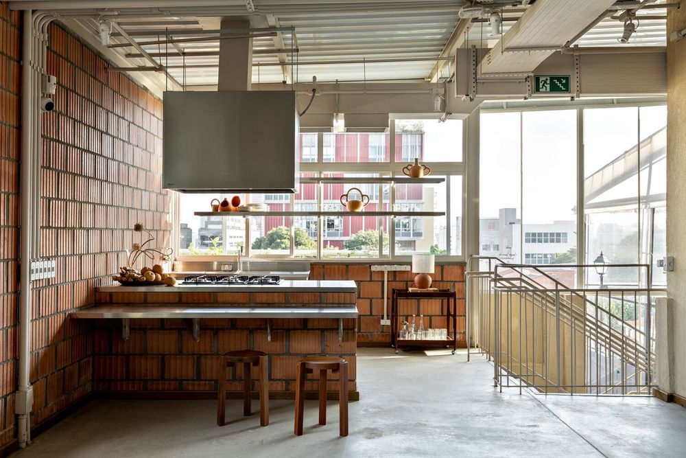


The coating on the existing walls also relates to earth. An external layer of rammed earth was applied to the façades, with horizontal friezes and color matching that of the bricks. Complimentarily, the interior existing walls received natural paints of earthy hues.
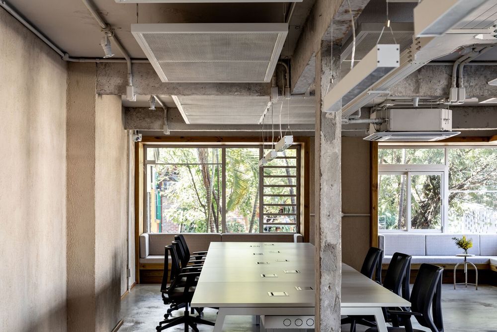
Amidst the property complete transformation, of which the beams bear testament with their layout mismatching the current place’s, all windows and doors were replaced. As it is usual in our practice, the frames combine fixed and open panes, folding and sliding openings, according to the room’s needs. However, here at Mãe Terra, the windows are also units that, protruding, signal the intention to close the gap between the occupants and the surrounding trees.

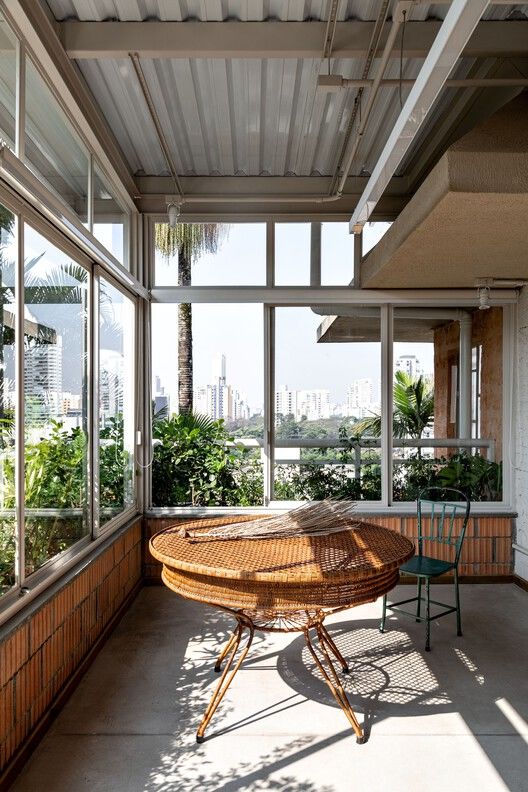
They are present on the first floor, completely remodeled to house the company’s office, and both inside and outside, its framing is made of pine wood. Metal beams embedded in the slabs support the floor of the protruding units that, furnished with fixed seats, conform spaces for social activities and for contemplating nature, its ludic character representing the informality of the design. At the corner of the building, which sits on a corner plot, both the sofa and the window follow the L pattern.

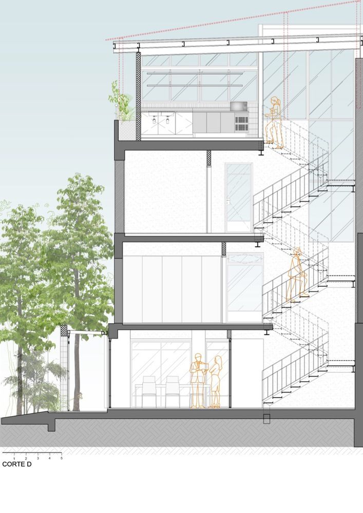
Natural lighting abounds, coming both from the new windows and from the cracks of the new metallic staircase (perforated sheet floor and rebar handrail), at the back of the building. The top floor, designed to house different meeting and event areas – some enclosed and some open space – is surrounded by glassed façades that, receded, accommodate planters filled with dense landscaping.

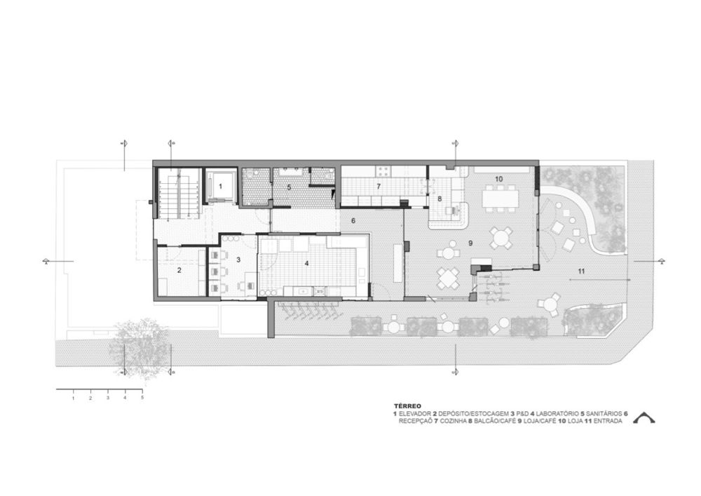
The ground floor houses the café, the kitchen – which can be used for courses – and the spaces for innovation and product development. The back patio can be seen through the stair hall’s large window and the coexistence of the materials and components – old and new – echoes the project’s visual language.

▼项目更多图片


