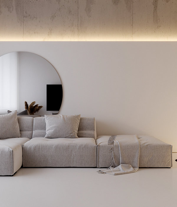
When thinking about conventional residential sales suites, images of conservative interiors with white walls and beige furniture may come to mind. Understandably, there is usually inherent neutrality to the design approach of these spaces, as bold, in-your-face design is unlikely to please a mass of potential clients. However, these conventions obviously did not make a significant impression on the concepts and ideologies emerging out of Melbourne-based design practice K.P.D.O. In fact, the team have created the exact antithesis in their residential display suite for One Wellington, a developing apartment building in St Kilda, Melbourne.
K.P.D.O. have broken down the polite niceties once attached to the typical display suite and have instead dipped every white surface in vibrant colour. The design pays homage to the rich and diverse culture of St Kilda through bold and playful interventions, the resulting interiors a physical manifestation of the electric energy of the community.
A custom-designed red rug acts as the beating heartbeat of the proposed room, the vivacious red colour mutating into orange as it reaches the carpet’s edge. The colour becomes a motif, layered across different textures and furnishings, combining to create overwhelming, powerful energy in the room. K.P.D.O. reject the traditional convention of implementing “a light or dark scheme”, instead focusing on customization, allowing future residents of the building the chance to inject contemporary designs containing all the nuances of their personalities into their apartments.
There is a textual complexity in the scheme, the inclusion of a deep blue coarse grain ceiling acting as a counterpoint to the lustrous quality of the stone on the splashback. Transparent table legs are rigid and hard in their form, which contrast the softness of the rug and upholstered armchairs. This constant and complex layering results in visually stimulating interiors which are seductive in their intensity.
Shapes become another element that has been used in an experimental, playful way. There is a tension between rectilinear and organic forms as square grids are placed alongside curving furnishings. An unmissable example is a mirror that distorts from its usual format into the wriggling body of a snake. This unconventional interpretation of decorative elements and at large, shared living space, solidify the project’s loud and unapologetic personality.
K.P.D.O. have dedicated time and consideration to the public areas which are often overlooked, viewing them as opportunities for energetic exchange and brilliant design. All the furniture and joinery insertions produced for the display will be included in the public spaces within the completed building, bringing colour and interest to future corridors, lounges and meeting areas.
[Words by Caitlin Miller. Images courtesy of K.P.D.O. Photography by Anson Smart.]
{{item.text_origin}}

