罗马 300 平米公寓的时光穿越之旅
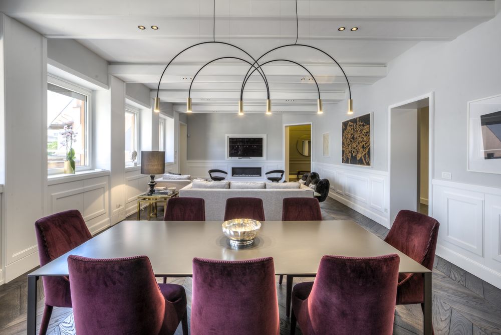
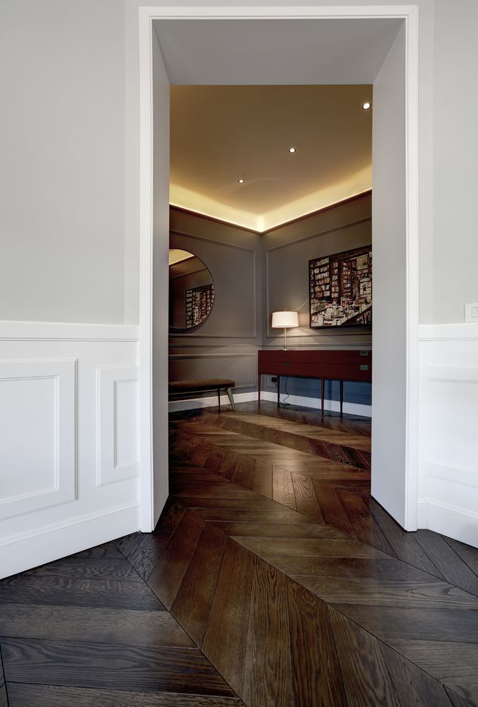
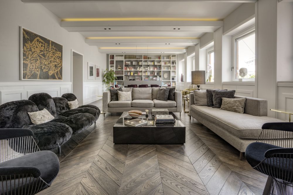
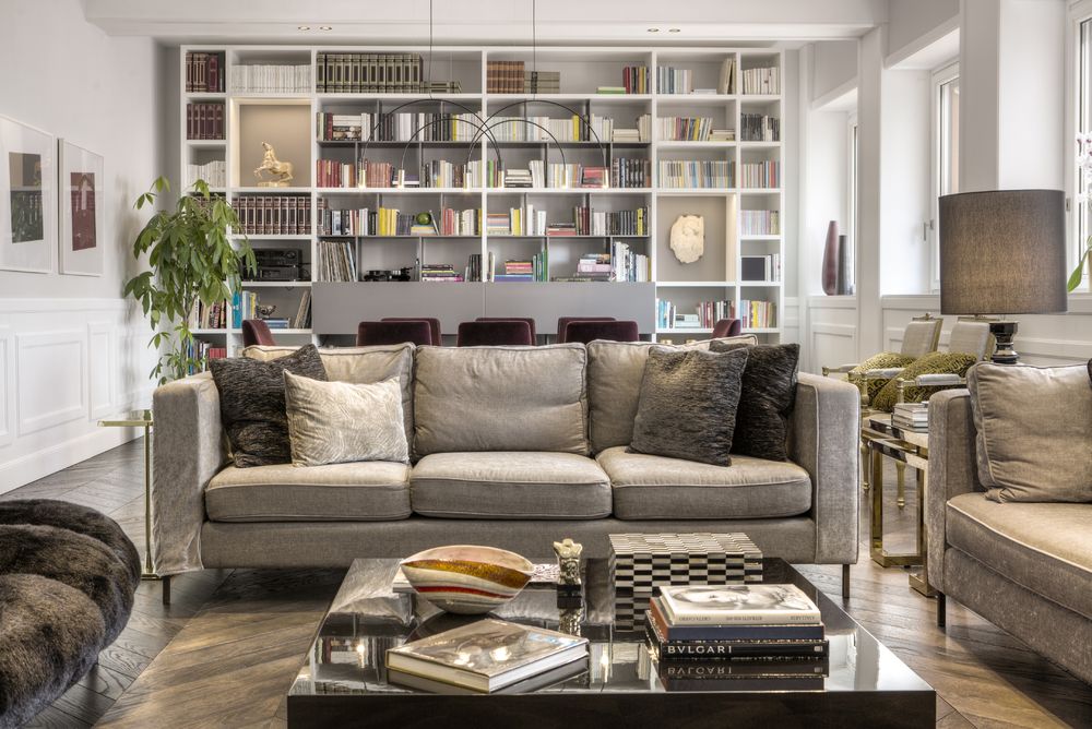
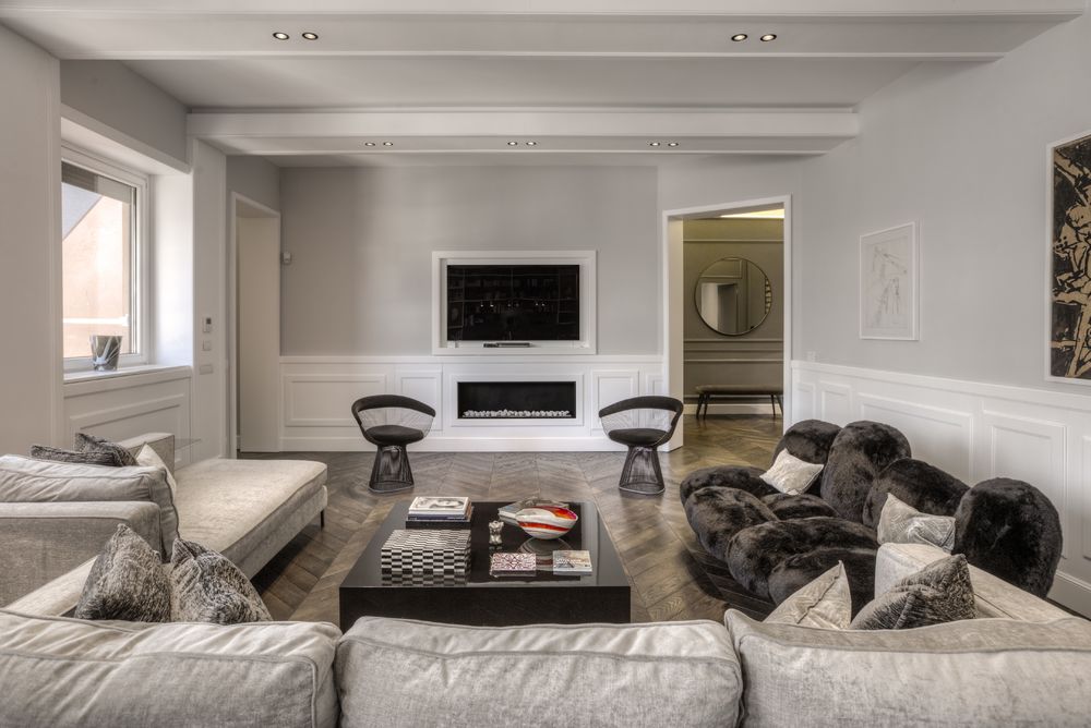
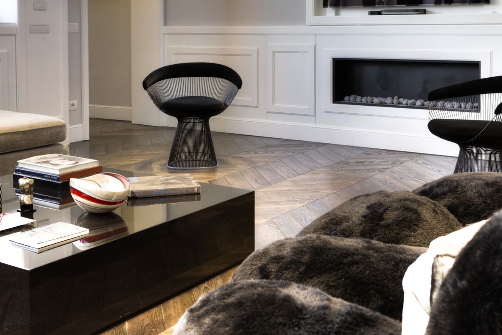

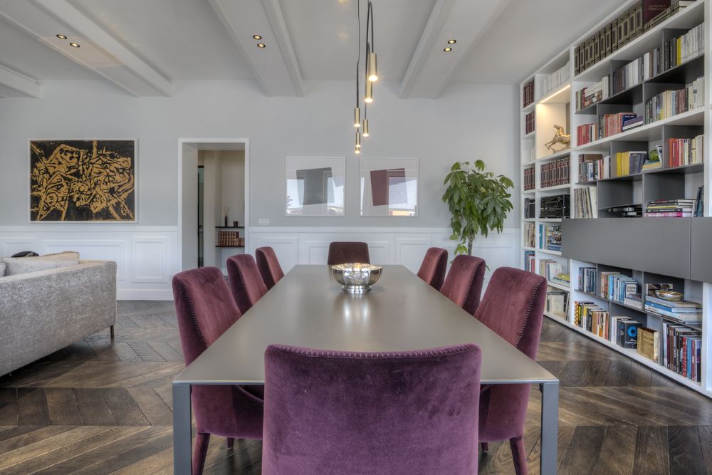
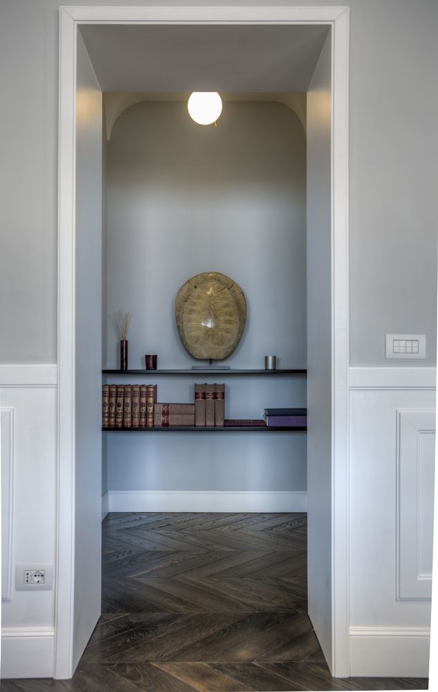
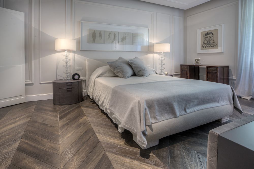
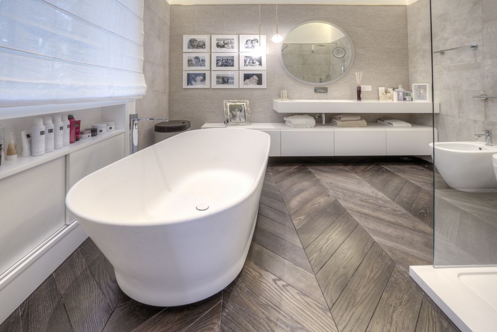
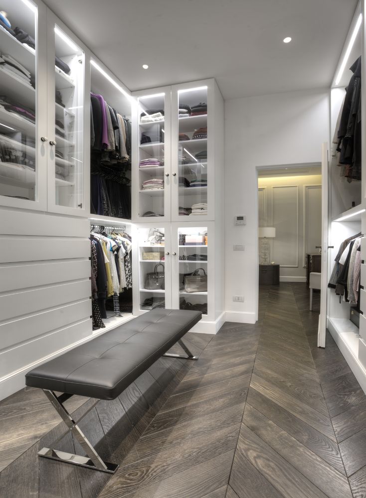
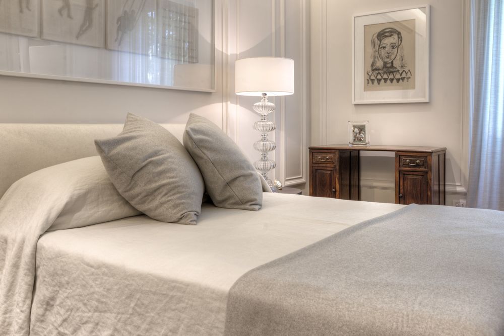

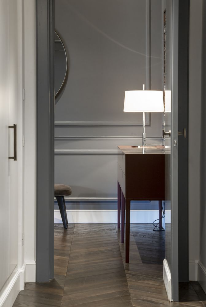
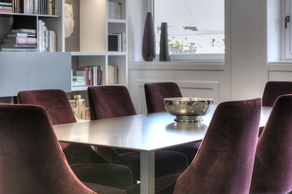
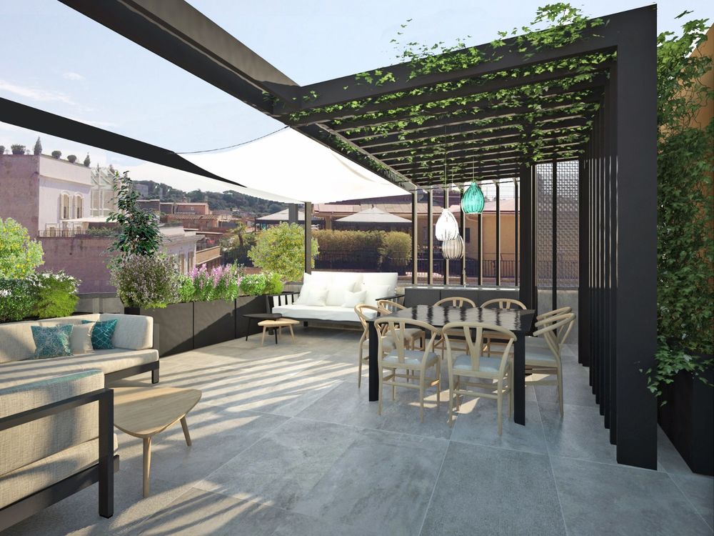


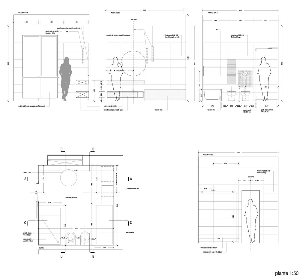
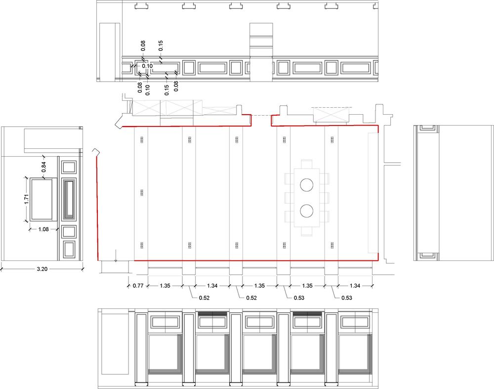
The project by Fabrizio and Pierfrancesco Capolei ( 3C+t architects Rome) for the refurbishing of an apartment of about 300 sqm in the center of Rome attempts to construct an identity in an interior that was completely lacking in character, in spite of the impressive 19th-century outer facade, since it had completely lost its distinctive features from the period of the building’s construction: a tabula rasa as a starting point, to rewrite a story in a delicate balance of citations from the past, reinterpreted and in constant evolution.
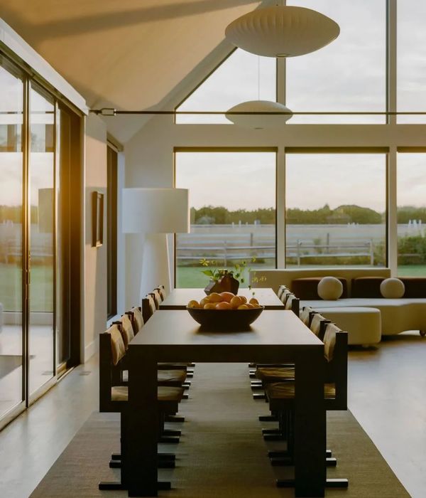
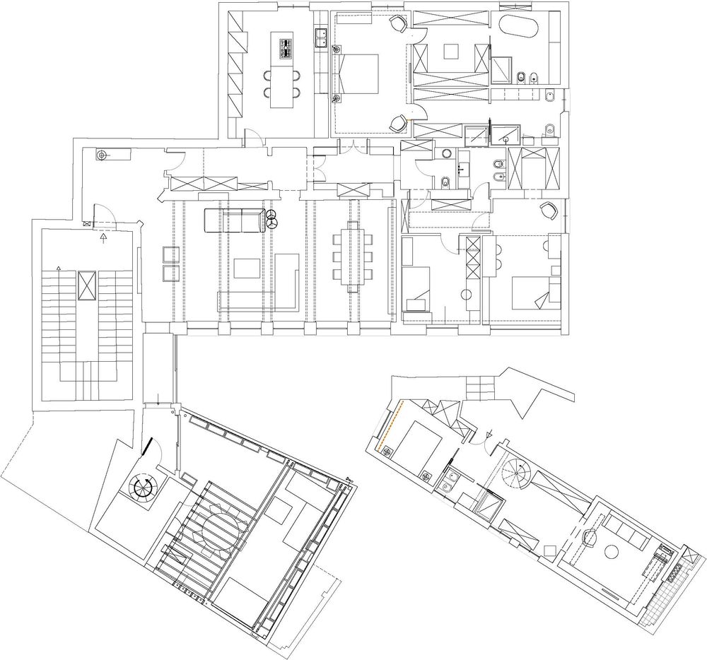
The size of the windows facing the street and the different sizes of the rooms immediately suggested a reversal of the traditional functional layout with respect to the exterior: the kitchen and the double bedroom were placed towards the street, while the dining room and the remaining bedrooms bed and bathrooms have been moved to the courtyard, overlooking the private terrace and the beautiful Villa Borghese park.
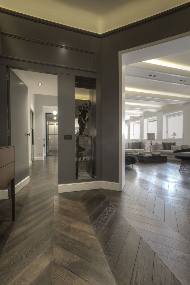
On the one hand, rediscovered the dignity of the living area, thanks to the relationship with the outside, the height of the ceilings and the new floor in large parquet planks; on the other hand, the maximum rationalization of space, to bring functional quality to the bedroom-dressing-bathroom area. The transition between the two dimensions is emphasized by the vaulted corridors filtered by high iron and glass doors, a work of architecture within the architecture, from which the metal frames extend to create new visual trajectories, but above all to act as tools able to divide the perception of spaces for entertainment, consumption and food preparation, without physical barriers that would reduce the space, the light and the view to the outside.
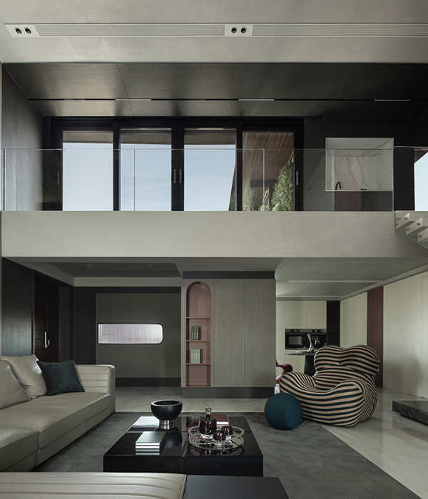
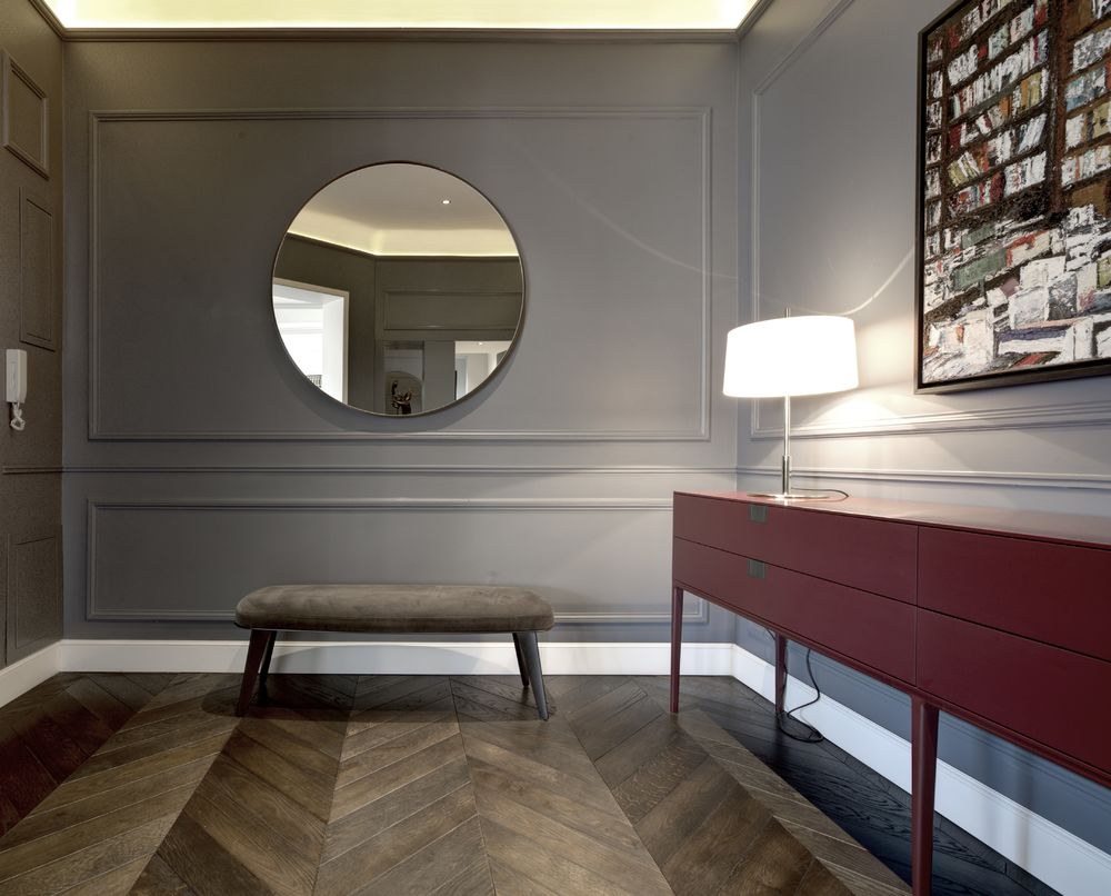
The division is not made only in terms of different areas of the plan: the project is also vertically stratified on two levels that form different backdrops, as was customary in the past, in order to highlight - starting from the bottom - first the furniture ordered by the design of the floors, then the wooden frames placed on the wall and finally the system of frames that support the lighting fixtures and generate axes of light, separating and enhancing the various pastel shades of the surfaces and on the ceiling, where they echo the positioning of the furnishings below.
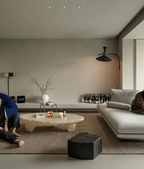
The details that refer to the past are clearly displayed: the plaster frames, like the French parquet, seem to have always been there, even if at a closer observation the decoration on the ceiling is decentralized with respect to the table, the design of the floor has a clear modern matrix, while the kitchen design, on the other hand, has an uninterrupted contemporary look, based on textures and materials.
A house of lights and shadows, with perceptive "jumps" between the living area and the sleeping area, where empty parts alternate with other full of functions and the large openings to the outside world of the living area form a contrast with the "loophole" frames that offer a view of the tree-lined avenue below from the bedrooms: a house where the future is also in the past, when filtered by the present ... only small fragments of history that repeat themselves ...


