- 项目名称:午马咖啡
- 项目类型:室内改造
- 竣工时间:2023年1月
- 项目摄影:金伟琦
这次将要改造的项目位于东四南大街,地点在人民艺术剧院菊隐剧场旁边,只有一墙之隔,门前正对的就是史家胡同。初勘现场,便被门前车水马龙的街景吸引,随之而来也面临很多问题,如何让改造以后的空间融入街道,以及给予一个“不规则空间”更多的可能性与生命力,妥善处理空间的各种规格及材料的承重柱体,让空间整体更为和谐统一是本次改造的重点。
The project for renovation is situated adjacent to the People’s Art Theater Juyin Theater on Dongsi South Street, with Shijia Hutong merely separated by a wall. The vibrant street ambiance at the entrance caught our attention during the initial site survey. However, several challenges emerged, including the integration of the renovated space into the street and the exploration of additional possibilities and vitality for this “irregular space”. The primary objective of this renovation is to address the structural concerns of various load-bearing columns while creating a harmonious and cohesive overall space.
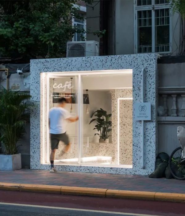
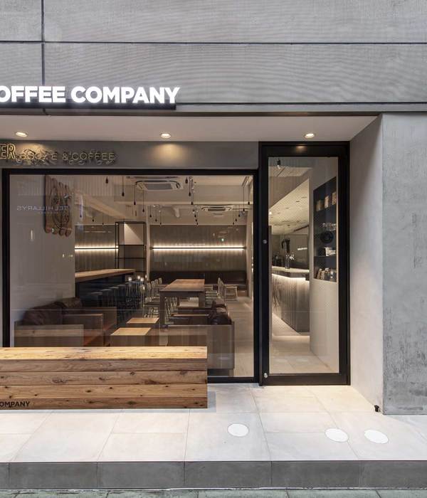
▼项目外观概览,Exterior Overview
▼改造前状态,Before the renovation
The exterior and the adjacent wall are maintained in the same color to enable the space to seamlessly blend in with the street or even “disappear,” thereby drawing attention solely to the contents displayed within the windows. Along the storefront facing the street, the materials employed in the space are thoughtfully curated. The original concrete load-bearing columns serve as a backdrop, complemented by coffee-colored paint to be applied within the space. The remaining metal from the demolition process is artistically reshaped into horseshoe forms and suspended on birch ocean boards that will be incorporated into the interior. The yellow soil below is intentionally directed through the columns, extending throughout the entire space. In addition, a bamboo plant gracefully grows towards the east, nourished by the yellow soil, symbolizing an “editor’s note” for the entirety of the space.
▼尽量融入街景,并成为街景的一部分,Blend into the street scene and become an integral part of it
这是一个狭长的空间,因为朝向原因,下午空间的最末端几乎没有什么自然光线。因此在空间的布置上,将空间安置成为四段,为了把最好的窗外街景给到客人,并希望用餐的客人成为街景的一部分,所以在入口的位置设置了座椅区,然后将中段的位置作为咖啡的点单及制作区域,通过更开放的动线,让咖啡师给前段和中后段的坐位提供服务都更为方便,在空间的最末端,因为已经几乎没有什么自然光,所以作为洗手间来使用。
▼分析图,diagram
This narrow space is characterized by a lack of natural light in the afternoon due to its orientation. To address this, the space has been divided into four sections, each designed to offer guests the best possible view of the street outside. The seating area is strategically positioned at the entrance to maximize exposure to natural light. Through this renovation, the boundaries between indoors and outdoors have been deliberately blurred, allowing the interior to seamlessly incorporate the changing seasons and vibrant street scenes. The middle section serves as a dedicated area for coffee ordering and preparation, facilitating an open workflow that enables baristas to conveniently serve guests in all three sections. Finally, the end of the space, where natural light is scarce, has been allocated for restroom facilities.
▼室内空间概览,Indoor Space Overview
在材料的选择上,贯穿了新生于旧的逻辑,让原始的建筑结构柱、红砖及混凝土墙体都重见光明,保留空间的“骨骼”,并在新材料的呼应下,得以焕发新的生命。新材料的选择上,在人能够接触到的位置,都尽量选择了相对温润的木板,另外其他的所有新建的顶面、墙面、地面上,都混入咖啡粉、不增加任何色浆,直接调色批刮处理,希望因为这次因为“咖啡”而改造的这个场所,就用“咖啡”让材料统一纯粹,通过这样的方式,给予空间使用者“原汤化原食”的体验。
In terms of material selection, the concept of “rebirth from old” is emphasized, highlighting the restoration of the original building structure, columns, red bricks, and concrete walls. Through the integration of new materials, these elements are revitalized. To create a warm and inviting atmosphere, wood panels are predominantly chosen in areas where people can interact with them. Furthermore, all newly constructed ceilings, walls, and floors are blended with coffee powder, without the addition of pigments, and directly tinted and scraped. This deliberate approach aims to provide space users with an authentic and unadulterated sensory experience, emphasizing the use of raw materials throughout.
▼入口的座椅区,The seating area
为了尽可能的引入自然光线,选择了能够全部打开的折叠窗,并希望通过这样的改造,模糊室内外的边界,把四季和街景一并拉到室内。深色的竖向金属承重柱都被完整的保留。
To maximize the influx of natural light, foldable windows that can be fully opened have been chosen. Through this renovation, the intention is to blur the boundaries between the interior and exterior, seamlessly integrating the changing seasons and street scenes into the indoor space.
▼从室内看座椅区,From the interior perspective, the seating area showcases preserved dark vertical metal load-bearing columns in their entirety.
从橱窗处开始贯穿空间的绿植作为链接两个混凝土柱体的“纽带”,上午阳光可以从柱子与墙体中间的缝隙钻进来到绿植区域,营造特别的阴翳美感。
Starting from the display window, the green plants that permeate the space serve as a “link” connecting the two concrete columns. In the morning, sunlight filters through the gaps between the columns and the walls, creating a unique interplay of shadows in the greenery area, adding a touch of enchanting beauty.
▼绿植及等餐座椅区,Green and other dining seating area
▼绿植区域细部,Details of the green plant area
中段的点餐及咖啡操作吧台区别传统的吧台,空间的两侧都设置了开口,让服务动线更便捷高效。
The ordering and coffee preparation counter in the middle section differentiates itself from traditional counters by featuring openings on both sides of the space. This design allows for more efficient and convenient service workflow.
▼吧台区概览,Bar area overview
▼从室内看向入口处,View from inside to the entrance
▼咖啡操作吧台,Coffee preparation bar
咖啡点单对面的位置,在绿植区的上方现浇了混凝土的结构,作为等餐小坐的区域来使用。
Opposite the coffee ordering area, above the greenery section, a freshly poured concrete structure has been incorporated to serve as a seating area for waiting and relaxation.
▼走廊看向后段座椅区
View from the hallway towards the rear seating area
座椅区的对面作为一些日常物品的收纳以及酒水、图书的展示功能出现,下方同样把从橱窗起点的土壤做延续。
Across from the seating area, the space serves as a storage area for daily items and also showcases beverages and books. The yellow soil,originating from the starting point of the display window,extends beneath this area as well.
▼后段座椅区,Back-end seating area
▼座椅及收纳区关系,Relations of seating area and reception area
为了追求和空间其他的材料以及形式的统一,营造一个相对更纯粹整合的空间,餐桌和座椅直接用同样的木板手工制作完成。
In order to achieve harmony and unity with the other materials and forms within the space, a deliberate effort was made to create a relatively pure and integrated environment. As a result, the dining tables and chairs were handcrafted using the same wooden panels, ensuring a cohesive aesthetic throughout.
▼座椅区细部,Seating Area Detail
末段的卫生空间把洗手和马桶间单独分离,提高空间的使用效率。
In the final section, the sanitary facilities have been thoughtfully designed to separate the handwashing area from the toilet area, maximizing the efficiency of space utilization.
▼洗手池及清洁区,Sinks and sanitary areas
空间由于朝向问题,下午开始,最深段没有什么采光,因此设置了两条贯穿空间的氛围灯结合射灯,营造更舒适的用餐体验。
Due to its orientation, the deepest section of the space lacks natural light in the afternoon. To address this, two sets of ambient lights, combined with spotlights, have been installed to traverse the entire space, creating a more comfortable dining experience.
▼下午时分的后端座椅区,Back-end seating area in the afternoon
▼空间细部,Details of the space
▼夜间灯光概览,Night lighting overview
▼空间细部,Details of the space
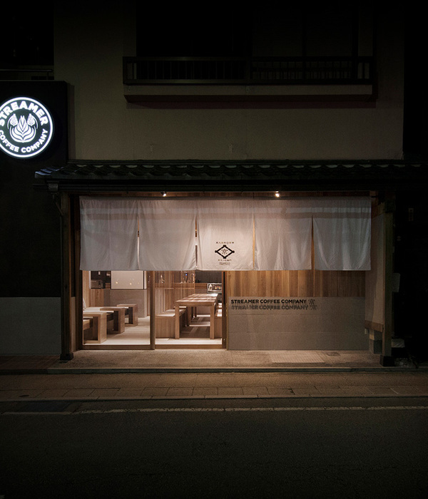
▼深夜后点亮街景,Light up the street after night
▼平面布置图,Floor Plan
项目名称:午马咖啡
项目类型:室内改造
竣工时间:2023 年 1 月
室内面积:48㎡
室内设计:马志成
照明设计:张帆
项目摄影:金伟琦
{{item.text_origin}}

