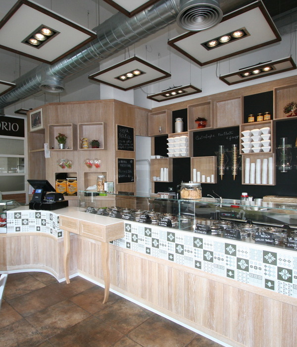
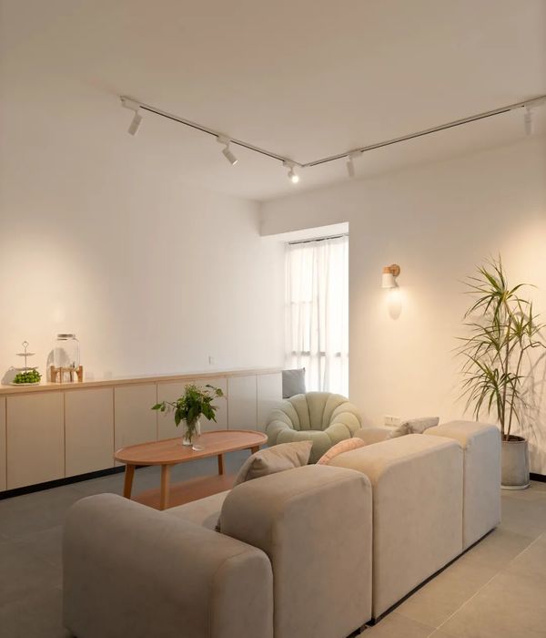
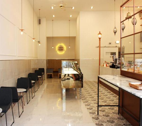
A few weeks before the start of the summer season, two entrepreneurs decide to open a DINO in the Born district of Barcelona and, in just one month, turn an old shoe store into an appealing display for selling ice creams. Time presses, costs must be kept down to the minimum and several corporative elements can’t be missed (logo presence, ceramic tiled floor, ice cream display freezers…).
Jordi Ginabreda Studio proposal adheres to these determinants. Making a virtue of necessity, the economy of means becomes economy of actions. Exposed original brickwork walls, coats of paint in selected colours and visible electric system make up the inside of the business.
From that starting point, the project conceptually spreads out like a big sketch. A series of master lines taking up the space, delimiting outlines and defining different zones.
Lines that demarcate the exhibition and sale area, drawing up a three-dimensional sketch that suggests a traditional ice cream stand and an awning where methacrylate backlit signs announcing the products are hung.
Lines drawn by the visible electrical systems as they go through most of the interior surfaces leading to two singular elements that provide the place with its own personality: the Sole I Palau ceiling fans and the IKEA ARӦD lamps converted into wall lamps. Each one of these elements are lacquered in the brand’s corporate red over a twilight dark blue background.
Lines that shape a neon light ice cream, sparkling illuminated sign for passers-by that complement the mandatory franchise sign.
Just a few lines; quick and easy, as a sketch, as a melting ice cream in a summer night.
{{item.text_origin}}


