- 项目名称:梦醒咖啡厅
- 项目类型:餐饮空间
- 设计师:Lin Qiaojia
- 主题:梦醒
- 空间布局:艺术空间
卓美设计
Zhuo mei Design
我们的使命:把经验传递给有梦想的人
卓美室内设计暑假班学员作品
ZHUOMEI DESIGN
项目名称 |“梦醒”咖啡厅 / Project Name丨Wake up cafe
项目类型 | 餐饮空间 / Project type丨Dining space
设计师 | Lin Qiaojia / Designer丨Lin Qiaojia
WAKE UP CAFE
初醒,品上一杯苦中带香的咖啡是当代多数都市人一天的开端。
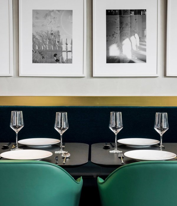
本次咖啡厅设计以“梦醒”作为主题。通过曲面的设计搭配清新怡人的基调,打造一个舒适、雅致又不缺趣味性的咖啡厅空间。柔和的曲线、有趣的家具摆件,软化了整个空间,营造了一种如梦初醒的慵懒感和舒适感;墨绿色作为主基调给人品味咖啡时深沉而不明显,苦涩而又清香的舒适感受。绿色的空间色调,让人置身大自然,吸收纯洁的气味,如梦初醒,精神爽朗,让置身于其中的人们可以静下心来感受当下短暂的美好时光。
Waking Up to a cup of bitter coffee is the beginning of the day for most modern urbanites. The theme of this café is "waking up from a dream" . Through the surface of the design with fresh and pleasant tone, create a comfortable, elegant and no lack of interesting coffee room space. Soft curves and interesting furniture pieces soften the space and create a languid and comfortable feeling like waking up from a dream; dark green as the main tone gives a deep and subtle, bitter and fragrant feeling of comfort when tasting coffee.
The Green Space Tone, lets the human place oneself in the nature, absorbs the pure smell, such as the dream awakes, the spirit is bright, lets expose oneself in which the people may settle down to feel the present brief happy time.
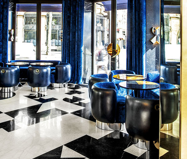
主入口区域是大多数顾客进入咖啡厅的第一个区域,是顾客对咖啡厅的第一印象,因此在空间布局上将它设计成一个小的艺术空间,有趣的雕塑造型,墨绿色的曲面墙体,围绕墙体做的白色曲面灯带与地面黑白花砖的相互搭配,给人一种有趣,雅致的第一感受。细节上,选用光束感较强的筒灯,提高这个空间的艺术感;台阶上简约的金属包边与暖白色灯带,在提醒顾客小心台阶的同时也不忘考虑美观性。
The main entrance area is the first area that most customers enter the coffee shop and is their first impression of the coffee shop, so it is designed as a small art space with interesting sculptural shapes and dark green curved walls, the white curved light band around the wall and the black-and-white tiles on the floor complement each other, giving people an interesting, elegant first impression.
整个空间以墨绿色为整个空间的主基调,搭配黑白地砖和金属质感的点缀,在富有趣味性的同时又不缺一丝轻奢雅致。
The whole space to dark green as the main tone of the whole space, with black and white tiles and metal texture embellishment, while full of fun without a trace of luxury and elegance.
空间中墨绿色的墙面通过曲线蔓延的方式延申到吊顶最后在门洞结束,正好将空间大体分为了两个区域,以墨绿色为主体的一个人流动区和以白色为主体的一个流动性较慢的静区。两个区域又两个巨大的半圆形门洞作为最直接的隔断,在空间划分的同时又能不破坏空间的整体性。
The Dark Green Wall in the space extends to the ceiling by the way of curve spread and ends in the doorway, just dividing the space roughly into two areas, dark Green as the main body of a human flow area and white as the main body of a slow flow of quiet area. The two areas are separated by two huge semicircular openings, which can divide the space without destroying the integrity of the space.
整个空间的细节上,金属铝合金的收边点缀使空间中的墨绿色不会太过于沉闷,反而多了一丝灵动感。吊顶的暖白色灯带自上而下的渐变,形成一种梦幻的感觉,提高顾客对梦境咖啡厅的体验感。统一的空间配色,使整个空间东西虽多,却不复杂,各有各的亮点和趣味性。
The details of the entire space, metal aluminum alloy embellishment so that the space in the dark green will not be too dull, but a touch more dynamic. Ceiling& s warm white light belt from the top down gradual change, forms one kind of dreamlike feeling, enhances the customer to the Dreamland coffee shop the experience feeling. Unified space color, so that the whole space things although many, but not complex, each has its own bright spots and interesting.
咖啡厅前台区域,前台的造型配合整个空间曲线元素的运用,将前台的边角做圆,装饰上也采用与门洞相同的形状做了凹凸的金属处理,提高前台的高档感。底下的踢脚线则提取了花边的形状,搭配暖白色灯带,在美观的同时也富有趣味性。在座椅上也选用了黑色蝴蝶结造型的吧台椅,与底下的花边踢脚线结合,有趣且雅致。吊灯与酒柜的造型同样采用与门洞相同的形状,从而统一整个空间的主要设计元素。并且,酒柜采用挖洞的形式,在不破坏吊顶到空间立面的整体性的同时,增加空间的趣味、美观性。
Coffee Shop Front area, the front of the shape with the use of the entire space curve elements, the front of the corner to make a circle, decorative and the same shape with the door made concave and convex metal processing, improve the front of the high-end sense. The bottom of the skirting line is extracted from the lace shape, with warm white light band, beautiful but also full of fun. In the chair also chose a black bow shape of the bar chair, and the bottom of the lace skirting line combination, interesting and elegant.
咖啡厅的卡座区域,整个卡座由空间的吊顶到墙面再延申下来,使空间更加整体。暖白色的灯带在起到装饰空间的同时,分割了立面的两个面,使几个面的墨绿色墙面不会融在一起。吊灯桌椅的选用上也都是选用了曲面造型的元素来软化整个空间,创造空间想要的那种初醒感。
The cafe& s booth area, the entire booth from the space ceiling to the wall extension down, so that the space is more integral. The warm white light band plays the decoration space at the same time, has divided the facade two sides, causes several surfaces dark green metope not to melt together. Droplight desk chair also is the element that chose curved surface modelling to soften whole space, the kind that creates a space to want is awakened at the beginning feeling。
咖啡厅的沙发区域,一般落座在这个区域的顾客大多愿意静下心来在咖啡厅停留一个美好的午后,因此家具上选用造型有趣、配色简洁、质感舒适的家具来提高顾客的舒适度,让顾客真正感受到在这环境下的美好。由于这个空间给人的感觉都比较简洁,为了不给人一种过于简单的感受,落地灯则选用了一个用花瓣拼凑出来的云朵造型落地灯,花瓣与云朵这种现实毫无相连的两种事物的组合,更像是梦境中才会有的,可以起到不经意的点题效果。拱形玻璃窗,统一了这个空间的元素,金属的包边也提高了这个空间的质感,档次。
The Sofa area of the coffee shop where most customers are willing to settle down for a nice afternoon in the coffee shop, therefore, the furniture with interesting shape, simple color scheme and comfortable texture is chosen to improve the comfort of customers, so that customers can really feel the beauty in this environment.
咖啡厅的多人散座区域,次出入口不同于主出入口有一个单独的过渡空间,因此在次出入口旁边不采用厚重的家具而是采用简单的桌椅来划分与次入口的区域,蒲公英的吊灯与小女孩雕塑正好形成了一模糊的分割线,使次出入口与多人散座区看似是一个整个又是分割开来的两个区域。女孩雕塑上的蝴蝶、抬头准备触碰轻盈的蒲公英、地上多彩的球体、有趣的门造型,都给人一种初醒意识还在梦境的朦胧感、舒适感。
The multi-seater area of the cafe has a separate transition space from the main entrance, so instead of using heavy furniture next to the entrance, simple tables and chairs are used to divide the area with the secondary entrance, dandelion Chandeliers and the little girl sculpture just formed an identical dividing line, so that the secondary entrance and many people scattered area seems to be a whole is separated from the two areas.
咖啡厅的雕塑区域,该雕塑是次出入口的一景观节点,穿墙而过的白色骏马,撞出一堆梦幻的泡泡球,仿佛从一个空间进入另一个梦境般的空间一样。也是希望从这个入口进入的顾客有着同样进入似梦似醒的美好畅想。
The sculpture area of the cafe, a landscape node at the entrance, is a collection of dreamlike bubbles created by white horses passing through the walls, as if from one space into another. It is also hoped that through this entrance into the customers have the same dream-like awakening of the good dream。
设计师访谈 :
卓美设计:
作为一位设计师,您最初学习设计的梦想来自于哪里?
Qiaojia:最初学习设计的梦想是小时候看的交换空间,幻想自己也能有一个好看温馨的房间,所以学习了环境设计专业。
卓美设计:
有设想过下一套作品,是往哪一个方向创作吗?有没有自己特别想融入的元素?
Qiaojia:想创作一套会所空间,想往高端复古的方向创作。设计元素上想提取70、80时年代的港风来进行设计。
卓美设计:
可以分享一下您本次在卓美学习有哪一些收获吗?
Qiaojia:前段时间在卓美学习,首先是把自己那半桶水的软件技术加强,然后就是建模中对细节的处理,怎么做得更真实更美观。细节的处理也让我的作品看起来更加精致更有档次。
卓美设计:
借着最近比较火的综艺节目《乘风破浪的姐姐》,想访问一下,您比较喜欢节目里的哪一位姐姐或喜欢设计界的哪一位姐姐,说说您欣赏她身上哪一些特质;
Qiaojia:比较喜欢张雨绮,有趣得灵魂,活得真实,洒脱。
-以上是作品部分图片展示-
{{item.text_origin}}

