The owners of Newry, a family of four, wanted to renovate their single-fronted terrace home in inner-city Melbourne, on a tight budget. Though the house had already been renovated in the 90s, the two storey addition at the back failed to address the primary issue, a lack of light. The owners asked Austin Maynard Architects to reconfigure their living zone to allow in sunlight and make better use of their limited space.
Keywhole Surgery. Situated amongst a row of adjoined terraces, Newry is a fairly small family home which has been dramatically transformed by a relatively small renovation. As an architectural ‘operation’, it’s akin to keyhole surgery. Here, a small incision has been made to access and fix the problematic central core, to maximum effect.
Through years and years of learning, Austin Maynard Architects have become incredibly incisive dealing with the problems of dark and poorly laid out terraced houses. Though typically, in terms of design and build, the team is more inclined to chop off a limb and add new cyborg arm, the restraints of budget, (as well as ego and eco-conscience), led to a more considered and restrained approach.
The ‘90s addition was structurally sound. The bathroom and laundry at the rear were neat and functional. To demolish, simply because it wasn’t in the ideal location, would have been wasteful. Instead, discipline was required to work with what was already there, implementing strategic moves to solve and improve.
The Core. Apart from new carpets and joinery in all three bedrooms, the front and the back parts of the house remain largely untouched. The ‘rotten’ middle section of the house was gutted, including the old timber floor, replaced by a thermally efficient, hydronically heated, concrete slab. A wall that once separated the kitchen from one of the smallest, darkest, bleakest dining rooms to ever exist, was also removed, opening up the kitchen/living-dining space. The ceiling, and above it a leaky roof deck outside the main bedroom, was also demolished and a large pitched glass roof with sliding awnings installed.
Part of the client brief was to not build bigger but to design better. Their old kitchen had a huge amount of wasted space, which was very inefficient and difficult to access. The space was compact and so the staircase, kitchen, and storage are all combined into one object. A merging of perforated steel and blackbutt timber, concealing doors, drawers, and cupboards. In the centre a beautiful Studio Italia bench provides further storage. The exposed garden has been integrated into a bench seat, optimising space in the dining area.
An indoor garden. The fundamental concern with most terrace houses is a lack of natural light. This problem is generally resolved with some form of light well, open to the sky with some kind of garden greenery at the base. At Newry there is no lightwell, no ‘box’, the garden greenery is inside, integrated within the space, exposed and easily accessed beneath a glass roof that allows for an abundance of natural light.
In a space that is already tight, the question was, why take away indoor space to capture outdoor space? Instead, we focused on the conservatory idea; a glasshouse that brings the outdoors inside, with responsive sliding shade awnings to shield from too much sun. In seconds the raised shading can be remotely closed, (partly, fully, on one side, etc), to provide almost 100% protection from UV rays.
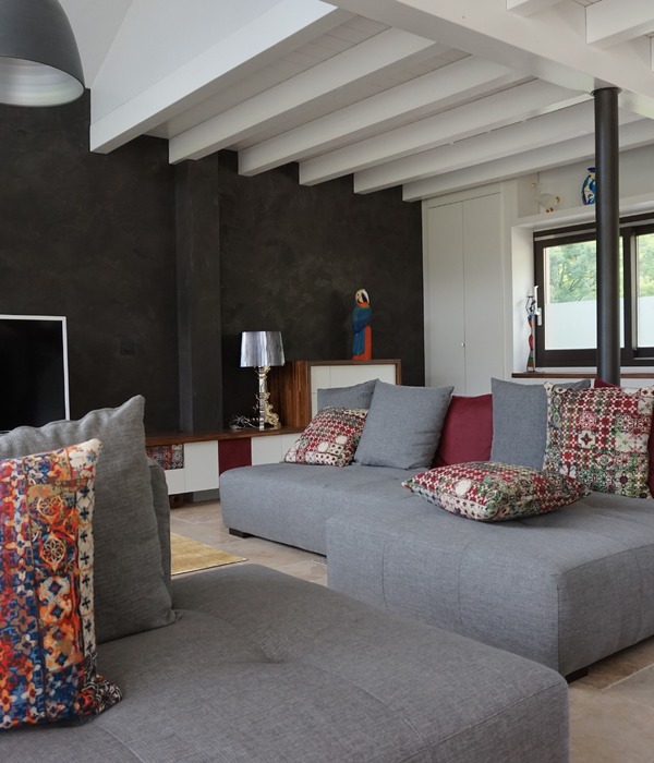
Color run. It wouldn’t be an Austin Maynard Architects project without moments of discovery and delight, although at Newry these were largely thanks to the client’s great taste. The home’s modest palate is dashed with colour that pops and converses throughout the whole house. The perforated steel staircase - bright white but for a surprise twist of vivid green at the top is a nod to the green of the garden and the bench seat. The rich burgundy Tretford carpet in the entrance hall balanced by the sofa in the living room.
Making allowances. Newry is a small project, much smaller than AMA usually undertakes. The clients were locals, neighbours who posed an interesting challenge. They wanted to dramatically improve their home-life and also the way their home performed (on a thermal and sustainable level) but were aware of their limitations and were prepared to pick their battles. Instead of spending their tight budget thinly across the entire site, and compromising everywhere, they chose to completely subvert one area, the main living space, and do it very well. They identified how they lived as a family and prioritised their needs and wants. Focusing on one area is difficult, but it’s a great way to deal with the budget.
Sustainability. Sustainability is always at the core of Austin Maynard Architects’ work. Most old homes, or 80s/90s renovations, tend to be breezy, cold, and thermally inefficient. A few straightforward moves can solve these issues. At Newry, windows and doors have been re-fitted with thermally separated double glazing. Drafty timber floorboards have been replaced with hydronic heated concrete.
The installation of a Tesla battery ensures the home not only performs well but pumps excess green energy back in to the grid. With the ongoing dilemma of air conditioning, caused by increased weather extremes, good design and passive solar gains are not always enough. A solution is to work with the natural elements to ensure carbon zero is attained.
{{item.text_origin}}


