Dikka Bakery in Shanghai is filled with delectable snacks and cream-stuffed bread (yep, you can imagine what I will be eating after I finish fawning over this interior). Chinese design studio Some Thoughts have included colour themes that incorporate comforting brown tones evocative of a freshly baked loaf. Even looking at these colours has me imagining the pillowy texture of baked goods.
Spaced over two levels, Dikka wraps around the southern exit of Shaanxi Road Station with its second level folding above the station’s stone-grey entrance. Its primary entrance stands on the main street front with a stone-arched walkway pushed out to entice pedestrians to walk through the metal door.
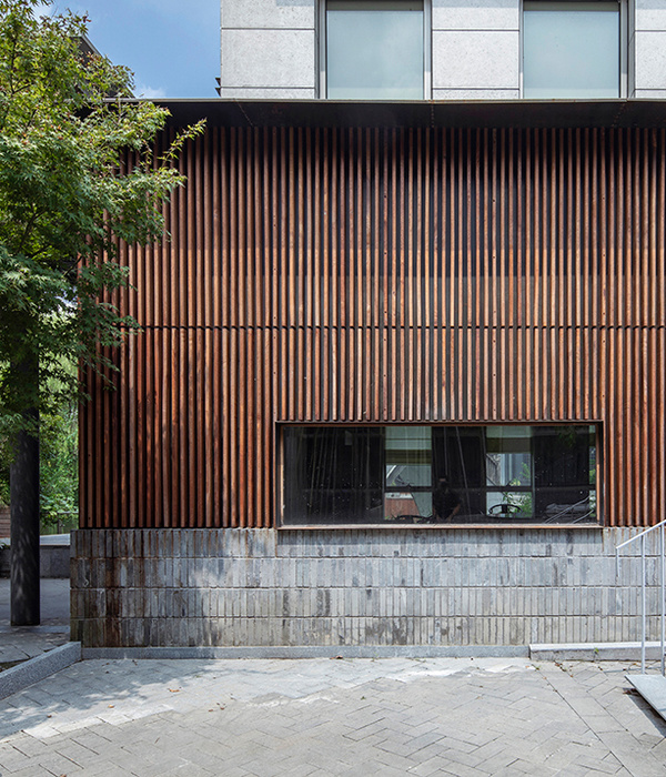
The other side carries a material palette of grandiose orange tortoiseshell and wooden batten façade, blending into the existing building while standing out altogether. Above the station rests a large section of glazing—a soft pull of natural lighting to flood into the floor above, while giving an illusion of openness of the boutique’s interior.
A footprint of 120 square metres, Some Thoughts carefully made use of the tight space through layering and pushing of partitions and nostalgic innovations for a whimsical pit-stop for pedestrians. Like a typical bakery, but stripped of clutter, the ground floor is reduced to a bay of display benches pushed against the wall opposite the main entrance, a screen for display, a singular counter for purchase and a small seating area.
Tucked towards the secondary exist lies a small space for services, including an electronic dumbwaiter that connects to the floor above for logistics. The second floor hosts a similar layout, save for an extra storage area for the dumbwaiter and a joining of cashier and display cabinet area.
Like the electronic food lift obviously executed in sleek industrial tones. Dikka’s interior doesn’t just exude a pastry sensation overload with textured caramel tones on the surfaces, but also the steel notes used on the display benches, shelving and suspended lighting reminiscent of a production line.
The playfulness is hinted in the circulation of the space. The stairs interconnected between the two levels ignite an image of bread rolled out on the production line. A black flipboard that rests on the landing of the staircase with rolling yellow text, echoes the pace of everyday life—one to look at and think of while on the way to collect bread.
[Images courtesy of Some Thoughts. Photography by SFAP.]
▼项目更多图片
{{item.text_origin}}

