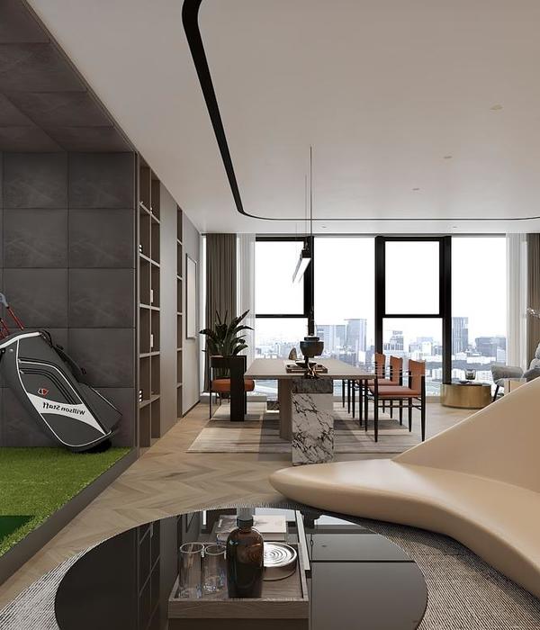
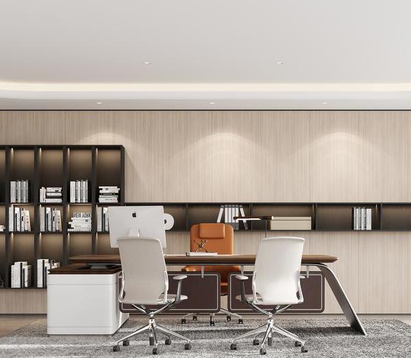
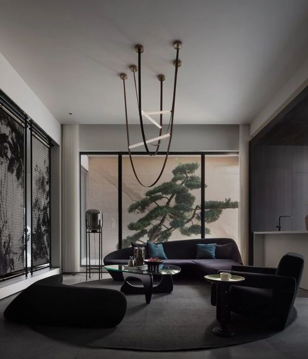
Hitachi Vantara engaged SCA Design to create a new office space in Singapore that reflects their vision and inspires staff, incorporating looping flow, clean palette, warm tones, collaborative zones, themed meeting rooms, and maximizing utilization of irregular spaces.
Hitachi Vantara is located at Suntec City, an iconic integrated development at the heart of the Marina Centre precinct. To conceptualise a new design concept for their office space, Hitachi Vantara engaged SCA to create a space that not only reflects their company’s vision and aspirations but also serves to inspire and motivate their staff.
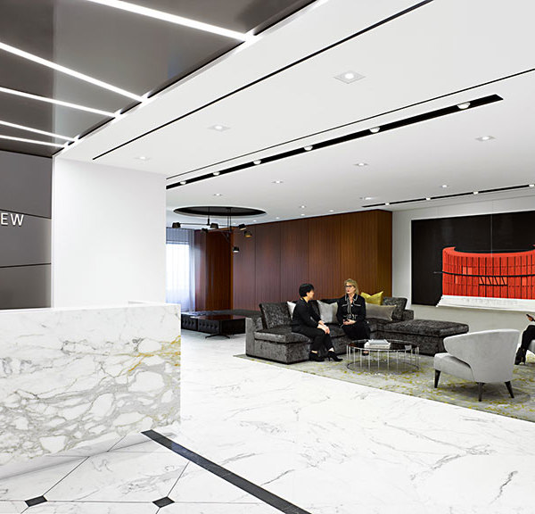
SCA drew inspiration from the infinity symbol to form a looping flow and designed the space around how people move while also maximising opportunities to build connections. The team proposed a timeless mood that was achieved by incorporating a clean and bright palette to reflect a fresh image while boldly opting to expose and paint a section of the ceiling in black. SCA incorporated a layered curved plaster ceiling and LED light strip that seamlessly connects the front of house facilities, including the reception area, demo lab, breakout space, and waiting lounge.
Adjacent to the reception area, is a welcoming lounge and refreshment area. This communal zone comes to life in the mornings as employees gather for coffee and breakfast, creating an opportunity for social interaction and catching up. The beverage point was intentionally created with a warm tone design to delineate this specific area within the larger space. To enhance the visual appeal, a warmer colour palette was introduced, complemented by subtle blue accents that add depth and diversity to the overall aesthetics.
Sofa sets were placed in the space approaching window perimeter. This open zone acts as a waiting space and also a place for colleagues and partners to collaborate and discuss work more comfortably and naturally. Moving further into the space is the Demo Lab, where dichroic film was applied to the glass panel that produces an ever-shifting lens of colour when viewed from different angles.
For the meeting rooms, the team identified an optimal location for the conference room, offering a stunning view and enhancing the overall atmosphere. Besides that, using acoustic panels to refine the interior columns and walls, resulting in a refined frame that elegantly highlights the natural splendour of the outdoor cityscape. The plan was devised to incorporate an operable wall alongside acoustic panels that match, offering flexibility for users to adjust the meeting room’s size to suit various group sizes and types of meetings.
The conference room provides a unique visual experience with colours transforming at different angles to showcasing the room’s versatility and the thoughtful integration of design elements. From one entrance, one can observe a textured baffle ceiling in a light grey hue, while when viewed from the opposite direction, one will see vibrant red accents adorning the ceiling.
The other three meeting rooms are differently themed, with each representing Singapore, Japan, and San Francisco, respectively the firm’s Asia Pacific Regional Hub, origin country, and headquarters.
The most challenging aspect of space planning involved the optimal utilisation of the various small and irregular spaces around the building’s core. The design team brainstormed and transformed all the sharp angles into various functional collaborative spaces, including focus pods, high-touchdown tables, and private phone booths.
This approach aligns with the new office design principles, representing creativity, innovation, and maximising space utilisation, reflecting Hitachi’s Spirits – Harmony, Sincerity, and Pioneering Spirit. The new office design also serves as a bridge, connecting what’s now to what’s next signalling its journey into the future.
Design: :
SCA Design
Photography: :
Owen Raggett
{{item.text_origin}}

