- 项目名称:米米猫宠物医院
- 项目类型:室内
- 设计方:舍近空间设计事务所
- 客户:沈阳市米米猫动物医院
- 项目地址:沈阳
- 建筑面积:300㎡
- 设计团队:舍近空间设计事务所(主创设计师),邵婷婷,叶杉(设计团队)
- 摄影版权:TOPIA图派视觉
◎外立面External wal
l
◎依次为春田1 春田2 米米猫
米米猫MIMICAT—建立专业与爱的宠物医院场所,舍近通过设计语言来描述场所精神,打造清爽、温暖的空间氛围,探索宠物主人与医生、空间的共存关系
MIMICAT -- In order to establish a professional and loving pet hospital place, Shejin describes the spirit of the place through design, creates a fresh and warm space atmosphere, and explores the coexistence of pet owners, doctors and space.
本次项目地点位于沈阳,原始空间结构多以柱子、厚墙体为主,结合北方特性,我们打破常规的宠物医院设计并除去室内一切复杂造型,以“渗透”、“流通”为空间主旨,希望营造专业透明且更具亲和力的宠物医院空间
The project site is located in Shenyang. The original space structure is mainly composed of columns and thick walls. In combination with the characteristics of northern China, we break the conventional pet hospital design and remove all the complicated interior shapes. We take "penetration" and "circulation" as the theme of the space, hoping to create a professional, transparent and more friendly pet hospital space
由外立面向内部空间转换,围绕原始承重柱形成核心区域,四个诊室以阵列形式放置其中,同时我们沿诊室外侧设立等候区,将功能空间围合在中央形成体块连接;
Transformed from the exterior to the interior space, the core area is formed around the original load-bearing columns, where four consulting rooms are placed in an array. At the same time, we set up a waiting area along the outside of the consulting room and enclose the functional space in the center to form a block connection.
◎一层功能分析图Functional analysis diagram
◎功能区围合体块Functional area encloses a mass block
首先进入场所内的是一个吧台,高低错落的体块形式突出结构层次,削弱了整体的拥堵感,同时凹进去的吧台面也可满足宠物主人放置宠物包的功能;
The first thing to enter the place is a bar, the staggered body form highlights the structural layer, weakens the overall sense of congestion, and the recessed bar surface can also meet the function of pet owners to place pet bags;
◎吧台The bar
◎以“圆”增加可视性Holesare used to increase visibility
为了增加中心区域之间的连贯性,我们将等候区与吧台相连,随之向内部延伸,场所中舍弃了多余的造型表现,以方正秩序的空间语言及直白流畅的座位形式让客户感受到就诊环境、从而拉近其与医生间的交流联系;
◎与吧台相连的等候区Waiting area connected to the bar
◎与吧台相连的等候区Waiting area connected to the bar
◎等候区长廊Waiting area corridor
◎三个诊室外侧对应的等候区Corresponding waiting areas outside three consulting rooms
在等候区的另一侧设置了长廊,作为展示医生简介及宠物图片的载体,从局部陈列营造空间氛围,此外,长廊也容纳了米米猫第一家店的部分功能以及物品:鱼缸、毛巾架、叫号电子屏等;
On the other side of the waiting area, a corridor is set up as a carrier to display the doctor's introduction and pet pictures, creating a space atmosphere from the partial display. In addition, the long corridor also accommodates some functions and items of MIMICAT first hospital: fish tank, towel rack, electronic screen for number calling, etc.
◎等候区及展示长廊Waiting area and exhibition gallery
◎等候区及展示长廊Waiting area and exhibition gallery
◎等候区及展示长廊Waiting area and exhibition gallery
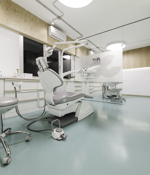
通过建立秩序感诊室将重点功能区聚集在一起,由于诊室内部为暗空间且没有采光,所以我们多使用可视性材料,通过灯光膜和两侧阳光板,提供最大程度的照明体验;
By establishing a sense of order, the clinic brings togetherkey functional areas. Since the interior of the consulting room is a dark space with no light, we use more visual materials to provide maximum lighting experience through light membranes and sunlight panels on both sides.
◎诊室内部Inside consulting room
◎诊室内部Inside consulting room
这条长走廊承载药物仪器归置的功能,我们做了“专业性”的对外展示,是米米猫更加包容开放性的体现,客户可以直观的看到医生检验取药的操作;
This long corridor carries the function of drug instrument placement, and we have made a "professional" display to the outside world. This is the embodiment of the inclusiveness and openness of MIMICAT. Customers can visually see the doctor's operation of testing and taking medicine;
◎化验室及药品储存区The laboratory and drug storage area
二楼聚集中央处置区、药房、手术室、住院部等功能区,彼此之间需要相互串联,因此我们以“九宫格巷道”的形式将其连接,使动线合理化,一定程度上打消独立空间的形式,创造功能、场所和谐共存;
The second floor gathers the central disposal area, pharmacy, operating room, inpatient department and other functional areas. These areas need to be connected to each other. Therefore, we connect it in the form of "nine gong grid laneway" to rationalize the moving line. To some extent, this eliminates the form of independent space and creates a harmonious coexistence of functions and places
◎二层功能分析图Functional analysis diagram
把握空间的功能节奏,专业处置区设置在一层,二层则以简易的处理为主,因此对应着开放式处置区在二层的中心位置,抬高地台的形式与其他功能区形成差异化对比;
Grasp the functional rhythm of the space, and the professional disposal area is set on the first floor. The second floor is mainly for simple processing, so the open disposal area is in the center of the second floor. This area is differentiated from other functional areas in the form of elevated platform.
◎中央处置区Central disposal area
为了打破原始层高限制,顶面使用镜面不锈钢来放大空间,营造无限延伸的视觉感受;
侧面的白板成为二楼的趣味装置,达到通透空间的同时也可以对外展示专业度;
In order to break the limit of the original height, the top surface uses mirror stainless steel to enlarge the space and create an infinite visual feeling;
The whiteboard on the side becomes an interesting device on the second floor, which can achieve a transparent space and also display professionalism.
◎中央处置区Central disposal area
由于原始空间中的墙体不可去除,所以通过做些小窗口可随时观察病房情况;
Because the wall in the original space cannot be removed, the situation of the ward can be observed by making small Windows;
◎二层走廊Second floor corridor
◎病房内部Inside the ward
为了呼应场所主题,我们在空间内尝试了一款新材料:阳光板,通过其不同的颜色、透明度和厚度来营造柔和且舒适的室内氛围。室内外也多处使用该材料,如空间的顶面、立面及收纳装置处;
In response to the theme of the place, we experimented with a new material in the space: sunlight panels. A soft and comfortable interior atmosphere is created through different colors, transparences and thicknesses of sunlight panels. The material is also used in many indoor and outdoor places, such as the top surface of the space, the facade and the storage device;
◎阳光板Sunlight panels
◎等候区的“通透感”"Transparency" in waiting area
◎阳光板的应用Application of sun panels
此外在入口的左侧有个相对独立的区域,这里用作药品储存区。我们希望将“专业性”对外展示,但又要保证一定的私密性,于是用了透明玻璃来做隔断;
In addition, there is a relatively separate area on the left side of the entrance, which is used as a medicine storage area. We want to show "professionalism" to the outside world, but also to ensure a certain degree of privacy. Finally, we used clear glass for the partition;
◎区域间的玻璃隔断Glass partitions between zones
◎一层平面图Floor plan of the first floor
◎二层平面图Floor plan of the second floor
◎
轴
测图
Axonometric draft
◎
项目视频
Project video
项
目名称:
《米米猫宠物医院》
Project name:MIMICAT HOSPITAL
项目类型:室内
Project type:Architecture
设计方:
舍近空间设计事务所
Design:Shejin Space Design Office
客户:沈阳市米米猫动物医院
Clients:Shen Yang MiMi Cat Hospital
项目地址:沈阳
Project location:ShenYang
建筑面积:300㎡
Gross built area: 300㎡
项目设计:
2022.10
Design year:2022.10
完成年份:2023.3
Completion Year:2023.3
设计团队:Often(主创设计师);邵婷婷、叶杉(设计团队)
Leader designer & Team:Often & Shan Ye 、TingTing Shao
摄影版权:
TOPIA图派视觉
Photo credit: TOPIA
往期回顾
SPACE DESIGN·春田宠物医院
SPACE DESIGN·春田分院
SPACE DESIGN·B4box商业社区
个
ESIG
N·B4box
舍近,于2020年成立。团队一直秉承“做难而正确的事情”,坚持设计初心,竭力为业主提供创新、有价值的设计方案.设计团队拥有建筑。室内、软装等相关设计经验;管理团队具备多年品牌定位、品牌策划、项目管理经验.项目覆盖城市广州、北京、天津、上海、杭州、桐庐、金华、秦皇岛、德清、宁波、沈阳,苏州,义乌,长兴共计 14个城市
'She Jin (舍近)' was established in 2020. The team has been adhering to the "do the difficult but correct thing", adhere to the original design, and strive to provide innovative and valuable design solutions for the owners.The design team owns the building. Experience in interior and soft decoration design; The management team has years of experience in brand positioning, brand planning and project management.The project covers guangzhou, Beijing, Tianjin, Shanghai, Hangzhou, Tonglu, Jinhua, Qinhuangdao, Deqing, Ningbo, Shenyang, Suzhou, Yiwu, Changxing, a total of 14 cities
{{item.text_origin}}


