The Smile Academy is a human based designed clinic where the greenery is involved within the dynamic, comfortable, living place. Unique via its plain but yet surprising style, clinic presents a variety of places to explore. Altering the perception of a clinic being an uncomfortable, scary place, smile academy offers a peaceful environment for both the visitors and staff. Having these features, this policlinic creates a new style of “health space” for the city.
The project site is in Gaziantep, one of the biggest cities in the east of Turkey, on a busy boulevard. The spatial characteristics of this two storeys high interior is similar to a store typology, where the entrance has a big gallery opening with a huge glass facade yet no other windows. Project aimed to transform these restrictions of the existing space into positive effects.
Natural ventilation and natural light are particularly important elements of a policlinic. The potential of having a double-height ceiling inspired the designers to locate both of the examination rooms on top of each other benefiting from the facade. The “Mega Box” (having known that the word is “box” defining the examination room in the clinics) has a steel-structure and it is constructed on the front side of the clinic. You can access to the clinic room from the second floor passing through a small lounge area with. The “Mini Box” that is located on the mezzanine floor has a contemplating look to the “mega box” element. These architectural elements appear on the main display window and they emphasize the typology of the policlinic.
The policlinic is designed with functional motivation and yet bringing out the aesthetic characteristic of a clinic design. The composition of materials are decided via the functionality of both the clinic rooms and public areas. Creating a contrast of clear glass and semi-opaque glass materiality emphasizes on the different usages of spaces. The clear glass creating the façade of the main entrance area, ensures to perceive the depth and to understand the two soreys height of the policlinic. The reception is located under the double-height celling and it is enriched by the implement of monumental hanging lighting armatures. The “Mega Box” masses façade is semi-opaque as privacy is needed while the main entrance and reception is totally covered with a clear glass drawing the attention of the potential visitors. This co-existing enriches the space and creates the dynamism on the main facade. The building aims to emphasize the academy identity in the memory of the citizens and to exist as an example of human centered designed clinic in the city.
Considering to maintain the spatial necessities and functional usages of the program the designers located the circulation areas and the main public areas in front part of the clinic. Keeping the double-height of the reception area, designing comfortable waiting rooms with alternative usages, locating two clinic rooms on the facade; generates both a functional and visual compact integration within the space. The configuration of waiting rooms creates alternative lounge areas full of surprising usages that aim to reduce the anxiety of waiting and dental operations. The digital point where you can watch informative videos, reading point, child-based waiting area and the main lounge areas where you can simply watch the TV are designed for users to have a choice between the passive and active waiting.
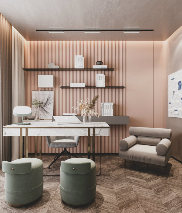
The choices of materials and colors are mainly kept simple and neutral for the minimal designed spaces to create modest and calm identity for the policlinic. The details are enriched via the usage of signage, graphic designs and lighting fittings for the visitors feel positive and cozy within the place. Multi-functional minimal furniture that are designed in the intersection points of the waiting lounges and circulation exhibit themselves as bookshelves, news points, kitchenette, memory board and storage. The whole composition of the space is designed to ease the human psychology by using natural stone, plants, zen gardens and the simplicity of colors and textures.
By designing creative and user-friendly places within human centered design, the clinic aims to both be the center for the specialists of the dental sector in the city and to be perceived as a policlinic where the visitors feels at ease, sterile and technically up-to-date health space.
Year 2016
Work finished in 2016
Client Selim Gunsoy
Status Completed works
Type Hospitals, private clinics
{{item.text_origin}}


