The art house by BMArch
The art house by BMArch
The art house by BMArch
The art house by BMArch
The art house by BMArch
The art house by BMArch
The art house by BMArch
The art house by BMArch
The art house by BMArch
The art house by BMArch
The art house by BMArch
The art house by BMArch
The art house by BMArch
The art house by BMArch
This three story house in the Sharon district was planned as a new building on top of a rectangular lot, 512 square feet in diameter. The house was placed on the lot according to its proportions, so that the narrow façade faces the street and the back garden. The house is one half of a duplex with a shared wall length-wise, and so the functions had to be divided so that all spaces remain well-lit and ventilated.
We treated the shared wall between the houses as an opportunity – A long element that the inner spaces “approach”, but also distance themselves from. On this continuum we placed, on the ground floor, the dining room, the patio, the lobby and the living room, their glazed sides creating a visual “flow” with the wall, connecting the indoors and outdoors – Starting at the frontal garden all the way to the back garden. The patio is used like a forth façade for the house. It was designed as an outdoor space with features typically seen in indoor spaces – The flooring inside the house continues here too. On the patio wall in front of the lobby, an art piece was hung up, as if the wall belongs indoors. The art piece works harmoniously with the ones inside the house, some of which were made by the house’s owner himself.
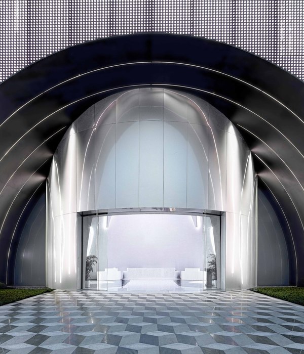
The house’s entrance is in the center of the long façade. A wide, tall aluminum door opens into the lobby – From which all of the houses’ activities originate throughout each and every floor. The lobby has a double ceiling with a “bridge” in the center that connects the two wings of the first floor.
The living room is divided into two sitting areas, furnished with an abundance of color – The big aluminum doors allow the garden and the pool to work in sync with the space. The pergola has a white sail stretched above the sitting area to provide shade. Together with the design of the outer railings around the balconies, as well as the round bathroom window overlooking the back garden, the concept of the houses’ design was formed, inspired by boats, as per the house owners’ wishes.
The glass wall on which the house owners’ art piece is printed, accompanies the serrated stairs instead of the traditional railings.
On the first floor, the children’s wing faces the street. The rooms have a big window facing the façade and a small balcony. The parents’ wing is located so that it faces the back garden. A “bridge” that’s built right next to the patio and the lobby allows access to this area, creating a separate, private wing for the parents. The room has a big display-window, which leads to a balcony, facing the garden and overlooking the swimming pool. The room is spacious, and a wall in the middle of the room separates the closet and the rest of the room, so that it also functions as backing for the parents’ bed.
Status: Current works
Type: Single-family residence
{{item.text_origin}}


