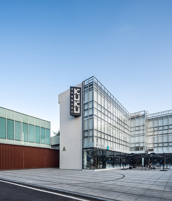
Qualicer奇丽砂|微型综合体本案是以出口瓷砖品牌-奇丽砂在中国陶瓷城的展示中心。从我们的调研到最后的定位,从品牌视觉、展品美学和空间展示都进行了“重新定义”。对于陶瓷行来的业态多样化与消费享受化,引导了行业升级与变革,我们从概念方案上以“微型”综合体来设计奇丽砂的新店。
商业综合体的概念,源自"城市综合体"的概念,城市综合体是以建筑群为基础,融合商业零售、商务办公、酒店餐饮、公寓住宅、综合娱乐五大核心功能于一体的"城中之城"。而我们这个展厅更希望能通过“功能”空间构成一股串联感,让整体意境更清新,也顾客在环境里有探寻和发现转变成逛街的乐趣。
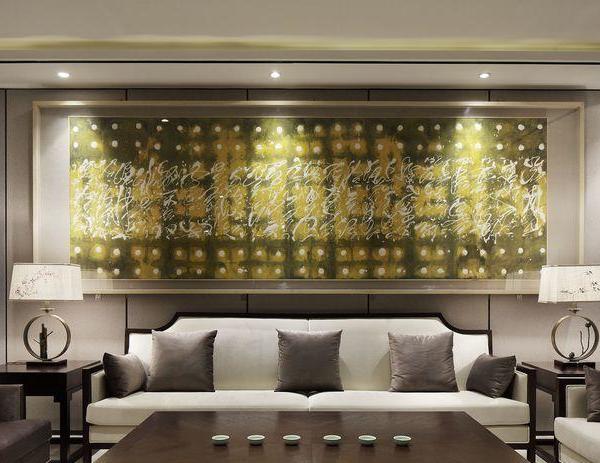
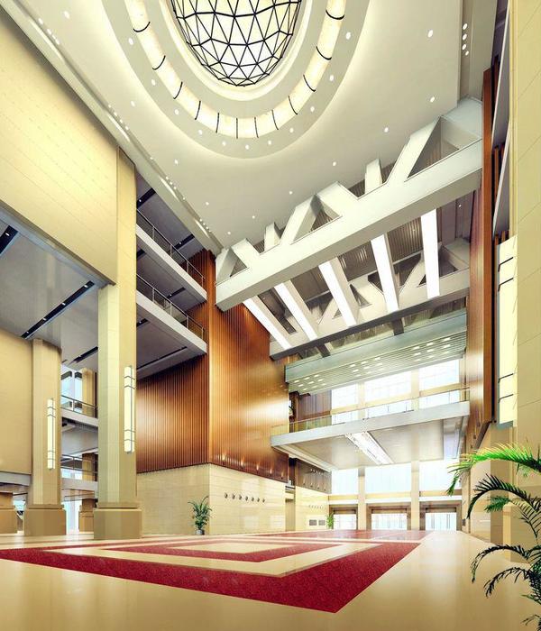
从精品酒店式的体验空间为入口,放大的门口形成橱窗般显纳客之态。地面选用了鱼骨纹拼法的卡拉拉地面。墙身是奇丽砂独有的浮雕产品以清波搭配。一实一虚,展现立体空间之余,赏景般浏览瓷砖之美。让材料展示融于无形,而形象台用的是真石材意大利卡卡拉。取于自然而胜自然的对比。增加几份瓷砖之美。再到室内的街道空间更是一次新的功能体验的开始。皮包店、服务店、餐厅、茶道、选材区。我们摆脱了传统而制式的产品展示态度,以产品应用差异化为宗旨。强调空间的功能性和产品的趣味性。从一个空间到加一个空间在过渡中细致而整齐的让瓷砖产生一个展示的位置,每个情境区都像一家完整而独立的商铺。让瓷砖与整体空间融合而形成一个综合体的空间。
除了对空间的趣味性进行了新的演译,我们在灯光上也做了智能化的设计,对空间进行了情境化和功能化的梳理。加强了动和静的情境体验。让顾客在空间里有更强的互动感。
This case is to export tile brand - Qili sand in the Chinese Ceramics City Exhibition center. From our research to the final positioning, from the brand vision, exhibits aesthetic and spatial display have been re defined". For the ceramic industry diversification and consumption enjoyment, and guide the industry upgrading and transformation, we from the concept of the program to "micro" complex to design qilisha Hsintien.
The concept of commercial complex, from the concept of "urban complex", the urban complex is to buildings based on integration of commercial retail, commercial office, hotel catering, apartments, comprehensive entertainment five core function in one of the "city within a city". And we hope that this exhibition hall through the function space constitute a series of sense, so that the overall mood is more fresh, but also in the environment in which customers have to explore and discover the joy of shopping into.
From the The Inn Boutique style of the experience of the space for the entrance, the entrance of the window to form a display of the status of the window. The ground with herringbone spelling Carrara ground. The wall is unique to sand relief products Qili Shiba collocation. One is a virtual reality, show the three-dimensional space, enjoy the beauty of the ceramic tile. Let the show into the invisible, and the image of Taiwan with a real stone of Italy's. Compared with the natural and natural. Added a few tiles of the United states. And then to the interior of the street space is a new experience of the beginning of the function. Bag shop, shops, restaurants, tea ceremony, material area. We get rid of the traditional and standard products to show the attitude of product differentiation for the purpose of application. Emphasize the function of the space and the interest of the product. From a space to add a space in the transition carefully and neatly to produce a display of the location, each situation is like a complete and independent shops. Let the tiles and the overall space integration and the formation of a complex space.
In addition to the interest of the space for a new interpretation, we have done in the light of the intelligent design, the space of the situation and function of the comb. Strengthen the dynamic and static situation experience. Allow customers to have a stronger sense of interaction in space.
{{item.text_origin}}


