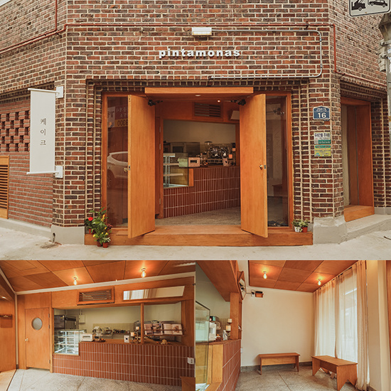
就像品牌名称'Gyeongseong'一样,我们希望表现出新与旧之间的和谐美感。因此我们把现代东方的概念将质朴宁静的形象与精致简约的风格融合在一起。由于现有建筑的外观具有如此鲜明的特征,我们担心这会造成室内外的脱节,因此决定需要一种有层次的设计连接。所以我们将曲线特征移植到了室内的天花板造型上。现有的混凝土天花板和新建的自由弧形天花板都是为了在这个并不宽阔的空间里营造出一种地域感。
Like the brand name 'Gyeongseong', we wanted to express the harmonious beauty between the new and the old. We therefore took the concept of the modern oriental and fused the image of rustic serenity with refined simplicity. As the exterior of the existing building had such a distinctive character, we were concerned that this would create a disconnect between the interior and exterior and decided that a layered design connection was needed. So we transferred the curvilinear character to the interior ceiling mouldings. Both the existing concrete ceiling and the new free standing curved ceiling were designed to create a sense of place in this not-so-expansive space.
咖啡馆内部包括销售区、烘焙室、工作区、用餐区和独立的男女卫生间。由于空间不大,我们认为将空间分区自然连接而不是分开是合理的。烘焙室位于吧台的后方,用餐区位于吧台的前方,这样顾客可以自然地看到吧台和烘焙室重叠在一起。此外,在吧台一侧创建的动线将销售空间置于在咖啡馆内吃饭或散步时自然会看到的位置,使得从空间的任何地方都可以看到销售区。
The interior of the café consists of a sales area, a roasting room, a work area, a dining area and separate male and female toilets. Due to the small size of the space, we thought it would make sense to partition the space to naturally connect rather than separate. The bakery is located behind the bar and the dining area is located in front of the bar so that customers can naturally see the bar and bakery overlapping. In addition, the dynamic line created on the side of the bar places the sales space in a position where it would naturally be seen when eating or walking around the café, making the sales area visible from anywhere in the space.
整体材料的选择以东方建筑的色彩和纹理为基础。首先,墙壁和天花板用米色灰泥拼接,让人联想到土墙,现有的混凝土柱和水泥砖墙被暴露出来,并与现有的建筑元素重新组合。地面铺设了栗色复古地砖,营造出温暖自然的整体视觉流线。顾客围坐在窗边的长椅子是用与地板颜色相近的粘土砖制成的,以保持温暖的形象,并提供材料的多样性。在这种温暖的背景下,家具可以像古老的韩屋那样厚重质朴,也可以像现代物品那样冷峻精致。
The overall choice of materials is based on the colours and textures of oriental architecture. Firstly, the walls and ceilings are spliced with beige stucco, reminiscent of earthen walls, and the existing concrete columns and cement block walls are exposed and reassembled with the existing architectural elements. The floor is covered with maroon vintage floor tiles, creating a warm and natural overall visual flow. The long chairs where customers sit around the windows are made from clay tiles in a similar colour to the floor to maintain a warm image and provide material variety. Against this warm backdrop, the furniture can be heavy and rustic like an old hanok or cool and sophisticated like a modern item.
吧台由不锈钢制成,经过磨砂板的手工打磨,质感粗糙,而造型则非常简化和现代化。空间内部没有任何现成的东西,所有东西都是与木工和金属工一起制作的。从外面一进门,首先映入眼帘的是一张立桌,它是由木头堆叠而成的原始形式,材料交接处的接缝设计旨在展示家具的细节。咖啡桌由原木切割而成,每张高度不同,但桌面由不锈钢制成,与原木形成鲜明对比。灯罩由锤击铜制成,灵感来自灯笼的形状,表面经过锤击处理,与之相对应的是一根细长的抛光不锈钢管。手柄由红铜制成,触摸时会自然变色,从锤击量到加工细节,每一个环节都与产品的设计一样细致入微。
The bar is made of stainless steel, hand polished with frosted panels for a rough texture, while the styling is very simplified and modern. There is nothing off the shelf inside the space, everything was made in conjunction with the carpenters and metalworkers. The first thing that strikes you as soon as you enter from the outside is a stand-up table, which is made of wood stacked in its original form, with seams where the materials meet designed to show off the details of the furniture. The coffee tables are cut from logs, each at a different height, but the table tops are made from stainless steel, contrasting with the logs. The lampshade is made of hammered copper, inspired by the shape of a lantern, with a hammered finish, against which is a slender tube of polished stainless steel. The handle is made of red copper, which naturally changes colour when touched, and every aspect of the product is as meticulous as its design, from the amount of hammering to the finishing details.
Interiors:ProjectMark
Photos:ChoDonghyun
{{item.text_origin}}

