- 项目名称:BUDGREEN 潮字空间
- 品牌:芽绿
- 空间定位:新派潮菜
- 主题色系:金色,绿色
芽绿作为品牌的第二家餐厅,以潮州手工菜为主的整合料理。在和业主沟通品牌之初,提到新派潮菜。也因为理解的偏差,巧妙的把空间定位于潮的字眼上,有别于原来的潮州印象。
As the brand's second restaurant, BUD GREEN offers integrated cuisine based on chaozhou handmade dishes. At the beginning of brand communication with the owners, mentioned the new style chaozhou dishes. Also because of the deviation of understanding, the space is cleverly positioned on the words of "chao"(tide、trend), which is different from the original impression of Chaozhou.
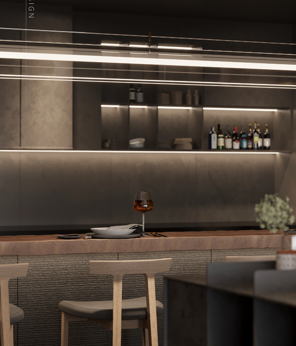
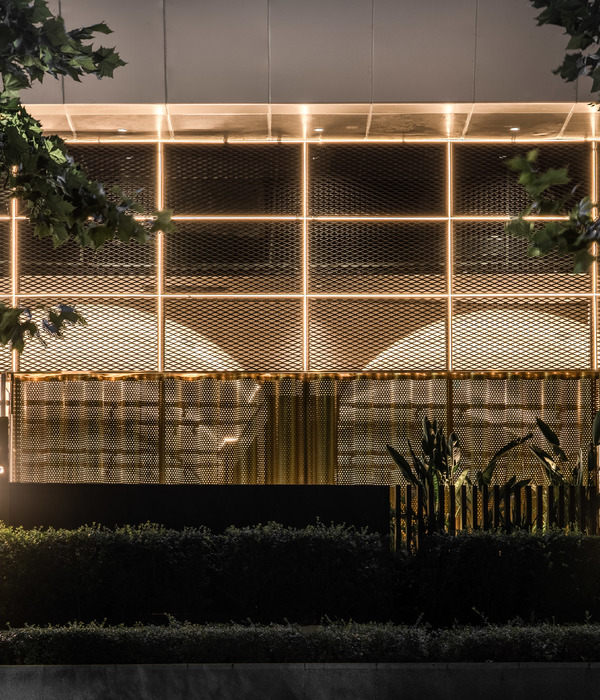
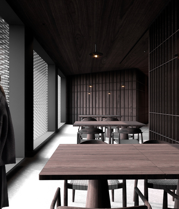
提取品牌VI中的主题色系:金色、绿色,运用铜板切割模仿传统砖饰拼贴、拉丝金属隔断按建筑门窗格栅形体进行分隔、电镀金属网天花传达布曼的形体感,用当代材料和手法展示传统形体及神态。
Extract the theme color system of brand VI: gold and green, use copper plate cutting to imitate the traditional brick act the role of collage, wire drawing metal partition to separate according to the shape of building door and window grids, electroplate metal mesh ceiling to convey the body feeling of Curtain, with contemporary materials and techniques to show the traditional form and expression.
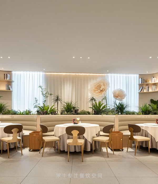
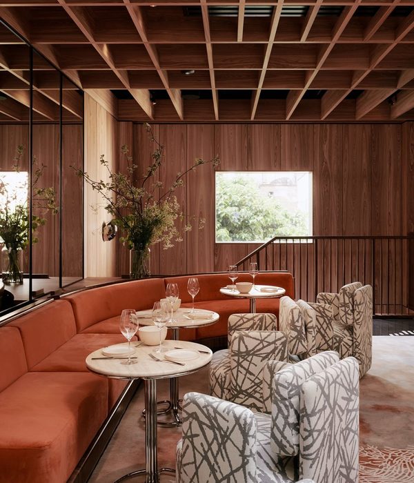
为了满足不同的消费群体,桌椅采用了多种形式组合。还有周末的家庭客群,特别增加了两个包间,且以折叠门进行区隔,让空间的灵活性最大化。
In order to meet different consumer groups, tables and chairs are arranged in various forms, for the weekend family guest group, especially added two private rooms, and separated by folding doors, to maximize the flexibility of the space.
{{item.text_origin}}

