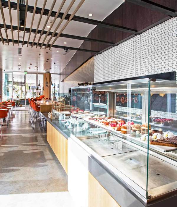
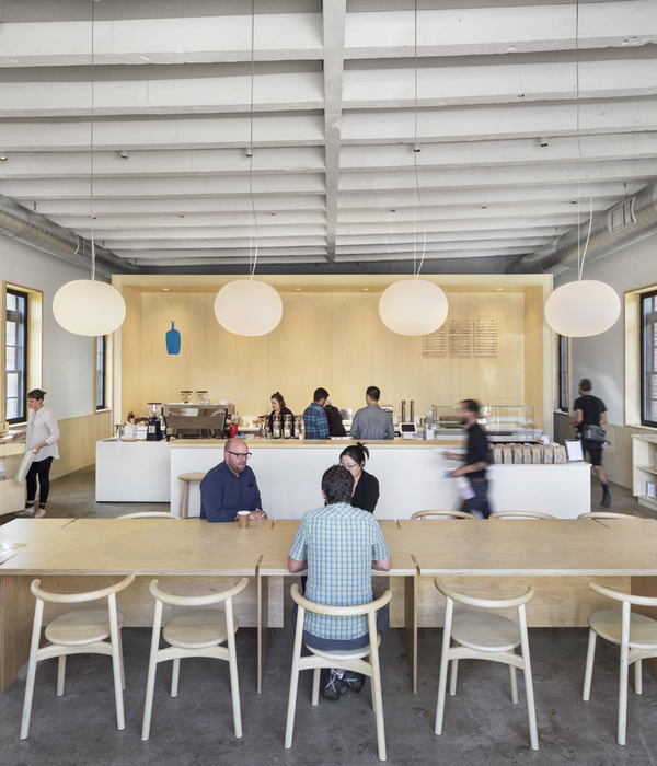
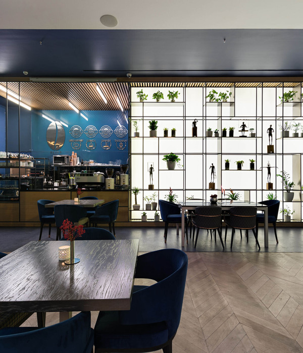
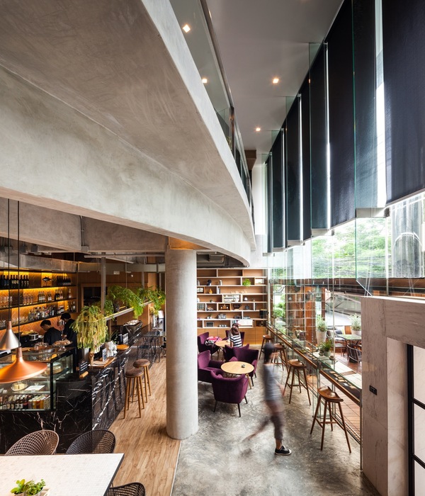
The brief - As typologies of cafés become more than just an eatery, and transforming into art galleries, co-working and gathering spaces develop around the world – the design brief of Modernist Coffee was to cleverly unite various concepts. Using the brand’s idea of ‘Spaces, People and Coffee’ to intermingle and flow into each other, the café was to be conceived as a modern crossroads where coffee culture seamlessly merged with art and public life.
The idea - By taking the client brief forward, and pushing the boundaries of what a “new café typology “means- we evolved fresh ideas about how the café, art and performance spaces could coexist and thrive. We decided to create seamless partitions, infinity water body and green terraces to expand the experience of just having a cup of coffee.
The design intent - Part of The Crossboundaries rapidly evolving signature style, this café was approached with a fresh outlook on materials, textures and meaning of art. By using materials in their raw, true form, as well as exhibiting the properties of ageing and distress on them, we intended to create a unique experience of savoring coffee. An open bar and service counter was envisioned, to give a free-flowing customer and barista relationship.
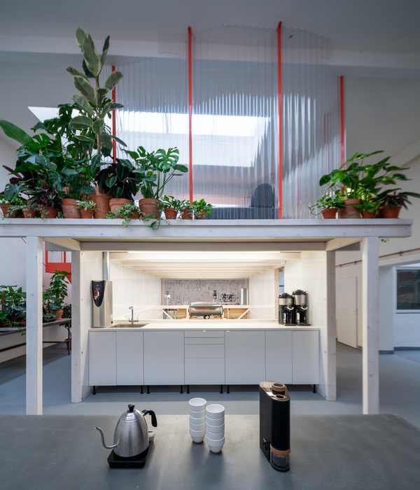
The site - There are very few places in our growing city which offer us solace, good views and ample space to breathe. The site chosen by the clients for Modernist came with these coveted benefits, as well as 2 beautiful open to sky terraces to let the wind and sun in. We decided to make most use of these spaces, as well as turn the café into an open plan, barrier free layout suitable for art exhibitions and gatherings. What is more comforting than the aroma of coffee wafting through an open space!
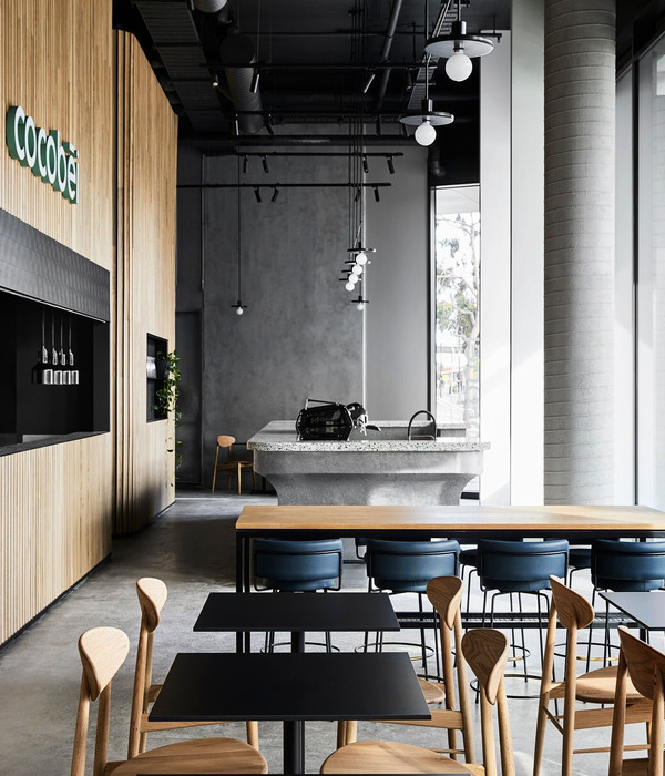
The material palette - In keeping with our design philosophy of experimenting and innovating with a wide material palette, we used metals, wood and dressed plaster to its fullest. With seamless dark micro-crete flooring and exposed brick cladding, the aim was to give a raw, unfinished and edgy look. Sleek metal partitions with clear glass are used, to give a sense of openness. As part of an ongoing quest of art, we created lighting fixtures and sculptures out of jute and fibre- these are displayed around the café.
The highlights - Necessity creates innovation, and we always look for challenges to innovate! A great example is the precisely calculated bent lights running on a grid. Running across the ceiling and along the beams, an array of bent- GI pipes, grouped equidistantly, and fluidly ending at different lengths. The pipes terminate in a bent curve, with a cylindrical spot-light fixture at its end. The radius of each curve has been carefully calculated and executed in place, to precisely illuminate a spot. Also, apart from designing lights to highlight artwork, some light fixtures themselves have been designed as a work of art! In the central bay, linear lights spanning between beams are uniquely fashioned out of brown medicine bottles and metal sheeting and is named “cyclotron”!
Another unique feature of this café is the furniture selection, which forms a physical catalog of the eclectic furniture brand, Olvvi. Stools, café tables, high chairs and loose furniture – all are part of the furniture brand’s display where it is playground of furniture to buy from within the café itself.
{{item.text_origin}}


