Architect:Perkins&Will
Location:Dallas, Texas, USA
Project Year:2020
Category:Offices
Signify Health is a company built for a purpose: to enable more happy, healthy days at home. Signify has built a leading healthcare platform that leverages advanced analytics, technology, and nationwide healthcare provider networks to create and power value-based payment programs to deliver on that mission. The people who work at Signify have a common purpose of inventing ways to help families, neighbors, and our country live better. This kind of work attracts a diverse group of talented people who come together to solve some of healthcare’s most complex challenges. To have a physical space that nurtures this mission-driven culture and focuses on wellness for its employees, Signify Health tapped Perkins&Will for its expertise in interior design, workplace strategy, and change management of its office in Dallas, Texas.
Peter Molick
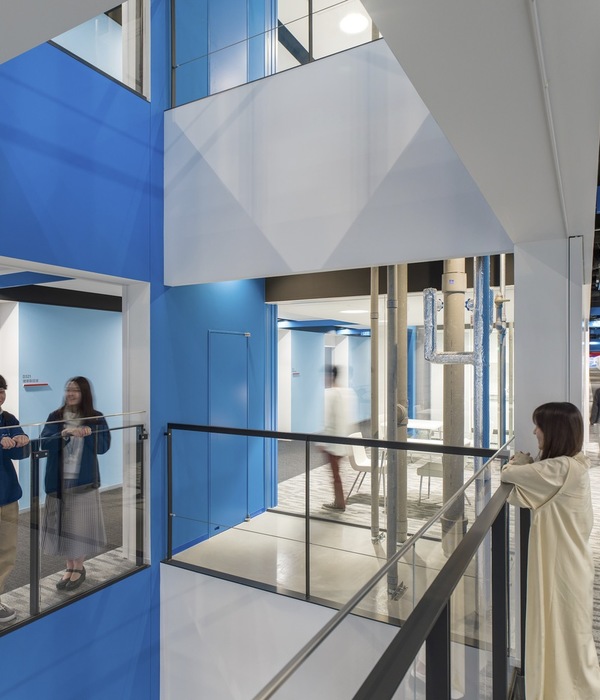
Signify Health desired interiors and a strategy that offered a refreshed sense of connectivity to bring together its culture and people. Influenced by Signify Health’s existing company culture, Perkins&Will incorporated a dynamic workplace model inspired by its forward-looking nature. Working in tandem with the Signify Health team, Perkins&Will developed a wide variety of appropriate space solutions for the company’s differing needs. The design team equipped the flexible office with collaborative work areas dispersed with meeting and breakout rooms to form “workplace neighborhoods.” The intention was to create transparency and accessibility, like a “living organism,” thereby tying the design theme back to healthcare and the company’s dedication to well-being.
Peter Molick
A must-have feature for the renovation was the monumental staircase, conceptualized in collaboration with Big D Metals, to represent connectivity physically and metaphorically throughout the firm. The staircase promotes access to the executive team, while the tiered wood platform at the foot of the stairway serves as additional seating space, thereby enabling large town hall meetings. Similarly, there is a standout community area adjacent to the stair that is solely dedicated to employees, which provides them with a space to gather, eat, unwind, and get to know each other. Large training rooms and office space round out the floor.
Peter Molick
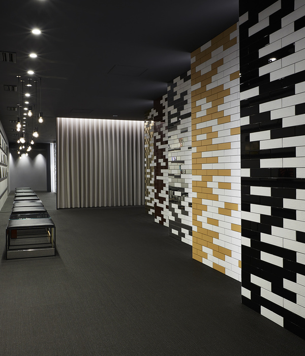
Wayfinding elements such as paint graphics were applied to the walls that extend to the sealed concrete in exit stairs and elevator lobbies, providing pops of color throughout the building. Beyond vibrant graphics, shades of grey with splashes of copper, orange, and blue complement Signify Health’s new branding. The design team also used pendant lighting to brighten the office further and arranged these pieces in sculptural groups to add a sense of whimsy to the space.
Peter Molick
Perkins&Will incorporated sustainable elements throughout the project, inspired by the three certification programs: LEED, Well, and FitWell. The finished materials selected for Signify Health’s office interiors were vetted through Perkins&Will’s material health program, which is committed to reducing and eliminating any substances of concern in the built environment linked to negative impacts on human health. To the highest degree possible, the materials and products selected for Signify Health prioritized those that do not contain substances on Perkins&Will’s Precautionary List, including low volatile organic compound (VOC) materials. Another aspect integral to the design was the inclusion of eco-friendly and energy-efficient products such as low flow plumbing fixtures and motion sensor dimmable LED light fixtures. Other sustainable and wellness highlights include the durable and environmentally responsible sealed concrete floors that define each floor’s main circulation path and accent paint found on each stairwell floor and walls further promotes walking and an active lifestyle for staff.
Peter Molick
Signify Health’s new office gives employees a supportive and encouraging work environment that will help the company continue to provide comprehensive care where and when needed most. Through meticulous design and programming, Perkins&Will captured an atmosphere of health and happiness reflective of the healthcare brand’s wellness-focused values.
The project spans approximately 148,278 square feet across six floors.
Material Used:
1. Flooring: Carpet – J+J flooring & Shaw Contract
Porcelain Tile – Stone Source
Concrete Floor Paint – Benjamin Moore Floor Enamel with Corotech Sealer
2. Storefront: Raco Interior Products, Solutions II
3. Solid Surface: Avonite
4. Metal Screen: Fabricoil
5. Wood Ceiling: Grade AC, Plain-Sliced Baltic Birch Fire Retardant Treated Plywood
6. Wood Platform: Dooge Rustic Knotty White Oak, FSC Certified. Flat Cut and Quartered
7. Interior furniture: Haworth
8. Staircase: Big D Metals
9. Lighting: “V” Shaped Lights – Prudential
Decorative Pendants – Muuto
Typical Office Lighting – EELP, Flat Panel Luminaire 2x4
▼项目更多图片
{{item.text_origin}}

