太空探索主题艺术涂料概念店 | 意库马成都 130㎡设计惊艳!
- 项目名称:意库马艺术涂料成都概念店
- 项目地址:中国·成都康普雷斯
- 项目面积:130㎡
- 主案设计:李杰
- 项目摄影:404NF STUDIO
- 完工时间:2022年4月

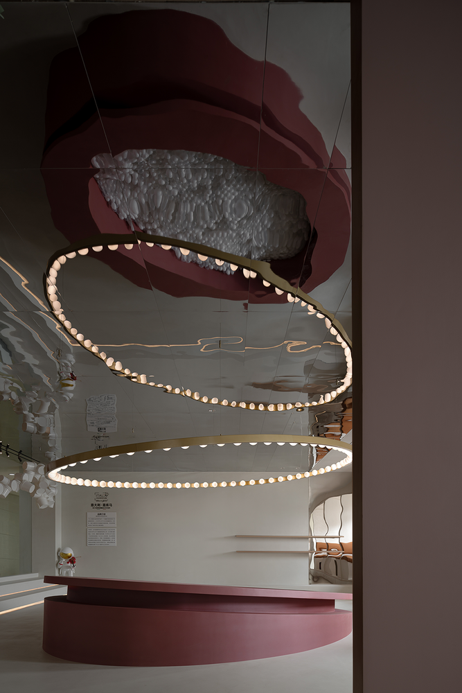
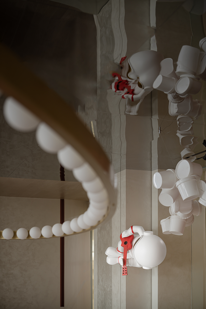
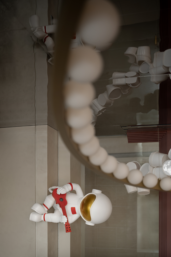
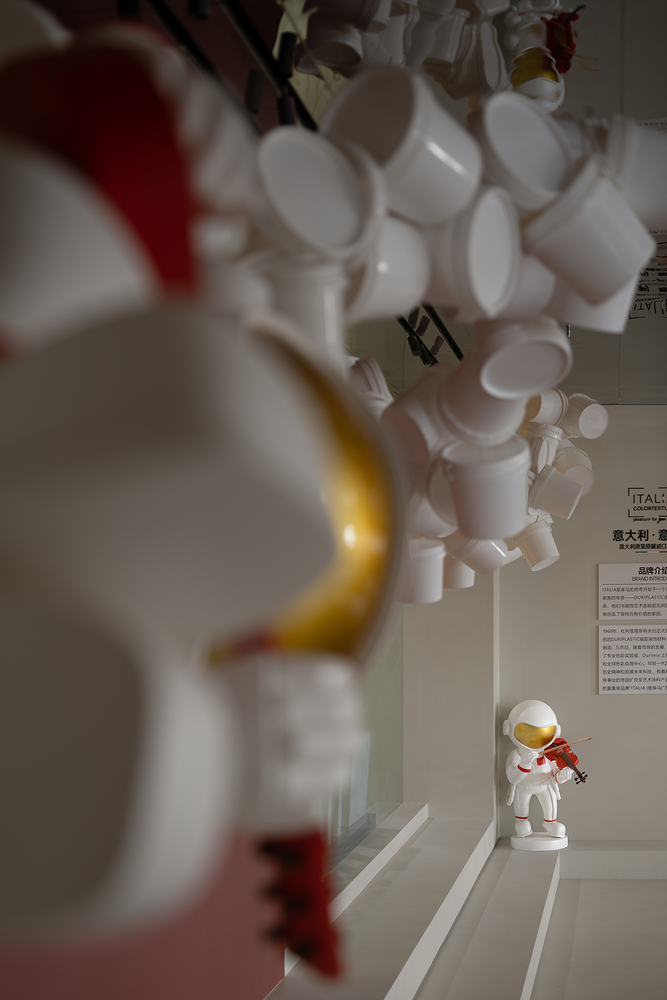
以太空探索为基调,表达品牌的探索精神;用油漆桶做成的艺术装置像极了太空的陨石;太空人+音乐的形象,让空间灵动有趣;Take space exploration as the keynote to express the brand's exploration spirit;The art installation made of paint bucket looks like a meteorite in space;The image of astronaut + music makes space flexible and interesting;
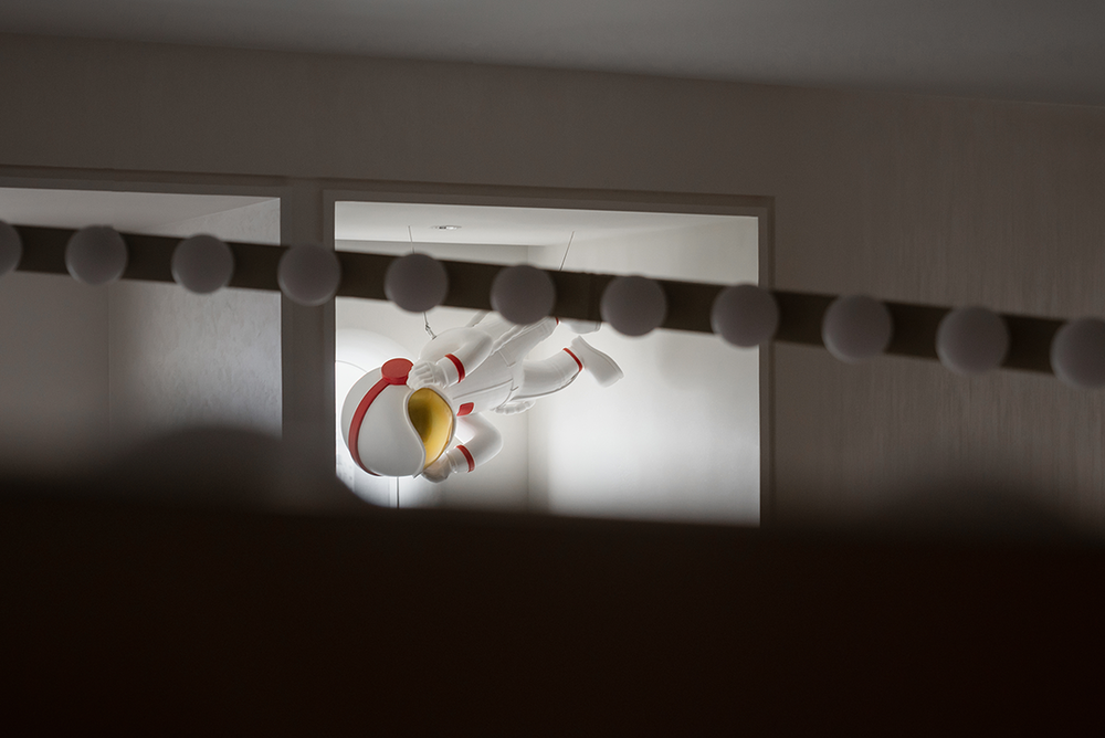
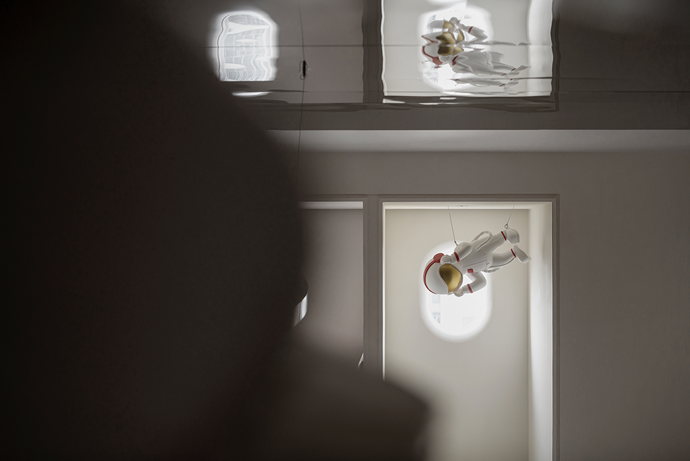
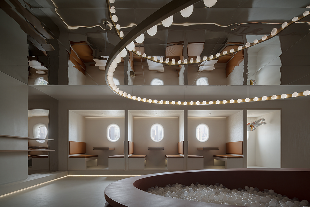
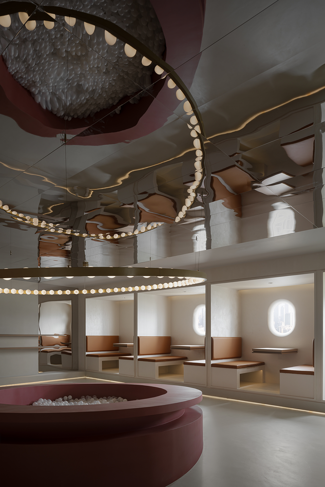
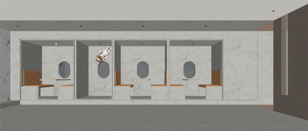
顶面用了大量的镜面金属材质,一方面是空间层高较矮;一方面是拓展和镜像空间,拉开人们想象的阀门;悬浮状的太空人好似漂浮在宇宙飞船内惬意的听着歌,这个状态也非常“成都”。定制的艺术吊灯像一个崭新的宇宙飞船,正在飞离下方的发射基地,随着顶面的镜像效果,犹如开启了曲率引擎,正要飞往下一个星球探索。On the top side, a large number of mirror metal materials are used, on the one hand, the space layer is short. On the one hand, it expands and mirrors space and opens the valve people imagine; The suspended spaceman seems to float in the spaceship and listen to music, which is also very "Chengdu". The custom art chandelier is like a brand new spaceship, flying away from the launch base below, and with the mirror effect on the top surface, it is like turning on the curvature engine and exploring the next planet.
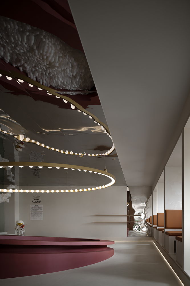
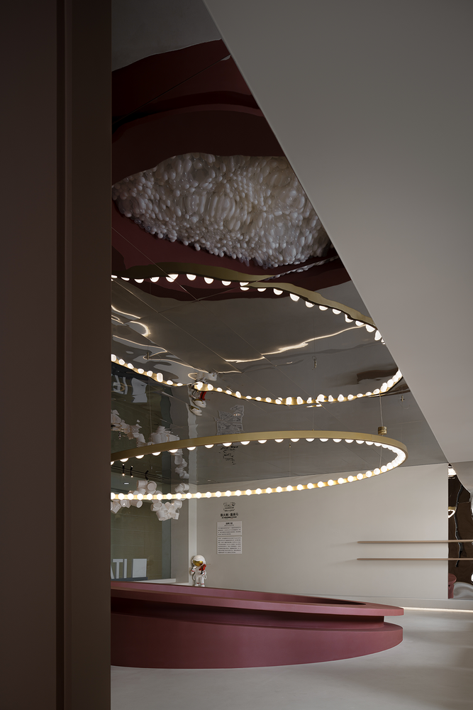
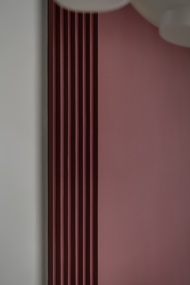
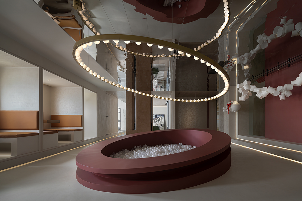
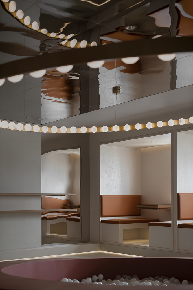
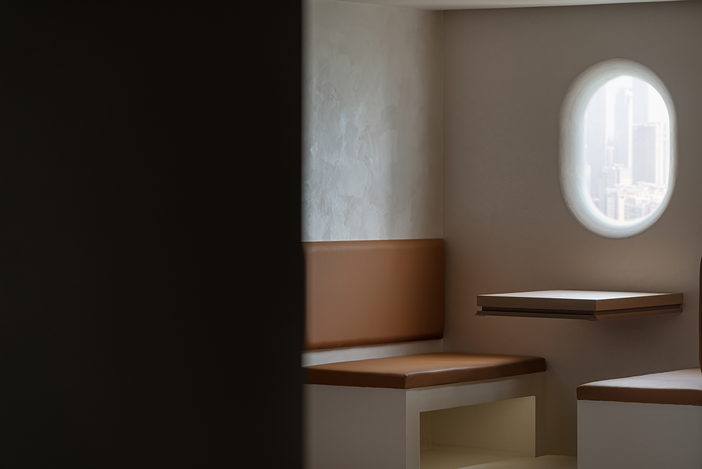
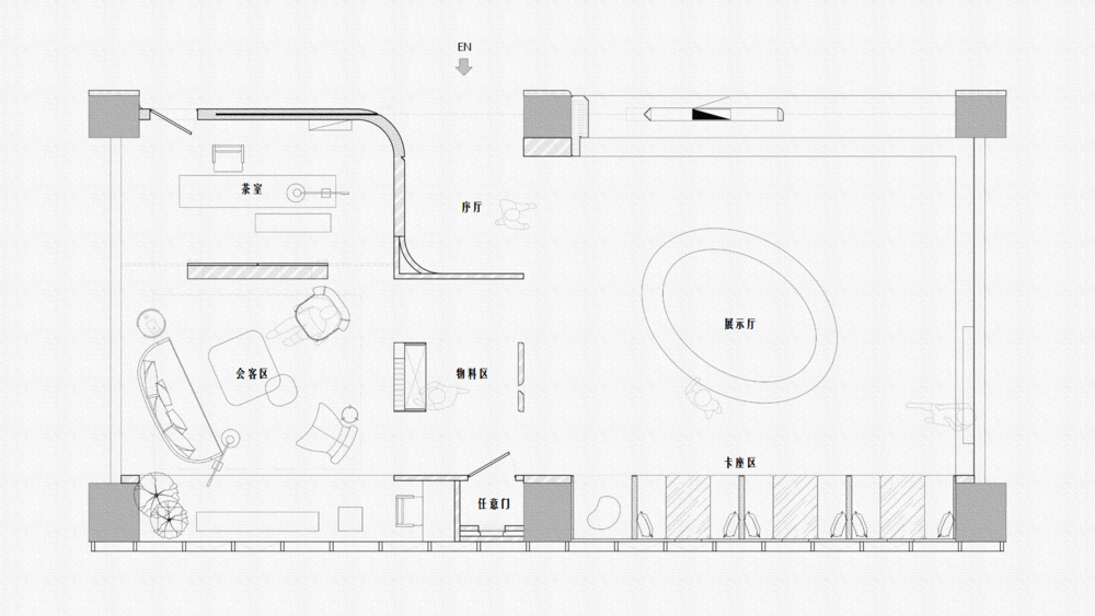
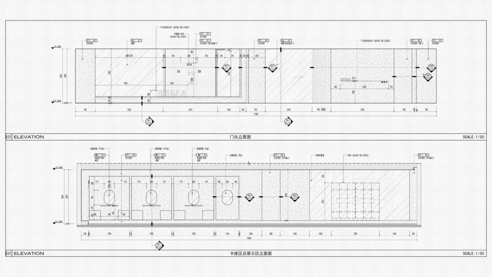
展厅内设置了“太空舱”式的卡座,一方面是为了洽谈客户、休闲办公;另一方面是主题的延伸设计,现在流行的“沉浸式体验”。卡座区的窗口刻意设计成了“机舱式”的窗口,卡座下方的灯光会随着客人的靠近而缓缓亮起,仿佛是一种无声的迎接仪式。The exhibition hall is equipped with a "space capsule" type card seat, on the one hand, it is for customer negotiation, leisure and office; The other is the extended design of the theme, which is now popular as "immersive experience".The window in the card seat area is deliberately designed as a "cabin type" window. The light under the card seat will light up slowly with the approach of guests, as if it were a silent welcoming ceremony.
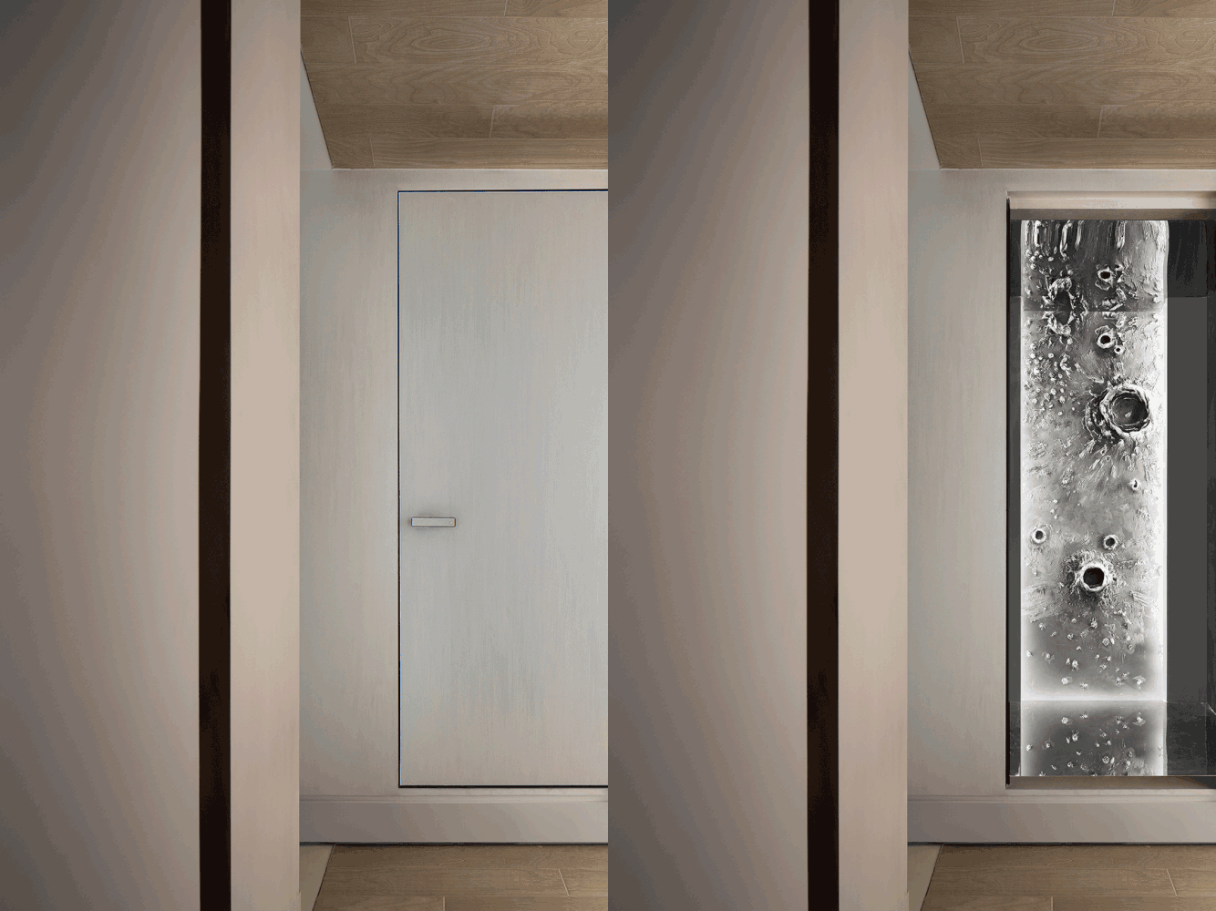
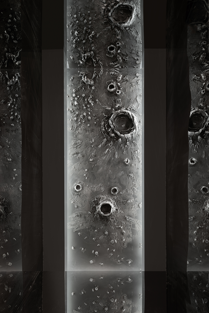
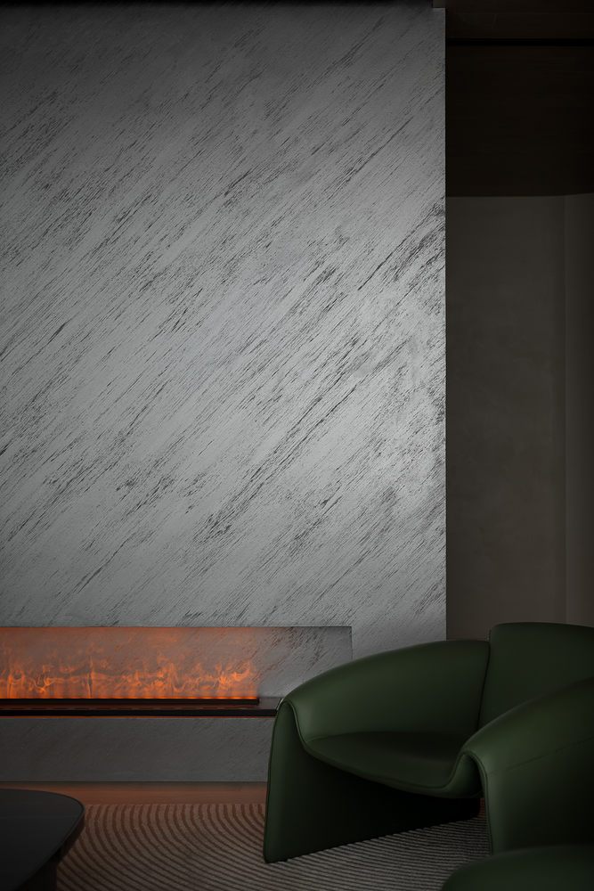
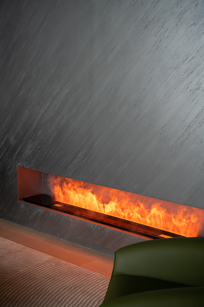
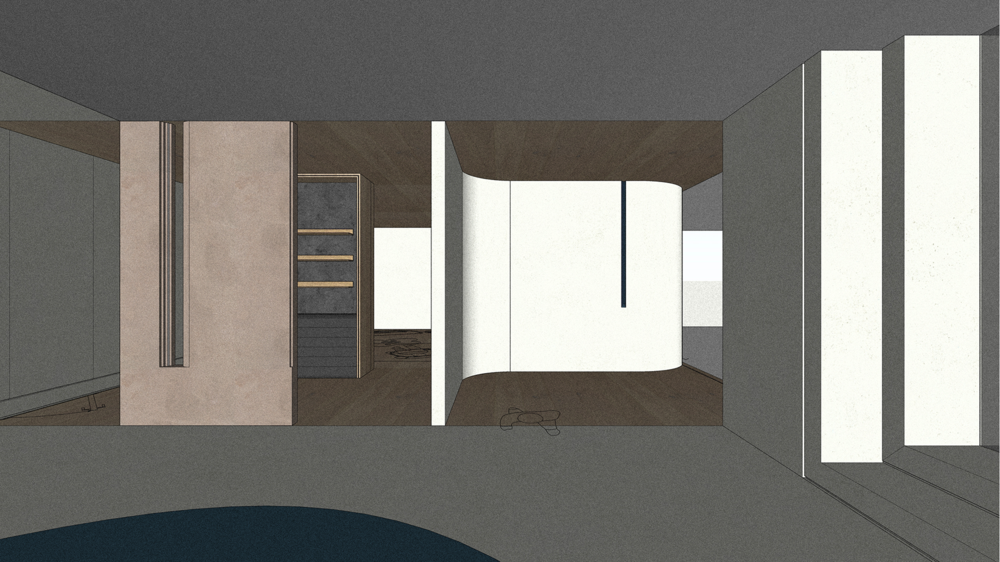
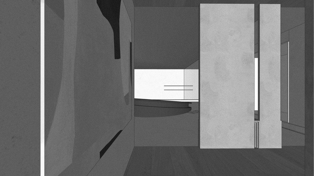
靠展厅旁有一个小小的过渡空间,陈列及储藏部分实物样板。同时在此区域将隐形门工艺做了展示,我们特意在门后的空间设置了“惊喜”。门后的空间犹如一个平行宇宙空间,并通过这样特殊的场景展示了超强的肌理涂料工艺。Next to the exhibition hall, there is a small transition space for displaying and storing some physical samples. At the same time, the invisible door technology was displayed in this area. We specially set a "surprise" in the space behind the door. The space behind the door is like a parallel space, and shows the super texture coating technology through such a special scene.
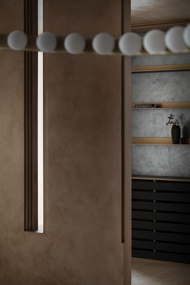
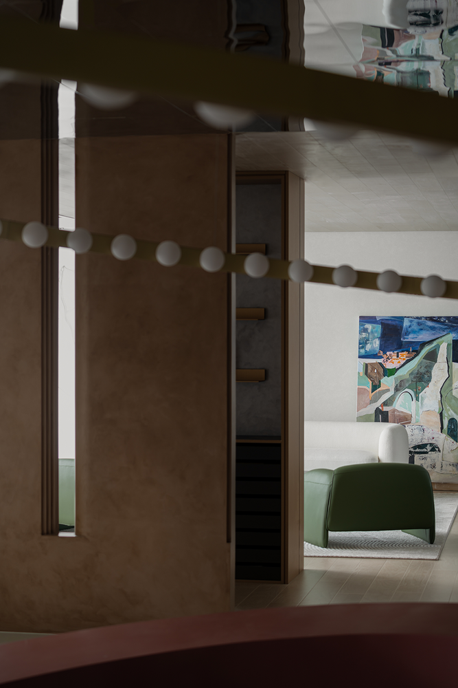
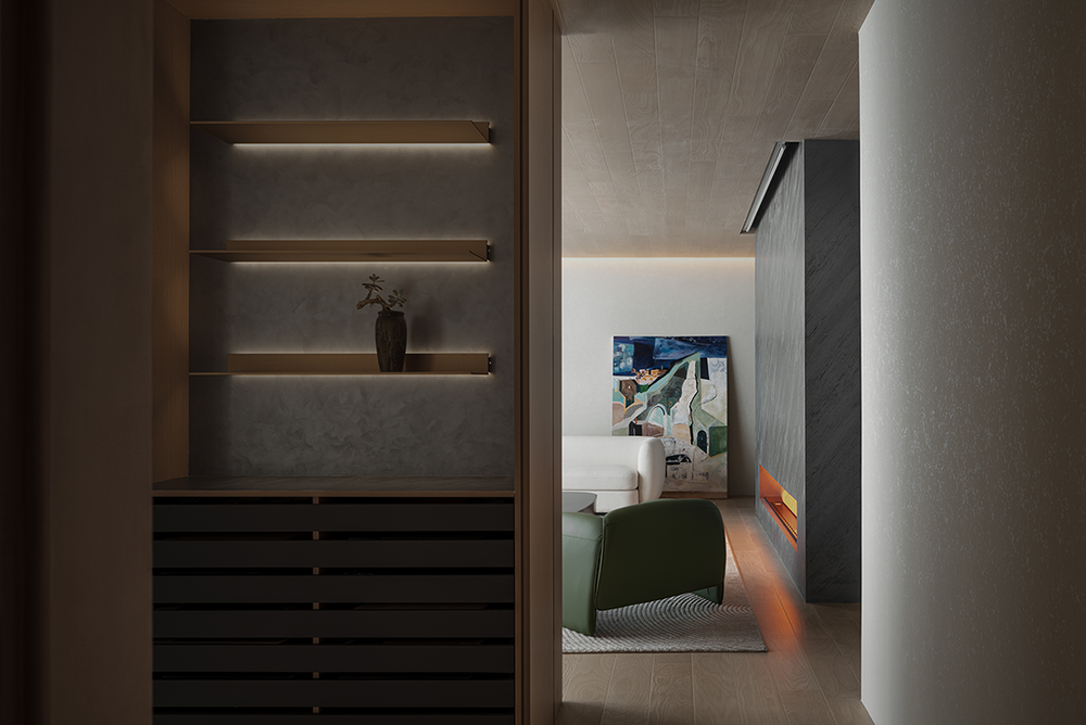
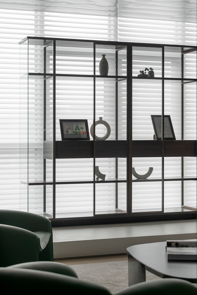
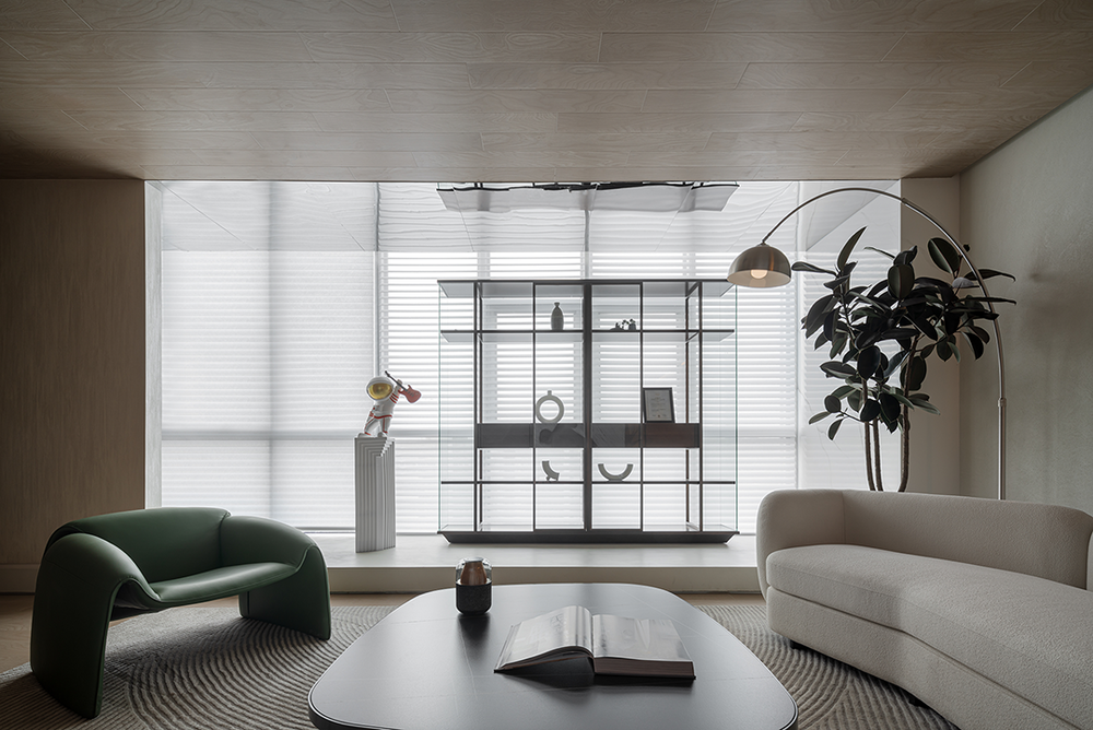
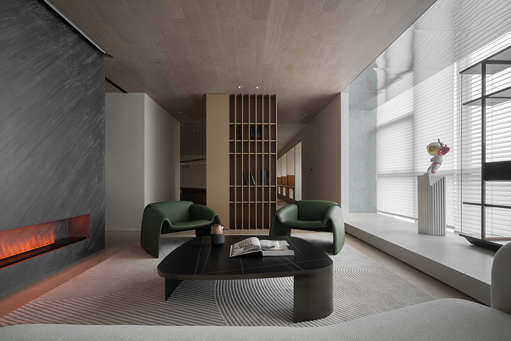
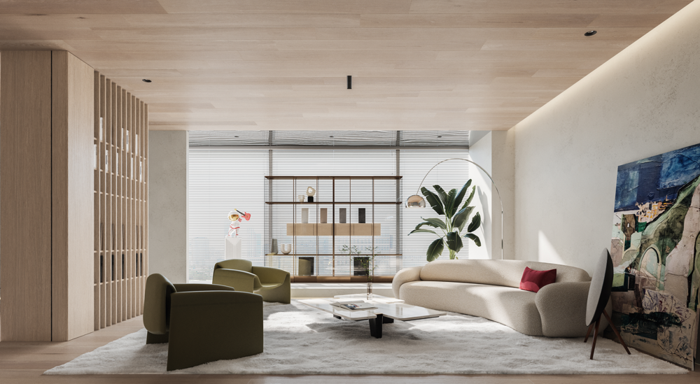
内侧的场景区采用全系的意式家具,还原“意味”的产品场景,并延续了“太空人”的元素,与当代的意式风格碰撞出有趣的火花。在此空间内我们考虑的就不单单是涂料展示,而是希望通过还原意式风格的家居状态,及更多木质材质的介入,让客户能有一个放松的洽谈和体验的状态,同时能感知这个涂料店不像其他的店一样全部是涂料的单调场景。因为大多数客户做艺术涂料不太可能全屋所有材料都做,而是和其他的材质做搭配。所以,换个口味也就顺理成章的事了。The scene area on the inner side adopts a full range of Italian furniture to restore the "meaning" product scene, and continues the element of "astronaut", which collides with the contemporary Italian style to create an interesting spark. In this space, we are not only considering the paint display, but hope to restore the Italian style home state and the intervention of more wood materials, so that customers can have a relaxed state of negotiation and experience. At the same time, we can feel that this paint shop is not a monotonous scene of paint like other stores. Because most customers do art paint, it is unlikely that all materials in the whole house can be made, but it can be matched with other materials. So it's natural to change your taste.




项目名称 | 意库马艺术涂料成都概念店项目地址 | 中国 · 成都康普雷斯项目面积 | 130㎡设计团队 | LDC studio | 轻年致造(成都)设计顾问有限公司主案设计 | 李杰项目摄影 | 404NF STUDIO完工时间 | 2022年4月


