Javier Terrados 打造西班牙科尔多瓦简洁现代药店 B58
提要 | Headline
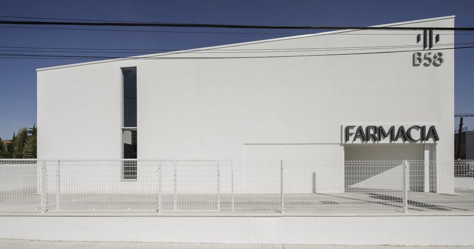
该项目需要通过一座小型的建筑来同时回应城市与建筑的问题:在科尔多瓦主干道沿线的一个复杂场地上建造一座药店,同时需要考虑紧凑的布局和有限的预算。建筑的独特之处体现在其显而易见的简洁性上。
This project is about a small building that comes as the answer to both urban and architectural issues: the requirement was to build a pharmacy in a complicated plot located in one of the mains avenues in Cordoba (Spain), with a tight program and a low-cost budget.The singularity of the resultant building lies in its apparent simplicity.
▼临街立面,street facade ©Fernando Alda
概述 | General description
该项目所在的位置是决定其布局的关键因素,其所在的El Brillante大街长3.5公里,是连接科尔多瓦历史中心与郊区的标志性道路。这一高收入的街区分布着一系列独栋住宅,每天都会有数量可观的车辆从街道上驶过。
▼场地平面图,site plan © Javier Terrados Architecture Studio
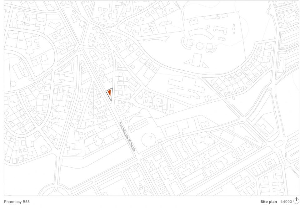
The location of this project plays a principal role in its configuration. El Brillante is a 3,5 km length and representative avenue running from the Cordoba historic center to the outskirts. In this high-income neighborhood, one can find single-family houses, and the presence of a considerable number of vehicles that run this street every day is remarkable.
▼场地鸟瞰,aerial view ©Fernando Alda
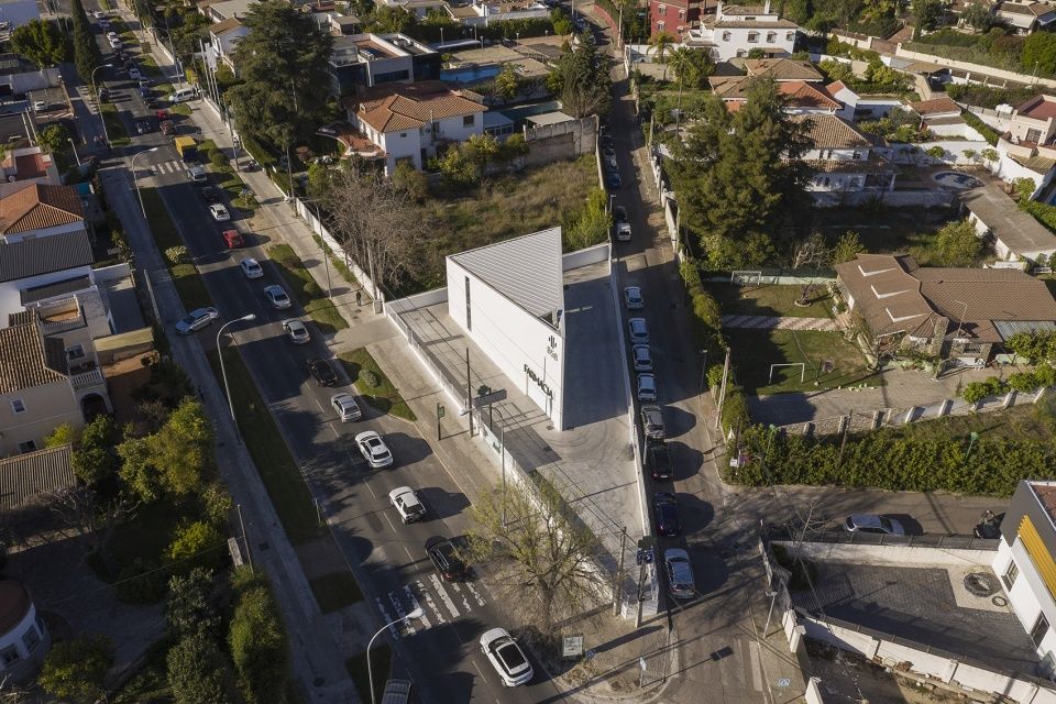
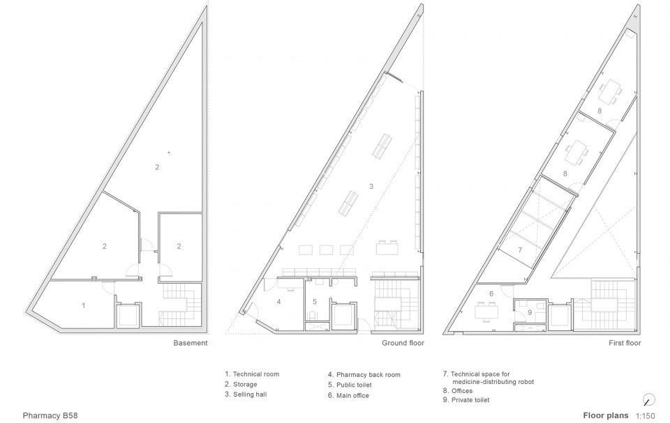
作为商业建筑,药店需要配备完善的功能,包括首层的销售大厅、具有不同功能的办公室、存放药品所需的库房以及配药机器人所需的空间。项目所在的地块呈三角形,这对实现完整的三层建筑方案提出了挑战。建筑结构、外墙和不同系统中使用的“裸露”材料在实现这一低成本且具有代表性的项目的过程中扮演着重要的角色。
The commercial building required a complete pharmacy program: ground floor selling hall with the support of different offices, the needed storage for medication, and space for a medicine-distributing robot. In a plot whose triangular geometry made it hard to optimize such a complete program divided into three floors, the “nude” materiality of structure, envelope and systems played a principal role in the achievement of getting a low-cost, representative building.
▼入口立面,entrance facade ©Fernando Alda
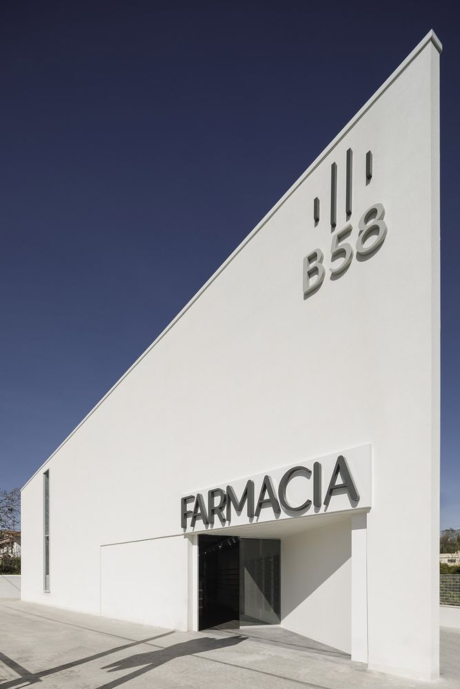
概念/环境和策略 Concept / Context and strategy
为了适应位于两条街道之间转角的地块,需要设计一个三角形的建筑,此外还要解决药房空间的特殊功能需要。客户希望建筑能够同时包含普通药店和汽车服务窗口。设计团队对场地的几何形状进行了细致的研究,为行人和车辆设置了不同的出入口,这样,药店周围的动线就能够让普通零售和汽车服务同时发挥出最佳的效果。
▼交通流线示意,circulation plan © Javier Terrados Architecture Studio

The first problem the project had to deal with was geometry: the plot is the resulting space of a corner between two streets, so it was needed to design a triangular-shape building. Besides, the project may solve the unusual program requirement of the so-called Pharma-car. The client wanted the building to work as a regular pharmacy and kind of a car selling service. To get that, the team carefully studied the plot’s geometry to place the different entrances for pedestrians and vehicles. This way, a perimeter circulation around the pharmacy could allow an optimal working of the Pharma-car service.
▼行人和车辆使用不同的入口 ©Fernando Alda different entrances were placed for pedestrians and vehicles
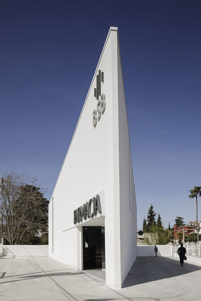
▼汽车服务窗口位于后方 ©Fernando Alda the car selling service is placed in the rear facade
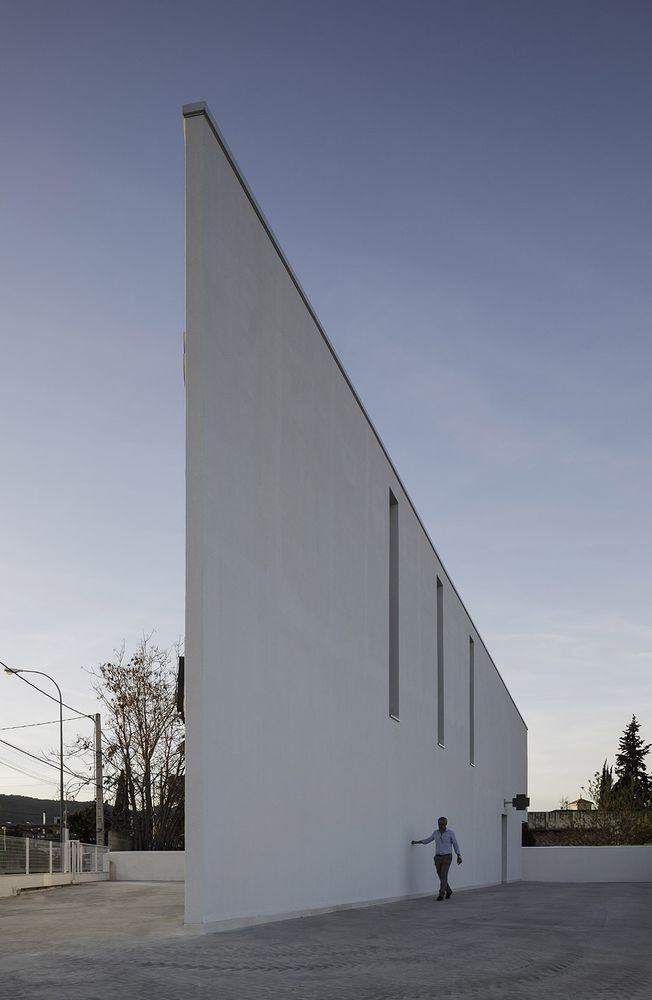
▼药店主入口,main building access ©Fernando Alda
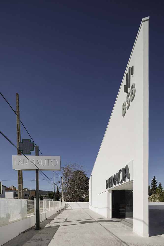
在严格遵守城市法规的前提下,要实现一个既具抽象性又富有表现力、既节约成本又具有象征性的建筑。它需要有大的标志,又需要避免建筑污染;它是一座船形的避难所,同时也是显眼的商业标识背后的中立容器。最终的结果正是对以上这些需求进行平衡的产物。
It was necessary to closely examine the tight urban regulation to achieve a building supposed to be both abstract and expressive, cheap and emblematic, with large signs but without generating architectural contamination, a sanctuary whit the shape of a prow at the same time as a neutral container behind the showy commercial signs. In the end, the result is the product of this difficult balance.
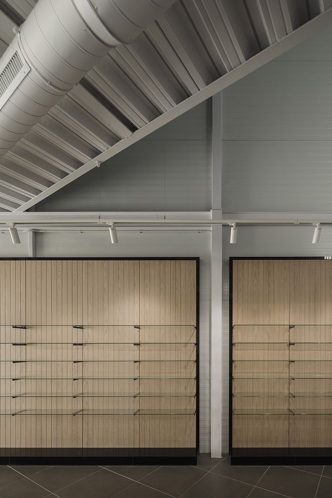
▼药店内部,interior view ©Fernando Alda
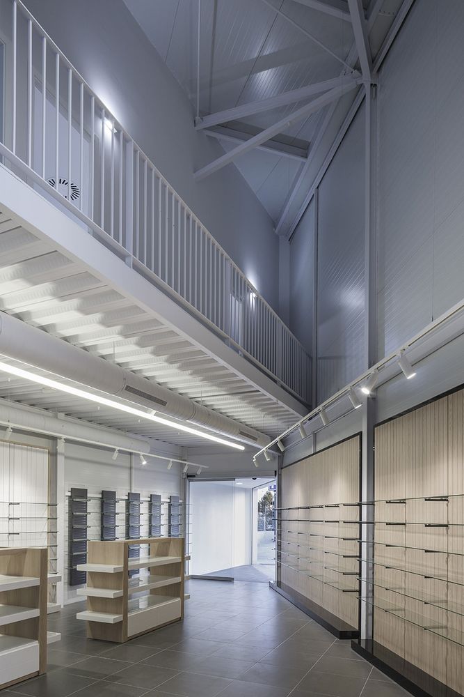
▼售药大厅,selling hall ©Fernando Alda
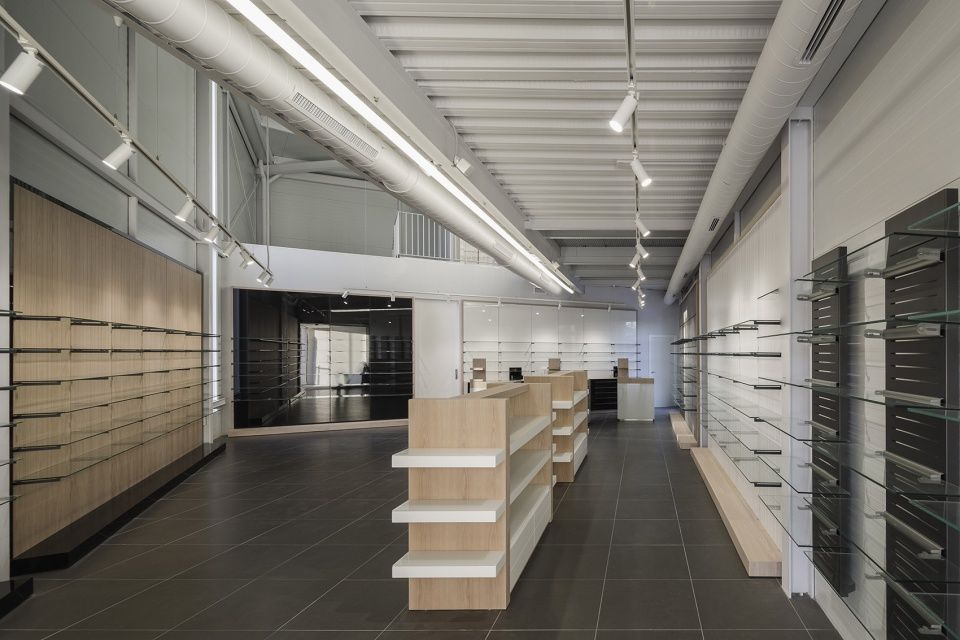
▼大厅局部,selling hall detailed view ©Fernando Alda
=

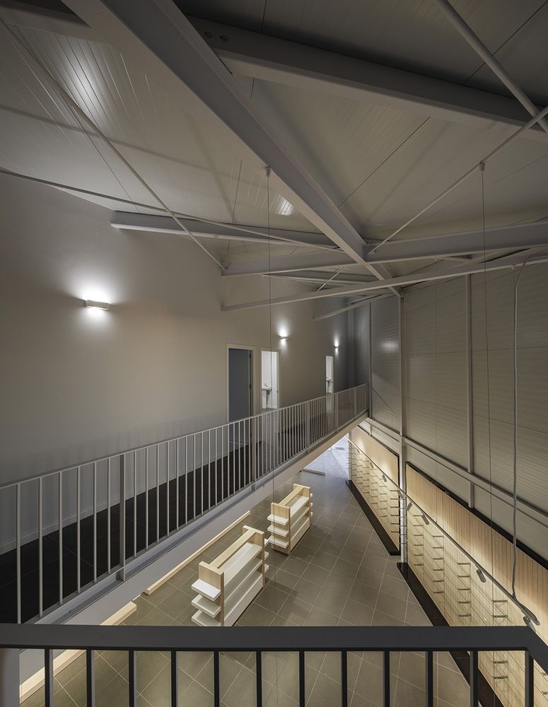
▼从二层俯瞰大厅,view from the first floor ©Fernando Alda
建筑/材料和结构 Construction / Materials and structure
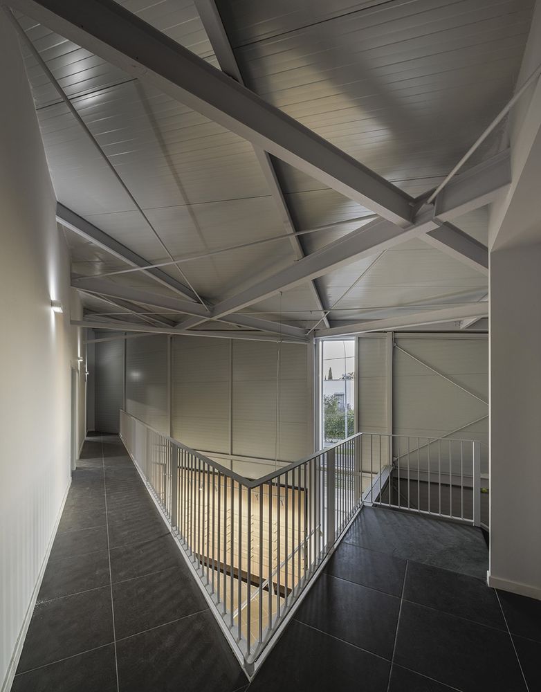
材料的选择以效率为核心,建筑的结构、外墙和各种系统均没有设置任何的覆盖物。基座部分采用了钢筋混凝土,经过优化的钢结构回应了轻质和工业化的设计要求。设计团队仔细研究了钢框架结构和每一个构造细节,最终实现了材料的最优化以及在建筑学角度上具有趣味性的内部空间。外墙由双层金属材质的隔热夹芯板、外部保温层和连续的外部饰面组成。
The concept of efficiency is the basis of the material conception in a building whose structure, envelope, and systems are showed with no covering. The foundation is of reinforced concrete, and the optimal steel structural design is the answer for the lightweight, industrialized construction required. The team carefully studied the steel framework structure and every constructive detail, so the result was material optimization and architecturally interesting interior spaces. The envelope consists of double-metal side insulating sandwich panels, external insulation, and continuous exterior cladding.
▼二层设有办公区,offices are included on the first floor ©Fernando Alda
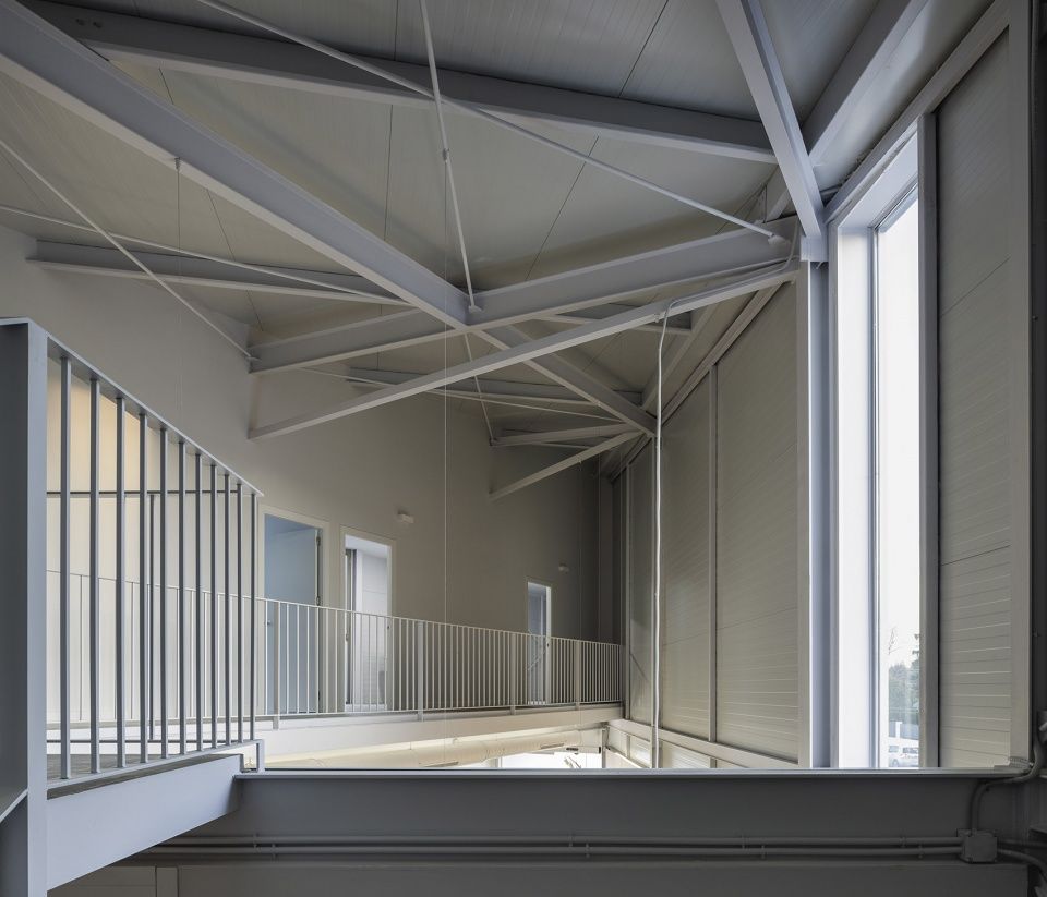
▼走廊和屋顶细节,corridor & ceiling details ©Fernando Alda
总体上看,建筑设计在此成为了一种整合所有问题的方式。例如,建筑前端的独特形状并非是为了凸显外观的象征性而凭空作出的设计,而是为了解决几个具体的功能问题,包括轻质屋顶的雨水收集、隐藏供热系统的外部构建、最优的形式以及对城市法规的严格遵守。形式和功能的共同作用使建筑兼顾了成本与节能两个方面的平衡性和高效性。
To sum up, architectural design acts here as a way to integrate every single issue. For example, the singular prow-shape of the building is not a fanciful formal resource to get an emblematic appearance, but the result of several functional issues: water collection in a lightweight roof, hidden location of external elements of the heating system, optimum form factor, and strict compliance with the urban regulation. As a result, form, and function, work together to make this building balanced and efficient from both costs and energetic points of view.
▼立面局部,facade view ©Fernando Alda
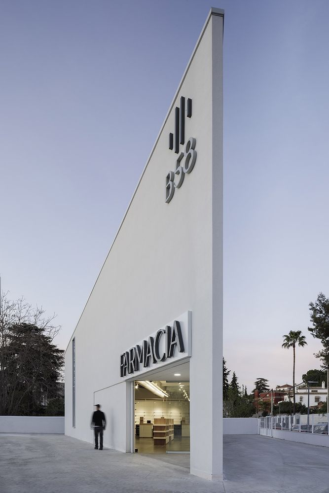
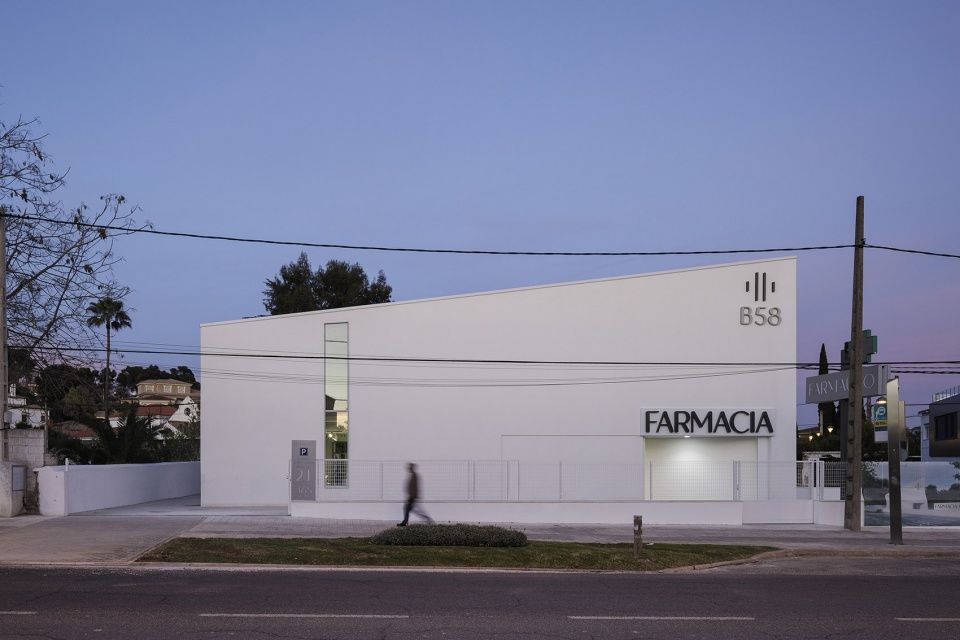
▼夜景,night view ©Fernando Alda
▼平面图,floor plans © Javier Terrados Architecture Studio
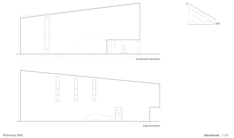
▼立面图,elevations © Javier Terrados Architecture Studio
© Javier Terrados Architecture Studio
