RSAA / 庄子玉工作室的张家港教堂项目旨在打造一个既尊重过去又能面向未来的宗教建筑。因此新教堂的设计既需要尊重基地的现状和特征,同时也能帮助教众去面对新时代背景下基督教的各种机遇与挑战。 为了达到这个目标,RSAA将教堂的主体和一些附属的功能群体分离开来,同时这些附属功能又能更好的支持主体建筑。教堂主体以及辅助活动功能群建筑应该表达不同的建筑语汇,从而加强最终我们所期待的各自的特征。即附属建筑是一种原生的植根土地的状态,以体现亘古既有的主的存在,是隐。而圣堂本身则应傲立于山水之间,宏天地之正气,上帝之福音,是显。而这一显一隐从建筑手法和材质形态上的对比,也分别影射了对传统的尊重,和对未来的期许。 而通往圣堂正门的途经之中也设计了一系列或放大或交叠的室外空间,但总的而言总平面倾向于一种更加内向的氛围,利用一系列矮墙对视线的遮挡和内向湖水的平静,打造一个教堂入口前的“舞台“去强调其核心的位置。 the design was to create a building that represents both past and future. In doing so the design of RSAA HAS formed a house that reflects on the current situation and the challenges Christianity is dealing with. To reach that goal, the main church has been separated from the additional functions and cluster those together in supporting buildings. This community center and the church itself shall express different architectural languages to strengthen the desired effect.
建筑和宗教有着共同的目标-实现个体和人性的回归与升华。故此作为主要使用空间的教堂内部我们希望它体现一种心灵回归和庇护,就如达芬奇的名画“岩间圣母”中所传递的意向,内部的空间是一个教徒们心灵的“避难所”,或如婴儿在母体中的状态,或如克利姆特画中金色的环抱,在这个纯粹的普照光芒的空间中,人们方能感受上帝对众生之爱与造物之美好。故而教堂的内部是一个软性而更为环抱的轻柔的存在。 The rounded interior follows harmonious curves that follow the traditional basilica concept, but does so in a modern interpretation, creating a cradling space on the inside to comfort the visitors.
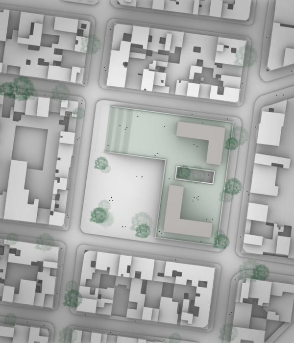
为了强调教堂传统根源, 顺延传统布局方式,教堂主体的朝向直接设置在正东西。教堂主体设置在整个场地中间部位,将场地自然的划分成两个广场:北部广场相对偏小,强调私密性,南部的广场相对开场,强调开放性和公众性。 辅助活动功能的建筑形成一个开敞的回字形,将整个布局包裹起来,与外界隔离开。 开敞的部分是的整个建筑群体可以与活水形成强烈的对话, 同时对外部街道的噪音进行隔绝。 来教堂的人群从东侧进入地块,在东侧绿地停车后穿过景观中间切分出来的道路进入教堂地块内部。而后道路划分出两个方向,人们可以向南进入辅助活动功能建筑,或者向北进入教堂的主体建筑中。 To emphasize the traditional roots of the church we orientate it directly east-west, following the historical layout. It is positioned in the center of the area seperates it into two plazas: The northern one is articulated as a smaller, more private space, while the southern one is more open and public. The buildings of the community center form an open ring and shelter the arrangement from the outside. The opening allows the compound to have a strong connection to the lake, whilst blocking the noise of the street. To access the church visitors arrive from the east – either after parking their car or bicycle in the sunken parking lot, or by foot – and walk through a path that is cut through the landscape. The way than seperates into two directions, either turning south towards the community center, or north to enter the main church building.
教堂位于整个地块的中心部位,包括主礼拜堂, 赞美会,青年团契,诗班。辅助交流活动建筑群,作为辅助功能的建筑体被划分成两个部分:北侧为功能与教堂的联系更紧密的祷告室,陪谈室,母婴室和排练室。二层为教堂的行政办公,会议接待,培训,财务等功能。南侧为配套相关的图书室,餐厅,档案,史料室等,二层为主日学的空间。这些建筑的外部与景观相结合,充分利用地势高差,将部分建筑隐藏在地势下面。内侧立面则用大片的石灰岩板来强调立面轮廓,同时营造不一样的肃静平和的氛围。 The supporting buildings are all clustered together in two groups, in the north the functions in close affliction to the church are located and it offers space for prayer, counsel and young mothers. The upper floors are aimed at the churches administrations and have space for offices. The southern plaza is activated by the cafeteria, library and museum, as well as the small church. The upper floors are reserved for sunday rooms and other activities. The outside of these buildings is connected to the landscape, using the already existing hill, accentuated by the dugout earth of the foundations. The inside is defined by a calm limestone facade dominated by huge blocks that give way to different views.
作为建筑的外部形象我们认为它必须是纯粹的以使人得以回归教堂形式的传统,故而我们从众多的传统教堂意向中提取出最基本的几何元素,以抽象切片形式加以叠加还原,而每部分切片又以金属表皮的现代形式得以呈现,故而使教堂的外部效果会根据观察者的角度变化而呈现出不同的效果。 RSAA的设计提取一系列柔和的曲线随空间序列缩放,形成一个内敛的腔体,其基线关系依然延续传统的十字形巴西利卡的形制,而同时具有极强的流动感。而这些曲面在三维层面则形成一个更具未来感甚至永恒感的形式。同时,这种柔美与其外部坚硬的状态形成强烈对比,以形成内外视觉的互动。切片的形式所形成的内外轮廓的交叠使建筑在夜间泛出柔和的光线与简洁的外轮廓刚柔相济,同时让即使路过的行人也能感受到圣堂所散发出的神圣光芒。 但其形式是用一种独特的方式形成的: 一系列的金属切片纵向排列, 每个切片为2厘米厚,每个切片间的缝隙为18厘米。所有这些切片组成的形成整个墙壁,屋顶以及塔楼。这些切片形成体量的内部是另外一种形式的切割形成一种更加自由形态的空间。柔和的弧线形的内部空间遵循传统的落发长方形基督教堂的平面形式,用一种更加现代的解读方式,创造一个弧顶架式得内部空间使人们在其中感觉更加舒服。 建筑表皮的分层结构有两个效果:首先教堂呈现的外部效果会根据观察者的角度变化而呈现出不同的效果。从侧面观察时一个闭合的墙面,但是从垂直方向(例如内部的人从内看外部的天空),整个建筑的立面的一个开敞的,视线可以透过这些缝隙。其次外部肃穆的造型和内部流畅的空间是的效果不停的产生变化, 从而形成一种变化的表皮。 The church’s volume and outside shape is following classic European church-architecture, showing its heritage. This shape however is formed in a unique way: A series of metal slices is erected vertically, each with 2cm thickness and 18cm gap. Their outside shape is modeled to represent walls, roof and tower, whilst the inside is cut away to give space to a more free form. The rounded interior follows harmonious curves that follow the traditional basilica concept, but does so in a modern interpretation, creating a cradling space on the inside to comfort the visitors. The layered construction of the skin of the building has two central effects: First of all it changes the appearance of the building depending on the angle at which it is looked at. From most points it closes up, but when looked at directly – for example when inside and looking up towards the skies – it opens up and lets the vision pass straight through. The second effect is that the penetration of the light is different depending on the thickness of the wall – and that constantly changes due to the play between the rigid outside and fluent inside shape. The result creates an seemingly changing pattern that hints at the inside when seen from outside and vice versa.
{{item.text_origin}}


