巴伦西亚彩色市场,个性空间营造
Mercado San Valero位于巴伦西亚标志性的市中心鲁萨法区(Ruzafa),由建筑事务所nihil estudio设计,旨在打造该市的第一座街头食品市场。Mercado San Valero食品市场的设计重点有两点,一是空间特色,二是空间的彩色色调,建筑师将这二者串联,从而为游客提供了一个真正的个性化空间。
Located in the emblematic district of Ruzafa, in Valencia, Mercado San Valero is projected by nihil estudio with the aim of creating the first Street Food Market in the city.The concept Mercado San Valero has been developed following two lines, one of spatial character and the other of chromatic character, forming a tandem that allows the visitors to enter a genuine atmosphere with a personality of its own.
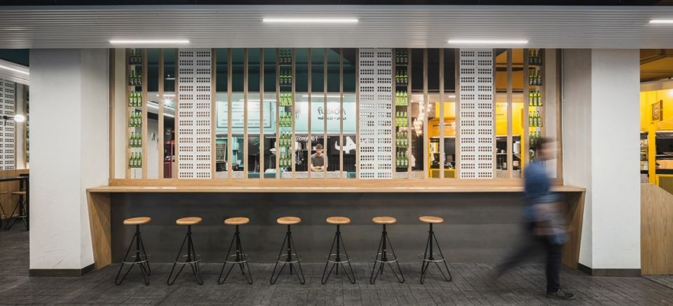
▼市场内部局部,partial interior view of the market
第三种空间 | The Third Space
从空间的角度看,现有的规范和法规将空间分为两类空间,即公共空间和私密空间。然而,很多相关的文本中都提到了第三种空间:集体共享空间。在这个具有公共性质的私人空间中,人们可以以一种共享的心态工作。
From the viewpoint of space, the current norms and regulations make reference to the existence of two spaces: public space and private space. However, there are many texts that mention a third type: collective space. It is here that we work with a shared mentality, as it is a private space with a clearly public use.
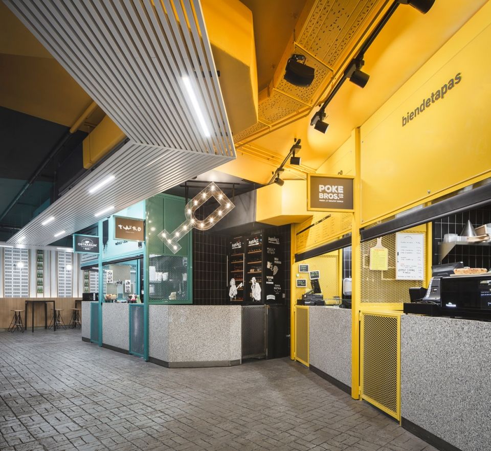
▼市场内部局部,不同性质的摊位采用不同的颜色,partial interior view,the stalls in different functions use different shades of colors
色彩 | Colour
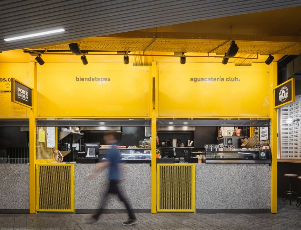
众所周知,对于一个市场来说,最重要的不是空间,而是市场上的产品。因此,建筑师将色彩这个概念运用在了Mercado San Valero食品市场中。最初,建筑师受到了食物金字塔中主要营养来源的启发,提出了这个色彩的构想,从而暗指传统市场中不同摊位上的新鲜产品。因此,通过进行色彩解构,建筑师将不同颜色之间的差异降至了最低,并且将颜色分为了三种颜色,从而对市场中不同摊位进行分类,使其商品类别更加明显。这三种颜色分别是:红色/粉色色调用于售卖生肉、鱼类和红色水果的摊位,绿色色调用于售卖水果和蔬菜的摊位,黄色色调则用于售卖谷物、米面粮食和乳制品等的摊位。
▼市场不同颜色区域的划分,the diagram of the classification of different stalls in different colors
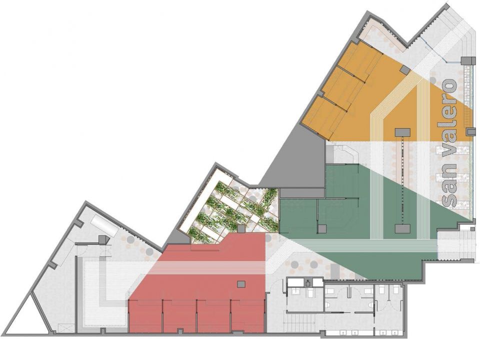
This concept is added to the previous one in a space that is well known and used by everyone: a market. In a market, the central character is not the space, but the product. Our proposal for colors originally makes reference to the main sources of nutrition in the food pyramid, alluding to the fresh products to be found at the different stalls in traditional markets. So, by making a chromatic deconstruction they are minimized and grouped in three shades of color (red/pink for raw meat and fish and red fruits, green for fruit and vegetables and yellow for cereals, grains, tubercles and dairy products) getting to classify the different stalls in the market and their signaling.
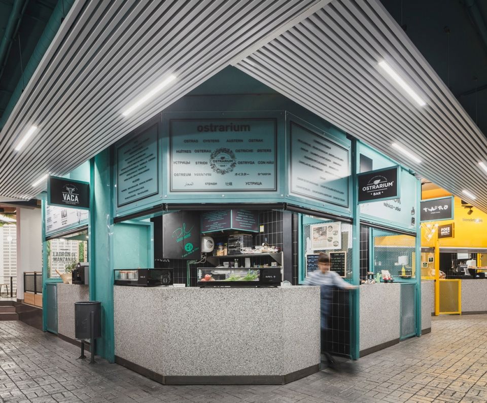
▼市场内部局部,不同颜色的摊位划分强调出不同的商品性质,partial interior view, different shades of colors classify the different stalls in the market and their signaling

▼市场内部局部,绿色色调用于售卖水果和蔬菜的摊位,partial interior view, the shade of green for fruit and vegetables
▼市场内部局部,黄色色调则用于售卖谷物,partial interior view, the shade ofyellow for cereals, grains, tubercles and dairy products
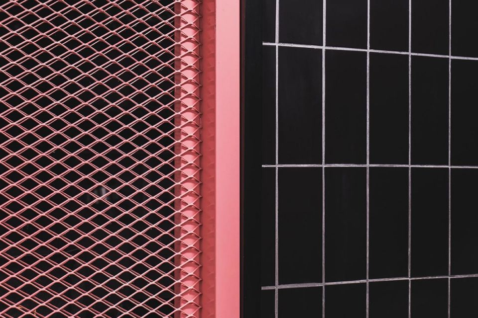
▼市场内部局部,红色/粉色色调用于售卖生肉、鱼类和红色水果的摊位,partial interior view, the shade of red/pink for raw meat and fish and red fruits
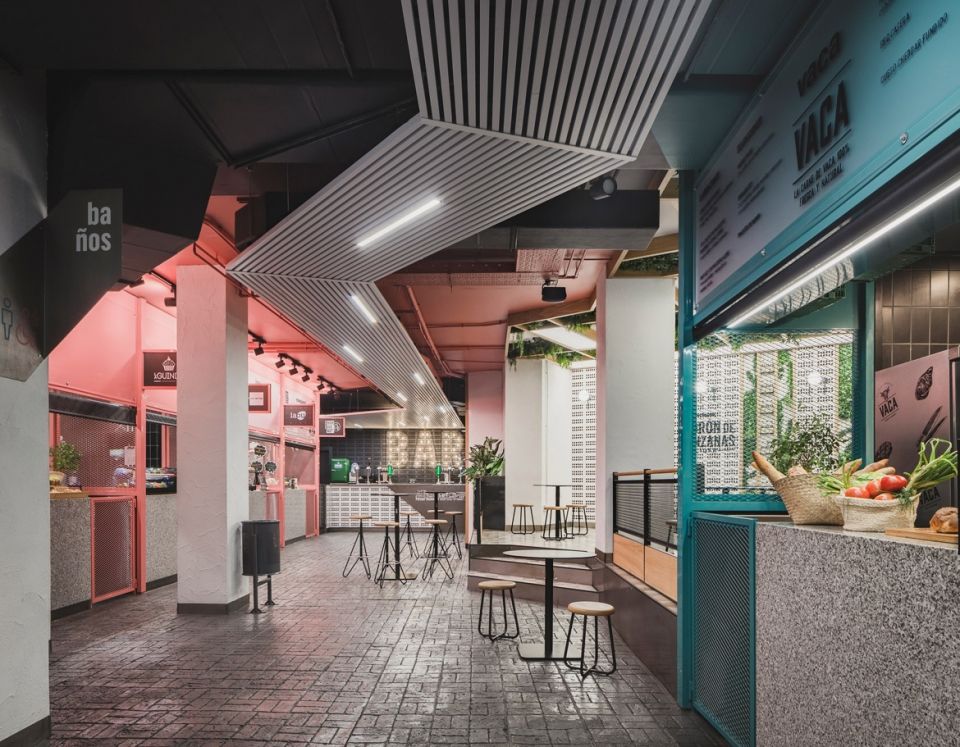
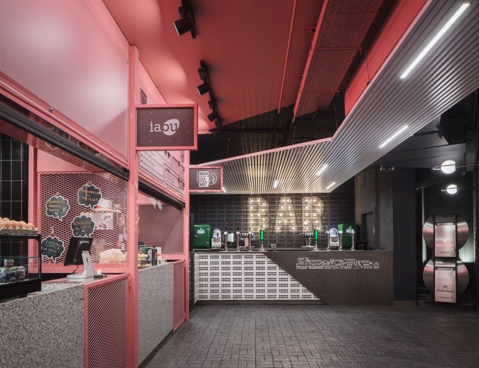
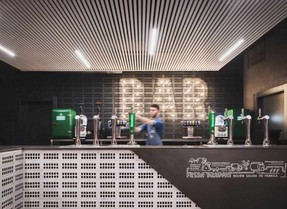
▼酒吧,the bar
▼摊位的表皮细节,details of the stalls skins
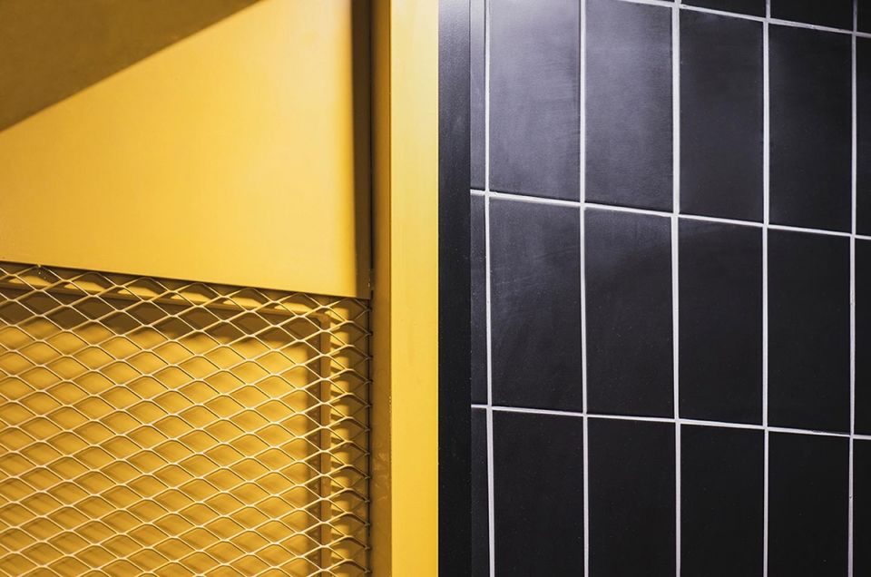
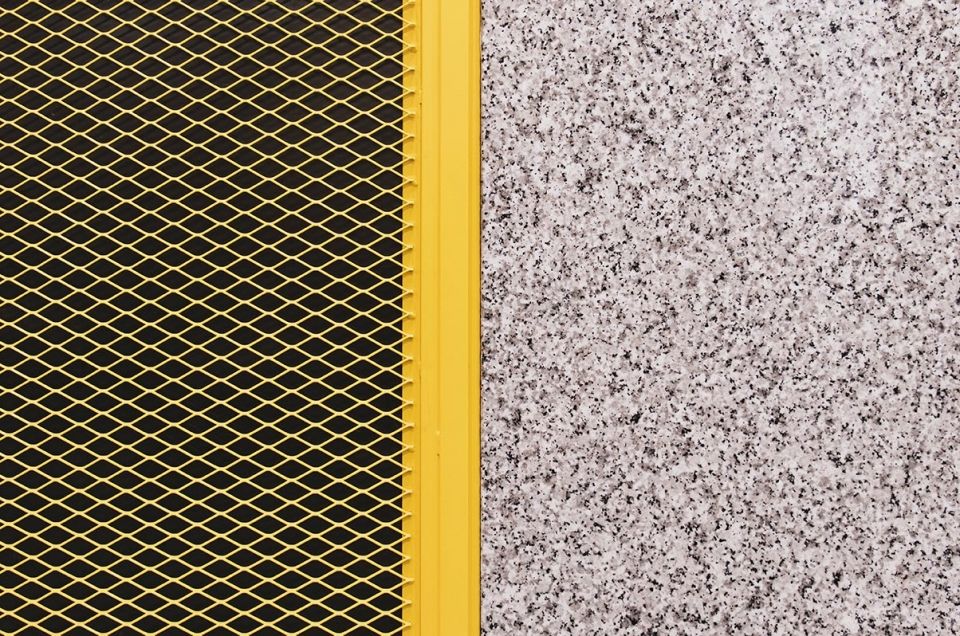
▼摊位的双层表皮细节,details of the double skin of the stall

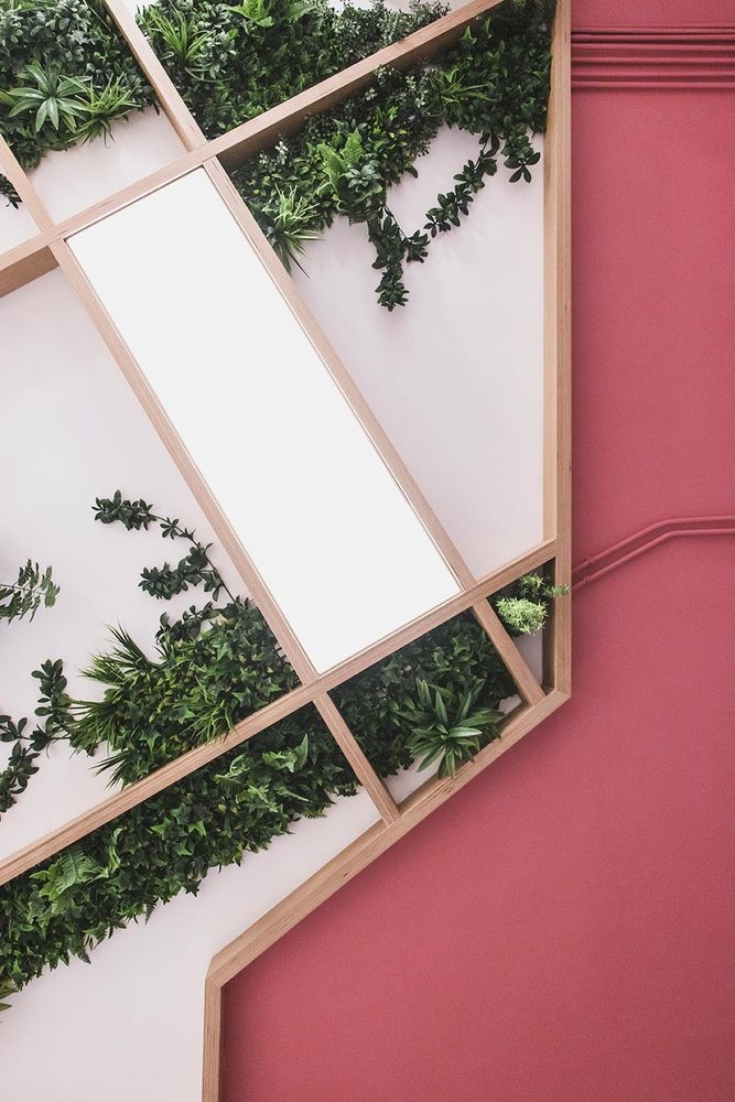
▼摊位墙面细节,以绿植装饰,detail of the wall of the stall with the decoration of plants
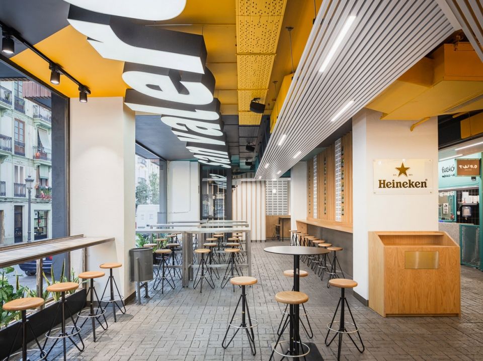
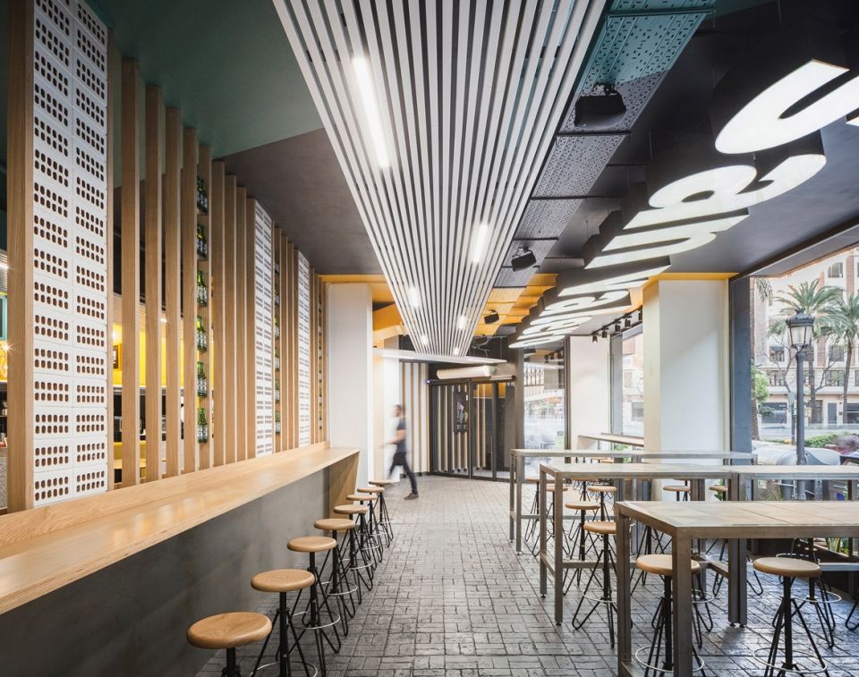
此外,材料在设计中也起到了至关重要的作用,建筑事务所nihil estudio通过色彩和材料的变化,清晰地展示出空间的不同作用和不同活动,从而形成了不同的空间场景。食物市场的地板由混凝土打造而成,混凝土表面带有鹅卵石路面般的凹槽状方格纹理,一路从室外延伸至室内,引导着游客在Mercado San Valero食品市场中的各个空间中穿行。通过体量的变化和双层表皮,塑造出市场中不同摊位的造型,同时,还特意选择了由花岗岩打造而成的酒吧吧台来呼应传统市场中所特有的酒吧。通过上述设计手法,建筑师在服务型空间和公共空间中创造出了一系列不同的空间氛围,实现了空间上的完美平衡。
Materiality is of the outmost importance in this intervention of nihil estudio, in which the different uses and activities are clearly defined by chromatic and material changes, thus generating different scenes. The floor spreads into the inside in a layer of printed concrete, imitating cobblestones, that guides the visitor throughout the different zones of Mercado San Valero. The changes in volume and the double skins shape the stalls in the market, with bars made of granite intentionally chosen to make reference to the typical bars in traditional markets. Thus creating a variety of atmospheres in a perfect balance between service and public use.
▼市场内部局部,混凝土地面的表面带有凹槽状方格纹理,partial interior view, with the floor in a layer of printed concrete
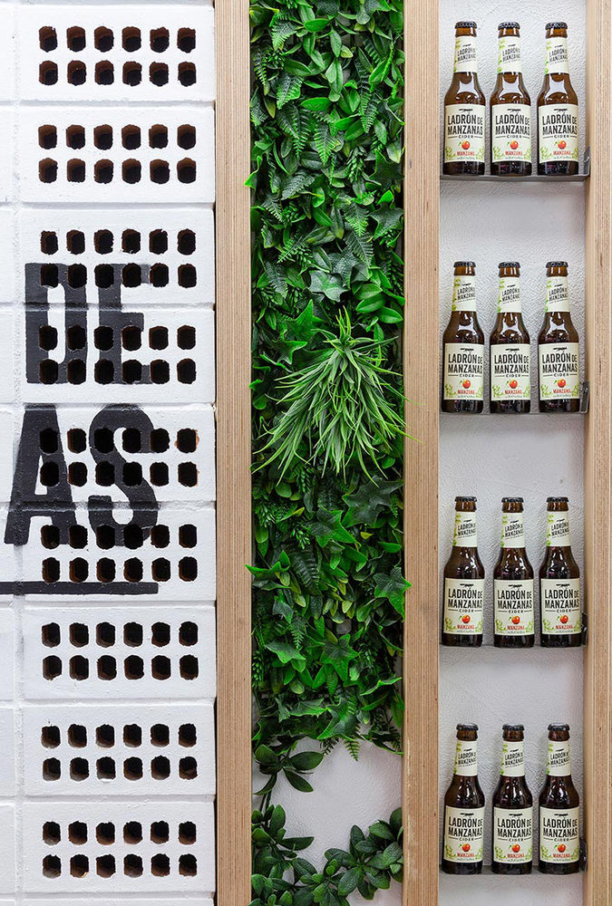
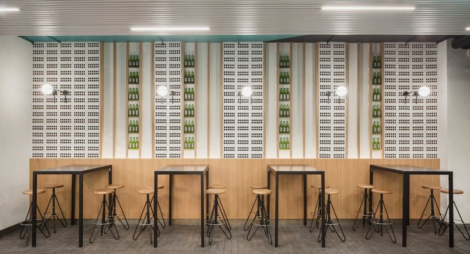
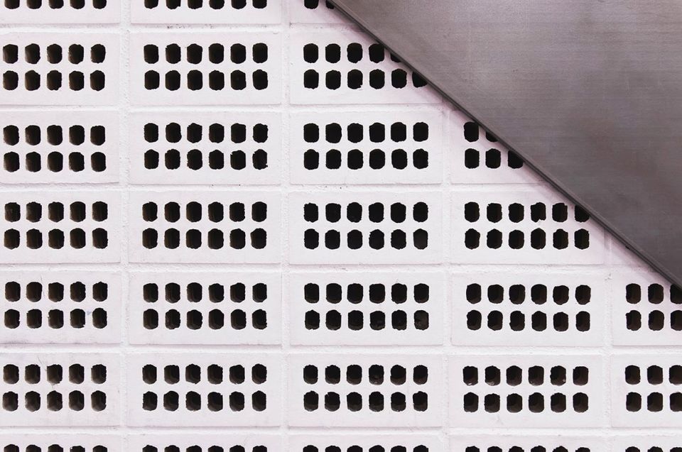
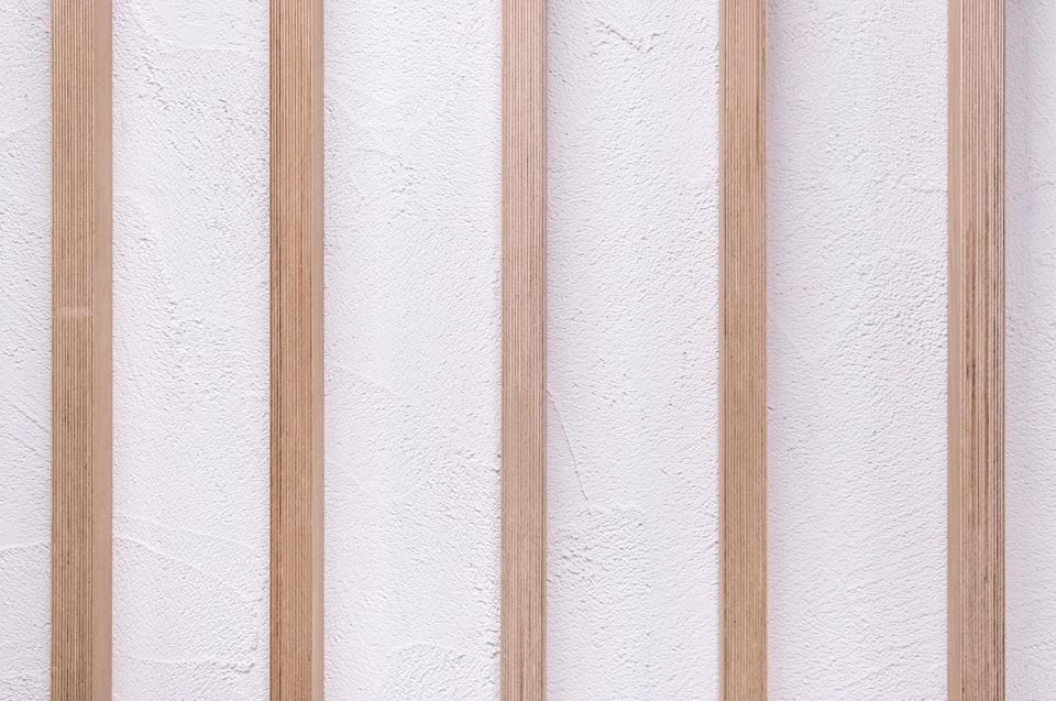
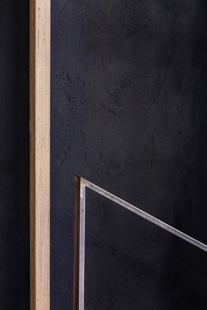
木条以及由粗灰泥和蜂窝砖组成的饰面强调了空间的连续性和完整性。它们不仅提供了植物的种植空间,还创造了一种双层表皮,从而有助于市场的声学调节。
Wooden strips and coating made of coarse plaster and honeycomb bricks are the elements give continuity and unify the space as a whole. Besides by combining vegetation brushstrokes, they create double skins that help the acoustic conditioning of the premises.
▼室内主休息空间,采用木条以及由粗灰泥和蜂窝砖组成的饰面,main lounge space with the elements of wooden strips and coating made of coarse plaster and honeycomb bricks
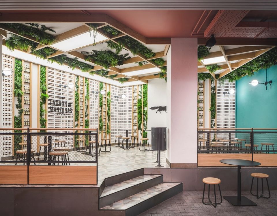
▼室内主休息空间局部,墙面和屋顶提供了植物的种植空间,details of the main lounge space, the wall and the ceiling offer vegetation brushstrokes
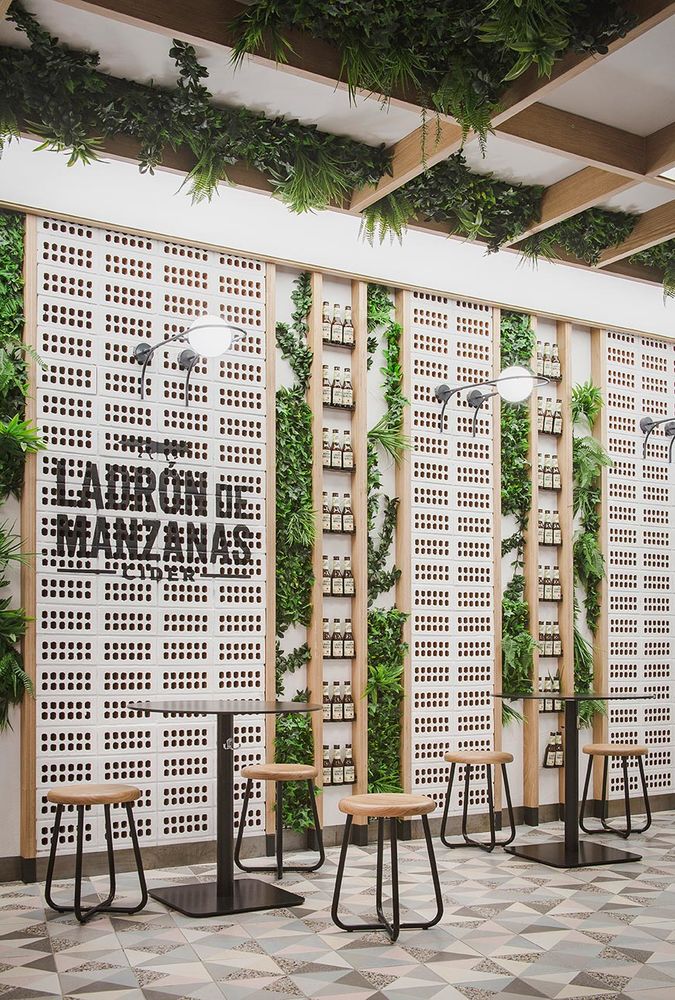
室内休息空间,木条以及由粗灰泥和蜂窝砖组成的饰面创造一种双层表皮,有助于市场的声学调节,interior lounge space, the elements of wooden strips and coating made of coarse plaster and honeycomb bricks create double skins that help the acoustic conditioning of the premises
▼木条以及由粗灰泥和蜂窝砖组成的饰面细节,details of the wall made of wooden strips and coating made of coarse plaster and honeycomb bricks
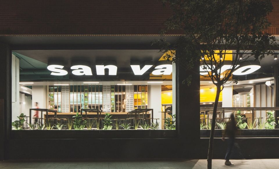
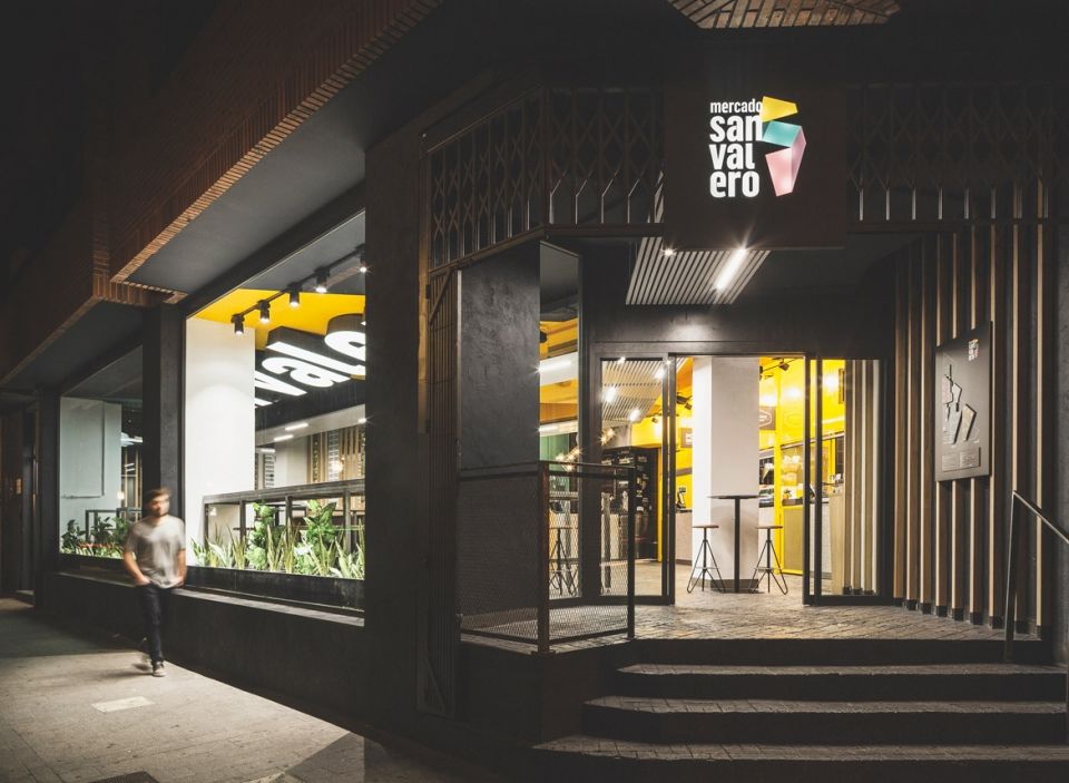
空间照明也是一个不可或缺的元素,在白天和夜晚的不同光环境中,食品市场也具有不同的空间氛围。白天,市场的大窗被打开,整个空间向外部环境开放,使得自然光线能够进入室内,创造出一个光通道般的小巷空间。在晚上,人工照明则将Mercado San Valero食品市场与外部环境联系了起来。建筑师将人工照明设备安装在了由板条制成的假天花板中,作为交叉空间的提示性元素,划分出了不同的工作区域,并作为一种引导性元素,将游客们有意识地引至市场的主酒吧。
Illumination becomes an essential element, paying special attention to its changes in space, both during the day and at night. During the day, big windows are open to the outside, letting natural light come in and working as a tunnel, almost an alley. At night, artificial illumination connects Mercado San Valero to the outside. Integrated in the false ceilings made of slats, it is used as a guide in the crossing zones and divides the different areas of work, accompanying visitors in their tour of the premises until they reach, intentionally, the main bar.
▼卫生间,the restroom
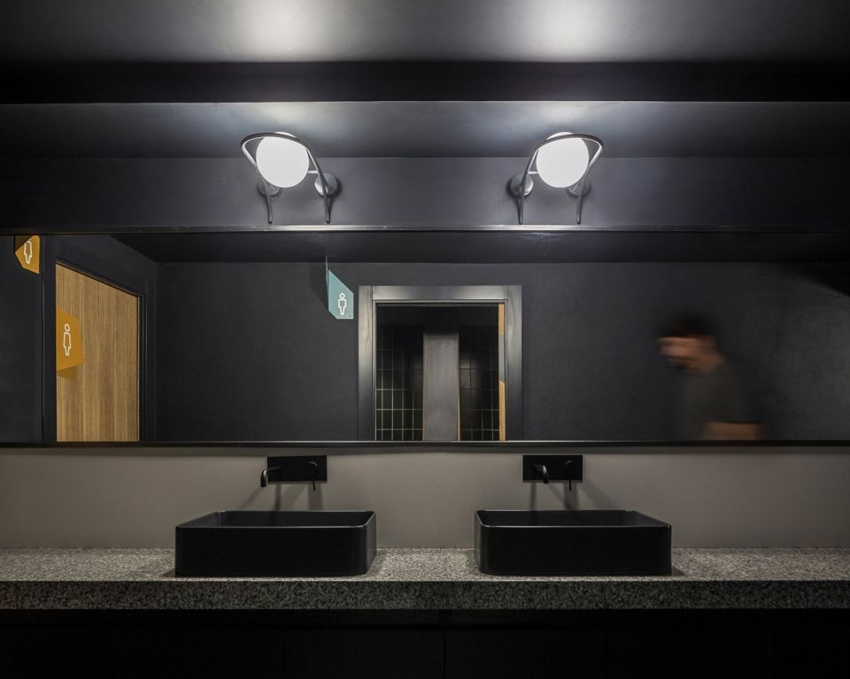
▼卫生间细节,details of the restroom
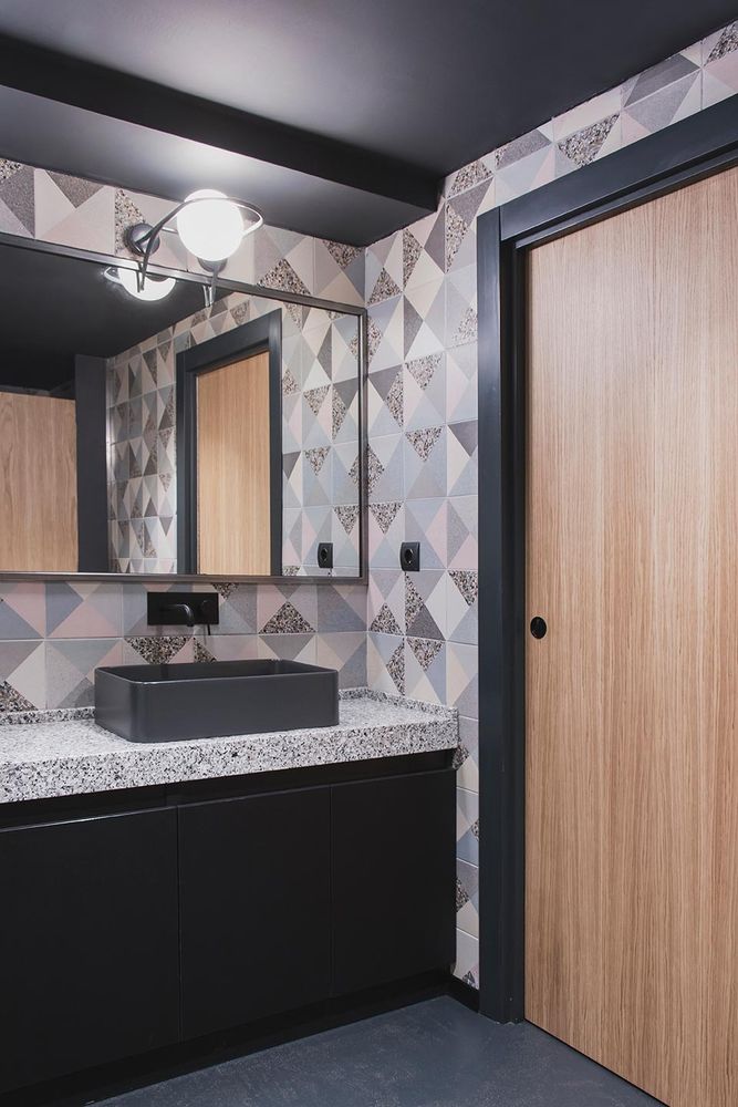
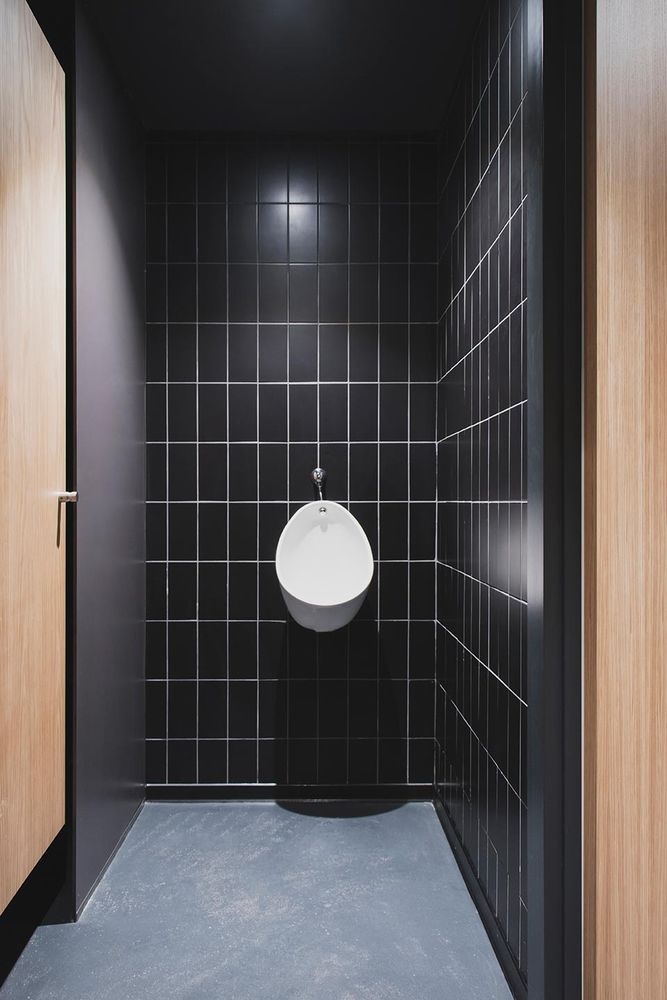
▼卫生间外墙面细节,使用木条以及由粗灰泥和蜂窝砖的饰面元素,details of the exterior wall of the restroom withwooden strips and coating made of coarse plaster and honeycomb bricks
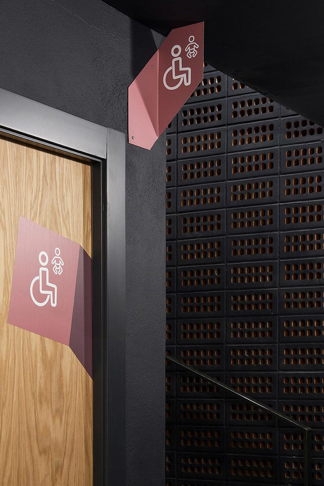
▼市场夜景,night view of the market
在本项目中,建筑事务所nihil estudio从一开始就明确了一个设计概念,并将其贯穿项目的始终,从而营造出了一种能够激发游客感受和情感的空间氛围。
A project made out of a concept clearly defined from its very beginning, in which nihil estudio aims at creating an atmosphere that activates the feelings and emotions of visitors.
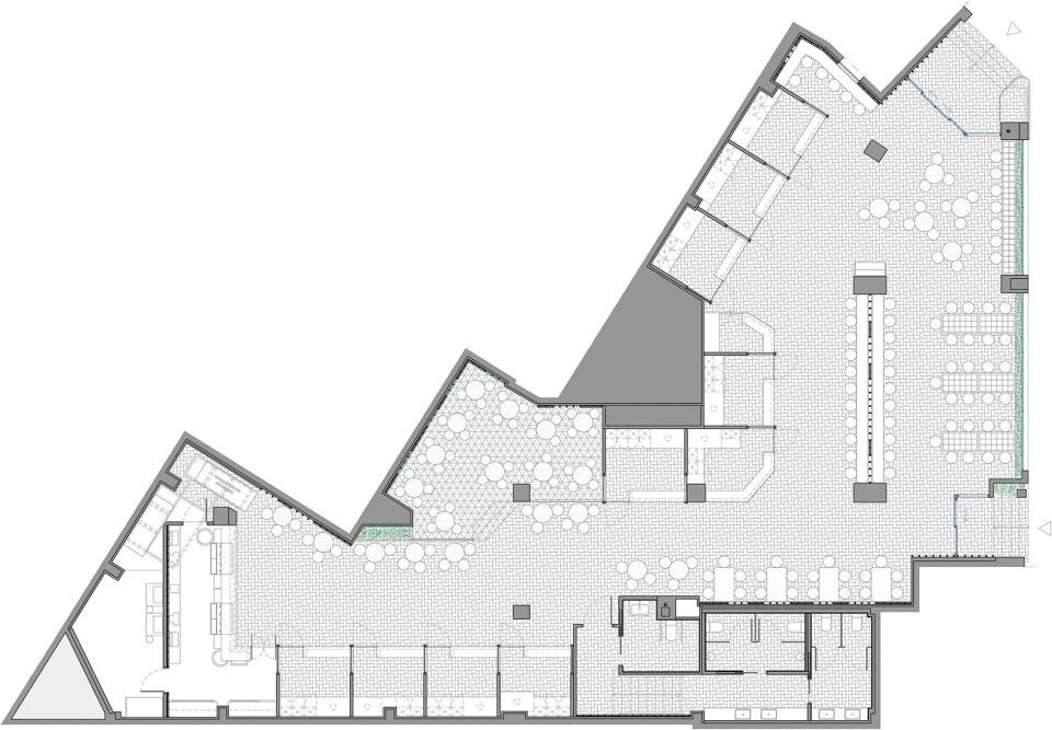
▼市场平面布置图,layout plan
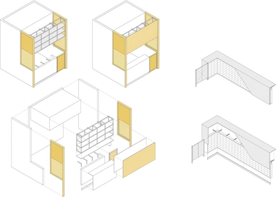
▼摊位爆炸轴测图,the exploded axon of the stall
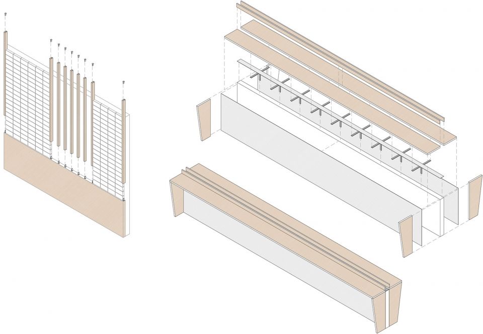
▼吧台爆炸轴测图,the exploded axon of the bar
Year: 2018
Client: Mercado San Valero
Area: 433 m2
Branding, Art Direction y Graphic Design: nihil estudio
Interior Design: nihil estudio
Location: Gran Vía Germanías, 21, Valencia, Spain
Photography: David Zarzoso and nihil estudio
Collaborators:Ceilings: THU Ceiling Solutions (Italia model slat)Furniture: Cesar Olmos Representaciones – ADICO (Classics collection: stool 274B, low stool 341)Metal carpentry: Monleón Metales
Wood carpentry: Suite 9 Contract
Lettering and corporeal: Lamarka Corporativa
Marble worker: Mármoles Santamaria (National granite model)Coating, sanitary fittings and taps: Tendenzzia
Illumination: Skeo | Led Your Life
Production of decorative lamps designed by nihil estudio: Ilexpa


