Architects:LDL Design
Area :1300 m²
Year :2019
Photographs :Yi Wang
Manufacturers : Shaw, Panasonic, Tikkurila, TimbertimesShaw
Lead Architects :Jun Liu, Leo Yin
Design Team : Guiyuan Liu, Yifa Shi
Project Director : Leon Zhang, Leo Yin
City : Hangzhou
Country : China
Panasonic Center Hangzhou is the third flagship store in the world after Osaka and Tokyo. Adjacent to the West Lake, it is located in Block B, Jiebai City Outlets, West Lake Business District. Panasonic Center, as an experience flagship store, unlike other flagship stores mainly specializing in offline sales, it is more focused on offline experience and interactive display in close range, so that consumers could obtain a more intuitive understanding of the products and brand itself, thus updating the image of the century-old Panasonic brand in their heart. In this regard, after a close discussion with the project team of Panasonic, the design team decided to start from several directions within the extremely limited design time, so as to realize the business goals set by Hangzhou Panasonic Flagship Store.
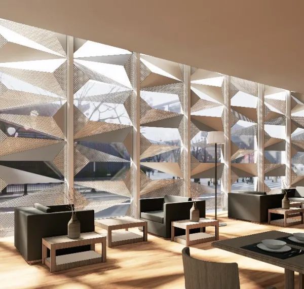
TimePanasonic is a century Japanese companyPanasonic is a century-old Japanese company and time-honored precipitation has become one of the characteristics of Panasonic. In order to leave the imprints of time in the flagship store, the design team searched for the answer from the traditional Japanese architecture, and finally chose the representative traditional Japanese elements of square panes, which, after being refined, became more symbolic. After combining with the “scale sense” of traditional Japanese architecture, the building facade of the flagship store was re-constructed, allowing the abstract “time” to be visualized.
In the center of 2F, the design team introduced the concept of traditional Japanese courtyard and combined with modern design techniques to create a modern atrium atmosphere for the entire 2F. It is this series of design techniques that make the combination of tradition and modernity just to the point in a natural manner. In addition, in the flagship store, some time-imprinted “items” were also considered by the design team at the beginning of the design, such as Panasonic’s most classic historical products and the “Capsule Toys” derived from these products.
SpacePanasonic Center Hangzhou consists of two floors, with a usable indoor area of 1,033 square meters. Among them, hundreds of exhibited products and a large number of future activities were available for the design team as subjects. Therefore, in terms of the thinking direction, designers had been aimed at creating an efficient space that can be used flexibly in the future. After sorting out the space for many times, the design team chose “Panasonic Light Theatre” as the spatial theme for 1F and divided the forms of theatre, most of which were set as flexible display space to correspond to the theme, and flexibly displayed and constructed by the Panasonic project team in accordance with the theme of its own products.
In addition, the design team opened up the narrow main entrance to the original building facade, creating a transitional space between indoor and outdoor to ease the adverse conditions of being too close to the intersection, and specially set up barrier-free ramps to facilitate consumers. Moreover, a cafe area was set up in Wushan Road adjacent to the future pedestrian street in Hangzhou. At the same time, the curtain wall facing the street is opened, and an open bar and an outer booth were set to extend the indoor space to the outdoor. Inside it, the overall circular space and the highly layered arc-shaped LED wall soften the visiting line and the space, making the space more “dramatic”.
Located in the circular space, a spiral staircase connects 1F and 2F as a link. Meanwhile, a barrier-free elevator is specially set between the core cylinder of the staircase to provide more convenient services for consumers. Different from 1F, 2F serves as the exhibition of living space with a spatial theme of “Panasonic Light Life House”. Therefore, the design team referred to the rectangular grid planning of traditional Japanese streets for layout, forming a microscopic scene of Japanese downtown streets. Therefore, after consumers climb up the spiral staircase to 2F, they will see the exhibition area of featured products with the Japanese courtyard as the element. The difference in form strengthens its spatial contrast with 1F.
Other functions such as “Beauty”, “Light Catering” and “Cooking” are all centered on this, just like the layout of traditional Japanese downtown streets. Centered on “the courtyard”, the space is interconnected with each other, and the unity between materials and color tones makes the entire 2F a richer but not messy space. Therefore, when commercial activities or live broadcasts are carried out in any block of 2F, there will be no conflict between different spaces; instead, it will better set off the activity by contrast, making it more exciting and more active.
LifeLife is a philosophy, and a comfortable and beautiful life could heal people and give them hope. Designers not only give full consideration from the perspectives of vision and space, but also pay great attention to the creation of the environment and atmosphere so that Panasonic Center Hangzhou could have an atmosphere of life. All the small objects and plants in the space are arranged to make consumers feel the beautiful and relaxed life atmosphere in this experience flagship store with the purpose of conveying the brand spirit of Panasonic: “A Better Life A Better World”.
▼项目更多图片
{{item.text_origin}}


