Architects:DELUTION
Area :75 m²
Year :2021
Photographs :Fernando Gomulya
Contractors :DELUTION Build Ex CRI
Design Team : Muhammad Egha, Hezby Ryandi, Fahmy Desrizal, Indira Pramundita S, Kevin Varraby, Doni Mahardika
Engineers : Muhammad Egha, Defi AndriI
Site Area : 184 m2
City : Pesanggrahan
Country : Indonesia
Noid House is a house that applies the concept of Continuous Void. This concept comes from the background of a client who has a large land area of 23 x 8. However, the client does not want to use the total land, and wants a house that is compact and functional in terms of space, as well as according to needs and has a large open space. Then with the concept of a compact space, the client still wants the existence of voids that can as a whole have a compact house but still have voids that can connect interactions between floors in the house. With this background, the architect then placed the void right in the middle of the building. Indirectly, this void then divides the building into two and creates space zoning.
The zoning is formed into, the 1st floor area is a public area consisting of a living room, kitchen & dinning, and a powder room area. Then up 1 floor on the right area of the building is a semi-private area which is the guest bedroom area and there is a shared bathroom. Moving to the left of the building, is a private area consisting of the owner's master bedroom and children's room.
The owner's expectation who wants to have a large void is almost impossible to implement considering that the client wants a compact house. However, the architect then tried to take the essence of the existence of the void itself, namely maintaining connectivity between the floors, flowing air and light circulation more freely from the bottom up and vice versa through perforated metal material. So that in addition to being able to connect the 1st floor and the second floor, it can also keep air and light flowing both horizontally and crossing. So as if the house has voids throughout the area of the house.
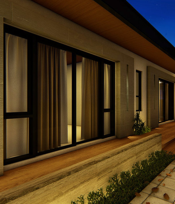
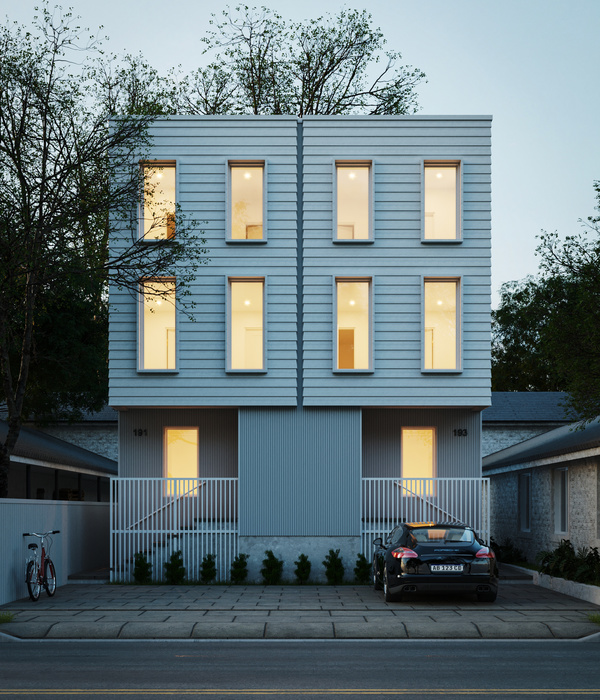
Meanwhile, in terms of color tone and material selection, due to the needs of clients who want easy maintenance, the architects apply simple materials, namely color paint and camprot plaster. In color tone, black and white were chosen. The choice of color tone also depicts simplicity, to the point, and wants to thicken the function of the building's mass.
▼项目更多图片
{{item.text_origin}}

