Firm: AIM Architecture
Type: Commercial › Retail Shopping Mall
STATUS: Built
YEAR: 2014
SIZE: 100,000 sqft - 300,000 sqft
BUDGET: $5M - 10M
Photos: Dirk Weiblen (21)
Designing a shopping mall is a strange thing: it is considered a commercial only affair. It implies: not culturally relevant. That is odd, as shopping malls seem to be among the highlights of our culture, like it or not, and enjoy a lot of attention from both public spaces and their residents.
SIZE MALL
So we re-envisioned our favorite collection of stores and F&B outlets and wanted to try to make the mall not to look like a mall. Instead we were hoping for a home to individual stores, restaurants and bars that are presented in a setting that supports their individuality rather than collective. Our aim is: “Shopping S-Mall” instead of “Shopping Mall”.
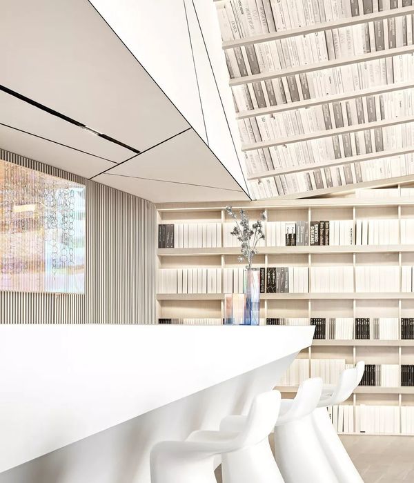
So we have avoided designing things as mall style: no glass railings but closed balustrades that create sculptural voids and no continuous brand banners above the stores but deep floor to ceiling frames to express the carefully crafted personality of the stores.
WHITE CHARACTER
We embraced Soho's admirable belief in the future, to present the project as a seductive bright white environment that encourages creativity and optimism and give all the protagonism to the units same as in an art gallery where art hanging on the walls or standing on podium are the ones that organize and full the pure and neutral white space.
INTERIOR MOVEMENT
Circulation thought the project is proposed as a movement in between the different units not as a main corridor looking to the shops. In our concept the units create a new public space, bringing the successful “sMall scheme” that we can find on original Xintiandi area.
We dramatized the escalators by cladding them in white and chrome, white for the exteriors presenting them as odd scaled sculptures of movement, while we clad the interiors in chrome to reflect and multifold the people using them.
Connection of levels is made by a spiral stairs, almost as a slide, to celebrate your movement in space. Stairs acts as a sculpture on the middle of the space giving a static movement to the inner square created by a huge elliptical opening. We used chrome on the outsides of the balustrades. This strangely reflects the floors making them light and seemingly immaterial.
The access from the landscape to B1 level is done as a generous cone made of natural and untreated brass sheet that beautifully frames the buildings on the square.
On the floor we have used grey marble, to present simple class without trivial design.
LIGHTING EXPERIENCE
The spot lighting is chosen to create a spontaneous and lightly mystifying environment where things can be personally or individual, rather than collective and controlled. Not even lighting is what we were looking for to provide a private feeling to this new brand “S-Mall” project.
In total a more aesthetic and elegant retail environment that originates from a sensitive architectural perspective. SOHO and AIM Architecture have tried to re-envision what a retail space can be made off.
{{item.text_origin}}


