Architect:Slash Architects
Location:İstanbul, Turkey; | ;View Map
Project Year:2021
Category:Hospitals
Qualident is a dental clinic located in Istanbul’s European business district Kagithane. The clinic lodges in the recently constructed residential project Porta Vadi. This location grants the clinic a rather calm environment especially through an independent landscape zone. Qualident lies on three different levels; an underground floor, a ground floor and a mezzanine floor. Qualident’s two visible levels offer two different environments, leading to two distinct yet complementary experiences. The ground floor is dedicated to the waiting areas, the secretary, medico-technic rooms, a meeting room, a pair of lavatories and two of the eight clinic boxes. On the upper level however are assigned the remaining six clinic boxes.
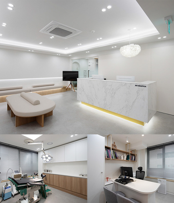
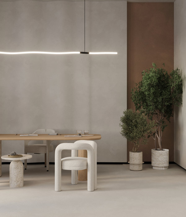
The plot being of a frank rectangular shape, it is lightened by adopting a canyon-inspired inner cavity plan. This approach is clearly exhibited through the main façade’s limpidity as it pleasantly vacuums the user from the outer space to the inner, and from the front of the space to the back in a fluid manner. The inner geometry of the clinic plays a crucial role in the inviting effect of the exterior. Once inside, the two floors showing are connected by contrast rather than unanimity. This allows the singular space to portray two different atmospheres. One attempts to tame the common dental fright among patients by embracing a rather “zen” environment at the ground floor. The upper floor however, fades in a striking white as a physical reminder of the high-end hygiene of the clinic without fiercely colluding with the serenity of the ground floor.
The horizontal dissection of the overall space shall remain incomplete without a vertical parceling. The canyon-inspired cavities come thus as a result to the organic flow required in such spaces. This vision allows an indirect connection with the back of the clinic by going after any firm or sharp features. In other words, the proportioning of the solid and void, the angular concavity and the continuity of the circulation systems join the different activities in a harmonious, uninterrupted, almost-natural flow. The unifying aspect of the overall space speaks promptly to the various users of the clinic. As much as it is important to put the patient in the center of attention, it is equally important to place the health professionals’ comfort up front as well, for they end up using the facility on a daily basis. One way to manifest this gesture is by creating a garden at the back with a pleasant seating area and inviting the green within the interior space as frequently as possible.
The rather organic geometry dominating the interior of Qualident is portrayed again in the clinic box designs. Avoiding the manufacturing effect, each box has a different theme. These themes vary with the dissimilarity of their orientation and the on-wall floral illustrations. The latter are a subtle reminder to the Japanese spirit that influences the ground floor’s design. This “zen” attitude is therefore omnipresent in all the details of Qualident.
In contrary to the classically static, vigorous and almost-disciplinary Japanese design character, Qualident embraces it in a far more fluid, smooth fashion. This approach guides and accompanies the users through the space by setting physical, passive signals such as the ceiling’s continuous pattern, the soft width variations of the space, in addition to the in-space delicate intrusions. These exceed the aesthetic cause to a functional purpose, all in a sympathetic and homogenous design language.
▼项目更多图片
{{item.text_origin}}

![SELECTED _dental office [PHOTO] SELECTED _dental office [PHOTO]](https://public.ff.cn/Uploads/Case/Img/2024-06-13/WdrLfBYxYoXMmjlBPkWWeNfrL.jpg-ff_s_1_600_700)

