Project Background
本案位于汕头东部的一个旧厂房改造的办公楼二层,集恩是一个以Fanpin梵品木饰面为主要载体的木作展厅,以木饰面为基础,衍生了不锈钢定制,柜体定制为一体的展示空间。
JIEN is a franchisee of wooden veneer brand Fanpin. Thecompany opened a new showroom centering on Fanpins wooden veneer products. Thespace sits on the second floor of an office building repurposed from an oldfactory in the east area of Shantou City. This showroom mainly focuses onwooden veneer display whilst also incorporating customized steel and cabinets.
Brand Exploration
Taking wood as the medium and draws on the quintessenceof nature, Fanpin is dedicated to creating tactile, distinctive and aestheticwooden panels.
集恩在潮汕经过5年的沉淀,与潮汕地区设计师已经有了互动的基础,同时也让市场对梵品木饰面有了一定程度的认知,艾克建筑认为这并不是一个开辟新市场的行为,而是如何稳固市场与让市场进行裂变的行为。设计中并不是要体现木饰面本身,主要的是要让市场知道集恩能做什么,一个从卖产品到定制与项目执行的行为差异,这是在展厅的设计中最重要的环节。
Having been based in Chaoshan Region for 5 years, JIENhas established a network with local design community, and has also enhancedthe visibility of Fanpins wooden veneers in the local market. This time, JIENinvited AD ARCHITECTURE to conceive the new showroom. AD ARCHITECTURE didntregard this project as JIENs attempt to exploit new market but to consolidate andfurther expand the existing market. Therefore, in addition to displaying the franchiserswooden veneers, the design team focused more on conveying JIENs own capabilitiesof creation. The key of the design shifted from products selling to thecommunication of the brands competence in creating and executing customizedfurniture solutions.
如何引流虽然是商业设计中很核心的问题,但是,本项目更重要的是如何让这个品牌产生粘性,以及让更多人知道,集恩不只是做木饰面,而是可以完成独立的家居系统定制体系。
How to attract customers is a core issue needed to befigured out in commercial space design. However, for this project, what mattersmost is how to enhance JIENs brand stickiness, and how to let more peopleunderstand that JIEN is capable of independently customizing home furniture systemsolutions in addition to selling wooden veneer products as a franchisee.
Design Exploration
集恩不只是一个展厅,而是一个艺术、温暖、私密的会客厅。
Therefore, AD ARCHITECTURE designed a space that notmerely functions as a showroom, but more importantly, an artistic, warm andprivate reception room for JIEN.
空间本身是一个容器,而我们试图探索产品与人的感受。在平静的空间中感受时间的启发,先关注空间与产品在空间中质感的魅力再去解读产品与工艺。
The space itself is a container. The design team tried toexplore products presentation and peoples experience in it, hoping tostimulate visitors to feel the charming textures of the space and products, andthen to interpret product details and craftsmanship.
宽敞明亮的空间感,以自然的质感,自然的光给空间最真实的反馈。空间与人的互交在我们的设计中特别的被重视。极大地改变了现有建筑的空间和组成关系,有利于空间结构、材料和色彩的选择与调和,并在建筑和场所之间建立了一种新的流动。
The small-scale space appears expansive and bright, and featuresnatural textures. AD ARCHITECTURE emphasized the interaction between people andspace. The design greatly transformed the existing architectural space andcomposition, to enhance the coordination of spatial structures, materials andcolors, and to create new fluidity between the architecture and the spatialrealm.
人总是能在跳出习惯的时刻获得惊喜,而这种惊喜的差异化是我们一手策划的......
The design team deliberately created unexpected, differentiated surprises in the space.
Spatial Narratives
200平方米的空间用一种果断的行为,分成三个部分,入口接待,木饰面展示与办公,项目执行展示与接待。
Occupying a floor area of 200 square meters, the overallspace is composed of 3 major functional zones, including reception foyer,wooden veneers display - office area, customized furniture solutionsdisplay - reception area.
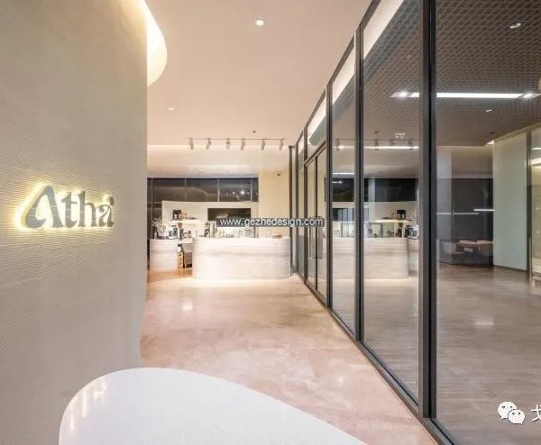
入口接待区去接待台的设计也是我们在商业领域的一次大胆的尝试,而这样的尝试也是因为当代商业的收银方式在产生变化。虽然去接待台,但入口的石头却有着接待的暗示,无人的空间状态下,也在安静的阐述了空间礼貌与谦逊
No front desk is set at the reception foyer. This is abold attempt, which is based on the consideration of the changing ways ofpayment recently. Conventional front desk is replaced by a piece of stone,which welcomes visitors in a low-profile posture.
空间的中心由两大部分组成,产品展示位于进入空间的左侧,简单中强调秩序,通过产品展示来强调空间的序列感,强调产品的美学理念。不锈钢与自然石头的展示台,初步诉说到了产品定制的核心理念,右侧为办公区,简洁的办公功能搭配背面木饰面活动样板展示,简洁大气。
The wooden veneer display - office area occupies thecentral part of the space. Products display is arranged at the left sectioninside the entrance. This simplistic space presents a sense of order throughproducts display, and highlights the aesthetic of products. The unique displaystand made of stainless steel and stone implicitly conveys JIENs core idea ofproduct customization. The office is on the right side. Concise working functionsare integrated with a backdrop of movable wooden veneer samples, showing asimplistic and neat image.
进入空间的第三个部分既是接待区,空间立面是柜体的展示,虽然空间较小,却将厨房系统、衣柜系统、酒柜系统、鞋柜系统以一种统一协调的方式一一陈列展示出来。空间的中心是一张定制的接待台,是一个拉近人与人之间细腻关系的中心,这是一个私密与舒适的过程。
The third major functional space combines reception andthe purpose of displaying JIENs bespoke home furniture solutions. Cabinets aredisplayed on interior facades. In this small-scale space, kitchen system,closet system, wine cabinet system and shoe cabinet system are showcased in aunified, coordinated manner. In the middle is a customized reception desk,which is a center that brings people closer together and provides private,comfortable experience.
空间如何变得有探索感,通过制造以小见大的空间效果,先抑后扬。目的是为了创造内向型的空间和开放的扩展。
As approaching this project, the design team worked tocreate an explorative spatial experience, and to obtain the effect of revealinga big picture through a small-scale space. The goal was to create anintroverted but freely expanding spatial realm.
天花中的形体人为的制造了自然的天光,这样的光是一个最舒适的状态,同时也是最真实的反映产品本身的状态,充分解读了产品/光与空间的关系,让人产生直接与真诚的态度。
Large areas of ceiling lighting produce a comfortableatmosphere, and help reveal the true state of products. The design fully interpretedthe relationship among products, light and space, conveying a sincere attitude.
这是艾克建筑设计团队在用西方的设计秩序来建树东方的空间情绪与哲学的再一次实践。
This project is AD ARCHITECTUREs another attempt atapplying Western design logic to construct Oriental spatial emotions andphilosophy.
Information
Project Information: JIEN Woodwork Showroom
Client: JIEN
Design Firm: AD ARCHITECTURE
Chief Designer: Xie Peihe
Design Team: AD ARCHITECTURE
Project Location: Shantou, Guangdong, China
Project Area: 200㎡
手工涂料、地毯、不锈钢、梵品木饰面
Main Materials: handmade paint, carpet, stainless steel, wooden veneer
Start Time: May 2021
Completion Time: November 2021
Photographer: Ouyang Yun
AD艾克建筑设计创始人及总设计师
谢培河怀抱强烈的情感张力和原创精神,主张以感性丰富驾驭理性简约,高妙且自然地融合空间功能与个性。在简单与复杂的动势中呈现空间美学,让人心与空间精神同振共鸣。凭借商业、住宅和办公领域的一系列极致空间作品,在过去几年内斩获了一系列国际知名奖项。其独具先锋性的“极简派艺术”空间设计语言,也已融贯东西方的认知并在全球业界得到极高的认可。
{{item.text_origin}}

