- 项目名称:COS 芝加哥橡树街店
- 室内设计:与COS的干净,现代线条的美学结合,结合自然元素,营造出一种充满活力,平静和现代风格的氛围
- 材料:灰色色调和微妙的材料在整个项目中作为一个空白画布,创造了一个互补的背景COS收集
- 商业意图:为游客创造一个放松和鼓舞人心的空间
- 文化:与品牌的艺术遗产相一致,为游客创造一个放松和鼓舞人心的空间
架构师提供的文本描述。总部位于伦敦的时尚品牌COS在芝加哥开设了第一家商店,位于橡树街,包括三层楼的女装、男装和童装系列以及5700平方英尺的销售面积。在芝加哥的第一个COS旗舰位置,COS的内部团队的建筑师,工程师,和室内设计师开始创造一个功能和现代空间灵感来自20世纪的建筑,这座城市是众所周知的。
Text description provided by the architects. London-based fashion brand COS opens its first store in Chicago located on Oak Street, housing womenswear, menswear and childrenswear collections across three floors and 5,700 square feet of sales area. For the first COS flagship location in Chicago, COS’ in-house team of architects, engineers, and interior designers set out to create a functional and contemporary space inspired by the 20th-century architecture for which the city is known.
Ground floor plan
内部建筑团队进行了多项可行性研究,以确保地块的结构局限性得到很好的利用,最终选择了一座跨越四层楼的建筑。商店引人注目的立面形式是复杂的幕墙,由三个重叠的栅格组成,每个网格的设计都是为了描绘城市的一个特定视角。
The in-house architectural team worked on multiple feasibility studies to ensure the structural limitations of the plot were well utilized, in the end opting for a building that spans four floors. The store’s striking facade takes the form of a sophisticated curtain wall, comprised by three overlapping grids, each designed to frame a specific perspective of the city.
Courtesy of COS
由COS提供
这座城市的外观是对这座城市极简主义建筑历史的致敬,整个城市的玻璃和钢铁部分都有丝带。它的最小框架是自定义的,与结构工程师合作设计,联锁,以承担正面的整个负荷到地面,而没有任何额外的结构支持。
The exterior pays homage to the minimalist architectural history of the city, with glass and steel sections ribboned throughout. Its minimal frames were custom designed in partnership with a structural engineer, interlocking to bear the facade’s entire load to the ground, without any additional structural support.
Courtesy of COS
由COS提供
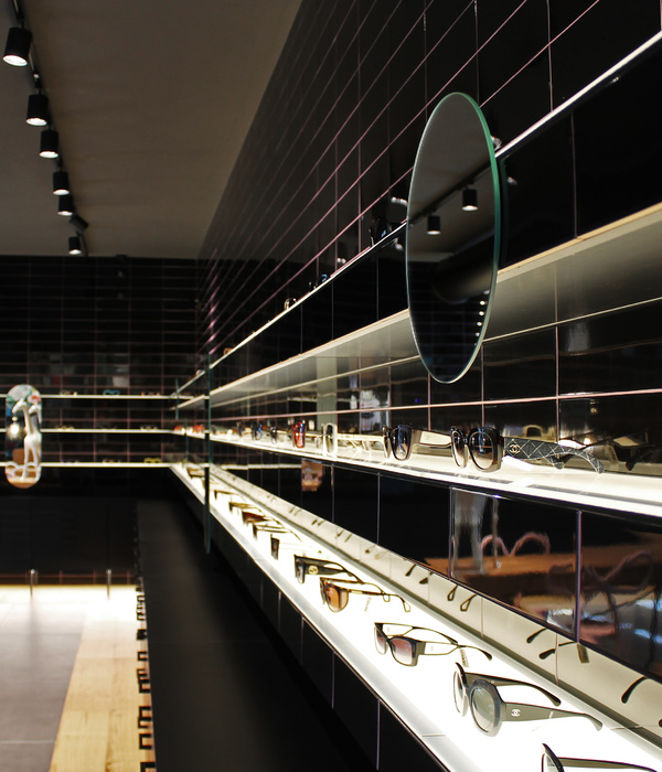
橡树街商店的室内设计与COS的干净、现代线条的美学结合在一起,结合自然元素,营造出一种充满活力、平静和现代风格的氛围。灰色色调和微妙的材料在整个项目中作为一个空白画布,创造了一个互补的背景COS收集。
The interior design of the Oak Street store aligns with the COS aesthetic of clean, modern lines in combination with natural elements, creating an atmosphere that is dynamic, calm and with a contemporary look. The grey tones and subtle materials implemented throughout the project act as a blank canvas, creating a complementary backdrop for the COS collection.
Courtesy of COS
由COS提供
另一个独特的元素,这个位置是仔细考虑的楼梯井作为一个多功能画廊空间。定制的浇灌水磨石地板,灰色的科里安表面和特别设计的照明在每个露台上安装,以创造一个均匀的照明效果,并作为一个合适的基础,以支持展览。
Another element unique to this location is the carefully considered stairwell built as a multifunctional gallery space. Bespoke poured terrazzo flooring, gray Corian surfaces and specially designed lighting on each soffit were installed to create an even lighting result and to act as a suitable foundation to support exhibitions.
Courtesy of COS
由COS提供
建筑团队在对待每一家COS商店的设计时,都对品牌的审美感很敏感,同时也考虑到商店所在地点的环境和文化背景的历史。与品牌的艺术遗产相一致,该项目的主要目的不仅是商业意图,也是文化,旨在为游客创造一个放松和鼓舞人心的空间。
The architectural team approaches the design of each COS store with a sensitivity to the alignment of the brand aesthetic, also taking into account the history of the surroundings and cultural context of the store’s location. Aligned with the brand's art heritage, the project’s main purpose was not only with commercial intentions but also cultural, intending to create a relaxing and inspiring space for visitors.
Courtesy of COS
由COS提供
{{item.text_origin}}

