Architects:Jost Architects
Area :130 m²
Year :2019
Photographs :Tom Roe, Shani Hodson
Manufacturers : Australian Sustainable Hardwoods (ASH), GRAPHISOFT, Lumion, Blanco, Brodware, DuPont, Falmec, Fisher & Paykel, Lysaght, Miele, Volker Haug, Weathertex, APLO, AWS, Anaesthetic Duomo, Artlantis, Astra Walker, Brightgreen, Carrara marble, Dowel Jones, +8Eurlouce, Geberit Hatria, HAIKU, James Hardie, Laminex, Marble & Ceramic Corp, Schots, Stonebaths-8Australian Sustainable Hardwoods (ASH)
Engineering :Tebbs Engineering
Design Team : Patrick Jost, Cameron Greiner
Clients : Reegan Stark
City : St Kilda
Country : Australia
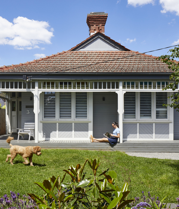
We took a classic weatherboard cottage located in St Kilda with a council Heritage Overlay and removed the previous 1980s extension to the rear. The two front bedrooms and bathroom on the ground floor, being part of the original main area of the house, was retained.
The planning restraints meant that careful consideration was given to how the upper-level area of the addition sat within the streetscape. The current ground floor footprint was utilised without pushing further back into the rear of the small site of 140m2. The brief was to add a master bedroom, ensuite, WIR and an east-facing deck on the upper level and to refurbish the ground floor bathroom, new kitchen and to utilise the small area of land to the northeast. This is where things got interesting.
Because the site tapered, becoming narrower to the rear and the proposed building was to utilise this valuable unused space, it meant that none of the gutter line, roof ridge and internally, the ceiling and wall junctions were parallel to each other or horizontal. The geometry applied ensured that the upper-level façades presented symmetrically to each end of the property. A couple of the builder’s carpenters who set out the framing had minor existential crises. Ironically, all this was very carefully worked out so no one would actually notice the unusual form.
It was a deliberate decision to make the new additions visibly contemporary in contrast to the existing dwelling but not move too far away from the original. The galvanised custom orb cladding wraps up one side, over and down on the other, intersecting with the weatherboard cladding. Both familiar materials found on the classic Victorian workers' cottages found in this part of St Kilda.
This abstract level 1 form envelopes the screened internal space creating areas of visual permeability which becomes an active and changing façade depending on the time of day, conditions and lighting. The internal planning was extremely important as there was no room to build further back to increase the internal area of the house without severe detriment to the very small rear yard. With this setback maintained, the internal planning was crucial to improve the functional layout and also fit in a stair to access the upper addition.
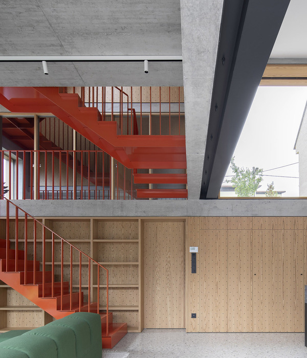
Some of these methods included introducing a banquette seat to the front of the kitchen bench which freed up valuable living space. The laundry is located in the hallway at the top of the stairs. The front-facing roof deck is accessed from here and returning back along with the stair void you enter the master bedroom. Beyond is the rear deck which is curtained by the operable aluminum screen that not only provides privacy but protection from the western summer sun. Returning back to the east, takes you through the walk-in robe, into the ensuite and back out to the eastern deck. Using room to room movement in the “doughnut” plan reduces the extent of a wasted egress area, more comfortable spaces as well as allowing excellent cross ventilation to all of the upper rooms.
The existing rooms were refurbished retaining their original features and trims with new contemporary fixtures and fittings that are aesthetically appropriate.
The interior finishes are selected to be honest with the raw textures and colours of the materials employed. The detail is careful and clean but controlled and practical. This detail was also very important to the client which delivered a combination of sensibility and functionality which won’t date.
Sustainable applications included long-lasting and durable materials such as decorative concrete with zoned hydronic heating, thermally broken aluminium and narrow profile steel frame double glazed windows and sliding doors. The upper level overhangs the west-facing of the lower living room which negated the requirement for air conditioning. The sensible application of good thermally passive design, energy-efficient lighting, and fixtures coupled with a 2.6kW PV system provides for comfortable living at a low environmental and financial cost.
The result is a unique and subtle addition that compliments the existing heritage dwelling and a home that is enjoyable to live in.
▼项目更多图片
{{item.text_origin}}

