NYPE 咖啡店 | 绿色植物打造宁静空间
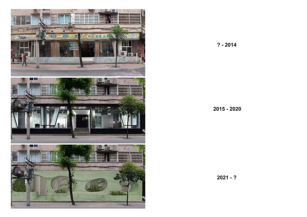
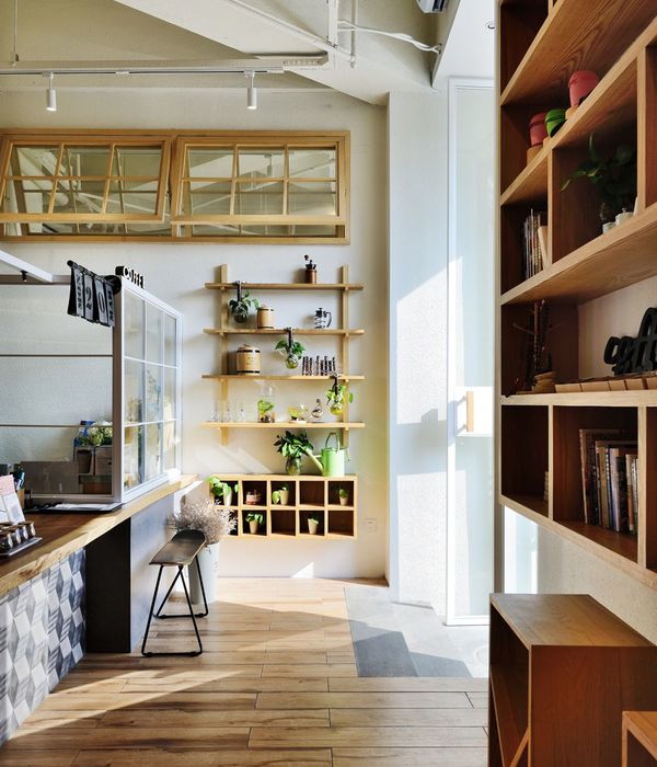
After five years since we first designed this store, this is our second time to be commissioned to design the same space. We are challenged how to provide the local people in the neighborhood and the customers of the store with a fresh look and new experiences. Recent living experiences with proximity to nature give us the inspiration to integrate green plants into the façade design and throughout the entire interior space, to give people a peaceful atmosphere even though it is physically located in a busy city center of a Chinese metropolis.
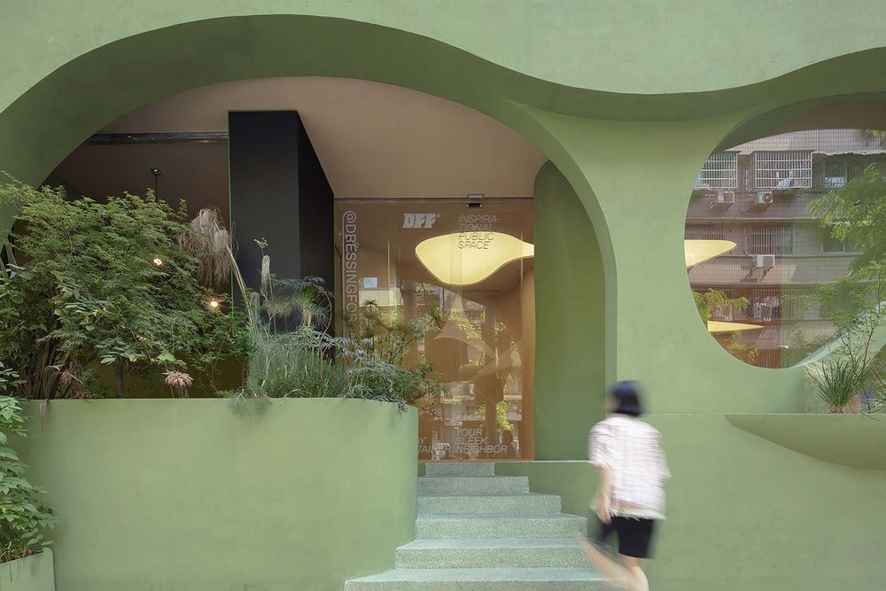
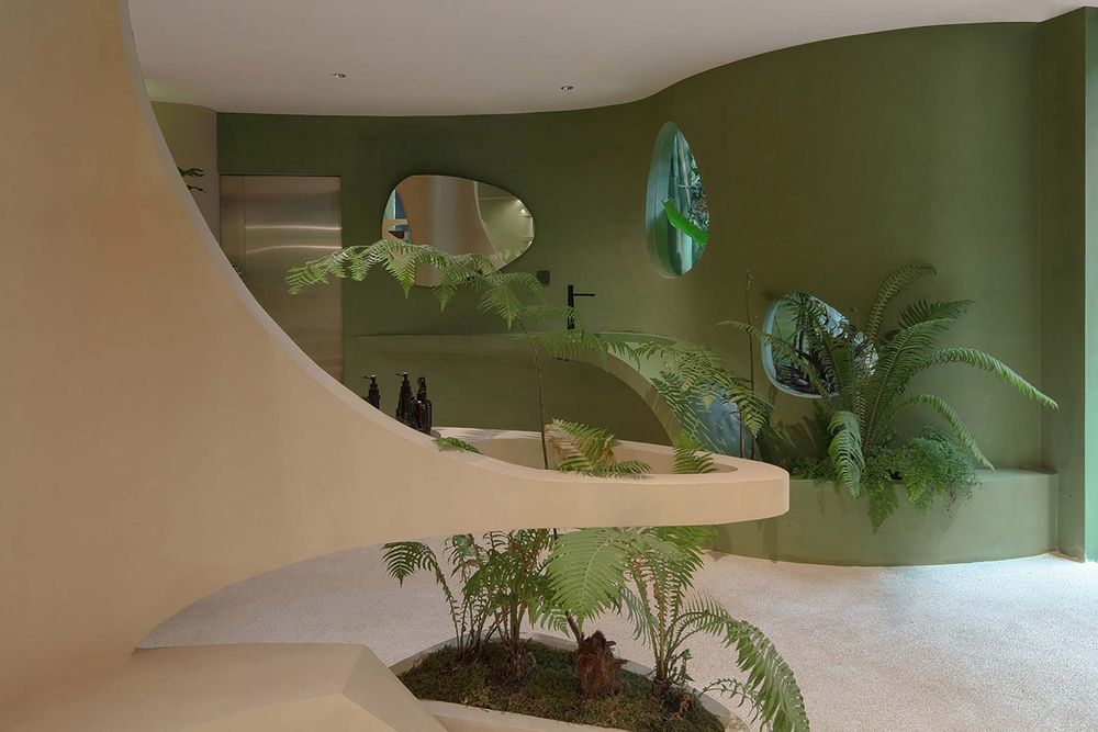
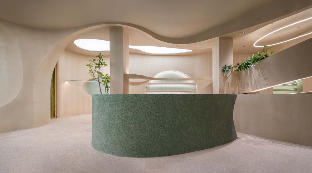
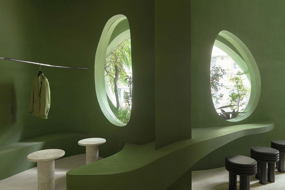
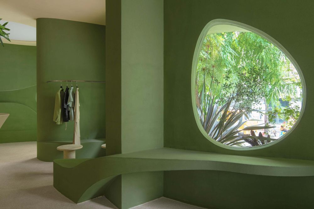
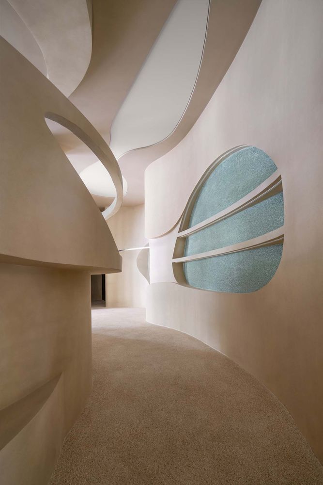
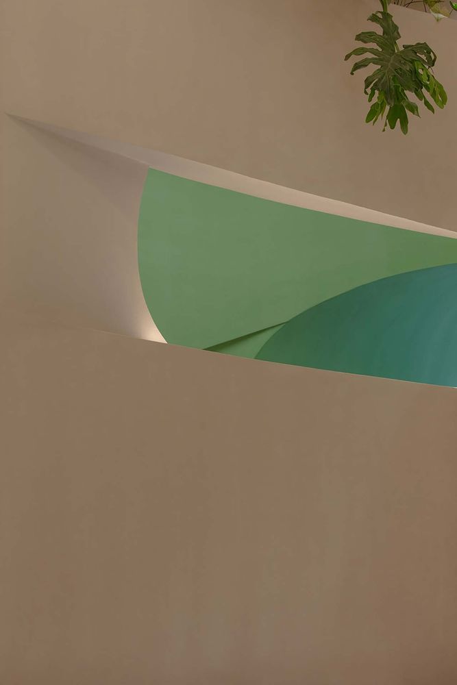
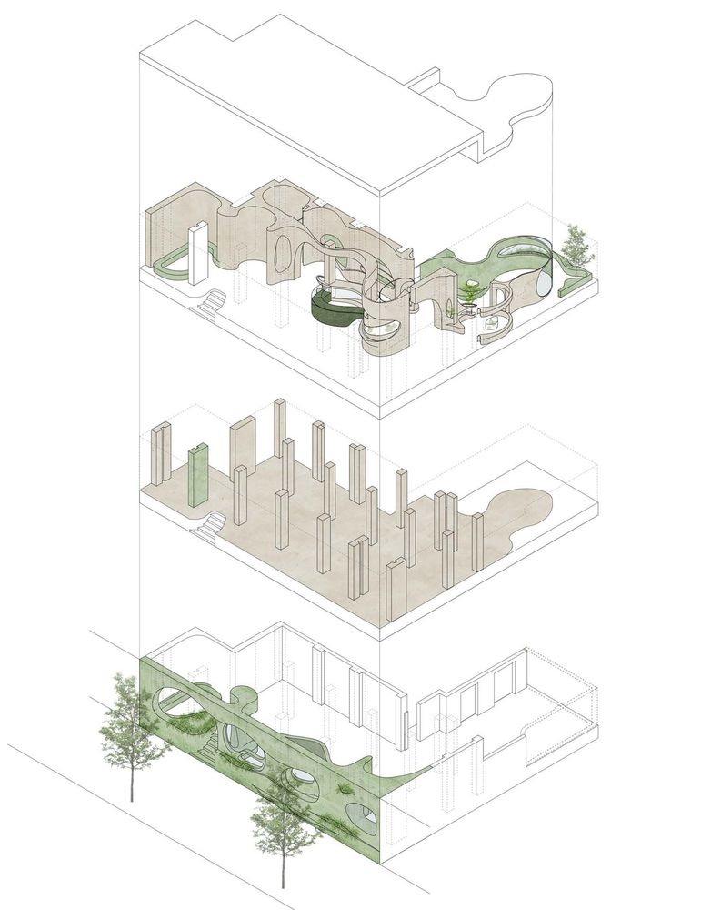
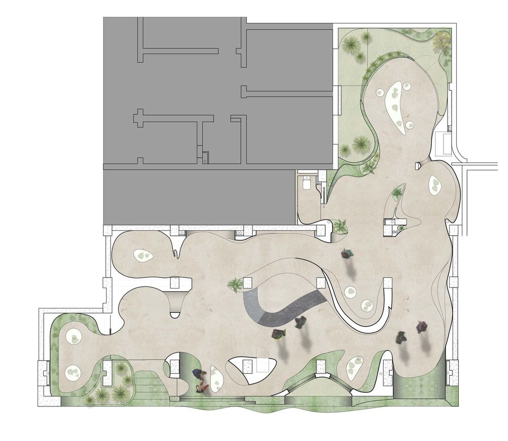
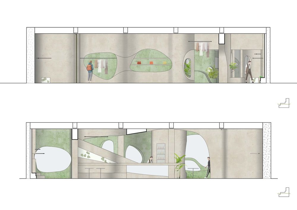
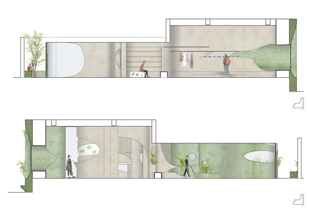
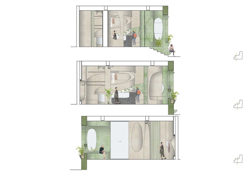
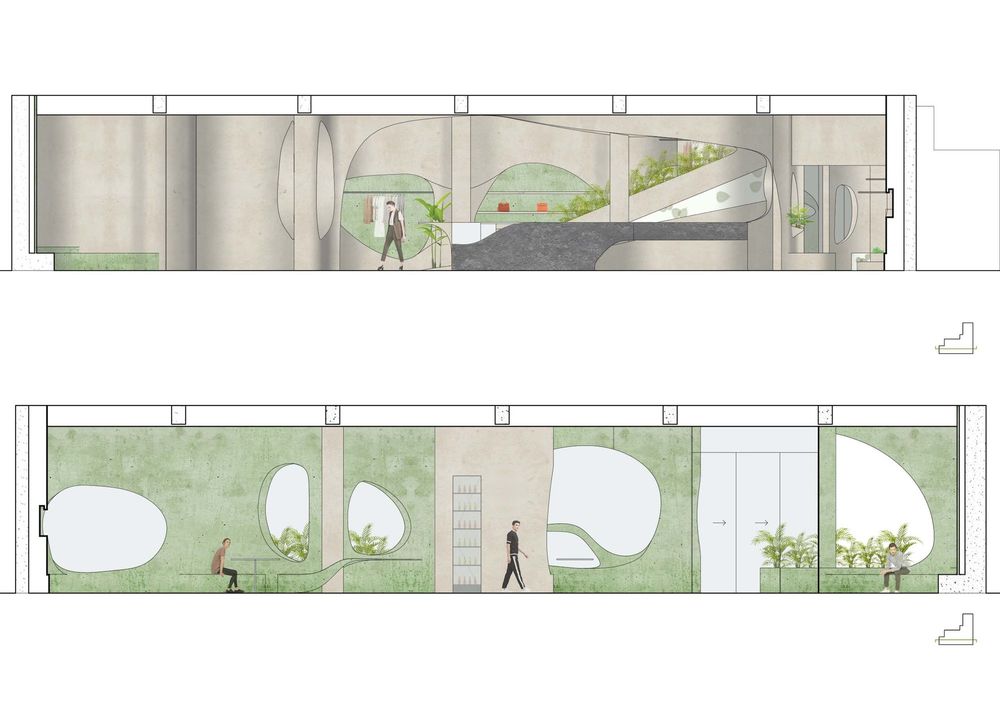
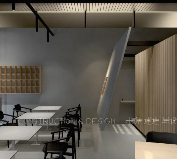
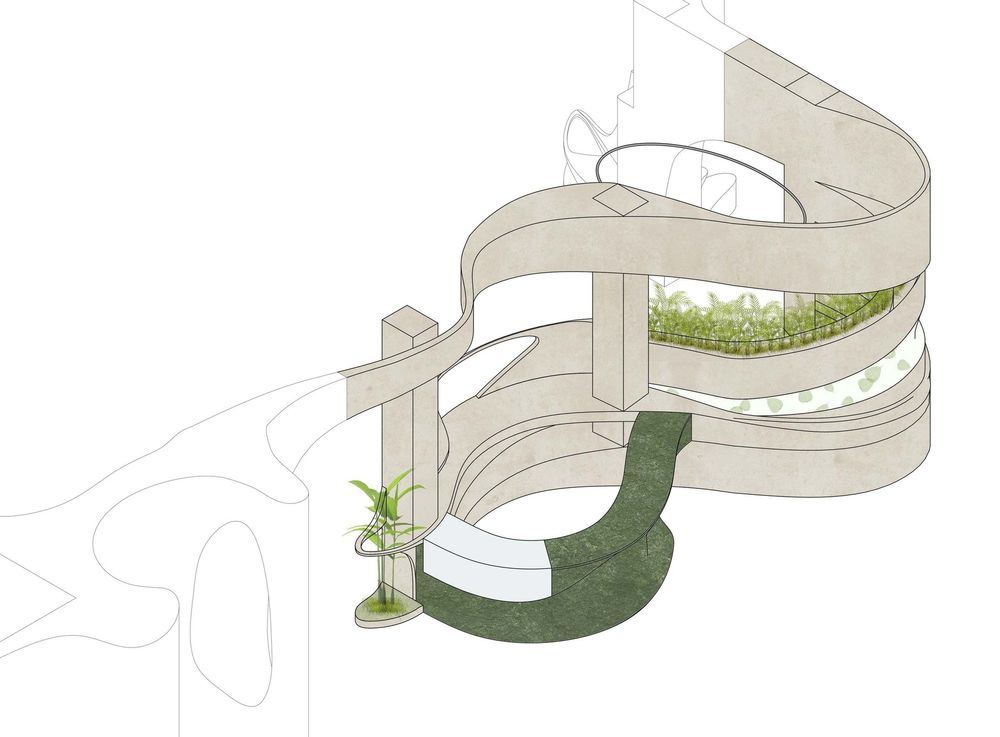
We created organic volumes to guide people through this 19 meters deep L shape space that was originally defined by a very rigid column grid spacing from 2.7m to 4.2m. Along the continuous spatial sequence of going through the store from the street front to the back yard, the space is enriched by varied scales, sometimes is narrowed down while sometimes is opening up, as well as by carefully positioned, sized, and shaped openings with specific views to arouse curiosity, to create a series of unexpected moments and to increase the depth and complexity of this very formally contained space.

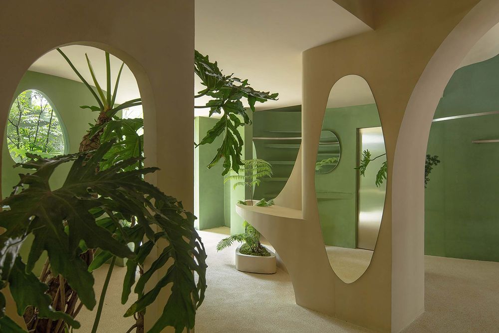
For example, outside of the bathroom where the washing sink is, an oval shape opening is created on the wall with a view to the green plants in the back yard. The sink is in a customized design in which the water after washing hands is directed by a channel to a planter at a lower level.
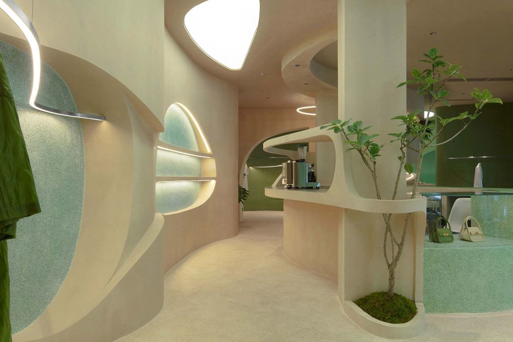
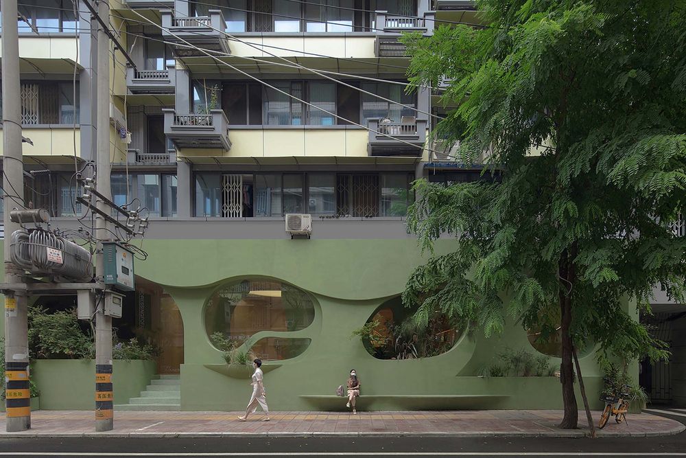
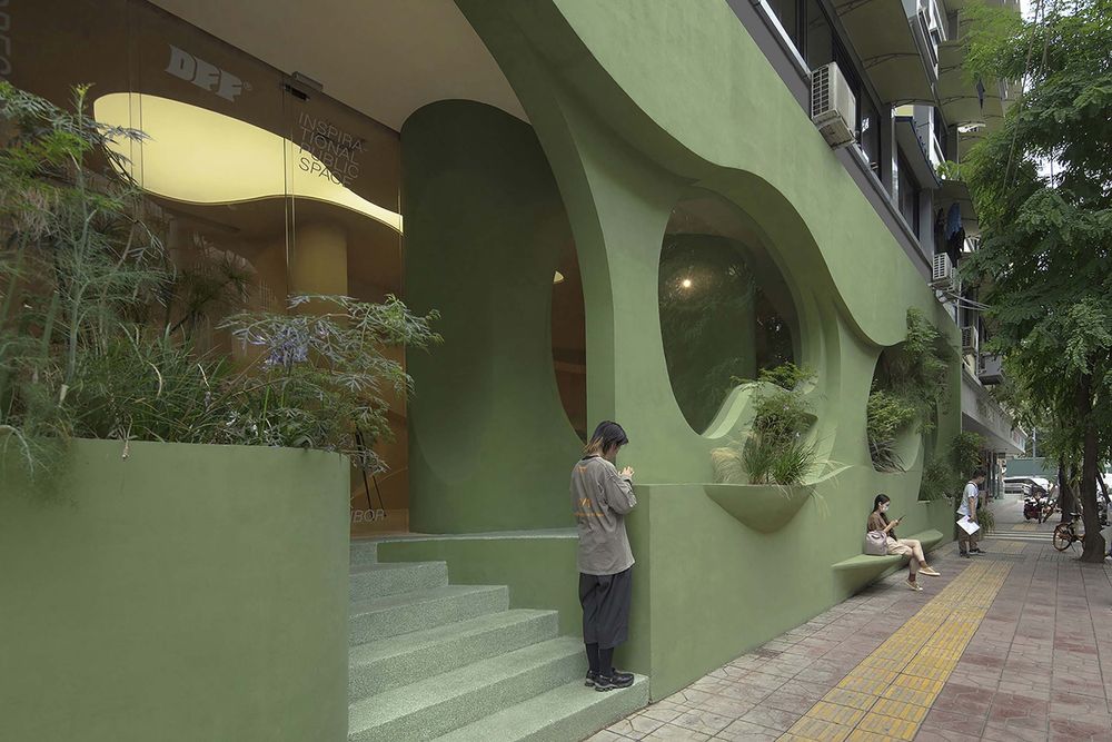
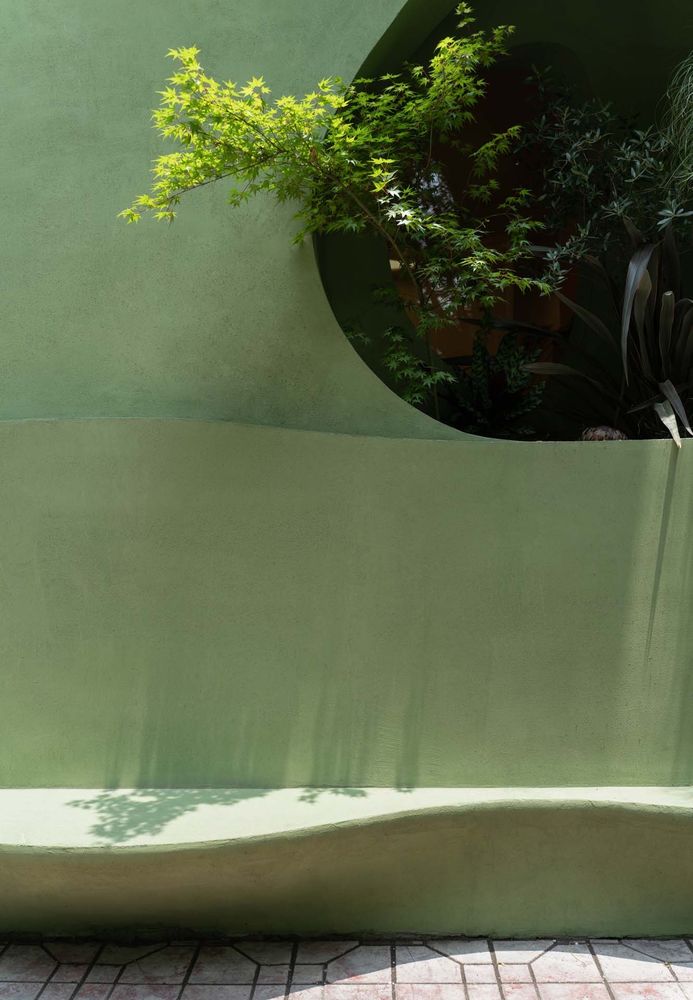
Considering that the store is located in a street with styphnolobium japonicum trees, and the program of café was requested by the client in this time renewal, very complex use of the façade is created. Besides the entrance to the store, urban furniture is designed as part of the façade for the passers-by in the street. Coffee table, seating and lounge areas with views and planters are integrated into the façade. The façade becomes an organic body engaging diverse uses at the same time.
