Architects:Estúdio Módulo
Area :7917 m²
Year :2019
Photographs :Nelson Kon
Lead Architects :Marcus Vinicius Damon, Guilherme Bravin, Andressa Diniz
Competition Collaborators : Daniel Korn, Manon Garcia, Raquel Andrade, Alessandra Figueiredo (revisão textos)
Structural Engineer : Engenheiro Miguel Marata
Coordinator : Marcus Vinicius Damon
Management : Guilherme Bravin
Executive Design Collaborators : Andressa Diniz, Fabiana Perazolo, Gabriela Galuppo Parisi, Jéssica Oliveira, Julia Dell'Acqua, Paula Máximo, Roberta Alecrim.
Landscape : Alessandra Figueiredo + Marcus Vinicius Damon
Concrete And Steel Structure : Beta 2 Engenharia
Electric, Telecomunications, Fire Protection, Sanitary And Water Protection : GRUPO VAEA
Air Conditioning : Meros & Silva
Building : Perville Engenharia e Empreendimentos
City : Joinville
Country : Brazil
The construction was as swift as that of a shed. The materials also do not differ that much from those employed in any industrial building. However, it is clear that the Ágora Tech Park is nothing alike the triviality of logistic factory buildings recurrently found on the margins of Brazilian highways. Estúdio Modulo has assumed that the Quality of a project does not come from the use of special and expensive materials. The Architects Marcus Vinicius Damon, Guilherme Bravin and Andressa Diniz make use of prefabricated building elements usually present in catalogs of companies in the national construction market. Nor do they conceive of elaborate details designed specifically for the building, the execution of which would require very specialized workmanship or almost handcrafted manufacture on the construction site. Therefore, in the Ágora Tech Park, Estúdio Modulo has set itself against those architects who sometimes have the understanding that their work as “epic”, which every millimeter needs to be drawn. The tectonics in the Ágora Tech Park is embodied with items from the industrial logic of large-scale production. The Authors appropriate this model also in the projectural reasoning based on the creation of systems. Due to this ode to pragmatism, the Joinville building was built between August 2018 and March 2019, the date of its opening. More than the Chinese speed in construction, it has been proved that, from the correct selection and arrangement of prefabricated materials, it is possible to conceive interesting architectural shapes and spaces.
The main facade itself is already didactic as it leads to the discovery of the main axis and the articulator: triple-height central space presents itself to the eyes as a starting portico for the Ágora complex, whose masterplan also is by Estúdio Módulo. The ragged floor plates 50 meters long esplanade enter the core of the building, impelling the visitor to get in. There are no distinctions on the floor between the inside and the outside, nor are there barriers to access the large, but outdoor, covered space. It is the central void that integrates all floors where all the building activities converge to it. All the functions of access, circulation, being and public gatherings come together – that is, in metonymic relationship, this is an agora in the project. The dimensions of space intersect as a square and the street, but in this aspect the closest analogy would be the 19th Century French and Italian generations – such as Vittorio Emanuelle II of Milan and Umberto I of Naples. Like the paradigmatic constructions, the grandiosity of the Ágora Tech Park central environment gives rise to a certain ceremonial air at the moment of the visitor’s entrance. However, such character does not diminish the liveliness of space: it is an environment of confluence of people coming and going. Anyone on their way to the workstation should pass through the core that connects the stairs, the corridors on longitudinal direction, the connecting crosswalks. The latter were interconnected in two building blocks of activity: the smaller is more compartmentalized and full of small spaces such as meeting rooms, pantries, toilets, stairs and elevators; The largest is an office-free floor plan with classroom division and layout independent of structure.
While the two upper floors follow full orthogonality, the ground floor contains a plan that combines more diverse and heterogeneous environments. On the larger side, there is the food court and the auditorium. In the square, two restaurants and a cafe are surrounded by dozens of dining tables and seating areas - the room is surrounded by glass which ensures full transparency with the outside. On the other hand, the auditorium has a Elizabethan stage and 200 seats in the audience. The dividers at the back of the room (that is, behind the chairs) are movable and when retracted make the foyer fully integrated into the presentation space. Still on the ground, but on the opposite flank central are the coworking environment, three modular meeting rooms (integrable depending on the occasion) and the administration. The bottom of this sequence of enclosures is marked by the curvilinear contour water mirror, whose pebbles and liquid height make tribute to Mies van der Rohe's project for the 1929 German Pavilion, in Barcelona. This water plane exacerbates and highlights a feature present throughout the ground floor: at this level, the building expands beyond the perimeter boundaries of the higher floors. In the non-alignment of plans, due emphasis is given to the two higher volumes as part of the coverage plan, without land occupation - which would happen if, for example, pilotis were used. The result is greater formal dynamics with the combination of orthogonality above with the heterogeneity and volumetric expansiveness below.
Let us return to the materials evaluation. The primary structure is made up of precast concrete parts – produced by the contracting company itself. In contrast are only the metal structure walkway and stairways in nuclear space. The external closures contain subtle distinctions to highlight the previously noted volumetric differences: on the ground floor, dark gray opaque corrugated tile is used; on the floors above, light gray colored panels (made of cement and wood) are used. Inside, wood is found on floors and ceilings of corridors and walkway to highlight the circulation. A few internal partitions are in graphite-colored Drywall. However, it must be emphasized that, in the relationship with the outside, transparency predominates. In the main facade the glass structured in dark frames predominates to highlight the modulation. On the other hand, on the side facades, perforated corrugated tile planes mediate between interior and exterior. The technical justification, of course, is the control of sunlight input. However, it should be noted that the perforation rate of the material of this metallic skin does not interfere in the visual relationship with the exterior from the point of view of those sitting at workstations.
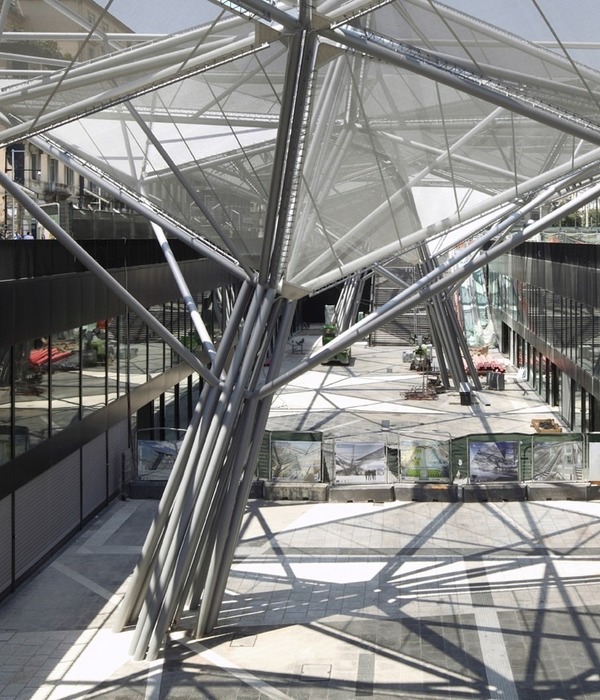
This enveloping occurs in a non-integral way: the side planes contain a design with cutouts that mark and hierarchize the internal spaces – the circulation areas with corridors and stairways have literal transparency. Thus, these subtractions externally give the visitor clues as to how the building works internally: behind the skin is the privacy of office areas, while clippings reveal the most public environments. The translucent side faces connects visually through the cover to form a single assembly – a large shelter. The huge Ceiling in of metal structure, which, in the main core of the building, becomes industrial shed with closures in alveolar polycarbonate, to allow natural lightning of the important environment. Both the central axis and the fenestrations in all facades are thought of as frames of the lush Santa Catarina landscape that surrounds the Ágora Tech Park complex. The core has nature in the background. The movement through the corridors and stairs always has as its focal point in the green context outside. Inner experience in the Ágora is permanently informed by views from the outside, especially to the preserved Atlantic Forest. Being inside the building permanently urges to look at the horizon beyond the realm of architectural design.
O fundo dessa sequência de recintos é marcado pelo espelho d’água de curvilíneo contorno, cujos seixos e altura do líquido fazem homenagem ao projeto de Mies van der Rohe para o Pavilhão Alemão de 1929, em Barcelona. Esse plano de água exacerba e evidencia uma característica presente em todo o térreo: neste nível, a edificação expande-se para além dos limites do perímetro dos andares superiores. Na descompatibilização de plantas, provê-se o devido destaque aos dois volumes superiores integrados no plano de cobertura, sem que isso tenha implicado a rarefação da ocupação próxima ao solo – o que ocorreria caso, por exemplo, fossem utilizados pilotis. O resultado é uma maior dinâmica formal com a conjugação da ortogonalidade acima com a heterogeneidade e a expansividade volumétricas abaixo.
Retornemos à avaliação dos materiais. A estrutura primária é composta por peças pré-moldadas de concreto aparente – produzidas pela própria empresa contratante. Em contraste estão somente as passarelas e escadas de estrutura metálica no espaço nuclear. Os fechamentos externos contêm sutis distinções a ressaltar as diferenças volumétricas apontadas anteriormente: no térreo, emprega-se telha ondulada opaca em tom cinza escuro; nos andares acima, utilizam-se painéis (de um aglomerado de compostos cimentícios e de madeira) de cor cinza claro.
No interior, a madeira é encontrada em pisos e tetos de corredores e passarelas, de modo a destacar as circulações. Algumas poucas divisórias internas são em drywall de cor grafite. Todavia, é preciso ressaltar que, nos divisionamentos internos e na relação com o exterior, o que predomina é a transparência. Na fachada principal prepondera o vidro estruturado em escuros caixilhos a ressaltar a modulação. Por sua vez, nas fachadas laterais, planos de telha ondulada perfurada fazem a mediação entre interior e exterior. A justificativa técnica, obviamente, é o controle da entrada de luz solar. Porém, é necessário notar que o índice de perfuração do material dessa pele metálica não interfere na relação visual com o exterior do ponto de vista de quem está sentado nos postos de trabalho.
Esse envelopamento ocorre de maneira não integral: os planos laterais contêm um desenho com recortes que marcam e hierarquizam os espaços internos – as áreas de circulação com corredores e escadas têm a transparência literal. Assim, essas subtrações dão externamente indícios ao visitante de como é o funcionamento interno do edifício: por trás da pele está a privacidade das áreas de escritório, já os recortes revelam os ambientes mais públicos. As translúcidas faces laterais ligam-se visualmente por meio da cobertura, de modo a formar um conjunto único – um grande abrigo. O imenso teto é de estrutura metálica, que, no núcleo principal do edifício, converte-se em shed industrial com fechamentos em policarbonato alveolar, de modo a permitir a iluminação natural do importante ambiente. Tanto o eixo central quanto as fenestrações em todas as fachadas são pensadas como enquadramentos da exuberante paisagem catarinense que circunda o complexo Ágora. O núcleo tem a natureza como pano de fundo. O deslocamento pelos corredores e escadas sempre tem como ponto focal o contexto verde do lado de fora. A vivência interna no Ágora é permanentemente informada pelas vistas do exterior, especialmente para a Mata Atlântica preservada. O estar dentro do edifício permanentemente incita a olhar para o horizonte, para além do domínio do projeto arquitetônico.
▼项目更多图片
{{item.text_origin}}

