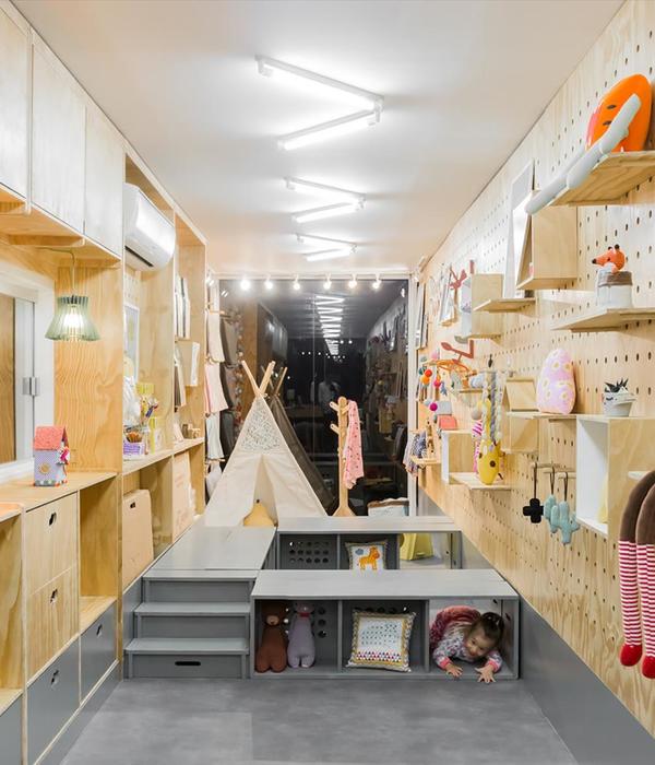
Located in the picturesque alleys of Chora, on the island of Mykonos, Mantolino, as it is called, a super tiny shop of just 20 m2, with souvenirs and giſts from Greece, was a very challenging project for Met Studio. The main idea was based on the re-design of this place in a way that would feel more fresh, vibrant and spacious, despite its size, but it would also reflect its locality· the island’s identity.
Therefore, some typical elements of Cycladic traditional architecture were chosen, in order to emphasise and enrich the concept. “Kamara”, the Greek word that defines the arch, that is oſten seen in local architecture and the dominant colour combination of white and blue, are the most representative examples of those elements, that appear in the shop. Large stone textured tiles, resemble the cobblestone paved streets, giving the feeling of the outdoor-space inside the store. However, the aim was to keep the design basic and simple, so that it would support and highlight the products.
Three equal-dimension arches were built at the leſt side of the store, as someone enters. These are destined for small objects, ceramics and decorative stuff. The rest of the space, around the arches, are hidden cabinets. The shop’s storage capacity has been largely improved, as it is almost doubled from its original state, with these wall-closets.
The wall-closet behind the cashier-counter, acts as a more playful background for the shop, as it alternates colour and scale of its parts. The blue half arch, is for small sculptures and white objects, so that they can pop out and the lower blue arch provides the entrance for a small storage room and the WC. Its surface though, is also used for hanging products with wooden sticks.
As long as the lighting is concerned, two large blue hanging tubes are put across the room and hidden lighting is in every exhibit area, in order to display the merchandise properly.
Photography: Dimitris Kleanthis
{{item.text_origin}}

