来自比利时独立平面设计师
Rik Staesens
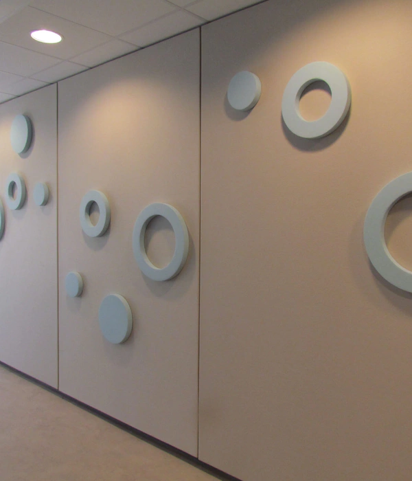
Abscis Architects事务所委托比利时独立平面设计师RikGrafiek为他们的建筑作品比利时根特新AZ St. Lucas医院停车塔设计一整套导识系统。借由建筑外表皮白色和菱形孔洞的灵感,RikGrafiek创造了一套符合建筑美学,且又清晰简洁的导识系统。所有的标示都以白色为基调色,明晰的对建筑内的流量进行指导。楼层的示意数字放在跨越天花,地板,还有墙面的菱形白色图案中,数字部分露出坚硬的混凝土墙面。地面上的青绿色线条带领参观者走向升降梯和楼梯。各种标识以简练的线条进行阐释,一目了然别具匠心。
RikGrafiek was approached by Abscis Architects to design a signage and wayfinding system for the newly-built AZ St. Lucas hospital parking towers in Gent, Belgium. A clear and simple icon set was created to fit the architectural aesthetic of the building. All signage is executed in white to complement the stark nature of the concrete while teal lines on the floor lead visitors to the elevators and stair cases. The characters feature loops as heads to emphasize the fluent traffic within the parking towers. The rounded lines of the icons reflect the curved corners of the building, while the floor numbers were placed in diamond shapes based on the pattern in the railing.
▼指示楼 Indication floor
▼ 停车塔 Parking tower
▼混凝土墙上的升降梯指示 Elevator on concrete
▼组合元素 Combined elements
▼消防设备 Fire
▼ 2层 Level 2
▼电梯+楼梯 Elevator+stairs
▼ 3层 Level 3
▼7层 Level 7
▼楼梯 Stairs
▼玻璃窗指示1 Window signage 1
▼玻璃窗指示2 Window signage 2
▼标示集 Pictoszwart
▼自行车 Bike
▼ 汽车 Car
ABOUT RIKGRAFIEK
Rik Staesens is a multidisciplinary graphic designer from Belgium specialising in creative branding solutions. He operates under the RikGrafiek moniker and works for a wide range of agencies as an independent freelance graphic designer. His client list mainly consists of small businesses and start ups.
MORE:
Rik Staesens
,
更多请至:
{{item.text_origin}}

