新西兰纳尔逊机场航站楼——自然通风与木结构之美的融合
纳尔逊机场航站楼坐落于新西兰首都惠灵顿,是一座大跨度木结构建筑,机场跑道位于航站楼后方,远处是壮阔的塔斯曼湾(Tasman Bay)和新西兰纳尔逊西部山脉(Western Ranges)景观。原航站楼建于1975年,由于近年来纳尔逊乘客人数不断增加,且旧建筑已不再符合当地规划要求,因此,Studio Pacific Architecture事务所为纳尔逊机场设计了全新的航站楼,以便机场可以继续高效运行。
The Nelson Airport Terminal is a new large span timber building overlooking the runway, with a stunning backdrop of Tasman Bay and the Western Ranges in Nelson, New Zealand. The requirement for a new terminal building arose out of the reality that the existing 1975 building no longer met building code requirements or functioned efficiently with the ever-increasing passenger numbers’ travelling through Nelson.
▼项目鸟瞰,aerial view of the project © Jason Mann Photography

▼远观项目,viewing the project at distance © Jason Mann Photography
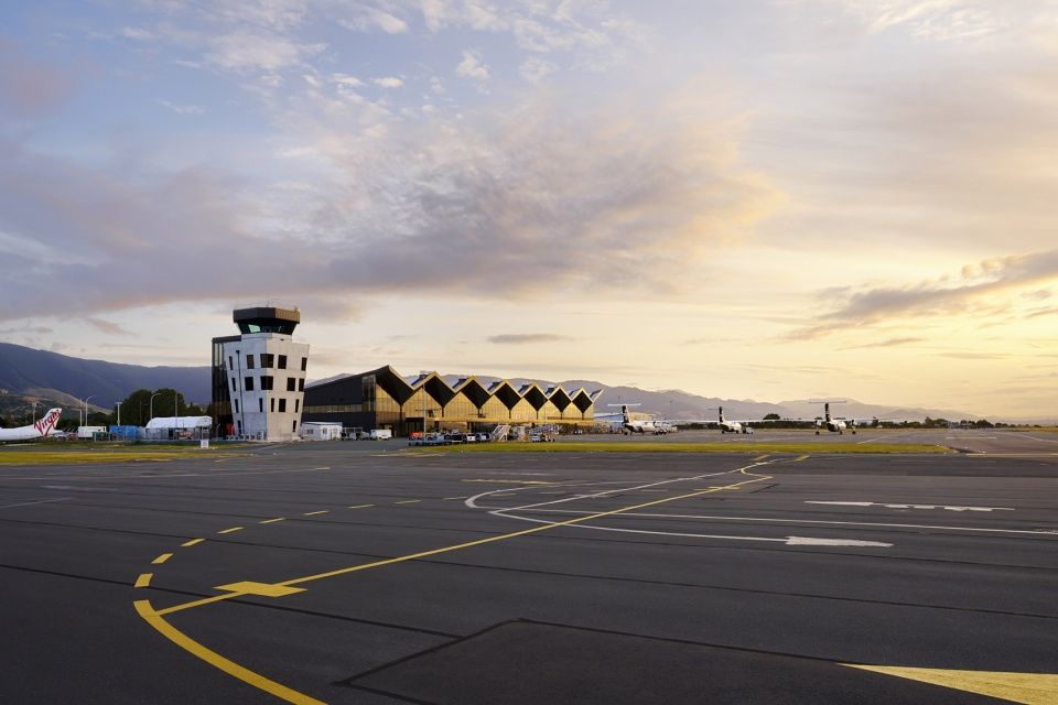
作为一个高效运行的交通枢纽,同时也是安全可靠的商业服务设施,本项目体现了纳尔逊的独特性。通过大量运用当地材料,航站楼内部与周边环境的景观完美融合在一起。在环境保护与可持续发展方面,项目主要采用了两种设计策略,分别为自然通风,以及大跨度木结构与弹性抗震结构相结合的建筑结构选型。这两种设计策略的实施使纳尔逊机场从众多交通建筑中脱颖而出,成为可持续机场航站楼的优秀范本。
The brief was for an airport that operated efficiently, both as a transportation hub and a safe and viable business, but also, aspirationally, one that reflected uniqueness to Nelson, connection to landscape within the building, and extensive use of local materials. Two main strategies have been chosen to deliver on the expectation for an environmentally sustainable design; natural ventilation and the use of a mass timber structure coupled with a resilient seismic structural solution. Utilisation of these initiatives enables Nelson Airport to differentiate itself and to set a precedent for the sustainable operation of an airport terminal building.
▼项目概览,overall of the project © Jason Mann Photography
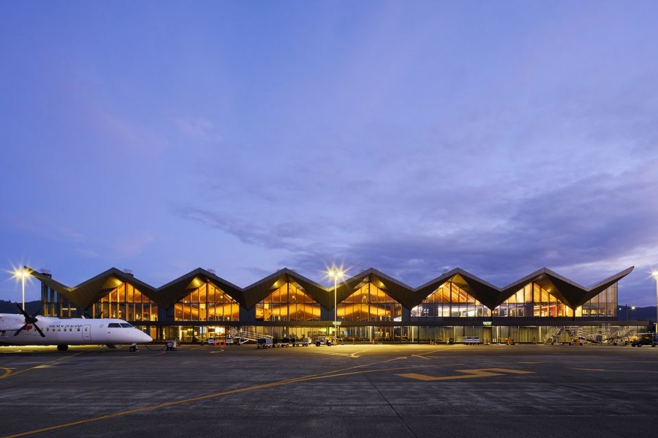
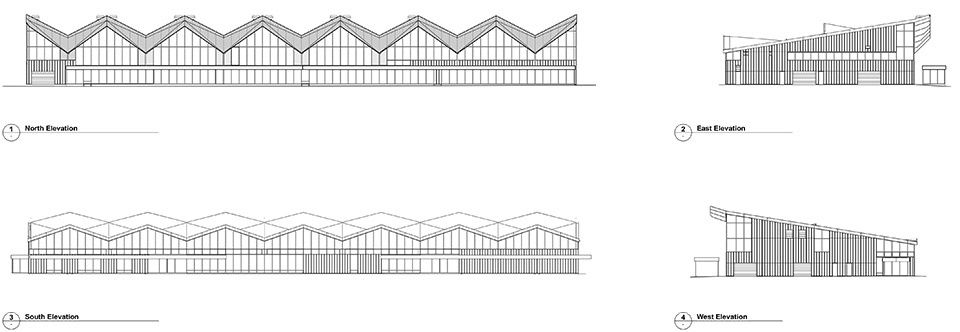
建筑的屋顶结构复杂而醒目,与简洁规整的平面、立面形成鲜明的对比。 以建筑的长轴为基准,屋顶表面以一定的模数有规律地折叠,呼应了周边起伏的山脉轮廓。北立面上,巨大的V字形屋顶悬挑出来,形成室外檐篷。这种设置具有多重优势,一方面,屋顶的结构与外表皮之间形成空腔,起到了将下方太阳能拔风塔中热空气排出的作用;另一方面,出挑的屋檐为室内提供了遮阳,并减少了北立面的玻璃面积。
In contrast to the simplicity of the plan and facade, the roof is highly complex and visually striking; folding across the length of the building in a constant, rhythmical pattern which references the surrounding mountain ranges. Along the north façade, chevron-shaped external canopies have multiple benefits; they act as large chambers discharging warm air drawn in from the solar chimneys below, whilst also providing solar shading to the interior and reducing the extent of glazing to the north façade.
▼北立面上,巨大的V字形屋顶悬挑出来,along the north façade, chevron-shaped external canopies © Jason Mann Photography
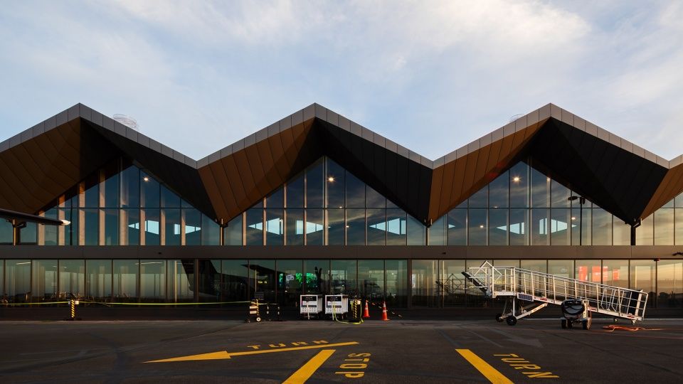
建筑师运用了一种简单而巧妙的手法来实现航站楼主要空间的自然通风。建筑的平面、层高以及屋顶形式最大限度地增加了空气流动,利用空气动力学原理,热空气从高窗排出,新鲜的冷空气从低窗进入,从而实现了室内的冷却降温,营造出舒适的体感温度。精心设计的铰接屋顶横跨过整个建筑中心,形成天窗,在最大程度上引入自然光线,并允许热空气通过玻璃百叶排出。
The building takes a simple but sophisticated approach to achieve natural ventilation for the main terminal space. The buildings plan, height, and roof form are designed to maximise air movement and to utilise the air’s buoyancy when heated to rise up to high level openings. Low-level windows bring air into the building and the carefully articulated roof is split through the centre of the building, creating clerestory windows that maximise daylight and allow release of hot air through glazed louvres.
▼室内空间概览,overall of the interior space © Jason Mann Photography

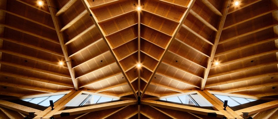
从室内看向屋顶,自然而温暖的木质纹理与合理的尺度,营造出迷人而亲切的氛围,让人不自觉地想要多逗留片刻。木材作为建筑结构与建筑形式的主要组成部分,以朴实而直观的方式彰显出项目设计理念的核心,即,运用材料体现建筑与周边森林环境的紧密联系,进而达到为建筑追根溯源的目的。
Internally the timber structure forming the roof is most captivating with a natural warmth, texture and scale that is an invitation to linger. The use of timber as structure and form-giver is integral to the aims of the design – a true and tactile response to the brief, that reinforces the materiality and its connection and relevance to the surrounding forestry, from which it has been sourced.
▼自然而温暖的木质纹理与合理的尺度,营造出迷人而亲切的氛围,the timber structure forming the roof is most captivating with a natural warmth, texture and scale © Jason Mann Photography
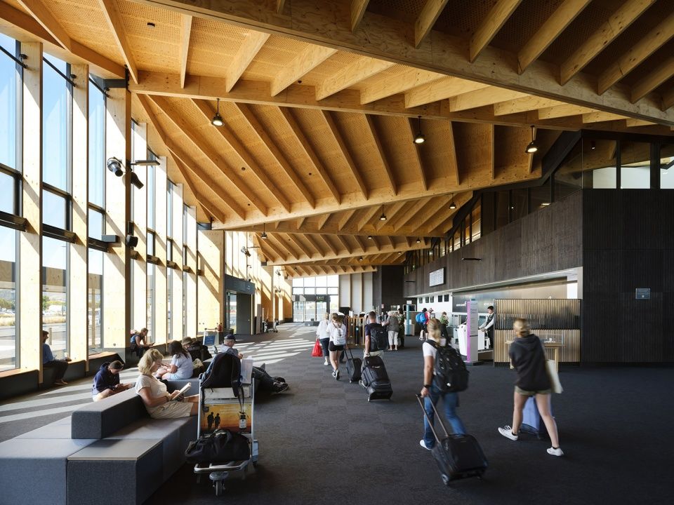
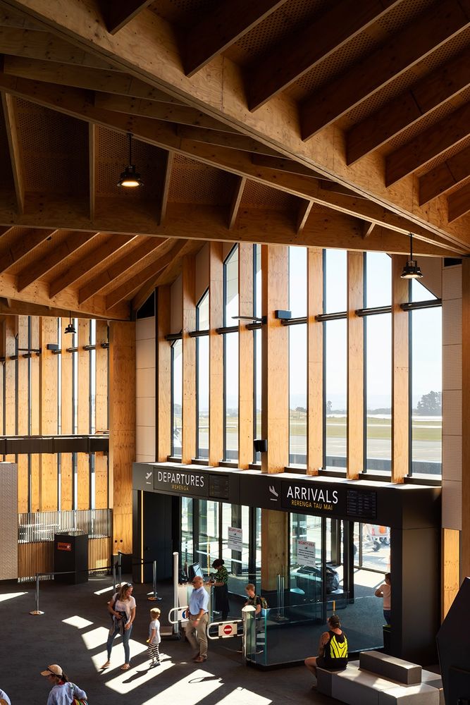
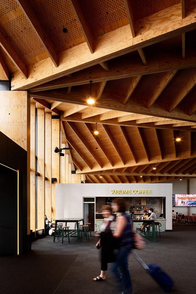
重复的建筑模块为实现大跨度的开放空间提供了条件,在最大程度上减少了柱子的排布,使室内布局变得灵活机动。完备的商业空间体块,宛如一个个漂浮在屋顶下的“舱体”,满足了机场运营、零售、餐厅等需求。室内主色调简洁而优雅,裸露的材料既突显出结构,又营造出自然和谐的室内氛围,将复杂的功能空间统一成一个整体。
The repetitive building module achieves a large open footprint, allowing for flexible internal planning with minimal columns, where internal ‘pods’ float beneath the roof and house operational requirements, retail, and food and beverage offerings. The material palette is simple – stripped back to both highlight the structure and to create a calming backdrop for the mix of spaces within.
▼裸露的材料既突显出结构,material palette is stripped back to both highlight the structure © Jason Mann Photography
▼商业空间体块宛如一个个漂浮在屋顶下的“舱体”, internal ‘pods’ float beneath the roof and house the commercial space © Jason Mann Photography
作为纳尔逊地区的主要门户之一,本项目通过建筑的形式与材料彰显出当地的特色。Studio Pacific Architecture事务所运用巧妙的设计语言打造出一座既独一无二又富有地缘气息的航站楼,使其从世界同类型的机场建筑中脱颖而出。
As one of the main entry points into the Nelson region, the building expresses in its form and materiality the essence of place. In this manner the terminal building is unique and differentiated from homogeneous airports around the world through its regionalism.
▼屋顶细部,details of the ceiling © Jason Mann Photography
▼总平面图,site plan © Studio Pacific Architecture

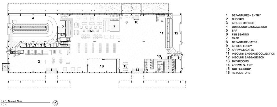
▼一层平面图,ground floor plan © Studio Pacific Architecture
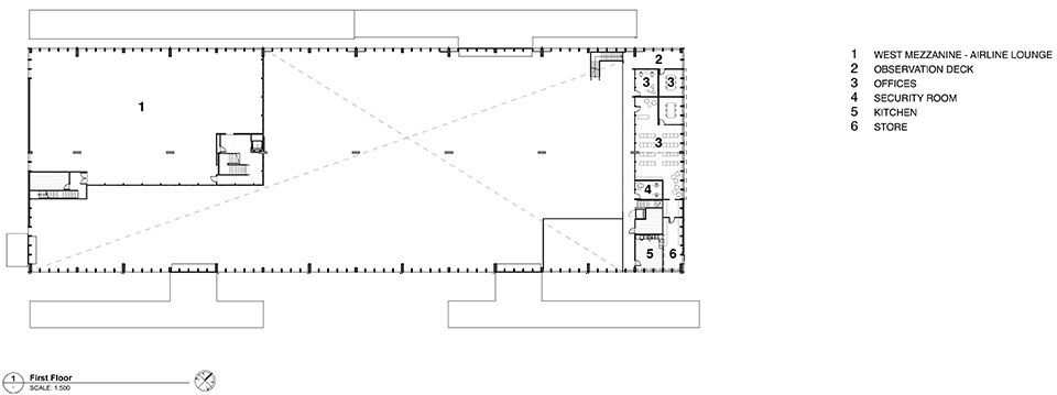
▼二层平面图,first floor plan © Studio Pacific Architecture
▼立面图,elevations © Studio Pacific Architecture
Clients: Nelson Airport Limited
Project Manager: Aesculus
Structure: Dunning Thornton Consultants Ltd
Services: E-Cubed Ltd
Fire: Aurecon
Acoustics: Acoustic Engineering Services
Façade Engineer: Mott MacDonald
Civil Engineer: CGW Consulting Engineers
Quantity Surveyor: Barnes Beagley Doherr Ltd
Retail Tenancy Fitout Coordinator & Bathroom Mosaic Tile Artwork: Edito
Signage Design: Studio Pacific Architecture in collaboration with Edito
Landscape: Studio Pacific Architecture
Main Contractor: Naylor Love in partnership with Gibbons Construction and Fulton Hogan.
Photo credits: Jason Mann Photography
Photographer’s e-mail: info@jasonmann.co.nz


