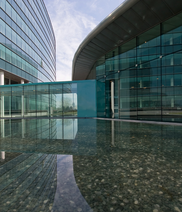
Marseille at the university of provence
设计方:Dietmar Feichtinger Architects
位置:法国
分类:教育建筑
内容:实景照片
图片来源:Sergio Grazia
图片:50张
就未来发展而言,上世纪60年代建立的学校需要体现出应有的附加值。Dietmar Feichtinger事务所表示,通过仔细的定位和外观设计,能够提升建筑的附加值,而不是采用一些夸张的造型符号。
不用故作姿态
有时候,通过设计师采用的方法和影响力,就能看出他的能力和艺术创造力。好的设计师能应对客户不同的要求和多重任务。在许多情况下, 设计需要一些约束力。
在建造人文主义学院的时候,设计师就面临了一个问题。一方面,扩建的话,需要新建学校的入口。而另一方面,根据设计情境,需要建造特殊的表现形式。地面设计面积达到了8000平方米,要建造演讲大厅和办公室,不包含礼堂或大型图书馆这种显眼的设计元素。新学校所在的城镇整体上缺乏特色,比较平庸,所以不需要添加夸张的设计元素。
空间而非建筑
设计师更喜欢建造空间,从无到有,从空白到丰富,打造全新的建筑。通过短暂的分析,设计师认为可以为校园增添入口,突出校园的身份。这里是法国最重要的大学之一,扩建时采用不相连的分隔设计。设计师根据城市模式,把校园大致划分为三个大小各异的区域,呈矩形设计,中间留有空地。进入学校,会有两条主街,分别引领学生进入主楼,或是图书馆。校园的环境很好,十分安静。
开放的设计
三个街区的布局设计能够抵御北部的寒风,这确实是该地区的气候问题。另一个显著的气候特征就是阳光非常强烈。因为有很所树荫能够遮阳,所以,这一点还是可以忍受的。但很可惜的是,很多树木将被移走,为扩建腾出更多地方。这里会新建一个喷泉和停车场,附近还有小河流过,建成后会呈现非常美丽的景观。
选材上比较统一,采用开放式的设计。建筑师会设计拱廊,体现垂直的线条感。采用赭色的混凝土板,这样的话能让建筑与普罗旺斯周边的景观相互融合。
古典主义节奏
设计师采用玻璃材料建造外观,比较经济适用、看上去很简洁。玻璃的百叶窗可以围绕中心轴灵活转动,借此调节光线。整个外观的垂直感比较强,设计品质很好。正面是面向庭院的,外墙的壁纸很有特色。
百叶窗在设计上有不同的定位,比较灵活。外观采用了薄纤维混凝土板,加上整个建造系统,突显了古典主义。演讲厅和办公室采用圆柱形的天花板设计,美化了外观,保证了更好的音响效果。
夜间冷却
混凝土的整体建筑使白天和夜间温度不同,这种设计主要是考虑到该地区特殊的气候条件。演讲大厅有制冷系统,其余的房间隔热隔音的效果也不错。建筑采用双层玻璃, 门窗前面还有凉棚,便于遮阳。室内环境比较舒适,明亮。设计师表示,自然和技术之间,我更喜欢自然。
译者: Odette
From the architect. A major gesture is not always needed. In further developing a campus that dates originally from the 1960s Dietmar Feichtinger shows that added value can be better achieved through restraint, carefully positioned cubes, and subtle facade rhythms than by the use of showy sculptural symbols.
At times the entire art of the architect can lie in his ability to assess the impact of the measures he employs. And in not prescribing a kind of architecture that is out of place or at loggerheads with the demands of the task posed, whether at a programmatic or context-related level. In many cases restraint is the best answer and also indicates true understanding of the particular situation.
In approaching the project for the extension of the humanities faculty of Aix-en-Provence University Dietmar Feichtinger found himself confronted with a contradiction. On the one hand the extension, by nature of its position, had to mark an entrance to the campus, but on the other neither the brief nor the context suggested a specific form of architectural expression. The brief, relatively modest in terms of floor area (8000 m²) and banal in terms of content (lecture halls and offices), contained no elements such as an auditorium or large library that would have called for strong architectural expression. In addition the dreary mediocrity of the context spoke against a too striking kind of architecture. Given the featureless nature of the periphery of this provincial town with its groups of little houses and allotment gardens, banal workshops, pizzerias, and here and there a social housing block, even a minor architectural gesture would have seemed unsuitable, indeed even provocative.
Consequently, Feichtinger opted for restraint, if not to say architectural neutrality. He prefers a space to a building, an empty volume to a full one, and a place to a piece of architecture. By breaking up the brief into a number of small buildings he allows an entrance to the campus to develop. Through the considered way in which he positions the buildings and the subtle expression of the facades he gives the place an identity. These are two important characteristics of this project which Feichtinger achieved by appropriating the characteristics of the campus and reinterpreting them. This proved to be a discrete way of integrating this small extension in one of France’s most important university complexes.
One of the essential characteristics of Aix-en-Provence campus that results from its difficult topography (a steeply sloping site) is the existence of small open spaces directly in front of the buildings. They all represent recreation spaces along the routes through the campus. Feichtinger takes up this urban pattern: he divides up the brief into three small blocks of different sizes and configurations in this way creating a virtual rectangle whose centre is an empty area. The placing of this ensemble, which is set back from the road, avoids direct confrontation with the context. You enter the campus by crossing this space. The layout of the buildings creates two directions, two streets that lead the students either to the main buildings on the higher ground of the campus, or to the neighbouring library. This quiet place, with proportions comparable to a large internal courtyard, forms a calm entrance to the campus both with regard to the external context and to the steep routes that the students must follow to reach the individual buildings that step up the slopes.
The way the three blocks are laid out also offers the advantage of protecting this space from the Mistral, a cold wind that often blows from the north and is one of the region’s climatic problems. Another is the strong sunshine, a privilege of this region, which, however, is tolerable only when combined with the benefits of shade. This makes it all the more regrettable that the fine plane trees which were removed in order to make room for the building were replaced by scrappy shrubs which will take years to reach a decent height. It is also to be hoped that elements of street furniture will soon make this area more comfortable and encourage people to spend time there. These elements could include a fountain – a typical feature that is found throughout this region and would be highly suitable here: there is a river flowing underneath the forecourt, which prevented the construction of underground buildings and led to an open car park being made nearby.
The uniformity of materials and the construction method used in the facades strengthen the impression of something greater, something open to the skies. The architect’s concept strives for a close relationship to the existing buildings. Erected in the 1960s during the major expansion of the Aix-en-Provence campus, these buildings are characterised by a striking architectural signature: an emphatic repetition of arcades that produces a compressed vertical rhythm. The cladding of light ochre-coloured concrete panels was intended to allow these buildings blend with the landscape of Provence.
Classical rhythm
Feichtinger reinterprets this rhythm and verticality but in a minor key, so to speak, as he used the NACO glazing system for all the facades. This very simple and economical system consists of series of screen-printed glass louvres that can be turned around their centre axis and overlap slightly to ensure air tightness. By adjusting the louvres the marvellous light in Provence, whose intensity drove Van Gogh mad, can be modified. The grid of NACO elements that runs up the entire height of the facade provides the vertical quality aimed at. The facades are treated differently, depending upon their position. The fronts facing onto the courtyard consist entirely of NACO bands. This creates homogeneity in the surfaces. The external skin here becomes a kind of wallpaper, strengthening the spatial coherence of the place and its outdoor character.
Only the variations in the positioning of the louvres, which indicate the spaces behind them, provide a gently animated quality. In the outward facing facades that address the old buildings the bands of NACO elements alternate with piers made of thin fibre concrete panels. Here the classic rhythm of solid and empty surfaces reveals the construction system. The structure consists of reinforced concrete load-bearing walls in which identical solid and empty areas alternate within a compressed grid. The low loads meant that no internal columns were needed. Inside the concrete was left exposed in all the rooms. Long cylindrical boxes fixed to the ceilings of the lecture halls and offices increase the absorption surface area and ensure good acoustics.
The concrete mass contributes to the buildings thermal inertia and takes into account the climatic conditions of the region with marked differences between day and night-time temperatures. Only the lecture halls have an air cooling system. In the other rooms traditional methods are used to ensure comfort: large amounts of external insulation in the solid areas, triple protection for the glazed areas: double glazing, awnings and the NACO system on the facade. When the louvres are closed the transmission of light into the space is reduced by 70%. Like in houses in Provence where the window shutters are closed during the day to protect against heat and opened at light to allow cool air to flow inside, here, too, thermal comfort is dependent on the behaviour of the users of the space. “I prefer nature to technology”, says Dietmar Feichtinger.
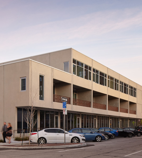
马赛普罗旺斯大学外部图
马赛普罗旺斯大学外观图
马赛普罗旺斯大学
马赛普罗旺斯大学底层平面图
马赛普罗旺斯大学总规划图
马赛普罗旺斯大学平面图
马赛普罗旺斯大学截面图
马赛普罗旺斯大学细节图
马赛普罗旺斯大学正面图
{{item.text_origin}}


