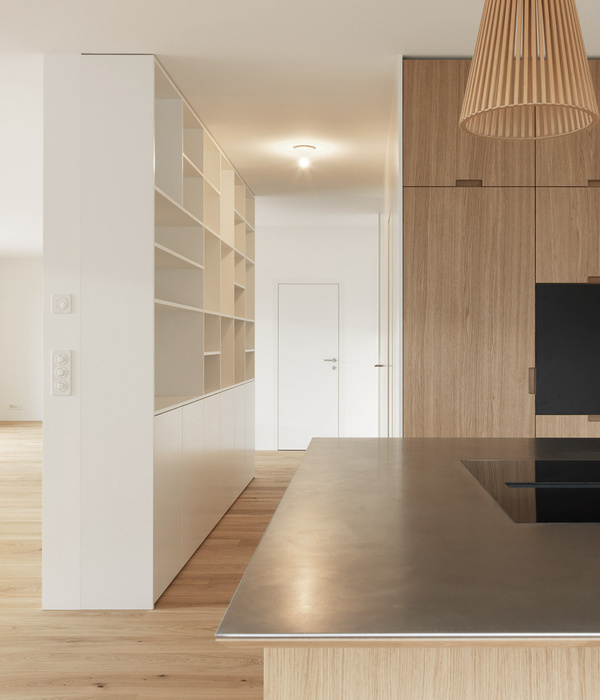
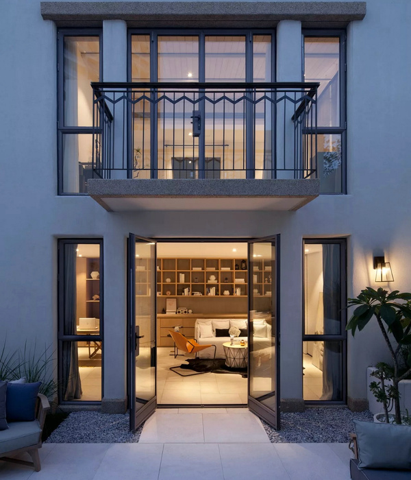
This is not the first time we’re featuring the work of Brussels-based architects De Vylder Vinck Taillieu (aDVVT). Jan De Vylder, Inge Vinck, and Jo Taillieu playfully break with the conventions of architectural functions, typologies, and the use of material time and time again.
In fact, their very first project we’ve ever featured on these pages remains my all-time top 10 (and that’s a pretty massive call, given we run 10 carefully chosen stories every single week, but I absolutely stand by it.)
The trio’s signature undone approach to architecture is brave, imaginative and genuinely inspiring. In fact, aDVVT’s projects are never entirely finished – or at least they don’t appear to be – and it’s precisely their incompleteness that gives their clients the freedom to intervene. This relaxed, undone quality of space stimulates the users own imaginativeness and creativity.
While most other architects are obsessed with controlling the shit out of every single project, detailing each junction and millimetre of their buildings, taking exhausting measures to ensure utter perfection every single time, Vylder, Vinck and Taillieu’s approach offers such a refreshing perspective.
This renovation and extension of an urban terrace in Ekeren, northern suburb of Antwerp, is a common type of project for Belgian architects to tackle. Similarly to other heritage projects, the main facade facing the street is unaffected, revealing very little of the radical transformation that sits beyond. The Vos House is a typical example of a 1930s terrace house with a 6m wide facade and 8.5m deep plan, yielding a 51 square metre footprint.
Behind the main building, aDVVT found a poorly built newer extension with an awkward orientation that faced a noisy street. The architects went about turning the project on its head, carving up the space in such a way it still respected the original elements of the existing building, while on the other hand offering a series of surprising, contemporary and comfortable space to live in.
Beautiful original timber stained-glass doors were restored and retained, along with original parquetry floor, ceiling roses and so on. And then, they made a nonchalant crude cut in the ceiling that exposes the timber structure overhead, deliberately leaving the edges raw and unfinished. This cunning move allows for natural light to penetrate what was once a dark room. And while the ceiling is looking pretty damn rough (to the point I question if they could’ve perhaps bothered to at least paint out the timber white), it’s really the ordinary choice of furniture and lighting that I have a bit of an issue with… But only until I remember that this furniture is what the owner probably actually already has, rather than it being the stuff a photographic stylist has schlepped into the frame to make the photo look Instagram ready…
Yes, like I said, we live in a time when designers and architects are controlling their projects so tightly, only to then also have to hire stylists to create an additional layer of smoke and mirrors for the final photos. It’s kind of insane if you think about it for a minute.
Meanwhile, architects de Vylder Vinck Taillieu stick out their middle finger to this exhausting approach and continue to give us spectacularly effortless projects that happily balance the heritage character of the building, while introducing new elements that create a completely unique aesthetic – one which is really difficult to describe and categorise.
Fucking legends, if you ask me.
[Images courtesy of Architecten de Vylder Vinck Taillieu. Photography by Filip Dujardin.]
{{item.text_origin}}

